


The Language of Science
Exploring language shifts in 175 years of science reporting
On the occasion of the 175th anniversary of the magazine, Scientific American invited me to explore their archive of 5'107 print issues. The results are a fascinating glimpse into how the language of science reporting has evolved.
Data processing and design approach
Summarizing the history of a 175-year-old magazine—that's 5,107 editions with 199,694 pages containing 110,292,327 words!—into a series of graphics was a daunting assignment. When the hard drive with 64 gigabytes of .pdf files arrived at my home in Germany, I was curious to dig in but also a bit scared: as a data-visualization consultant with a background in cognitive science, I am well aware that the nuance of language and its semantic contents can only be approximated with computational methods.
Given that the frequency of words in a language (and in the corpus of Scientific American's text archives) is so skewed, rather than comparing raw numbers of how often words occur, it became far more compelling to look at how the proportion of text a word occupies each year (its relative frequency) evolves over time.

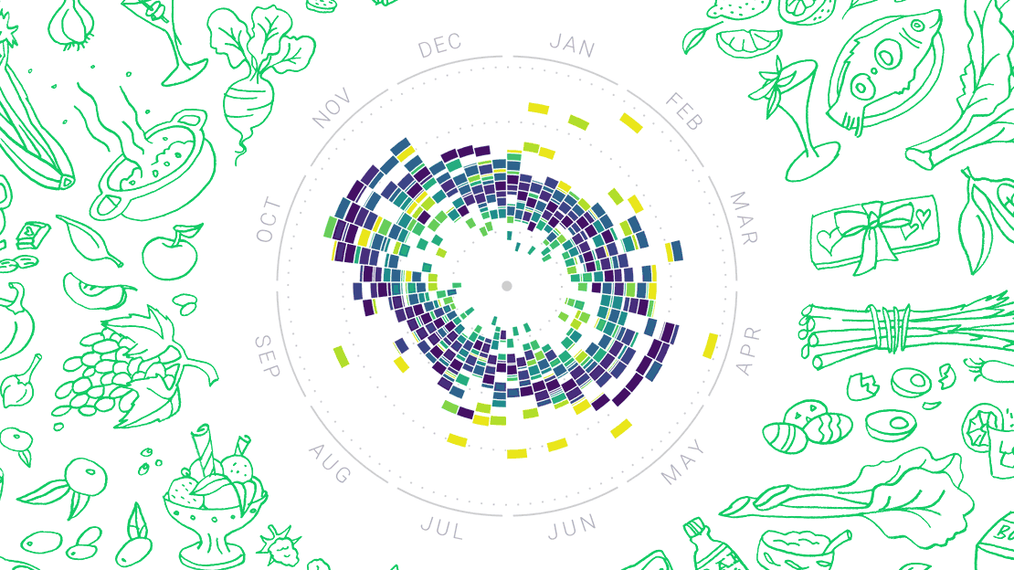
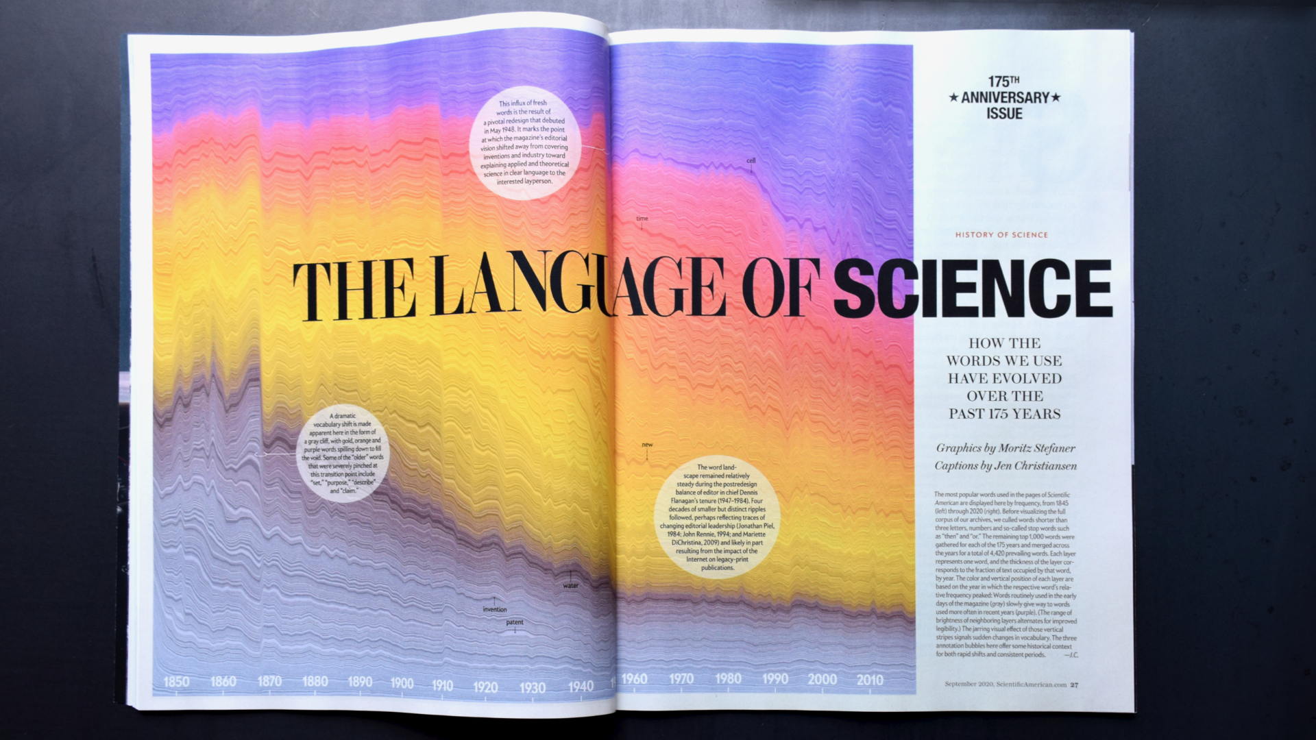
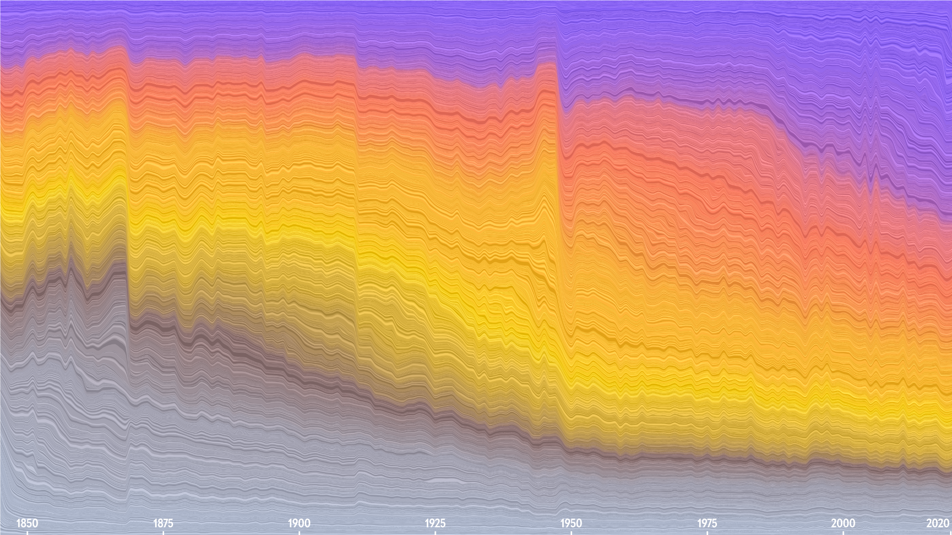
Based on this central idea, we explored many different visual forms—word clouds, stack area graphs, line charts, animations, spatial maps of semantic spaces—before settling on the layered stacked area chart for the opening spread as the overview visualization.
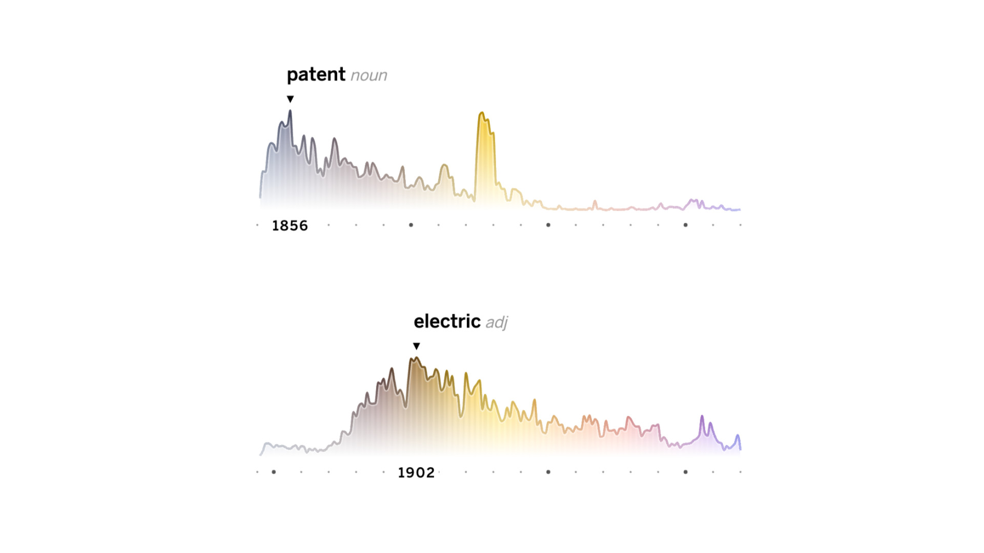
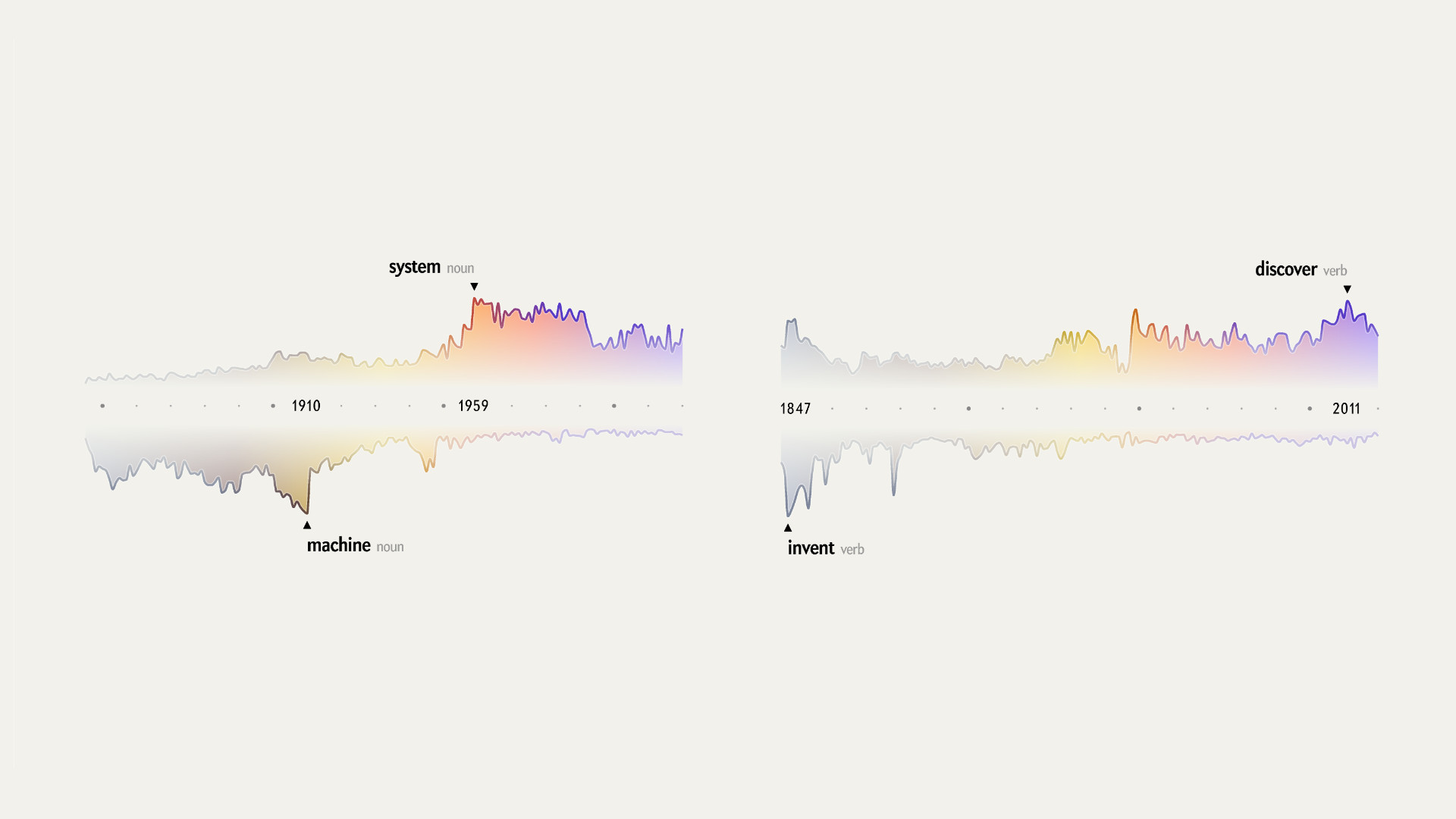
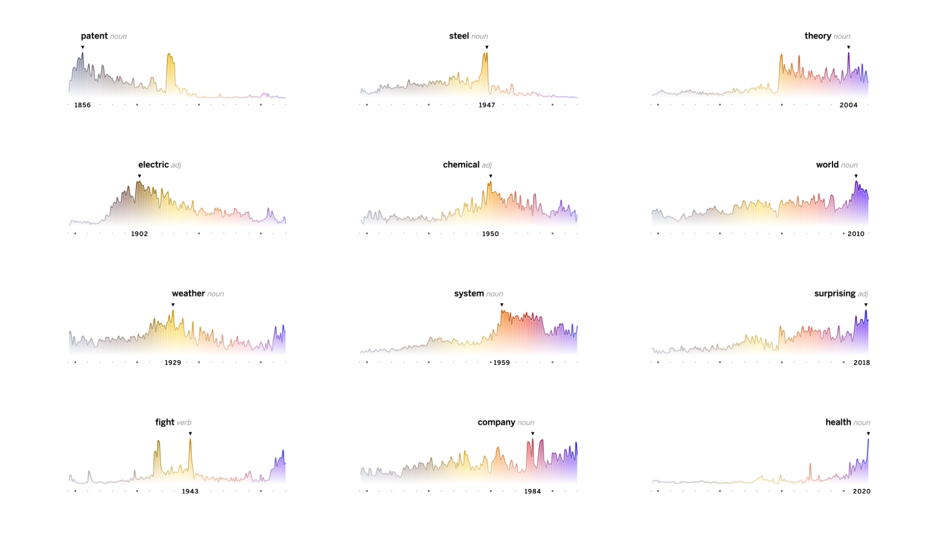
This high-level view of the major shifts in vocabulary, shown as “sediment layers,” is complemented by the individual miniature line charts showing the evolution of each top peaking word per year. Both charts are connected through a custom color scale from vintage brown to modern purple, to tie the various graphics together and to support a quick visual classification of the central trend.
The print piece comprises the "sediment" graphic as an opening piece, followed by a long, multi-page graphic showing the evolution of the number of pages per edition and year combined with one small graphic for each yearly top peaking word.

We close with a curated selection of interesting word juxtapostions — noteworthy complementary, or parallel trends that reveal bigger shifts in a pars pro toto manner. These juxtapositions were used throughout the whole anniversary issue to accompagny individual articles with fitting trend charts.
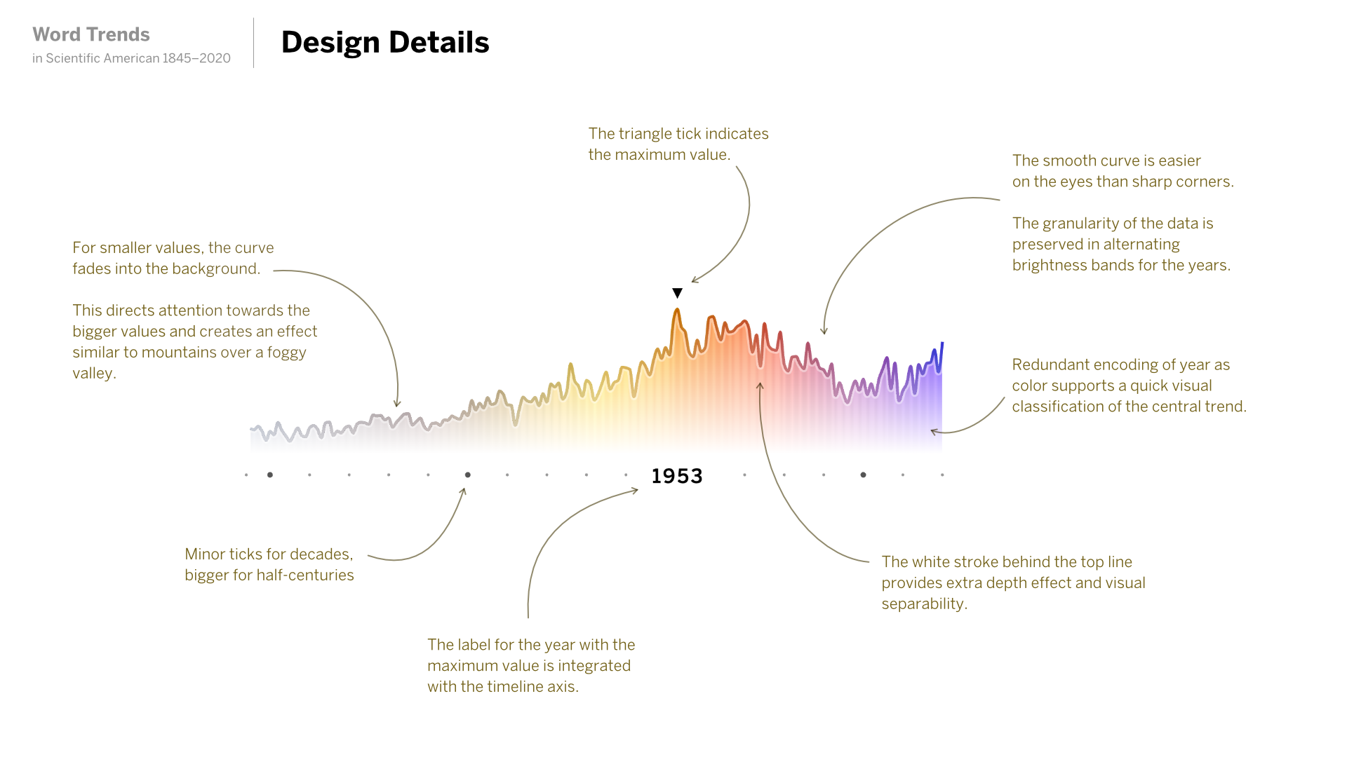
The line charts were designed with great care for detail. Such a simple, known form requires flawless execution (especially when 175 of those little charts are presented across 6 pages of print)!
Online
The interactive version is more reduced: It shows the top peaking word for each year, allowing to quickly scan and browse just by scrolling. Users can deeper by searching across over 4'000 most used terms. Fun detail: Tapping a term reveals other words with similar or flipped trend curves. What's not to like about serendipitous data exploration!
Findings and observations
Working with the data, my initial interest in “what” has been written about, shifted towards looking at the “how”: the evolution of verbs, adjectives and adverbs. These word types can tell so much about how the tone and attitude of the original magazine have changed from the engineering-driven, mechanistic language to the multifaceted science magazine we know today.
One thing that proved hard was to deal with the inherently noisy process of optical character-recognition (OCR) where letters can be mixed up (for instance, “substantially” was often parsed as “snbstantlally”), words might be combined or split at the wrong places, or multicolumn layouts might be read in the wrong order. Accordingly, zooming out on the data-analysis lens to a yearly perspective (rather than working on the level of individual editions) and analyzing the count of single words (rather than looking for compound terms or doing sentence-level analyses) became our sweet spot in the trade-off space between accuracy and robustness against noise. Accordingly, questions like "when was concept X or term Y" first used were unfortunately out of reach, because we could never be sure an earlier mention might have escaped our attention.
Finally, I believe finding a simple, straight-forward way to detect and present noteworthy trends — such as the yearly peaking terms, but also the curated juxtapositions — in combination with the thoughtful annotation and commentary on sides of the writer at Scientific American has been key to the success of this project.
Related resources
Find a few more notes on the design process and rationale in the article: How to Turn 175 Years of Words in Scientific American into an Image as well as a wider contextual embedding in "The Language of Science" by Lorraine Daston.
Acknowledgements
Thanks to Christian Laesser for his always amazing support and advice, to Jen Christiansen for editorial and art direction, to Jen Schwartz for commissioning and improving my process text substantially, to Amanda Montañez for support and advice, and all the others behind the scenes who made this project possible!