
Visual Funding Portfolios
Science funding distributions
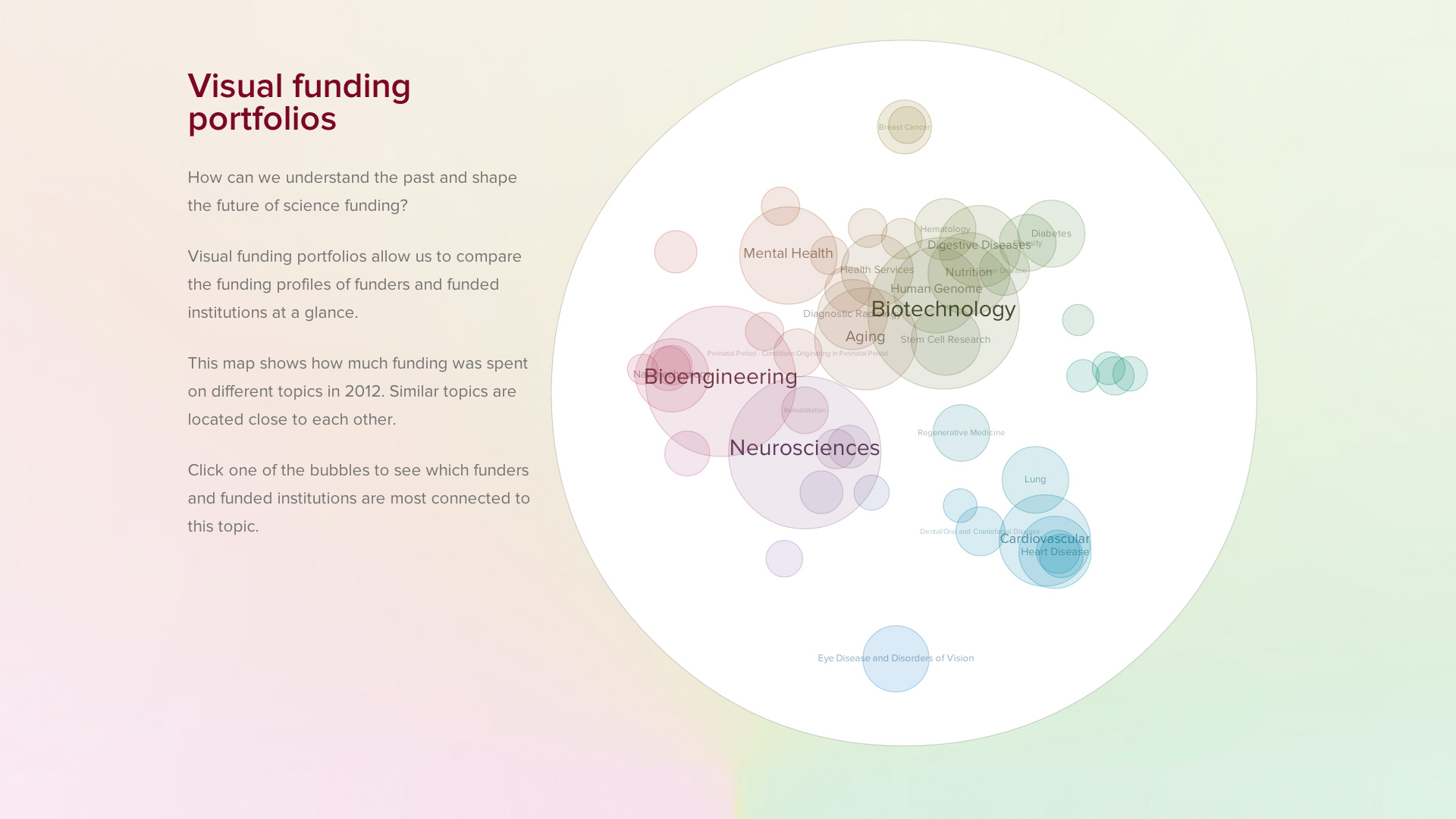
How can we understand the past and shape the future of science funding? Visual funding portfolios allow us to compare the funding profiles of funders and funded institutions at a glance. This visualization demonstrates the capabilities and potentials of the science funding datasets generated by uberresearch.com, a company specialized on analysing science funding.
How it works
First we collected funding data from 23 major funders active in 2012 and added them to the already categorized NIH grants and automatically assigned RCDC categories to the grants.
On this basis, we calculated an overview map that shows the overall distribution of funds for the 50 most used categories.
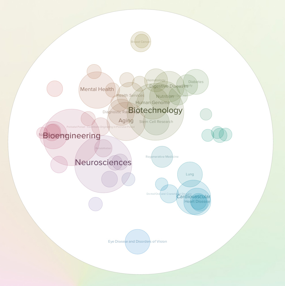
In this map, the bubble size shows the grant amounts spent on the topics, while the placement and coloring indicates similarities in the distribution of funding organizations for that topic.
The arrangement is based on a multi-dimensional scaling algorithm, putting topics which are covered by the same funders closer together on the map. The result is a funding landscape, where similar topics are located in vicinity. As a result, more general or crosscutting topics end up in the center, while the more specific themes are located towards the periphery.
The coloring is based on the angle of the topics with respect to the center point. As a redundant visual cue, it reinforces the readability of the overall funding profile, but also supports the identification of the same topic across maps even when they are presented in a small size.
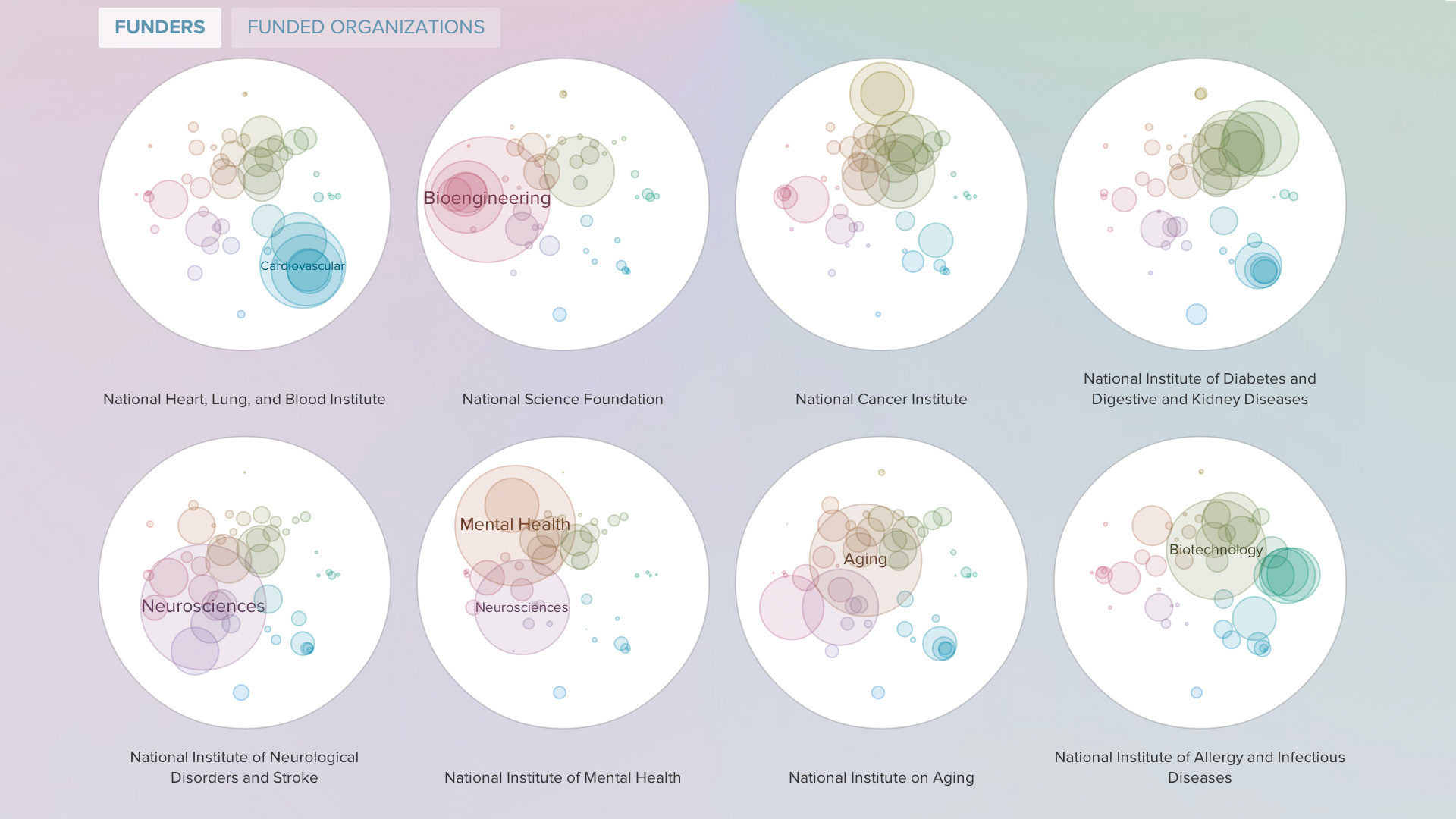
Small multiple for comparing science funder profiles
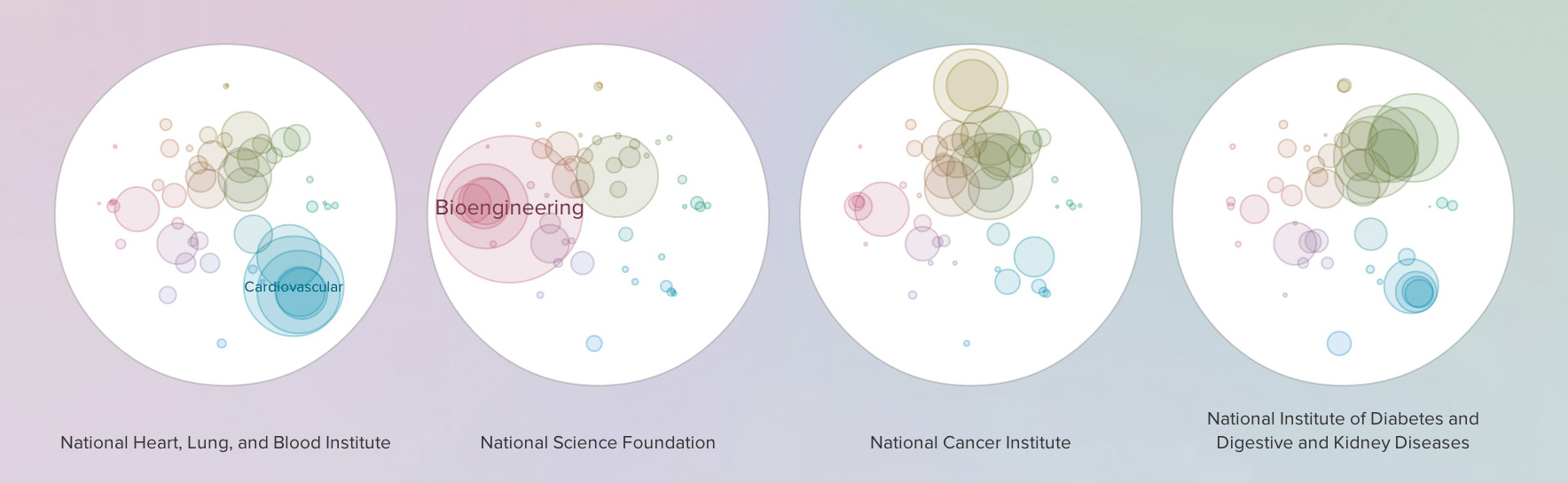
Using this basemap, we can compare the profiles of science funders, and funded institutions. Where is their center of gravity on the map? Are the fundings spread out or concentrated?
Visually, the maps vaguely resemble petri dishes — not only a nod to the theme of research, but also a conceptual anchor to make the graphic more memorable.
Visual guidelines
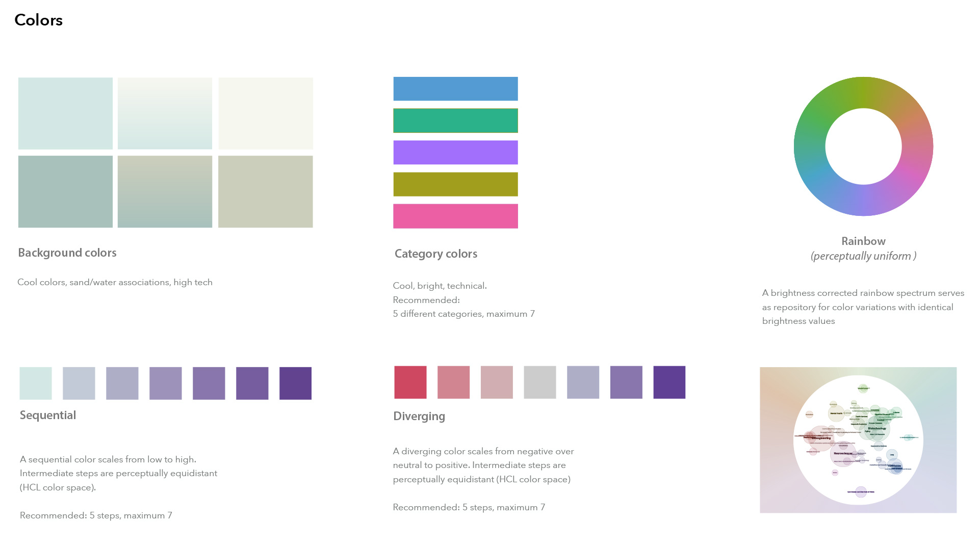
In addition to the publicly available interactive visualization, I also worked on a coherent data visualization language and visualization components for the company's main product, Uberresearch Dimensions, in collaboration with MING Labs.