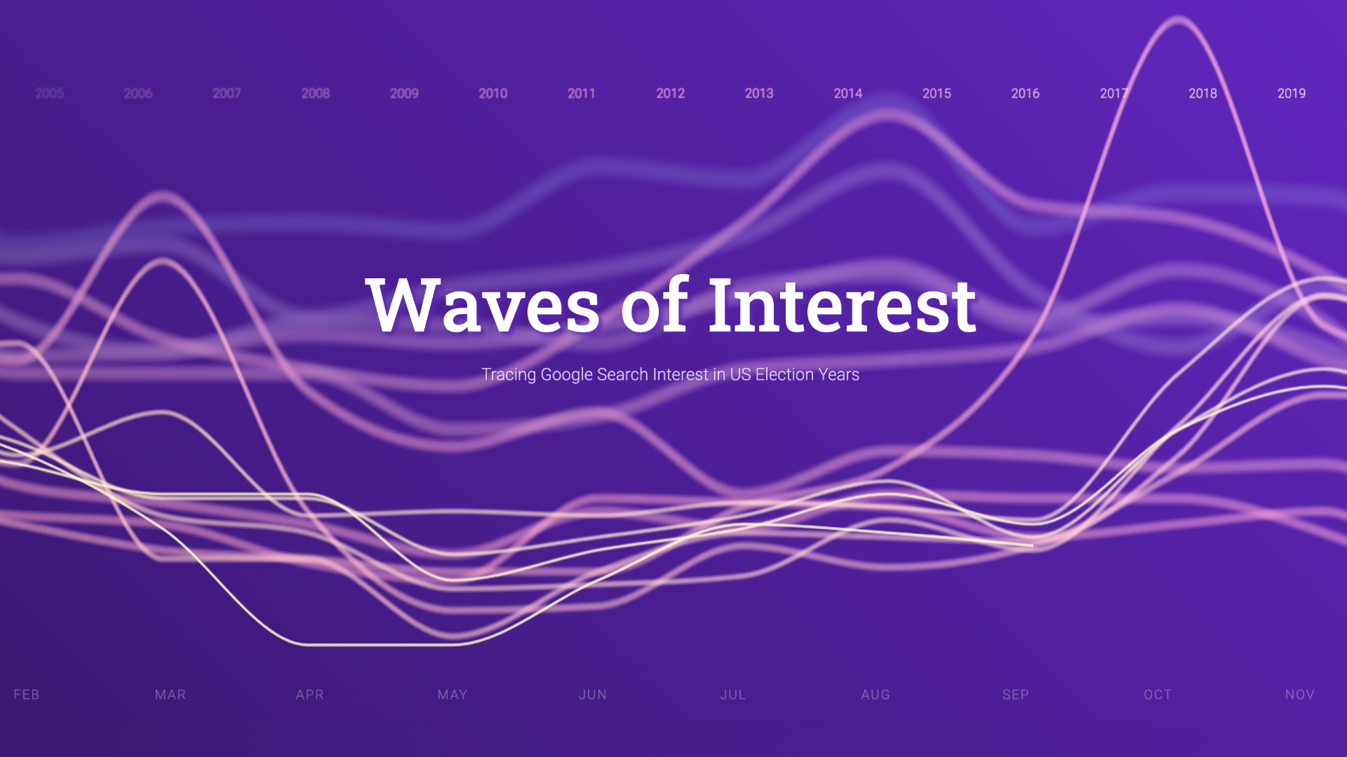
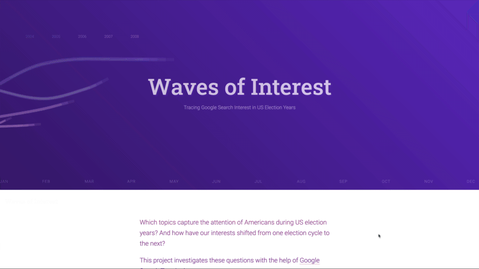
Waves of Interest
Tracing Google Search Interest in US Election Years
Which topics capture the attention of Americans during US election years? And how have our interests shifted from one election cycle to the next? This project investigates these questions with the help of Google Search Trends data.
When Google News Initiative reached out to do a project for the US elections with Google Trends data, my first thought was to escape the frantic day-by-day realtime news cycle and make it really long-term.
Google Trends can provide 17 years of search interest data by now — what an opportunity to investigate how past election years were different from this one, and which attention cycles can we observe within election years!
How did the topic landscape evolve? And how has the pace of attention shifting changed?
Seeing how the interest for topics comes and goes over the years, but also the seasonal rhythms within the years lead us to develop a design theme for the site centered around notions of waves, ebb and flows, and, in the final section, of islands with shores.
Site structure

After lots of analysis and experimentation, we compiled the final site as follows: Opening with a smooth wavy line chart animation — an ambient introduction to the theme of waves, and trends — we dive right into the central question:
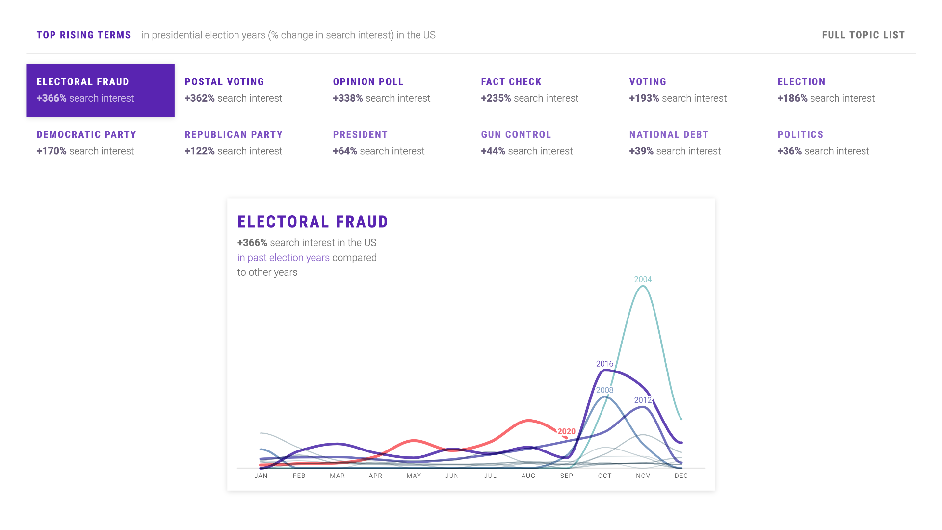
"Which political topics trend in election years in general? And when?"
We show both a list of top rising topics in election years, as well as a detailed chart of how their search interest values unfolded over the years.
This comparison allows us to understand where we are in the "attention cycle" around certain topics — and also gives us an opportunity to introduce the topic lists we are working with — a set of top searched political terms on Google, concepts from Pew surveys on top political issues in election years, as well as a few manually added terms to account for recent events.
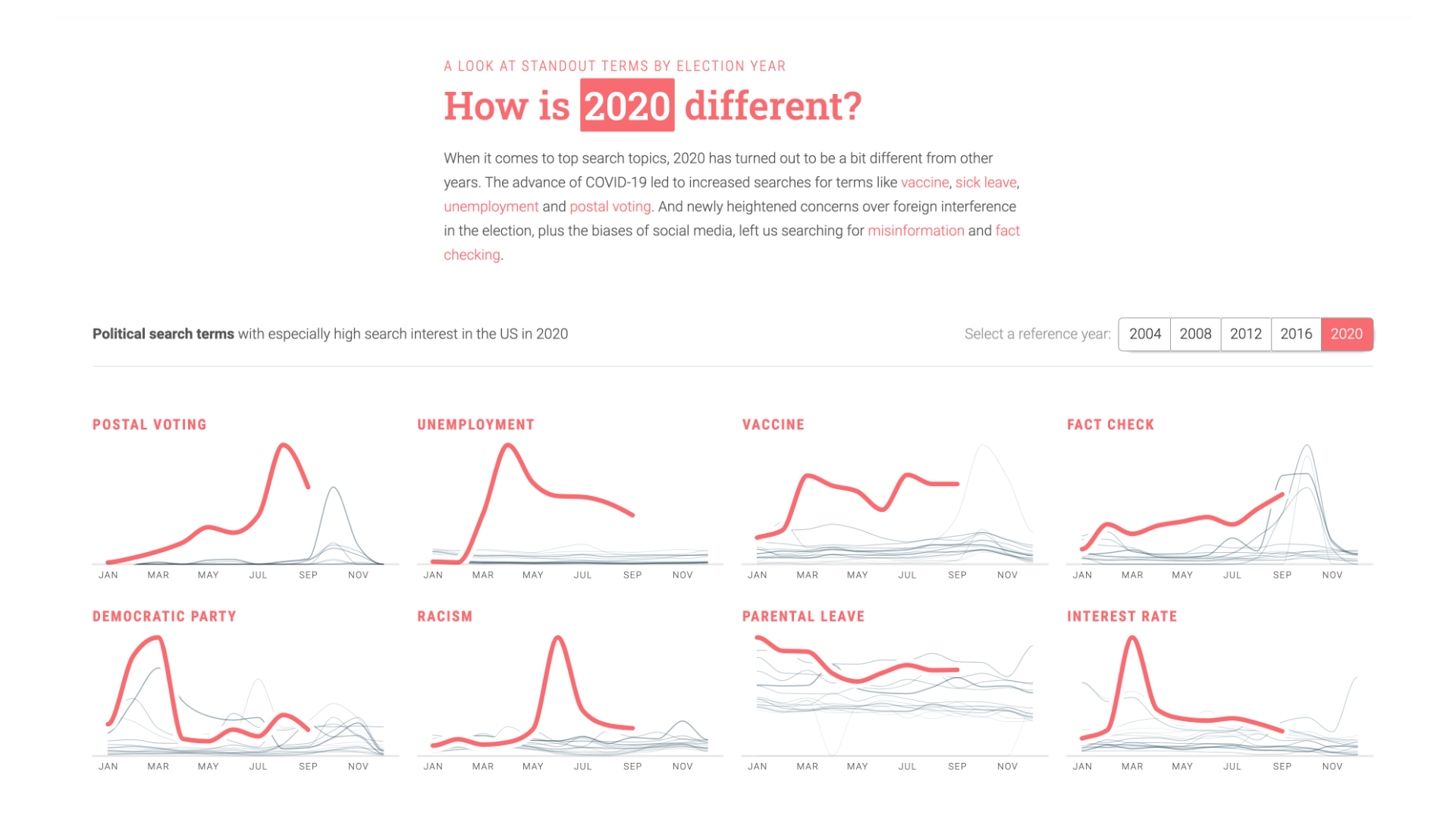
Obviously, 2020 begs the question how much out of the ordinary the year is compared to other years.
Data says YES INDEED.
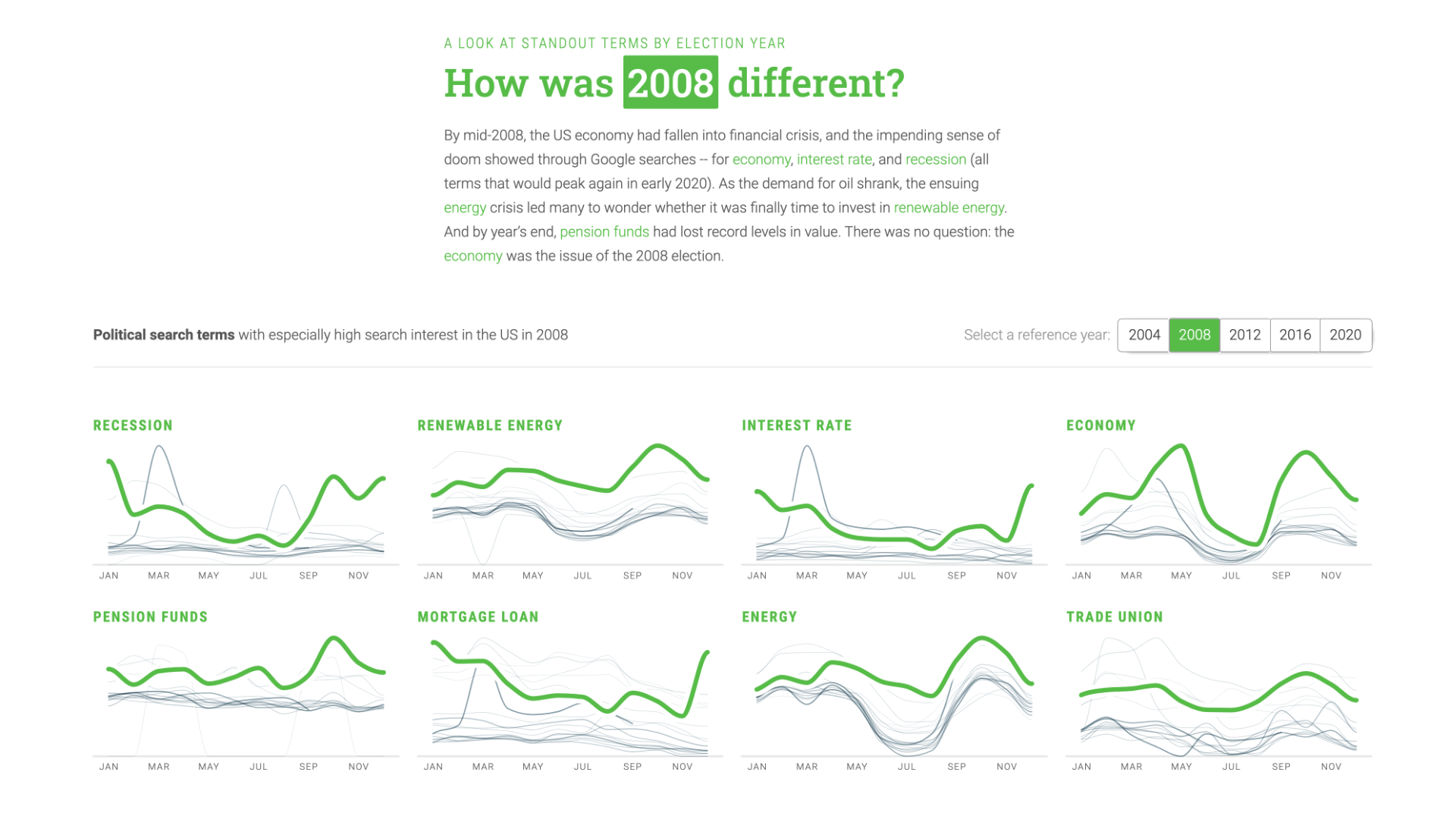
But, it's also been really interesting to also "time-travel" back to 2012 when national debt, student loans, legality of cannabis or same-sex marriage were among the most searched topics. Or look at 2008, where economy and environment were the dominating themes.
The flatness of these top issue curves, compared to 2020s attention spikiness, tells a striking story how pace of attention shifts has changed dramatically.
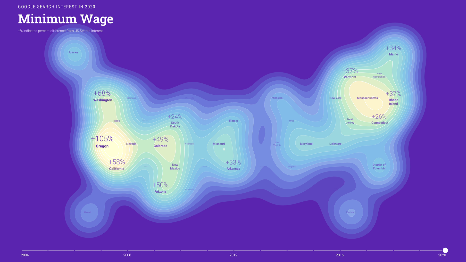
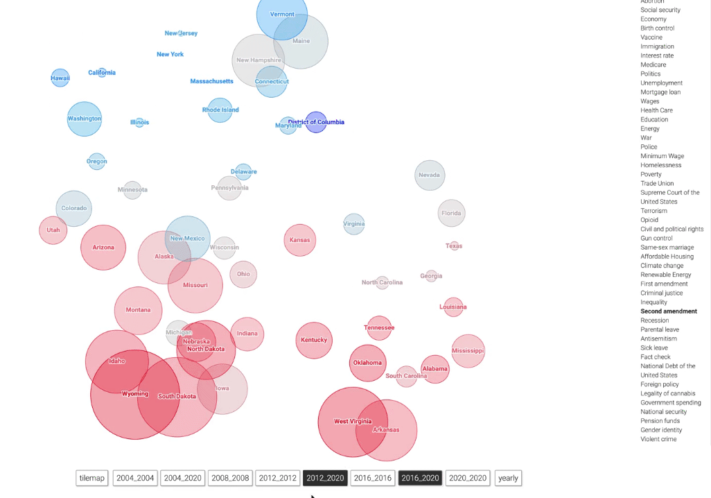
One other, somewhat hidden, but quite neat feature is to switch the whole site US-wide mode to individual state perspective.
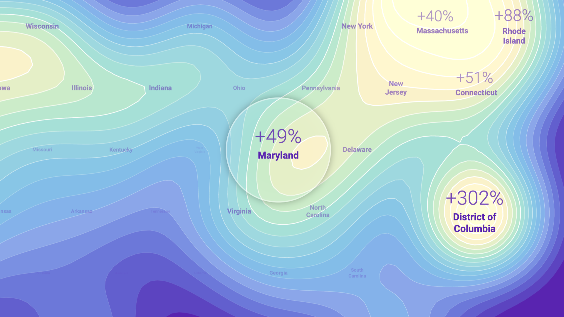
Which brings us to the final view: A map of the US based on topic interest — which topics are searched uniformly across states, and which are unevenly distributed? And how has the volume and spread of search interest developed over the years?
Read precise values in the expandable line chart, or get a geographic overview with the animated maps (Lava lamp style!)

The rendering style obviously reminds us of topographic maps, alluding to islands in the sea. We developed a novel spatial interpolation algorithm especially for this project.
Process
As always, the design process involved a lot of prototyping with data. Here are a few promising visuals we produced that didn't make it into the final piece:


The process of producing lots of visuals and later thinking about how to bring them into a meaningful sequence has proven really helpful. You can see e.g. how an early, in-browser prototype contains hints of the final version, as well as some of the discarded project directions. You can also see that we implemented a "playground mode" to easily switch between isolated visualization components vs the full site.

One important lesson learned in this project was that early prototyping with data is essential — but if it happens with preliminary (and overly aggregated) data one can get attached to visuals that later turn out to be less readable or interesting. Having robust data early on is indispensable for these data-driven projects.
Findings and outlook
What did we learn working with the data?
A couple of things stood out to us:
-
Classic political issues like foreign policy, national debt, education, … seem to have lost importance. On the flipside, issues around the election process or the administration, but also topics closer to personal situations and experiences (affordable housing, inequality, racism) have gained in interest.
-
2016, and now 2020, are widely perceived as years of abrupt change, but interestingly, our data often shows smooth developments over longer periods of time, and less sudden shifts than we would have expected. Some individual topics surged in interest (like e.g. Tariffs in 2018), but many issues stayed very consistent with their previous developments.
-
2020 is unparalleled in terms of short-livedness of topic peaks — there was basically a new hugely spiking topic every month.
-
For many topics, the search interest within states is strongly correlated with national search interest, so the state lines move up and down in parallel. We would have expected that the variation between states would change more over time and national interest to be a less strong driver. (One notable exception is same-sex marriage, which developed from a topic with huge interstate differences to a homogenous, lower interest profile. Other topics have expressed yearly state bumps due to referendums about state legislations or stand-out events.)
- At the same time, each topic does have a unique "fingerprint" on the map. The topic landscape of interests is indeed more diverse than we expected. "Red" and "blue" states are visibly different, but that's not the only story in the dataset. There are definitely more than "two Americas".
But, don't take our word for it — explore the data and make your discoveries :)
Further reading
Philippe Rivière was of great help with the technical and data exploration aspects of this project — make sure to check out his behind-the-scenes writeup!
Big thanks also to Destry Maria Sibley who worked on concept and copy editing, as well as Simon Rogers and Alberto Cairo for the opportunity and advice!