# Truth & Beauty — full content export
Markdown of every content page on https://truth-and-beauty.net, for AI agents. See https://truth-and-beauty.net/llms.txt for the curated index.
---
# https://truth-and-beauty.net/projects/spun-a-hidden-infrastructure
# A Hidden Infrastructure
_Mapping the underground world of fungi_
Published: 2026-05-19
Live project: [Project website](https://a-hidden-infrastructure.spun.earth/)
There is an incredible hidden infrastructure of ecosystems right beneath our feet: arbuscular mycorrhizal fungi. They connect to over 70% of plants, extend root networks up to a 100 times, and reach a length of 1 billion times the distance to the sun. Centered around a globe with ground-breaking new data on the density of these hyphal networks, this data narrative provides a glimpse into this fascinating underground world.
## Key visuals
- 3D globe of mycorrhizal fungal hyphal density glowing green across Earth, with a 3.78 m/cm³ location readout
- Cropland footprint slide showing AM fungal densities 47% lower under Europe's croplands, mapped in orange
- 3D terrain map of Tenerife shaded by fungal hyphal density, brightest around Mount Teide
- Sample sites view over desert dunes with a study detail panel and hyphal-density distribution chart
- Close-up globe view of glowing green hyphal density mapped over mountainous terrain
- Hyphal density map around the Black Sea with a 5.79 m/cm³ top 6% globally readout
- Full globe of global AM fungal hyphal density, brightest across Africa and Eurasia
- Grassland reservoirs slide, densest AM networks at Flint Hills Prairie reading 10.29 m/cm³ top 1%
## The globe
![3D globe of predicted mycorrhizal fungal hyphal density glowing green across Earth, with a 3.78 m/cm³ location readout]()
Working with SPUN and their international research team, I designed the project's centerpiece: an interactive 3D globe paired with a long-form story.
The globe renders the predicted density of fungal networks at 1 km × 1 km resolution across the whole planet — a continuous, glowing skin of living infrastructure grounded in 16,000 soil cores and robotic imaging of 300,000 living hyphae.
The initial timeline for the project was very ambitious, so, quite unusually, the globe design and implementation were created pretty much one-shot, based on earlier design and technology explorations I had done independently already. Usually, I will advise towards a more extensive design exploration phase — but you also have to know when to seize opportunities that present themselves: When we saw the dataset in this form, in its striking beauty, and fascinating interplay with features like land use and elevation, we just knew we had to make it the centerpiece of the project.
![3D terrain map of Tenerife shaded by AM fungal hyphal density, brightest around Mount Teide]()
## Narrative
A striking key visual like this globe goes a long way — but in order to explain the motivation, and also nuances behind the data, we worked on a long-form story to accompany the globe.
It is structured in three main sections: the first one introduces the hidden world of fungi and the motivation for the project; the second one dives into the research process and the data itself; and the third one looks at the implications of this new knowledge for our understanding of ecosystems and how we can protect them.
We consciously avoided a "scrollytelling" long page format for the story, and rather went for a step-based, slide-presentation style. This allows to easily jump between sections, find orientation, and to integrate the interactive globe as a constant companion to the story.
![Story architecture overview arranging the site's slides into narrative sections from mysterious intro to call to action]()
![Cropland footprint slide: AM fungal densities average 47% lower under Europe's croplands, shown in orange on the globe]()
Here's a speedrun of the data visualization parts of the site:
## Visual language
The visual impression of the globe is deliberately organic and otherworldly — mystic, almost alien — closer to looking at a living organism from orbit than reading a conventional dataset.
The UI and illustrations borrow from the clear and bold visual language of the SPUN brand, with a focus on clarity and legibility.
Specific illustrations were created to visualize, for instance, the staggering total numbers and the algorithmic mechanisms behind the dataset. For other parts of the story, video and photo material was available to provide a more human perspective on the research process and the scientists behind it and show all the on-the-ground work that needs to come together.
![Close-up globe view of glowing green hyphal density mapped over mountainous terrain]()
![Learning the Landscape slide explaining how machine learning predicts hyphal density from field samples and climate data]()
![Infographics: AM fungi biomass is roughly 5 times the weight of all humans and total hyphal length about 1 billion times the Earth-Sun distance]()
![Zoomed hyphal density map around the Black Sea with a 5.79 m/cm³ top 6% globally readout]()
## Tech notes
The application was built using [SvelteKit](https://svelte.dev/) and uses an end-to-end open source stack for the interactive vector maps, in particular:
- [MapLibre GL JS](https://maplibre.org/) — WebGL renderer for vector and raster map layers
- [Protomaps](https://protomaps.com/) basemap, served as [PMTiles](https://github.com/protomaps/PMTiles) — a single-file tile archive read directly via HTTP range requests
- Hyphal-density raster served as a [Cloud Optimized GeoTIFF](https://www.cogeo.org/) and read in the browser with [geotiff.js](https://geotiffjs.github.io/) for per-pixel value lookups.
![Full-screen mycorrhizal infrastructure map interface with a hyphal-density tooltip reading 3.99 m/cm³]()
## Reception
We received widespread media coverage, including:
- The New York Times: [68 Quadrillion Underground Miles of Fungi](https://www.nytimes.com/2026/06/11/science/ecology-mycorrhizal-fungus.html)
- The Guardian: [Subterranean fungi networks more than 100 quadrillion km in length, study finds](https://www.theguardian.com/science/2026/jun/11/arbuscular-mycorrhizal-fungi-plant-life-climate-global-mapping-study)
- National Geographic: [Fungi take up more mass than people—see how they stretch across the Earth](https://www.nationalgeographic.com/environment/article/arbuscular-mycorrhizal-fungi-networks-map)
- Scientific American: [See the Hidden Fungal Network So Big It Could Stretch to Proxima Centauri and Back](https://www.scientificamerican.com/article/see-the-hidden-fungal-network-so-big-it-could-stretch-to-proxima-centauri-and-back/)
- Live Science: [Earth's underground fungal network is so massive, it would span 10% of the Milky Way, map reveals](https://www.livescience.com/planet-earth/plants/earths-underground-fungal-network-is-so-massive-it-would-span-10-percent-of-the-milky-way-map-reveals)
- GEO: [Forschende vermessen riesiges Pilznetzwerk im Boden der Erde](https://www.geo.de/natur/110-billiarden-kilometer--forschende-vermessen-riesiges-pilznetzwerk-im-boden-der-erde-37529198.html)
Check out the [story](https://a-hidden-infrastructure.spun.earth/) and the [globe](https://a-hidden-infrastructure.spun.earth/map) — and learn more about the [Society for the Protection of Underground Networks (SPUN)](https://spun.earth/) and their work to protect these vital ecosystems.
## Credits
In collaboration with [SPUN](https://spun.earth/).
---
[View on truth-and-beauty.net](https://truth-and-beauty.net/projects/spun-a-hidden-infrastructure)
---
# https://truth-and-beauty.net/projects/state-of-neuroscience
# State of Neuroscience
_Tracking major trends in neuroscience_
Published: 2025-11-01
Live project: [Project website](https://stateofneuroscience.thetransmitter.org/)
This visual puts 50 years of neuroscience research on the map — by analyzing nearly 350’000 research publications and extracting salient keywords. Based on this, we were able to map the semantic concept space of neuroscience research: how are topic related to each other — and where is the current focus of attention?
## Key visuals
- State of Neuroscience 2025 hero on a topographic backdrop with Track major trends in neuroscience headline and key-finding sparklines
- Streamgraph closeup of shifting neuroscience term frequencies, blue older terms below and red recent terms like neuroinflammation and fMRI on top
- Sortable table of top neuroscience terms with publication counts, five-year change and trend sparklines, led by hippocampus at 18,915 publications
As the data‑visualization designer on the neuroscience mapping project, I led the transformation of 350,000 journal abstracts into an exploratory, term‑level landscape that invites discovery and surfaces meaningful patterns.
![State of Neuroscience 2025 landing page with key-finding sparklines: Alzheimer's disease at 6.2% of 2024 abstracts, EEG rising, COVID-19 newest]()
This includes, for instance, shaping the core presentation model (semantic map based on keyword co-occurrence) to balance overview and detail.
I also defined the visual language, based on input from project art director Rebecca Horne — a key visual idea being the use of topographic hills and valleys which remind of cortical structures with "activation overlays" for trending areas.
![Semantic trend map placing 500 neuroscience terms by co-occurrence, with heat overlay marking recently trending areas like EEG and neuroinflammation]()
Collaboration with research leads was essential to turn the myriad of theoretical possibilities into interpretable visuals, without sacrificing scientific soundness and precision.
![Trend analysis page ranking most used, top trending and newest neuroscience terms above a streamgraph and sortable full-term table]()
I also enjoyed producing the site fully myself, using [d3.js](https://d3js.org/), [svelteplot](https://svelteplot.dev/) and [svelte-kit](https://kit.svelte.dev/). The whole site runs as a static application, with pre-computed data files for performance and ease of hosting.
## Credits
In collaboration with [The Transmitter](https://thetransmitter.org/) (Kristin Ozelli, Emily Singer, Rebecca Horne, Hope Vanderberg) and [World Wide Neuro](https://world-wide.org/neuro) (Panos Bozelos, Tim Vogels). Funded by [Simons Foundation](https://www.simonsfoundation.org/).
---
[View on truth-and-beauty.net](https://truth-and-beauty.net/projects/state-of-neuroscience)
---
# https://truth-and-beauty.net/projects/waves-of-interest
# Waves of Interest
_Tracing Google Search Interest in US Election Years_
Published: 2024-10-26
Live project: https://waves-of-interest.truth-and-beauty.net/
Which topics capture the attention of Americans during US election years? And how have our interests shifted from one election cycle to the next? This project investigates these questions with the help of Google Search Trends data.
## Key visuals
- Title card over a blue-and-yellow topographic contour map of US search interest
- Landing screen tracing wavy search-interest lines across the years, with 'Recession' highlighted
- Grid of six US heatmaps of top trending 2024 topics, led by inflation at +115%
- Inflation search-interest line chart for 2004–2024, peaking at 100 in August 2022
- Blobby topographic map of US parental-leave search interest by state, highest in Washington DC
- Small-multiples grid of blobby US maps comparing search interest across dozens of political topics
When Google News Initiative reached out to do a project for the US elections with Google Trends data, my first thought was to escape the frantic day-by-day realtime news cycle and make it really _long-term_.
Google Trends can provide 17 years of search interest data by now — what an opportunity to investigate how past election years were different from this one, and which attention cycles can we observe within election years!
How did the topic landscape evolve? And how has the pace of attention shifting changed?
![Blobby topographic map of US search interest by state, evoking islands and shores]()
Seeing how the interest for topics comes and goes over the years, but also the seasonal rhythms within the years lead us to develop a design theme for the site centered around notions of waves, ebb and flows, and, in the final section, of islands with shores.
![Layered wave-like line chart of inflation search interest over two decades]()
## 2024 Edition
_Note: Most of the commentary in this page referes to the [original, 2020 version](https://waves-of-interest-2020.truth-and-beauty.net/)._
_For the 2024 election, we published an [updated and more streamlined version](https://waves-of-interest.truth-and-beauty.net/), focussing on the most successful visuals: the beautiful blobby maps and the animated lines. But a lot of the basic considerations still apply._
## Site structure
After lots of analysis and experimentation, we compiled the final site as follows: Opening with a smooth wavy line chart animation — an ambient introduction to the theme of waves, and trends —
![Animated wavy lines forming the site]()
— we dive right into the central question: "Which political topics trend in election years in general? And when?"
![Top rising election-year search terms, led by electoral fraud at +366%, with its yearly trend chart]()
We show both a list of top rising topics in election years, as well as a detailed chart of how their search interest values unfolded over the years.
This comparison allows us to understand where we are in the "attention cycle" around certain topics — and also gives us an opportunity to introduce the topic lists we are working with — a set of top searched political terms on Google, concepts from Pew surveys on top political issues in election years, as well as a few manually added terms to account for recent events.
Obviously, 2020 begs the question how much out of the ordinary the year is compared to other years.
![Small multiples highlighting how 2020 stood out, with spikes in postal voting, unemployment and vaccine searches]()
Data says YES INDEED.
But, it's also been really interesting to also "time-travel" back to 2012 when national debt, student loans, legality of cannabis or same-sex marriage were among the most searched topics. Or look at 2008, where economy and environment were the dominating themes.
![Small multiples highlighting how 2008 stood out, with spikes in recession, energy and pension-fund searches]()
The flatness of these top issue curves, compared to 2020s attention spikiness, tells a striking story how pace of attention shifts has changed dramatically.
One other, somewhat hidden, but quite neat feature is to switch the whole site US-wide mode to individual state perspective.
![Blobby topographic map of US minimum-wage search interest in 2020, peaking in Oregon at +105%]()
Which brings us to the final view: A map of the US based on topic interest — which topics are searched uniformly across states, and which are unevenly distributed? And how has the volume and spread of search interest developed over the years?
![Close-up of the topographic interpolation, with state peaks like Washington DC at +302%]()
Read precise values in the expandable line chart, or get a geographic overview with the animated maps (Lava lamp style!)
![Animated lava-lamp style map of US search interest shifting across election years]()
The rendering style obviously reminds us of topographic maps, alluding to islands in the sea. We developed a [novel spatial interpolation algorithm](https://observablehq.com/@fil/spatial-interpolation-voronoi-blur) especially for this project.
## Process
As always, the design process involved a lot of prototyping with data. Here are a few promising visuals we produced that didn't make it into the final piece:
![Discarded prototype: a UMAP projection scattering states and topics into a constellation-like map]()
![Discarded prototype: tangled colored trails tracing each state]()
![Discarded prototype: an animated tile-map of states as bubbles sized by search interest]()
![Discarded prototype: bundled line charts comparing topic search interest across election years]()
The process of producing lots of visuals and later thinking about how to bring them into a meaningful sequence has proven really helpful. You can see e.g. how an early, in-browser prototype contains hints of the final version, as well as some of the discarded project directions. You can also see that we implemented a "playground mode" to easily switch between isolated visualization components vs the full site.
![Animated early in-browser prototype cycling through the project]()
One important lesson learned in this project was that early prototyping with data is essential — but if it happens with preliminary (and overly aggregated) data one can get attached to visuals that later turn out to be less readable or interesting. Having robust data early on is indispensable for these data-driven projects.
## Findings and outlook
What did we learn working with the data?
A couple of things stood out to us:
- Classic political issues like foreign policy, national debt, education, … seem to have lost importance. On the flipside, issues around the election process or the administration, but also topics closer to personal situations and experiences (affordable housing, inequality, racism) have gained in interest.
- 2016, and now 2020, are widely perceived as years of abrupt change, but interestingly, our data often shows smooth developments over longer periods of time, and less sudden shifts than we would have expected. Some individual topics surged in interest (like e.g. Tariffs in 2018), but many issues stayed very consistent with their previous developments.
- 2020 is unparalleled in terms of short-livedness of topic peaks — there was basically a new hugely spiking topic every month.
- For many topics, the search interest within states is strongly correlated with national search interest, so the state lines move up and down in parallel. We would have expected that the variation between states would change more over time and national interest to be a less strong driver. (One notable exception is same-sex marriage, which developed from a topic with huge interstate differences to a homogenous, lower interest profile. Other topics have expressed yearly state bumps due to referendums about state legislations or stand-out events.)
- At the same time, each topic does have a unique "fingerprint" on the map. The topic landscape of interests is indeed more diverse than we expected. "Red" and "blue" states are visibly different, but that's not the only story in the dataset. There are definitely more than "two Americas".
But, don't take our word for it — [explore the data](https://waves-of-interest.truth-and-beauty.net/) and make your discoveries :)
## Further reading
[Philippe Rivière](https://visionscarto.net/) was of great help with the technical and data exploration aspects of this project — make sure to check out his [behind-the-scenes writeup](https://observablehq.com/@fil/how-we-made-waves-of-interest)!
Big thanks also to [Destry Maria Sibley](https://www.destrysibley.com/) who worked on concept and copy editing, as well as [Simon Rogers](https://simonrogers.net/) and [Alberto Cairo](http://albertocairo.com/) for the opportunity and advice!
## Credits
Project direction:
[Simon Rogers](https://simonrogers.net/), [Alberto Cairo](http://albertocairo.com/)
Creative direction, data visualization, design:
[Moritz Stefaner](https://truth-and-beauty.net/)
Research and annotation:
[Destry Maria Sibley](https://www.destrysibley.com/)
Data analysis & cartography:
[Philippe Rivière](https://visionscarto.net/)
---
[View on truth-and-beauty.net](https://truth-and-beauty.net/projects/waves-of-interest)
---
# https://truth-and-beauty.net/projects/ccvi
# Climate—Conflict—Vulnerability Index
_Mapping the overlap between climate and conflict risks_
Published: 2024-10-07
Live project: https://climate-conflict.org
Where in the world do climate and conflict risks overlap in harmful ways? Which role do local vulnerabilities play in exacerbating risks? How can we allow analysts and policymaker to make better decisions — based on heterogenous, multi-faceted information sources?
## Key visuals
- CCVI globe visualization with a Heatwaves callout reading 84 heatwave days in the past twelve months
- German Foreign Minister Annalena Baerbock presenting the CCVI map at the Berlin Climate and Security Conference
- CCVI methodology page beside a tree diagram of the index hierarchy across climate, vulnerability and conflict pillars
- CCVI Tool interactive world map of combined climate, conflict and vulnerability scores with a metrics sidebar
- CCVI business cards on a wooden table showing the project logo and the climate-conflict.org web address
- Dot-grid world map coloring climate, conflict and vulnerability risk layers across every continent
- Analyst pointing at a projected CCVI world map beside a Climate—Conflict—Vulnerability Index poster
- CCVI indicator catalogue page with cards describing droughts, heatwaves, heavy precipitation and other indicators
## Premise
There is significant overlap between countries most affected by climate change and those most at risk of violent conflict. Climate change in the context of conflict is considered a potential “threat multiplier” and the interplay between climate and conflict has received increasing attention from researchers and policy-makers over the last two decades.
In order to provide a bird's eye perspective on the climate-conflict nexus, the [Climate—Conflict—Vulnerability Index (CCVI)](https://climate-conflict.org) maps current global risks by integrating climate and conflict hazards with local vulnerabilities.
The index comprises a harmonized set of data layers and a transparent scoring methodology to make regions globally comparable. The data is updated quarterly and gridded to 0.5 degrees (ca. 55km by 55km at the equator).
Both methodology and data are [available for download](https://climate-conflict.org/www/data-pages/combined#download) and reuse under a permissive Creative Commons license.
![Dot-grid globe centered on Africa and Europe mapping CCVI climate and conflict risk scores]()
## Research project
![CCVI methodology page beside a tree diagram of the index hierarchy across climate, vulnerability and conflict pillars]()
The index is the product of a joint research collaboration between the scientific partners at the [Center for Crisis Early Warning (CCEW)](https://www.unibw.de/ciss-en/ccew) at the [University of the Bundeswehr Munich](https://www.unibw.de/home-en) and the [FutureLab - Security, Ethnic Conflicts and Migration](https://www.pik-potsdam.de/en/institute/futurelabs/security-ethnic-conflicts-and-migration) at the [Potsdam Institute for Climate Impact Research](https://www.pik-potsdam.de/en/).
My team and I have been guiding the development of the index from a design perspective, and help the project with science communications and data visualization.
![CCVI indicator catalogue page with cards describing droughts, heatwaves, heavy precipitation and other indicators]()
## Public launch
![German Foreign Minister Annalena Baerbock presenting the CCVI map at the Berlin Climate and Security Conference 2024]()
The CCVI was launched publicly by the German Federal Foreign Minister Annalena Baerbock at the Berlic Climate Security Conference 2024.
See a recording of the keynote in English translation below or the [original in German language](https://www.youtube.com/watch?v=aNqca37aq2o). The CCVI part start at around 08:30.
![Analyst pointing at a projected CCVI world map beside a Climate—Conflict—Vulnerability Index poster]()
## CCVI Tool
In addition to the public facing part of the project, we also work on advanced internal tooling to make the index relevant for decision-making at the German Federal Foreign Office and its partners.
The CCVI Tool provides analysts with detailed perspectives on the global CCVI data layers and powerful features for country-level analysis.
![Annotated CCVI Tool global overview: world risk map with panels for metric information, the full index data-layer hierarchy, most affected countries, export and a population-density filter]()
Based on the detailed, publically available data layers from the index, the CCVI Tool adds another level of analysis on a country level: The country profile pages feature detailed maps, trend analysis and comparison features.
![Annotated CCVI Tool country profile for Syria: climate and conflict risk maps, selected indicators, key trends, the pillar data explorer, case studies and a country ranking table]()
All data views can be downloaded for use in reports or presentations. The CCVI Tool is currently available to selected institutions for beta testing.
![Grid of domain-specific CCVI Tool widgets for Syria: fatalities change, armed-actor and event details, activity overview and climate-hazard exposure cards, each downloadable for reports]()
A concept that we introduced based on user feedback: domain-specific widgets that can be downloaded and used in reports or presentations. The widgets are designed to be self-contained and provide a clear, focused view of the data, using concrete, interpretable statistics, to complement the more abstract, global perspective of the CCVI Tool.
## Data Design Language
At the same time, we are considering more fundamentally how our contacts at the German Foreign Office can communicate data more effectively.
To this end, we are developing a Data Design Language, which provides an expressive repertoire of design elements, guidelines and components for effective data communication.
All fundamental design decisions are stored as design tokens, defining a single source of truth, and allowing consistent reuse across projects, applications, and media channels.
![Grid of Data Design Language styleguide pages covering colors, stroke widths, typography, charts and maps]()
The Data Design Language is documented in the form of a living styleguide, and has been implemented also in other tooling environments (R, observable, …) for internal products.
By supplying a toolkit and design repertoire, rather than just one-off projects, we enable the PREVIEW team to take real ownership and put design to use in the organization. Our design-token-centric approach makes it easy to adapt to the needs of different stakeholders and supply themes and templates for a variety of tools and platforms.
Contact us in case you want to learn more about this approach and its benefits.
## Credits
In collaboration with the [Christian Laesser](http://christianlaesser.com), [Flavio Gortana](https://flavio.is/), [Jan Johannes](https://www.linkedin.com/in/janjohannes/), the PREVIEW team at the [German Federal Foreign Office](https://www.auswaertiges-amt.de/en), the [Potsdam Insititute for Climate Impact research](https://www.pik-potsdam.de/en) (PIK) and the [University of the German Federal Armed Forces](https://www.unibw.de/home-en) (UniBW)
---
[View on truth-and-beauty.net](https://truth-and-beauty.net/projects/ccvi)
---
# https://truth-and-beauty.net/projects/data-stories
# Data Stories
_Life, data, the universe and all the rest_
Published: 2023-03-08
Live project: https://datastori.es
I initiated and co-hosted the self-produced, independent podcast ["Data Stories"](https://datastori.es) together with Enrico Bertini from 2012-2023. With over 2.7 million episode downloads, it has become one of the most popular data visualization podcasts in the world.
## Key visuals
- Network diagram clustering Data Stories episodes by topic around the Data Stories wordmark
- Live Data Stories recording with two hosts and a mic setup while a guest laughs across the room
- Three people recording Data Stories around a table with laptops, a mic and snacks
- Data Stories listeners gathered together for a group photo at a live meetup
- Smiling selfie of two attendees in colourful light at a Data Stories meetup
- Listeners mingling in dim, colourful light at a Data Stories meetup
- Listeners chatting over drinks and beers at a Data Stories meetup
- Attendee taping a Where do you come from? sign to the wall at a Data Stories meetup
Since the launch in 2012, we’ve produced 170 episodes covering a broad spectrum of topics, from cutting-edge visualization tools, data art to the ethics of AI-driven decision-making.
![Network diagram clustering Data Stories episodes by topic — art & design, tools, conferences, journalism and more]()
We’ve had the privilege of hosting over 100 esteemed guests, including [Giorgia Lupi and Stefanie Posavec](https://datastori.es/dear-data-with-giorgia-lupi-and-stefanie-posavec-ds64/), [Randall Munroe / xkcd](https://datastori.es/149-xkcd-or-the-art-of-data-storytelling-with-web-cartoons/), [Nadieh Bremer and Shirley Wu](https://datastori.es/98-data-sketches-with-nadieh-bremer-and-shirley-wu/), [Max Roser](https://datastori.es/data-stories-57-human-dev-w-max-roser/), [Scott McCloud](https://datastori.es/102-comics-and-visual-storytelling-with-scott-mccloud/) and many others.
Each guest has brought unique perspectives, enriching our understanding of data’s role in shaping the modern world.
![Four-way video call grid of a remote Data Stories recording with Moritz Stefaner and three headphoned guests]()
We’ve become known for our candid and approachable format, blending technical deep dives with humor, curiosity, and an emphasis on storytelling. This unique tone sets us apart from more formal or tutorial-based resources in the field.
## Community
In many ways, the podcast was about bridging gaps: between research and practice, different continents, philosophies, … Celebrating the creativity behind the charts, questioning the numbers, and bringing a personal touch to what can often feel like an impersonal subject helped open up new ways of thinking about data.
![Apple Podcasts review wall for Data Stories, rated 4.5 out of 5 from 388 ratings with enthusiastic listener reviews]()
The most rewarding part was to get to know so many people interested in the same topics, but from a different angle and to learn how many people have been willing to support the podcast through crowdfunding and sponsorship.
Meeting our listeners was a special treat — and always great fun!
![Data Stories listeners gathered together for a group photo at a live meetup]()
![Listeners mingling in dim, colourful light at a Data Stories meetup]()
![Listeners chatting over drinks and beers at a Data Stories meetup]()
![Attendee taping a Where do you come from? sign to the wall at a Data Stories meetup]()
## Numbers
All Time: **2,768,837** downloads of all Episodes
**00:54:31** is the average length of an episode.
**6.4 days** is the total playback time of all episodes.
**23 days** is the average interval until a new episode is released.
## AI-generated transcriptions
As an effort to make our vast archive more accessible, I teamed up with [Miska Knapek](https://knapek.org/) to transcribe all past episodes using [speech-to-text technology](https://assembly.ai). The results allow us to search text across episodes and immediately jump to the relevant section in the audio.
We built a custom web interface for this dataset ([https://archive.datastori.es](https://archive.datastori.es)), and also make the [code and transcription results](https://github.com/MoritzStefaner/data-stories-archive) available for download.
![Data Stories Archive web interface with episode list, AI-generated chapters and a searchable transcript]()
While the automatic transcription works very well on common English, it sometimes struggles with technical terms, names, or non-native accents. We went through all episodes to correct errors, especially when it comes to names. There might still be errors left, so please let us know (ideally with a [github issue](https://github.com/MoritzStefaner/data-stories-archive/issues/new)) if you spot any!
![Co-hosts Enrico Bertini and Moritz Stefaner laughing together during a video-call recording]()
## Credits
In collaboration with the [Enrico Bertini](http://enrico.bertini.io/), [Florian Wöhrl](http://www.florianwoehrl.de/), [Sandra Rendgen](http://www.sandrarendgen.de/) and [Destry Sibley](https://www.destrysibley.com/)
---
[View on truth-and-beauty.net](https://truth-and-beauty.net/projects/data-stories)
---
# https://truth-and-beauty.net/projects/solargraphy
# Lilienthal Solargraphy
_Physical data recording_
Published: 2022-12-22
I create images of the sunlight using pinhole cameras at my home in Lilienthal, Germany. This image presents a graphical recording of the sun’s position and strength over the course of 6 months in the second half of 2022.
Exploring data-less, [autographic visualizations ](https://arxiv.org/abs/1907.05454) bears a fascination for me, as it allows us to explore materiality and process behind data graphics in new ways. As a personal experiment, I set up pinhole cameras to capture the sun's light over the course of 6 months. The resulting images are diagrammatic in nature, but were created without any data, merely through a specific physical setup.
![Pinhole camera materials labelled on a wooden table: a light-tight can and a pack of Ilford photographic paper]()
![Blue-toned solargraph with white streaks tracing daily sun paths arcing across the sky over months]()
![Sepia solargraph with dark banded arcs tracing the sun's daily paths over six months in Lilienthal]()
Mathias Stahl has created [remakes](https://twitter.com/h_i_g_s_c_h/status/1615122784883015680) of the images using code. It is interesting to compare the relative qualities of the two approaches.
---
[View on truth-and-beauty.net](https://truth-and-beauty.net/projects/solargraphy)
---
# https://truth-and-beauty.net/projects/climate-and-conflict-2022
# Climate & Conflict Analysis (2022)
_Mapping climate security hotspots_
Published: 2022-07-01
Live project: https://2022.climate-conflict.org/
What is the relation between climate change and violent conflicts? Which role do socio-economic scope conditions play in exacerbating climate impact? How can we allow analysts and policymaker to make better decisions — based on heterogenous, multi-faceted information sources?
## Key visuals
- World map blending climate impact, scope conditions and conflict layers into combined colored dots
- Overview of the Climate & Conflict web app pages, from introduction and hotspot map to the Sahel case study
- Annotated Sahel map with hand-drawn highlights linking climate change, scope conditions and conflict
- World regions plotted as eclipse glyphs positioned by climate impact, scope conditions and conflict for cluster analysis
- Core palette of yellow climate, red conflict and blue scope conditions applied to eclipse glyphs and maps
- Concept framework grouping indicators into climate, scope conditions and conflict dimensions
- Glyph design of eclipse-style region marks with climate, scope conditions and conflict score bars
- Visual-language exploration sketching shapes and glyphs to encode climate, scope conditions and conflict
- Drought map of Nigeria showing SPEI water-balance change 2000 to 2019 with a severity distribution chart
- Sahel incident map of violent conflicts 2000 to 2021 with a vertical timeline of events
- World map layering climate impact in yellow, scope conditions in blue and conflicts in red
- Causal network linking changing weather patterns and population growth to shifting migration routes
## Premise
There is significant overlap between countries most affected by climate change and those most at risk of violent conflict. Climate change in the context of conflict is considered a potential “threat multiplier” and the interplay between climate and conflict has received increasing attention from researchers and policymakers over the last two decades.
In collaboration with the PREVIEW team at the German Federal Foreign Office, we set out to explore and visually explain the relationship between climate change and conflict. As part of the project, a consistent, expressive data design language was developed and first demonstrated in a web application introducing the topic to wider audiences.
We are now in the process of guiding the scientific development of a custom climate security index from a design perspective, and advising on the application of the Data Design Language for analysts and policymakers.
## Web application
As a first publicly visible output, we produced a web application that introduces the topic and methodology, helps to identify global hotspots and introduces a concrete case study.
![Overview of the Climate & Conflict web app pages, from introduction and global hotspot map to the Sahel case study]()
![Global dot-density map highlighting hotspot regions by climate impact, scope conditions and conflict overlaps]()
A key piece is the global multi-layer map, which shows the overlaps between climate impact, scope conditions (unfavorable conditions increasing the likelihood of conflict) and existing conflicts.
This global view is complemented by an in-depth case study: the farmer-herder conflicts in the Sahel region. By unfolding the layers of influence step-by-step, we can explain in detail how the long-term effects of climate change can have adverse effects in already conflict ridden regions, or might even spark new conflicts.
![World map layering climate impact in yellow, scope conditions in blue and conflicts in red as colored dots]()
![Title graphic for the German Federal Foreign Office Climate & Conflict data design language]()
## Data Design Language
At the same time, we are considering more fundamentally how the PREVIEW team and the German Foreign Office can communicate data more effectively. To this end, we are developing a Data Design Language, which provides an expressive repertoire of design elements, guidelines and components for effective data communication.
All fundamental design decisions are stored as design tokens, defining a single source of truth, and allowing consistent reuse across projects, applications, and media channels.
![Model-aspect, diverging and sequential color scales broken down by hue, chroma and luminance]()
![Design-token docs for functional colors accent, filtered-out and not-available with CSS variables and hex values]()
![Core palette: yellow climate, red conflict, blue scope conditions, applied to eclipse glyphs and maps]()
![Annotated Sahel map with hand-drawn highlights linking climate change, scope conditions and conflict in the text]()
## Rollout and Impact
The Data Design Language is documented in the form of a living styleguide, and currently implemented for internal products.
By supplying a toolkit and design repertoire, rather than just one-off projects, we enable the PREVIEW team to take real ownership and put design to use in the organization. Our design-token-centric approach makes it easy to adapt to the needs of different stakeholders and supply themes and templates for a variety of tools and platforms.
Contact us, in case you want to learn more about this approach and its benefits.
## Credits
In collaboration with the [Flavio Gortana](https://flavio.is/), the PREVIEW team at the [German Federal Foreign Office](https://www.auswaertiges-amt.de/en), [Kaldera](https://www.kaldera.dev/), [Maplecroft](https://www.maplecroft.com/), the [Potsdam Insititute for Climate Impact research](https://www.pik-potsdam.de/en) (PIK) and the [University of the German Federal Armed Forces](https://www.unibw.de/home-en) (UniBW)
---
[View on truth-and-beauty.net](https://truth-and-beauty.net/projects/climate-and-conflict-2022)
---
# https://truth-and-beauty.net/projects/who
# WHO Data Design Language
_Rich data experiences for public health data_
Published: 2022-06-01
Live project: → View project
Developed for the [data.who.int](https://data.who.int) — the new home for WHO's public health data — the WHO Data Design Language defines building blocks and techniques for creating rich, informative, accessible and equitable information experiences.
## Key visuals
- Healthy life expectancy at birth choropleth world map with per-country values for 2019
- Chart color palettes and a responsive font-size scaling table for small, medium and large charts
- Healthy life expectancy world map with a country detail panel showing 66.1 years for the United States
- Bar chart of estimated tobacco use prevalence in Austria falling from 49.6% in 2000 to a projected 19.6% by 2025, in dark and light modes
- Collage of WHO health data visualizations — maps, line and bar charts and big-number statistics
- Chart of global excess deaths from COVID-19, 14.91 million estimated excess mortality versus 5.42 million reported deaths
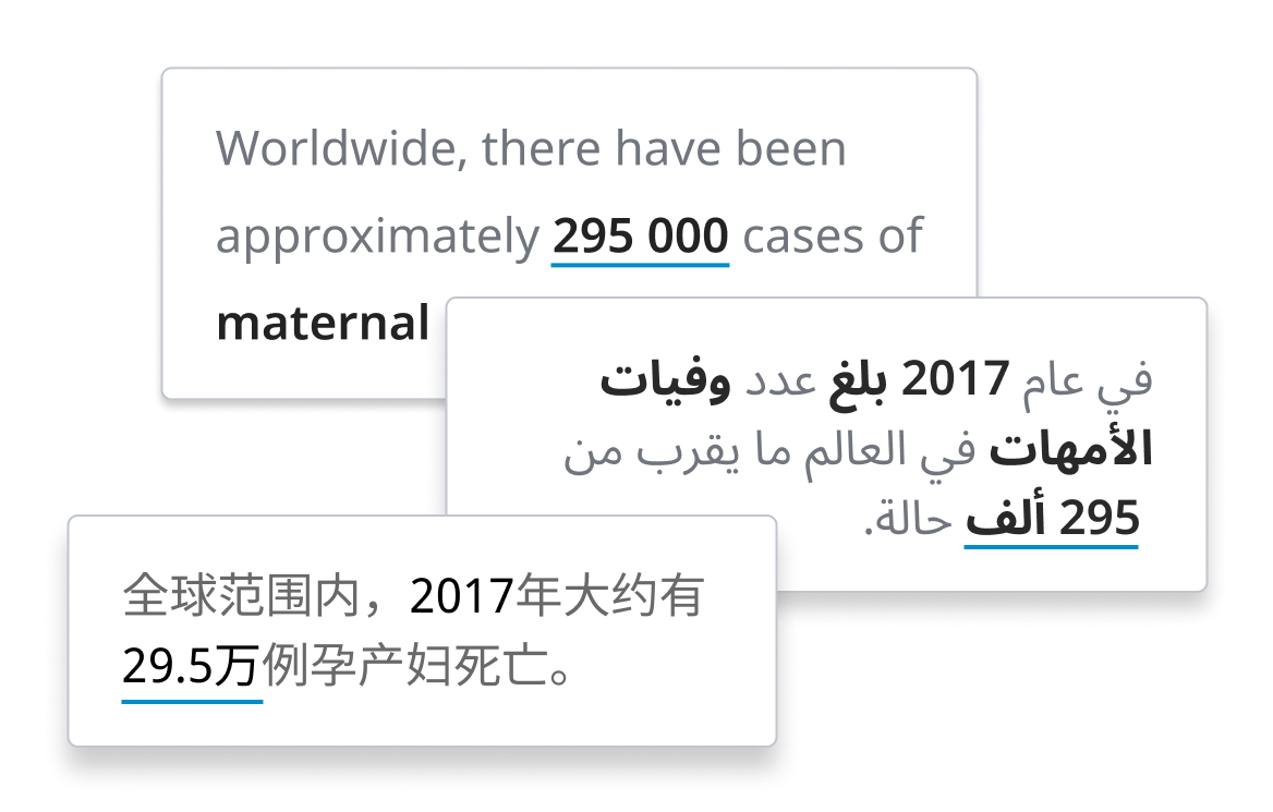
- Line charts of maternal deaths by country localized in Chinese and right-to-left Arabic
## Approach
This collaborative project with [Kore](https://kore.uk.com) reaches beyond merely “styling charts”. We reflected fundamentally about what it means to publish data in 2022, bringing topics like internationalization, accessibility, device and media responsiveness, data provenance, representation of uncertainty and many other fundamental topics to the heart of the design challenge.
Consequently, as a north star, we defined a guiding set of design principles:
- **Clear**
Data presentations are tailored to information needs, understandable and approachable.
- **Transparent**
They reveal uncertainty, precision, provenance, and coverage of the data.
- **Open**
We create rich data experiences for everyone, through accessible, international, adaptable, and participatory approaches to data visualization.
- **Robust**
Data can be consumed in a variety of channels and sizes, through robust and lean technological solutions.
![Diagram of the Data Design Language linking principles, guidelines and design vocabulary to the data.dot.viz component system]()
Deliberately designed as a **toolbox**, rather than a “rule book”, the Data Design Language includes not only principles and guidelines, but also a corresponding design vocabulary and repertoire — for instance, downloadable styles for color and typography, exemplary chart designs, as well as clear specifications for achieving high levels of responsiveness, interaction, internationalization and accessibility.
A **custom chart library** constitutes the reference implementation for the language and its principles. A corresponding chart creation tool will make it very easy for editors to effortlessly create and publish excellent charts.
![Collage of WHO health data visualizations built with the chart library — maps, line and bar charts and big-number stats]()
## Chart choices
The initial set of base charts supported by the system was carefully selected, to provide an optimal, straight-forward option for a variety of data situations (e.g. "many countries with a single data point" or "before-after comparison for a single country").
The design system provides guidance for data editors to pick the most suitable chart given data situation, communication intent and usage context. These constraints narrow down the applicable set of chart types and make it possible to suggest an ideal solution.
![Chart color palettes for diverging, brand and colorful scales beside a responsive font-size scaling table]()
## Colors and Typography
Building on the WHO brand color palettes, we designed a set of accessible, clear and easily distinguishable color schemes — on-point for the specific domain of WHO health data, culturally aware, and robust in a large variety of conditions.
We take both dark and light modes into account, and provide color variants with AA and AAA contrasts for small elements and texts.
Likewise, the typographic and spacing system is fully responsive by design: The dimensions of a chart will affect its rendering — sometimes even in terms of chart type and interaction possibilities.
For full page layout, we designed a [fluid modular scale](https://utopia.fyi/blog/designing-with-fluid-type-scales), allowing seamless interpolation of sizes without sudden jumps in scale at breakpoints.
![Figma Tokens plugin showing font design tokens next to the WHO design token documentation of colors and charts]()
## Design tokens
All basic design choices and building blocks are made available in the form of **design tokens**, ready to be used in a variety of environments. This approach provides a "single source of truth" for design parameters and enables automation of design updates.
Design tokens are currently in the process of [becoming a W3C standard](https://design-tokens.github.io/community-group/format/).
These design tokens also drive the **living styleguide**, a dynamically generated online documentation of the design vocabulary, guidelines and principles.
![Healthy life expectancy world map with a country detail panel showing 66.1 years for the United States]()
## Interactions and Composition
The system provides a stringent model for how to specify and synchronize selections, highlights and data filters across charts. As a result, charts can be composed into more complex compositions.
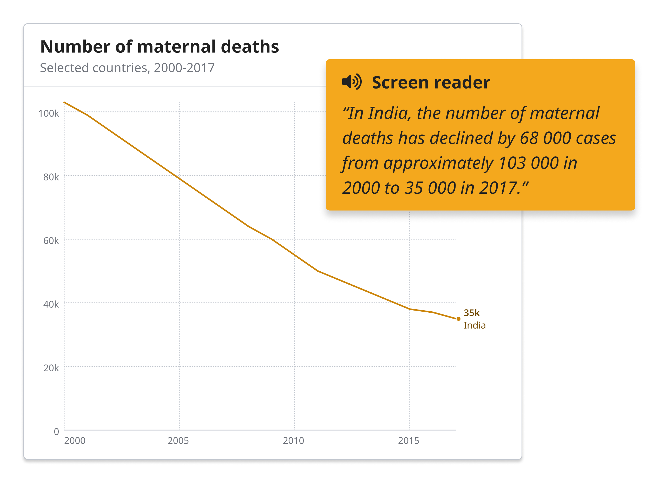
## Text generation
Dynamically generated text is treated as a first class citizen in our charting system. Data-driven text can be useful to make charts more accessible, but it can also present a powerful complement to others charts in general.
![World map with inline country labels showing maternal mortality figures, from 1,600 in Afghanistan to 8 in Australia]()
## Inline labels
Inline label placement is an important feature in the chart implementations. External legends and tooltips cause extra cognitive load, and might not show up in screenshots or static image exports. Consequently, we aim at providing inline labels wherever possible. They can be challenging to place without overlap, but the effort pays off — through highly improved readability and versatility of the charts.
## Implementation
The design system is currently being implemented and seamlessly integrated into WHO's publishing workflows. We strive for the highest standards of accessibility, internationalization and performance, in order to achieve our overarching project goal: to provide rich public health data experiences, for everyone.
Though in its early stages, the project is well recognized and plays a transformative role inside the organization, as part of the wider work of WHO's World Health Data Hub.
See progress on the work at [data.who.int](https://data.who.int).
## Reflections
The project is logical extension to the path chosen for the [German COVID Vaccination Dashboard](/projects/impfdashboard), as designed together with [Studio NAND](https://nand.io): Rather than trying to impress with fancy charts and novel approaches, we stick to the basics and make sure to express information in the most understandable, transparent and robust way we can.
While working on the system, we kept coming back to [Dieter Rams](https://en.wikipedia.org/wiki/Dieter_Rams) design principles:
to be…
- __innovative__ and
- __aesthetic,__
yes — but also, and foremost
- __useful__
- __understandable__
- __unobtrusive__
- __honest__
- __long-lasting__
- __thorough__
and, ultimately,
- __doing as little design as possible__.
Finally — thinking of the project in terms of **language and system design**, rather than a "chart makeover" challenge, provides the teams the WHO with the means to fully adopt and extend our work in the future.
Our design-token-centric approach makes it easy to adapt to the needs of different stakeholders and supply themes and templates for a variety of tools and platforms.
[Contact us](mailto:moritz@stefaner.eu) in case you want to learn more about this approach and its benefits.
---
#### Credits
This project was designed and developed for [Kore](https://www.kore.uk.com/), with [9elements](https://9elements.com).
Team: [Alice Thudt](https://www.alicethudt.de/), [Christian Laesser](https://christianlaesser.com/), [Moritz Stefaner](https://truth-and-beauty.net/) with [Philippe Rivière](https://illisible.net/philippe-riviere), [Sarah Fossheim](https://fossheim.io/), [Maarten Lambrechts](https://www.maartenlambrechts.com/), the teams at [9elements](https://9elements.com) (Mathias Schäfer, Leif Rothbrust, Philipp Doll) and [Kore](https://kore.uk.com) (Matt Hollidge, Fred Wheeler, Yaseed Chaumoo).
Thanks for advice, support and feedback to [Alan Wilson](https://adobe.design/stories/our-people/profile/alan-wilson), [Arvind Satyanarayan](https://arvindsatya.com/), [Amanda Makulec](https://www.amandamakulec.com/), [Dominik Moritz](https://www.domoritz.de/), [Flavio Gortana](https://flavio.is/), [Jeff Heer](https://jheer.org/), [Jon Schwabish](https://policyviz.com/about/), [Lynn Cherny](http://www.ghostweather.com/), [Max Roser](https://www.maxroser.com/), [Maxene Graze](https://datagrazing.com/), and all WHO staff involved with the project.
## Credits
For [Kore](https://www.kore.uk.com/), with [9elements](https://9elements.com).
Team: Alice Thudt, Christian Laesser, Moritz Stefaner with Philippe Rivière, Sarah Fossheim, Maarten Lambrechts, with Mathias Schäfer, Leif Rothbrust, Philipp Doll and Matt Hollidge, Fred Wheeler, Yaseed Chaumoo.
---
[View on truth-and-beauty.net](https://truth-and-beauty.net/projects/who)
---
# https://truth-and-beauty.net/projects/sf-dlux
# Deep Learning UX
_Can we teach machines to design?_
Published: 2020-08-27
Einstein Designer is a generative design solution for delivering personalized design at scale. I helped the team at Salesforce to analyze, visualize and synthesize design features like layout, color and typography.
## Key visuals
- Salesforce DLUX title card, cloud logo amid colorful particle dots on black
- Zoomed detail of the visual similarity map of clustered website screenshots and UI fragments
- Color distribution scatter where each dot is a color occurrence across 1,000 site palettes
- Grid of company websites each reduced to weighted horizontal color-slice palettes
- Latent style-space map with density contours over a labeled grid of design style variations
- Latent style manifold as a dense coordinate grid with colored clusters of generated styles
- Symmetric navy dot-matrix composition visualizing typographic style relationships
- Typographic palette analysis app with co-occurrence matrix, arc diagram and style-feature tables
- Particle-dynamics data visualization with colorful dots clustering on black
## Motivation
Designing and programming user interfaces takes significant resources. What if we could support this process with the help of Artificial Intelligence and Machine Learning? The UX R&D team at Salesforce investigates just that, and over the course of two years, I help them with data analysis, visualization and design on a couple of research iterations:
## Visual analysis and clustering of UI elements
![Visual similarity map clustering website UI elements by neural-network image recognition]()
First, we investigated if existing web site designs could be taken apart and re-organized in order to detect design patterns and structural similarities. We explored similarity in code (the "genotype") as well as visual appearance and behavior (the "phenotype"). In this phase, we produced visual similarity maps based on neural networks trained on image recognition. The results set the team on track for combining structural, code-based analysis with Machine Learning techniques from computer vision.
![Zoomed detail of the similarity map showing clustered website screenshots and UI fragments]()
![Voronoi clustering of UI elements, each a small colored donut glyph grouped by design similarity]()
## Analyzing color palettes
Color is a critical component in any design system. We compiled a training data set comprising 1000 websites from Fortune 500 and unicorn companies (start-ups with valuations over $1 billion) and analyzed their color use.
![Alteryx homepage beside its extracted color palette shown as weighted horizontal color slices]()
The results were fascinating: For instance, we learned that there isn’t a single color palette for a site or page, but that web design today favors slices — using different color palettes for different portions of a single web page. Second, a color palette is also not just defined the set of colors used, but also critically by their weights, i.e. how much space they occupy relative to each other. The visualization captures both the vertical, slicing rhythm as well the weights in a clear and comparable way.
![Grid of Fortune 500 and unicorn websites each reduced to weighted horizontal color-slice palettes]()
![Color distribution scatter where each dot is a color occurrence across 1,000 analyzed site palettes]()
Another interesting lens on color is to look at overall distributions of color hues, saturation and brightness values. In this visualization, each dot represents the occurrence of color in a palette across the 1,000 sites analyzed.
Based on this analysis, we built an interactive tool that allows to find matching color palettes and probability neighborhoods based on a selected anchor color.
![Interactive tool finding matching color palettes and probability neighborhoods from a selected anchor color]()
## Style manifolds — a vector space approach to generating design variations
We did analogous work on typographic "palettes" — what is the set of typeface features a specific design system uses, and how are they used together and interact with each other?
![Arc diagram of typographic style features showing which type styles co-occur across design systems]()
![Typographic palette analysis app with co-occurrence matrix, arc diagram and tables of style features]()
Together, all this lead to a notion of "deciphering the design genome". Can we teach machines to learn implicit design rules based on observations of samples? At this point, my previous experiences with vector space analysis and dimensionality reduction came in handy. We managed to boil down a set of multi-dimensional observations about sizes, colors, text styles etc. to just a handful of meaningful "latent" variables.
![Latent style-space map with density contours over a labeled grid of design style variations]()
Cartographing that latent style space or "style manifold" allowed us not only to see a visual summary of the design strategy of a certain brand or website. Excitingly, with a mathematical twist, it also allows us also generate new styles within — or even slightly outside — the rules of a design system, by filling in the blank spaces between the observations. (For the technically inclinded, we use a technique similar to the one described [here](https://umap-learn.readthedocs.io/en/latest/inverse_transform.html).)
![Latent style manifold as a dense coordinate grid, colored regions marking clusters of generated styles]()
![Interactive tool dragging through the style manifold to generate new typographic design variations]()
## Telling the story
Finally, helping the team to understand and explain the objectives and inner workings of the systems we build has been a crucial component of this project. What good is the most complex machine learning system, if its purpose and underlying mechanisms are poorly understood?
To this end, we designed and produced a data visualization language based on particle dynamics:
## Impact
The project has been been presented as one of the key innovations at a [Dreamforce Keynote](https://www.salesforce.com/video/7488085/) — a huge honour and validation.
In 2020, we won a nomination for the [UX Design Awards](https://web.archive.org/web/20201022200836/https://www.ux-design-awards.com/en/projekte/einstein-designer-powered-by-deep-learning-ux).
## Read more
Learn more about the project in Sönke Rohde's ["Einstein Designer — AI-Powered, Personalized Design at Scale"](https://medium.com/salesforce-ux/einstein-designer-ai-powered-personalized-design-at-scale-367d71b85a3d) and the approach to UI metrics in Owen Schoppe's ["Thinking Like the Machine: Using Metrics to Generate and Quantify UX Design"](https://medium.com/salesforce-ux/thinking-like-the-machine-using-metrics-to-generate-and-quantify-ux-design-92989ca383b).
## Credits
Client: Salesforce
Project lead: Sönke Rohde
Team: Alan Ross, Brian Lonsdorf, David Woodward, Jessica Lundin, Michael Sollami, Moritz Stefaner, Owen Schoppe.
Thanks to [Yuri Vishnevsky](https://yuri.is/) for development help.
---
[View on truth-and-beauty.net](https://truth-and-beauty.net/projects/sf-dlux)
---
# https://truth-and-beauty.net/projects/sciam-175-word-trends
# The Language of Science
_Exploring language shifts in 175 years of science reporting_
Published: 2020-08-21
Live project: [Interactive version](https://www.scientificamerican.com/article/explore-175-years-of-words-in-scientific-american/)
On the occasion of the 175th anniversary of the magazine, Scientific American invited me to explore their archive of 5'107 print issues. The results are a fascinating glimpse into how the language of science reporting has evolved.
## Key visuals
- Two stacked line charts of word frequency—patent peaking in 1856 and electric peaking in 1902
- Printed opening spread The Language of Science featuring the full-page sediment word-frequency graphic
- Paired word-juxtaposition charts—system versus machine and discover versus invent—revealing mirrored trends
- Layered stacked-area sediment chart of Scientific American word frequency from 1850 to 2020, gray to purple
- Close-up of printed pages showing rows of small word-trend line charts labeled by year, 1920s to 1950s
- Zoomed detail of the sediment chart showing fine wavy layers blending orange, pink and purple
- Twelve miniature line charts of yearly top-peaking words from patent (1856) to health (2020)
- Printed spread with the introductory essay and columns of small word-trend charts for the 1850s
- Annotated line chart explaining the word-trend design—peak tick, smooth curve, year color scale, timeline axis
## Data processing and design approach
Summarizing the history of a 175-year-old magazine—that's 5,107 editions with 199,694 pages containing 110,292,327 words!—into a series of graphics was a daunting assignment. When the hard drive with 64 gigabytes of .pdf files arrived at my home in Germany, I was curious to dig in but also a bit scared: as a data-visualization consultant with a background in cognitive science, I am well aware that the nuance of language and its semantic contents can only be approximated with computational methods.
Given that the frequency of words in a language (and in the corpus of Scientific American's text archives) is so skewed, rather than comparing raw numbers of how often words occur, it became far more compelling to look at how the proportion of text a word occupies each year (its relative frequency) evolves over time.
![Grid of six visual-form experiments—line, waveform, layered ridges, dot rasters—for word trends like computer, steam, electricity, power]()
Based on this central idea, we explored many different visual forms—word clouds, stack area graphs, line charts, animations, spatial maps of semantic spaces—before settling on the layered stacked area chart for the opening spread as the overview visualization.
![Layered stacked-area sediment chart of word frequency in Scientific American from 1850 to 2020, gray older words to purple recent ones]()
This high-level view of the major shifts in vocabulary, shown as “sediment layers,” is complemented by the individual miniature line charts showing the evolution of each top peaking word per year. Both charts are connected through a custom color scale from vintage brown to modern purple, to tie the various graphics together and to support a quick visual classification of the central trend.
![Twelve miniature line charts of yearly top-peaking words from patent (1856) to health (2020), colored vintage brown to modern purple]()
## Print
![Printed magazine spread The Language of Science showing the full-page sediment word-frequency graphic in the 175th anniversary issue]()
The print piece comprises the "sediment" graphic as an opening piece, followed by a long, multi-page graphic showing the evolution of the number of pages per edition and year combined with one small graphic for each yearly top peaking word.
![Long multi-page print graphic with a character-count landscape across the top and a grid of small yearly word-trend line charts, 1845 to 2020]()
We close with a curated selection of interesting word juxtapostions — noteworthy complementary, or parallel trends that reveal bigger shifts in a *pars pro toto* manner. These juxtapositions were used throughout the whole anniversary issue to accompagny individual articles with fitting trend charts.
![Two paired word-juxtaposition charts—system versus machine (1959/1910) and discover versus invent (2011/1847)—showing mirrored trends]()
The line charts were designed with great care for detail. Such a simple, known form requires flawless execution (especially when 175 of those little charts are presented across 6 pages of print)!
![Annotated line chart explaining design details—peak triangle tick, smooth curve, color-by-year encoding and timeline axis at 1953]()
## Online
The [interactive version](https://www.scientificamerican.com/article/explore-175-years-of-words-in-scientific-american/) is more reduced: It shows the top peaking word for each year, allowing to quickly scan and browse just by scrolling. Users can deeper by searching across over 4'000 most used terms. Fun detail: Tapping a term reveals other words with similar or flipped trend curves. What's not to like about serendipitous data exploration!
## Findings and observations
Working with the data, my initial interest in “what” has been written about, shifted towards looking at the “how”: the evolution of verbs, adjectives and adverbs. These word types can tell so much about how the tone and attitude of the original magazine have changed from the engineering-driven, mechanistic language to the multifaceted science magazine we know today.
One thing that proved hard was to deal with the inherently noisy process of optical character-recognition (OCR) where letters can be mixed up (for instance, “substantially” was often parsed as “snbstantlally”), words might be combined or split at the wrong places, or multicolumn layouts might be read in the wrong order. Accordingly, zooming out on the data-analysis lens to a yearly perspective (rather than working on the level of individual editions) and analyzing the count of single words (rather than looking for compound terms or doing sentence-level analyses) became our sweet spot in the trade-off space between accuracy and robustness against noise. Accordingly, questions like "when was concept X or term Y" first used were unfortunately out of reach, because we could never be sure an earlier mention might have escaped our attention.
Finally, I believe finding a simple, straight-forward way to detect and present noteworthy trends — such as the yearly peaking terms, but also the curated juxtapositions — in combination with the thoughtful annotation and commentary on sides of the writer at Scientific American has been key to the success of this project.
## Related resources
Find a few more notes on the design process and rationale in the article: [How to Turn 175 Years of Words in Scientific American into an Image](https://www.scientificamerican.com/article/how-to-turn-175-years-of-words-in-scientific-american-into-an-image/) as well as a wider contextual embedding in ["The Language of Science"](https://www.scientificamerican.com/article/the-language-of-science/) by Lorraine Daston.
## Acknowledgements
Thanks to [Christian Laesser](https://christianlaesser.com) for his always amazing support and advice, to [Jen Christiansen](https://www.jenchristiansen.com/) for editorial and art direction, to [Jen Schwartz](https://www.scientificamerican.com/author/jen-schwartz/) for commissioning and improving my process text substantially, to [Amanda Montañez](https://www.scientificamerican.com/author/amanda-montanez/) for support and advice, and all the others behind the scenes who made this project possible!
## Credits
Client: [Scientific American](https://www.scientificamerican.com/)
Art direction and annotation: [Jen Christiansen](https://www.jenchristiansen.com/)
Design support: [Christian Laesser](https://christianlaesser.com)
---
[View on truth-and-beauty.net](https://truth-and-beauty.net/projects/sciam-175-word-trends)
---
# https://truth-and-beauty.net/projects/impfdashboard
# Impfdashboard
_The official German COVID-19 vaccination dashboard_
Published: 2020-01-15
Live project: https://impfdashboard.de
How can we visualize the progress of COVID-19 vaccinations in Germany in a concise, appealing and accessible way? Our mobile-first solution for the official vaccination dashboard sets a new standard for governmental data communication around the pandemic.
## Key visuals
- Waffle charts of doses by priority group — health workers 45.5%, older people 41.0%, care-home residents 22.5%, at-risk 3.6%
- Regional dashboard view with map and bar chart of fully vaccinated per 100 residents by state, led by Rhineland-Palatinate 3.4%
- Bar chart of vaccination progress by age group — 85.3% of 60+, 73.0% of 18–59 and 41.5% of 12–17 fully vaccinated
## Design approach
![Mobile-first Impfdashboard screens: data-generated status text, daily-dose bar chart, vaccination clock, regional map and milestones]()
Our mobile-first design approach lead us away from the typical "chart patchwork" found on many other dashboards towards a responsive, content and communication oriented approach.
Consequently, we rely not only charts or tables to convey information, but also on text, generated from data.
![Data-generated text: 189K doses given on 29 Oct 2021, 55.5M people (66.7%) fully vaccinated in Germany]()
Compared to a chart, text generated from data is…
- lower barrier
- screenreader-friendly
- easily shareable by copy-paste
- automatically translatable
It's the perfect complement to charts and more visual elements.
![Map and ranked bar chart of fully vaccinated share by German state, from Bremen 81.1% down to Saxony 58.9%]()
Likewise, combining two simple charts, like the map and a bar chart can eliminate the need for a color legend, and provide better accessibility (and ranking information) combined with the power of the map to reveal spatial patterns and quick orientation.
## Vaccination clock
![Animated Impf-Uhr vaccination clock showing one COVID-19 shot given roughly every 0.6 seconds in Germany]()
We also make sure to present the most important facts in different forms — for instance, the bar chart on top shows how yesterday's vaccination rate compared to the last seven days, while the "vaccination clock" further below provides you an intuitive feeling how fast the pace of vaccination is in Germany, currently.
Same data, different perspectives, different insights.
![Bar chart of vaccination progress by age group: 85.3% of 60+, 73.0% of 18–59 and 41.5% of 12–17 fully vaccinated]()
## Milestones
The road to full vaccination is a long one, so we thought about how we can define intermediate goals. Our milestones section celebrates those achievements, (obviously inspired by badges in video games), and could provide meaningful anchors in a timeline view.
![Milestones timeline of Germany's vaccination campaign, from first vaccine approvals to 5 million doses by 20 February 2021]()
## Generating static assets
Other details that matter: Social media preview images, embeddable views on our partner site [https://zusammengegencorona.de](https://zusammengegencorona.de), and even the favicon, are generated as static images on each deployment, from current data, using puppeteer (https://pptr.dev).
![Tweet from German Health Ministry sharing an auto-generated Impfdashboard preview image, 69.2% with at least one dose]()
## Reflections
Although we were brought in as #dataviz experts, we opted not to impress with "fancy charts", but first and foremost to get the basics right, in terms of
- effective communication
- wide accessibility and
- practical use of the data
We rolled out a simple site very early on, and continued to refine the dashboard in three subsequent updates — reflecting and reacting to external as well as internal feedback, and the progression of the vaccination campaign. In our view, developing a complex and widely accessed site like this "in the wild" and in an agile manner is key to success.
![Five successive Impfdashboard versions side by side, showing the site's design evolution across four updates]()
## Impact
The site was widely recognized for its novel, user-centered and thoughtful design and on-point execution. Bloomberg featured it in the article ["The rise of the pandemic dashboard"](https://www.bloomberg.com/news/features/2021-09-25/why-every-government-needs-a-covid-dashboard).
## Credits
With [Studio NAND](https://nand.io) and [Cosmonauts & Kings](https://cosmonautsandkings.com/).
Published by the [Bundesgesundheitsministerium (German Ministry of Health)](https://www.bundesgesundheitsministerium.de)
Data supplied by [Robert Koch Institut](https://www.rki.de)
---
[View on truth-and-beauty.net](https://truth-and-beauty.net/projects/impfdashboard)
---
# https://truth-and-beauty.net/projects/perpetual-plastic
# Perpetual Plastic
_Beach debris reveals the fate of all plastic_
Published: 2019-12-04
Live project: [http://perpetual-plastic.net](http://perpetual-plastic.net)
What is the fate of all plastic ever produced? This 14m diameter data art sculpture, made from beach debris, provides the answer.
## Key visuals
- Two people on a Bali beach beside the colorful semi-radial plastic sculpture at sunset, temple shrine on a cliff
- Aerial hero view of the plastic-debris sculpture beside crashing ocean surf on a Bali beach
- Close-up of beach plastic sorted by color into rows of blue and red flip-flops, green sandals and white bottles
- Angled beach view of the spiraling plastic sculpture with volunteers, palm trees and surf at dawn
- Labeled aerial of the sculpture showing plastic fate — 60% discarded, 24% still in use, 9% incinerated, 7% recycled
- Volunteers arranging plastic pieces and baskets of sorted debris while building the sculpture on the beach
- Overhead view of volunteers laying blue and green rows of flip-flops with baskets of sorted plastic
- Top-down view of near-complete rainbow arcs of sorted flip-flops and plastic with a volunteer placing pieces
Since the early 1950s, 8.3 billion metric tons of plastic have been produced for human consumption. To understand the environmental legacy of exponential plastic production, we visualized what happens to plastics after its first use.
![Aerial view of the semi-radial plastic sculpture labeled with plastic's fate: 60% discarded, 24% still in use, 9% incinerated, 7% recycled]()
Installed on a beach in Bali with marine debris collected from nearby, this data artwork investigates our global plastic waste stream and emphasizes how mismanaged waste ends up in the ocean.
## Our focus
Our project highlights the scope of the plastic problem (in terms of amount produced as well as its fate) and the transformation of plastic over its lifetime, using beach debris as a salient example. The situated, participatory data installation approach extends abstract displays of numbers towards a more gripping form of ‘data visceralization.’ The direct link to beach clean-up activities suggests immediate opportunities for action, turning the sculpture into a catalyst for engagement.
![Timelapse of volunteers sorting and arranging collected beach plastic into the semi-radial Perpetual Plastic sculpture]()
## Data art installation
The 14m (46ft) diameter piece was assembled from 4760 pieces of plastic trash and took 12+ hours to install.
![Aerial hero view of the 14m plastic-debris sculpture on a Bali beach beside crashing surf, labeled 8.3bn tonnes produced since 1950]()
## Visualization design
The statistics used originate from a widely cited scientific publication on the ["Production, use, and fate of all plastics ever made"](https://advances.sciencemag.org/content/3/7/e1700782). The publication featured a representation of the main statistics in form of a flow diagram. The data platform "Our World in Data" created a reworked [Sankey diagram](https://ourworldindata.org/plastic-pollution#global-plastic-production-to-fate), which served as inspiration for our semi-radial redesign.
![Design evolution from the original plastics flow diagram to a Sankey redesign to the final semi-circle visualization]()
![Hand-drawn planning sketch on graph paper with dimensions and basket counts for laying out the beach sculpture]()
Learn more about the project at [http://perpetual-plastic.net](http://perpetual-plastic.net).
## Credits
A collaboration with art activist Liina Klauss as well as marine scientist and designer Skye Morét
---
[View on truth-and-beauty.net](https://truth-and-beauty.net/projects/perpetual-plastic)
---
# https://truth-and-beauty.net/projects/grow
# GROW Soil Moisture Maps
_Empowering growers with soil moisture data models_
Published: 2019-09-16
Live project: [→ Interactive Site](http://soilmoisturemaps.growobservatory.org)
The GROW Observatory is a European-wide project engaging thousands of growers, scientists and others passionate about the land. We developed the Dynamic Soil Moisture Map as a demonstration of an information service which could be used by farmers, scientists and policy makers for applications in agriculture and climate forecasting. These maps use GROW sensor data combined with satellite data to generate a continuous estimation of water content over a terrain.
## Key visuals
- GROW Soil Moisture Maps menu with a green Europe globe ringed by nine sensor-cluster sites and their sensor counts
- Tard, Hungary site view with a 3D soil moisture model over aerial imagery and moisture, light and temperature charts
- Close-up of the gridded blue 3D soil moisture surface floating over green aerial farmland
- Numbered help overlay explaining sensors, moisture model and time-series charts of the Soil Moisture Maps interface
- Mezőzombor, Hungary with sensor MIS_DK_D4E1 selected and its moisture line highlighted at 39.1% in the charts
- Detail of the moisture model with a selected sensor highlighted in yellow among moisture and light data columns
- Luxembourg site view with a 3D soil moisture model over aerial imagery and moisture, light and temperature charts
- Algarve, Portugal site view with a 3D soil moisture model over aerial imagery and moisture, light and temperature charts
- Vienna, Austria site view with a 3D soil moisture model over aerial imagery and moisture, light and temperature charts
- GROW Soil Moisture Maps intro screen with project description text over a faded Europe globe of sensor sites
## Screencast of the interface
## How it works
![GROW Soil Moisture Maps menu: green Europe globe ringed by nine sensor-cluster sites with sensor counts]()
Local farmers and growers can install Parrot Flower Power sensors on their fields. These sensors continously collect data on light, moisture and temperature conditions.
![Algarve site view: 3D soil moisture model over aerial map with moisture, light and temperature time-series charts]()
Once the user has selected a site of the exemplary GROW sites featured in the visualization, the sensor locations are shown on the map at the bottom. The map can be rotated by dragging with the mouse.
![Mezőzombor site with sensor MIS_DK_D4E1 selected, its moisture line highlighted at 39.1% in the time-series charts]()
The time series charts on the right show the development of light, moisture and temperature readings. Click to select a sensor — it will be highlighted in the map and the graphs on the left.
![Close-up of the gridded 3D soil moisture model rising above the point sensor columns for moisture and light]()
Based on this raw information from the sensors, a continuous moisture model is calculated for the whole surrounding area. The blue section above the sensors shows continuous soil moisture values across the area of land. The vertical axis of the blue section represents the moisture level. The "gridded carpet" look of the model is in contrast to the spiky columns of the sensor data visualization — in visual correspondance to the underlying process of continuous extrapolation from point-wise measurements.
## Technical background
The web application was implemented using [react](https://reactjs.org/), [mobx](https://github.com/mobxjs/mobx), [d3](https://d3js.org/), [mapbox-gl](https://github.com/mapbox/mapbox-gl-js) and [three.js](https://threejs.org/). The moisture model information is stored in [geoTIFF](https://en.wikipedia.org/wiki/GeoTIFF) files, while are loaded at runtime and transformed into 3D geometry using three.js.
## Credits
The GROW Observatory [Soil Moisture Maps](https://web.archive.org/web/20191016194202/http://soilmoisturemaps.growobservatory.org/) have been developed by the [GROW Observatory](http://growobservatory.org/)
Lead partner: [FutureEverything](http://futureeverything.org/)
Data visualisation: Moritz Stefaner ([Truth & Beauty](http://truth-and-beauty.net/)) with [Yuri Vishnevsky](https://yuri.is/)
Algorithms: [IIASA](http://www.iiasa.ac.at/) and [University of Miskolc](http://www.uni-miskolc.hu/en)
Data provided by: GROW community
---
[View on truth-and-beauty.net](https://truth-and-beauty.net/projects/grow)
---
# https://truth-and-beauty.net/projects/WEF
# World Economic Forum
_Information design and consulting for global issues_
Published: 2018-07-01
I am a long-term consultant for the [World Economic Forum](http://weforum.org). My tasks range from strategic consultations to the design of interactive information visualization and print graphics.
## Key visuals
- Risk Interconnection Map, a node-link diagram of global risks colored by category and linked by their perceived influence on each other
- Scatterplot of global risks around the 4.56 average, with paired dots comparing perceived risk levels across two years
- World map tracing Davos 2013 preparatory meeting locations from Bangkok and Brussels to Washington DC and Tianjin
- Small-multiple scatterplots of bribes versus burden of government regulation by world region, colored by competitiveness
## Global risk reports
Each year, the world economic forum asks hundreds of experts about their perception of future important risks. The Risk Interconnection Map visualizes the topology resulting from the experts' responses how these risks relate to and influence each other. For calculating the maps, I use a custom-made physical simulation to have full layout control.
Some of the static graphics from various reports over the last ten years:
![Risk Interconnection Map, a node-link diagram of 30+ global risks colored by category and linked by how experts see them influencing each other]()
![Global Risks Landscape 2021, small-multiple charts showing shifts in the perceived impact and likelihood of risks by category since 2020]()
![Global Risks Landscape 2021 scatterplot of 35 risks by perceived impact and likelihood, colored by category]()
![Survey participant statistics, 896 respondents broken down by gender, expertise, organization type, age and region]()
![Emerging technologies plotted by perceived benefits versus negative consequences, from AI and robotics to space technologies]()
![Ranking chart of the top perceived risks by world region, tracing how issues like cyberattacks and water crises rank across regions]()
![Lollipop chart of emerging technologies with the highest need for better governance, led by AI and robotics at 46.3%]()
![Bar chart of global risks for which most progress has been made, grouped by category, led by failure of financial mechanisms at 24.3%]()
![World map of the global risk of highest concern for doing business per country, colored by each country's top-ranked risk]()
![Diverging stacked bar chart of whether experts expect geopolitical risks to increase or decrease in 2018 versus 2017]()
## 2012
![Centers of Gravity interactive, risks arranged in orbits by category and drawn closer to center when connected to many other risks]()
![Impact and Likelihood interactive scatterplot of global risks with filters by category, region and stakeholder group]()
## 2014 WEF Transformation Maps
![WEF Transformation Map for Electronics, a radial diagram linking topics like Internet of Things, supply chain vulnerability and trade barriers]()
First version of [WEF Transformation Maps](https://clients.stefaner.eu/wef/transformation-maps/), together with [Dominikus Baur](http://do.minik.us) and [Scott David](https://www.weforum.org/agenda/authors/scottdavid,)
## 2009 — 2020: Global risk reports
Yearly interactives for global risk report, latest version:
[Global Risks Landscape 2020](http://reports.weforum.org/global-risks-report-2020/survey-results/global-risks-landscape-2020/#landscape)
![Global Risks Interconnections Map 2020, a network of global risks linked by how strongly they influence each other, centered on climate action failure]()
---
[View on truth-and-beauty.net](https://truth-and-beauty.net/projects/WEF)
---
# https://truth-and-beauty.net/projects/under-the-sun
# Under the Sun
_Tracing the sun zenith in realtime_
Published: 2018-06-08
Live project: http://projects.truth-and-beauty.net/under-the-sun/
There's exactly one point where the sun is at zenith, right now. A trip around the world in 24 hours — everyday anew, never quite the same. A nod to the beauty of nature, the passing of time, and a heating planet.
## Key visuals
- Under the Sun clock reading 19:38:57 over a satellite view of the Cuban coast where the sun is at zenith
- Under the Sun clock reading 11:14:11 over a sepia satellite view of desert at solar zenith
- Under the Sun clock reading 13:14:45 over a yellow satellite view of Saudi Arabian desert at solar zenith
- Under the Sun clock reading 05:42:21 over dark ocean near Okinawa, Japan, where the sun is at zenith
- Under the Sun clock reading 14:15:11 over a glowing orange desert in Saudi Arabia at solar zenith
- Under the Sun clock reading 07:12:49 over green forested mountains where the sun is at zenith
- Under the Sun clock reading 10:44:01 over a sun-bleached satellite view with scattered green map dots
---
[View on truth-and-beauty.net](https://truth-and-beauty.net/projects/under-the-sun)
---
# https://truth-and-beauty.net/projects/multiplicity
# Multiplicity
_A collective photographic city portrait_
Published: 2018-04-03
Today, we collectively and continuously document our city experience on social media platforms, shaping a virtual city image. Multiplicity reveals a novel view of this photographic landscape of attention and interests. How does Paris look as seen through the lens of thousands of photographers? What are the hotspots of attraction, what are the neglected corners? What are recurring poses and tropes? And how well do the published pictures reflect your personal view of the city?
## Key visuals
- Overview of the image map, thousands of Paris photos scattered as a cloud clustered by visual similarity
- Mid-zoom of the map showing round photo thumbnails with a human silhouette for scale
- Cluster of visitor photos of Monet's Water Lilies panoramas in the Orangerie's curved rooms
- Tight cluster of tourist photos posing in front of the Eiffel Tower
- Close-up of the touchscreen console showing the annotated map, projected photo grid behind
- Installation view of the console before the wide projection of the glowing photo cloud and title text
- Zoomed annotated map with labeled clusters including Food, Misc, Louvre and Tour Eiffel
- Grid of thousands of photos in one cluster, shading from dark nightlife to bright fashion portraits
- Cluster of art and design photos, typographic signs, murals and colorful street-art patterns
- Zoomed cluster of muted grey-toned art and painting photos with a human silhouette for scale
- Tight cluster of tattoo photos, arms and bodies showing delicate line-work designs
- Cluster of people posing at the blue Wall of Love (Le mur des je t'aime) in Montmartre
- Tight cluster of near-identical photos of people striking the same dance and yoga poses
- Cluster of hairdresser photos showing blonde balayage and wavy hairstyles seen from behind
- Tight cluster of photos of the Grande Roue Ferris wheel at Place de la Concorde
- Multiplicity title logo spelled out in a grid of letters on black
- Visitors reading the French introduction beside the projected sparse photo cloud
- Two visitors at the console before a projected wall of Paris cityscape and landmark photos
- A visitor alone at the console facing the glowing photo cloud in the darkened room
- Two visitors from behind exploring the map at the console before the full photo-grid wall
- Visitor silhouetted at the console between projected walls of neon nightlife and fashion street style
- Projection wall filled with hundreds of Eiffel Tower photos around the touchscreen console
- Gallery view of the installation booth with ceiling projectors and a visitor entering
- Projected wall spanning Monet Water Lilies panoramas and gilt-framed Louvre paintings including the Mona Lisa
- Joystick console before a projected wall zoomed into the tattoos cluster of arms and body art
- Multiplicity title logo, the word emerging from a grid of repeated letters
![Mid-zoom view of the image map, thousands of Paris photos clustered by visual similarity, with a human silhouette for scale]()
This interactive installation provides an immersive dive into the image space spanned by hundreds of thousands of photos taken across the Paris city area. Using machine learning techniques, the images are organized by similarity and image contents, allowing to visually explore niches and microgenres of image styles and contents.
![Grid of thousands of Instagram photos in one cluster, shading from dark nightlife shots to bright fashion portraits]()
Special emphasis is put on tight clusters of very similar images around a specific location: collective re-enactments of typical poses — same, same, but different.
To me, these very tight clusters of almost identical images became the most interesting aspect. How often can people take the same photos? At the same time, each of them is slightly different indeed, and the continuous re-enactment of rituals and re-discovery of photo ideas has a comforting charme to it as well.
Here are some of my favorites (but there are many more to explore):
![Tight cluster of near-identical photos of people striking the same dynamic dance and yoga poses]()
![Cluster of visitor photos of Monet's Water Lilies panoramas in the curved rooms of the Orangerie]()
![Cluster of art and design photos, typographic signs, murals and colorful street-art patterns]()
![Tight cluster of photos of the Grande Roue Ferris wheel at Place de la Concorde, day and night]()
![Zoomed cluster spanning colorful macarons and pastries into the skulls and bones of the Catacombs]()
## Installation & Interaction
The projection spans three 1080p squares arranged in a slightly angled tryptich structure, allowing an immersive dive into the image space.
![Installation view, touchscreen console before a wide projection of the glowing photo cloud, with title and text on angled walls]()
Visitors can navigate the map using a touch device as well as a physical joystick. Manual annotations help with identification of the main map areas. The application goes to sleep and starts to dream of Paris after a while of inactivity.
![Installation view with joystick console, projected wall zoomed into the tattoos cluster of arms and body art]()
![Touchscreen interface showing the annotated overview map with handwritten cluster labels and joystick navigation controls]()
![Installation view, projected wall spanning Monet Water Lilies panoramas and gilt-framed Louvre paintings including the Mona Lisa]()
![Two visitors seen from behind exploring the map at the console before the full photo-grid projection wall]()
![Installation view, projection wall filled with hundreds of Eiffel Tower photos around the touchscreen console]()
The projected display seamlessly zooms from the cloudy overview map over a gridded version of the cloud to a full grid. This layering allows to understand the clustering and neighborhood structure well in the zoomed out view, while providing a tidy and efficient image display in zoomed views.
See a screen capture of the flight animations here:
## Content selection and data processing
Based on a sample of 6.2m geo-located social media photos posted in Paris in 2017, a custom selection of 25'000 photos was chosen and forms the basis for the map.
It consists of
- 1 part top liked photos
- 1 part uniform spatial sample
- ca. 1 part hand-selected clusters
- ca. 2 parts most recent images from most active locations
The images were analysed using neural networks which were trained for image classification (from [tensorflow](https://github.com/tensorflow/tensorflow) with [keras](https://keras.io/)). I used feature vectors normally intended for classification to calculate pairwise similarities between the images. The map arangement was calculated using [t-sne](https://lvdmaaten.github.io/tsne/) — an algorithm that finds an optimal 2D layout so that **similar images are close together**.
## Layout strategy
Bridging the cloudy overview and the griddy detail view was an interesting challenge. After a couple of [failed approaches](https://vimeo.com/257880299/8bf4b950ed), here's how I solved it:
![Animation cycling through the four layout stages, from the scattered tsne photo cloud to a filled grid]()
**1** The initial, zoomed out view lays out the images according to the tsne coordinates. We draw images, which are more central to local clusters (technically speaking: having the highest degree centralities in a k-nearest-neighbors network), a bit bigger, in order to emphasize the cluster structure. Finally, the image is treated with a bit of post-production: Photoshop's smart blur filter and some tweaks to image contrast provide a better overview and pleasant zooming behavior.
**2** The second, gridded view puts every image on a rasterized coordinate system, as close to their original coordinates as possible. In this layout, some images will be hidden behind others; again, we put the ones on top which are more central to local cluster structure. Also this image is slightly blurred, in order to avoid flickering artefacts when zooming and panning.
**3** Finally, the fully gridded view assigns all previously hidden images to the next best free spot, thus leading to an almost fully filled grid.
**4** At the corners, due to the round nature of the cloud, some images were missing, so we iteratively filled these with the next best match (i.e. most similar image to the neighbors) from a larger image pool.
Altogether, this strategy makes sure that as little pixels change between the different transitions, thus leading to a consistent and satisfying zoom experience. Check out a slow motion version of the zooms below:
## Data-less visualization
As a final remark — it has been my intention **not to measure, but portray the city**, but to portray it, using social media contents as material. Rather than statistics, the project presents a stimulating arrangement of qualitative contents, open for exploration and to interpretation — consciously curated and pre-arranged, but not pre-interpreted.
At the same time, data was instrumental in arranging these contents in a human digestible way. How else would one scan and assemble hundreds of thousands of images into a coherent whole?
So, one could say, data was used as a vehicle for the experience and design process, but not as the object nor the end point of the visualization.
![Overview map of the photo cloud with handwritten annotations marking clusters like Food, Tattoos, Louvre and Eiffel Tower]()
The interplay between automatic analysis, inspection of the results — what does the machine suggest and conclude — and my own actions — (in terms of layout, content selection, parameter tweaking…) was inspiring to explore.
As a design hint, the use of handwriting for the map annotations hints at the involvement of me as an active author and a subjective sense-making process.
The final result emerged from a dialogue between me and the city, the image contents and the algorithms, which actually managed to surprise and inspire me throughout the project.
![Animated Multiplicity title logo, the word spelled out through a shifting grid of letters]()
## Related work
This project is part of a series of investigations of digital city images:
- [Stadtbilder](/projects/stadtbilder) investigates the digital layers of the city, beyond physical infrastructure.
- [Selfiecity](/projects/selfiecity) takes a closer look at the selfie phenomenon, and among other things, aims to identify unique styles of self-photography in different cities.
- [On Broadway](/projects/on-broadway) starts with a single street, and stacks all kinds of quantitative and qualitative information on top of each other.
I was also inspired by a couple of projects from other folks:
- [Exactitudes](http://www.exactitudes.com)
- [Diorama maps](https://web.archive.org/web/20250511152844/https://soheinishino.net/dioramamap)
- [City Scan](https://web.archive.org/web/20220814190146/http://www.spehr.ch/city_scan/made_in_paris/)
- [Terrapattern](https://web.archive.org/web/20250525222620/https://terrapattern.com/)
- [fw4](https://uclab.fh-potsdam.de/fw4/en/vis/)
## Thanks to
- [Christian Laesser](https://christianlaesser.com), [Dominikus Baur](https://do.minik.us), [Tobias Kauer](https://twitter.com/tobi_vierzwo), [Yuri Vishnevsky](http://yuri.is), [Jia Her Teoh](https://www.linkedin.com/in/herteoh), [Bernard Kerr](https://www.linkedin.com/in/bernardkerr), [Baldo Faieta](https://www.researchgate.net/profile/Baldo_Faieta) and [Christopher Pietsch](https://uclab.fh-potsdam.de/people/christopher-pietsch/)
for feedback and comments
- the communities behind [react.js](https://reactjs.org), [mobx](https://mobx.js.org), [pixi.js](http://www.pixijs.com), [d3](https://d3js.org/), [electron](https://electronjs.org), [parcel.js](https://parceljs.org), [keras](https://keras.io), [tensorflow](https://github.com/tensorflow/tensorflow), [pandas](http://pandas.pydata.org), [scikit-learn](http://scikit-learn.org), [jupyter](http://jupyter.org)
- [Mario Klingemann](http://quasimondo.com) and [Gene Kogan](http://genekogan.com)
for their extremely helpful [tutorials](http://ml4a.github.io/guides/) and [open source projects](https://github.com/Quasimondo/RasterFairy),
- the team at [Fondation EDF](https://web.archive.org/web/20191117153347/https://fondation.edf.com/en) (Catherine Jaffeux, Benoit Franqueville), [trafik](http://www.lavitrinedetrafik.fr) and [David Bihanic](http://www.davidbihanic.com)
for the opportunity and the production.
## Exhibition
The project is at display as part of the [123 data](http://123data.paris) exhibition at [Fondation EDF](https://web.archive.org/web/20191117153347/https://fondation.edf.com/en), Paris, May — September 2018.
![Gallery view of the installation booth with ceiling projectors and a visitor entering the projection room]()
![Two visitors at the console before a projected wall of Paris cityscape and landmark photos]()
![Visitors reading the French introduction beside the projected sparse photo cloud of the map overview]()
![A visitor alone at the console facing the glowing photo cloud projected across the darkened room]()
## Press material
You can find some hi-res screenshots and photos in a [dropbox folder](https://www.dropbox.com/sh/jage7v8i8d44t3t/AAC3gjK0Uyw-mbxIXTebysj2a?dl=0).
Also feel free to embed the [flight demo](https://www.youtube.com/watch?v=qvcaVKxyitA) and the [zoom layer](https://www.youtube.com/watch?v=RY4_jANyy0o) videos or download [social media teaser video](https://www.dropbox.com/s/cjxjvjbif1z3xrp/mutliplicity-teaser-square.mp4?dl=0).
Get in touch for any questions.
## Credits
Comissioned by Fondation EDF, Paris on occasion of the exhibition [123 data](http://123data.paris)
Design and implementation: Moritz Stefaner
---
[View on truth-and-beauty.net](https://truth-and-beauty.net/projects/multiplicity)
---
# https://truth-and-beauty.net/projects/wahl-2q17
# Wahl 2Q17
_Was sucht Deutschland zur Wahl?_
Published: 2017-08-04
Live project: http://2Q17.de
How do people search for candidates and political topics? And what are they really interested in? [Wahl 2Q17](http://2q17.de) uses Google Trends data to visualize the Google Search interest in the top candidates of the seven most searched political parties in the German general election 2017. From near real-time to long-term search interest, the project provides a rich overview over the search activity of millions of people.
## Key visuals
- Wahl 2Q17 website header and daily most-searched candidates ranking for 11 September 2017
- Embeddable word cloud of top searches for Angela Merkel, with rosenheim, tagesschau and tv duell most prominent
- Stacked word clouds comparing top searches for Weidel, Merkel, Schulz and Özdemir on 10 September 2017
- Word cloud of top searches around Alice Weidel, with email, frau, böhmermann and afd most prominent
- Candidate pulse cards for Weidel, Lindner, Wagenknecht and Gauland with overlapping circles marking their biggest search day
- Seven-day stream graph of candidate search interest ranked by share, from 7 to 14 September
- Seven-day candidate stream graph with Martin Schulz highlighted and his top terms wahlarena and tv duell
- Big timeline detail showing attention peaks, weekly search terms and a stacked bump chart of candidate search interest
- Sharing and embed dialog for the live word-cloud widget, showing embed code and live widget option
- Full word cloud of top searches for Cem Özdemir, with frau, ehefrau, religion and kinder prominent
- Lokaltermin ridgeline chart of search interest in local campaign events of Merkel and Schulz, August to election
- Ridgeline chart of the year's biggest candidate search peaks, from Kanzlerkandidat to TV Duell
- Annotated overview of the 2Q17 site sections — header, word clouds, embedding, pulse cards, timeline and weekly search interest
![Wahl 2Q17 big timeline showing attention peaks, weekly search terms and a stacked bump chart of candidate search interest]()
[Google Trends](http://trends.google.com) provides a fascinating data source, and I’ve had [great fun working with it in the past](http://truth-and-beauty.net/projects/the-rhythm-of-food). So when the Google News Lab reached out to me to think about ideas for a joint project around the German elections, I was immediately interested. How can we **capture the search interest** of people related to the parties, the elections, and candidates? What do people care about? How quickly does attention shift? These are all super-interesting questions we can now answer empirically.
After trying lots of different angles, we decided to concentrate on the **searches related to the candidates** (rather than parties or topics), and slice that data set in a couple of different ways.
## Site structure
We wanted to produce something that had appeal to journalists and the general public alike, and it should be interesting and fresh every single day.
Starting with a mobile first approach, we developed the idea to _scroll through time_ — what if you could start at "now" and as you navigate down the page, the time frame becomes wider and wider?
We designed the whole site structure around this concept: starting from a header with very specific, up-to-date terms, you dive right into the daily tag clouds, and scroll over the 21-days perspective in the middle section to the year-long timeline at the bottom.
![Annotated overview of the 2Q17 site sections: header, word clouds, pulse cards, timeline and weekly search interest]()
## Header
![Wahl 2Q17 dynamic header with current top search terms over a Germany-colored search interest silhouette]()
The dynamic header on http://2Q17.de reflects the most characteristic searches for the last day, allowing users to dip a toe into the stream straight-away and see the data set in its most granular form. Each of the terms is clickable and takes you right to the respective Google search - an interface for serendipitous discoveries.
## Word clouds
We follow with a view of the top search terms across candidate, a type of stacked word cloud which we referred to as "[Döner](https://www.google.de/search?q=d%C3%B6nerspie%C3%9F&safe=off&dcr=0&source=lnms&tbm=isch&sa=X&ved=0ahUKEwio0_766MTWAhWjJcAKHch3B2oQ_AUICigB&biw=1365&bih=906) chart" throughout the project:
_Navigate through time with the slider on bottom, and through candidates with the arrows / dots on top. Clicking (>Mehr) opens a candidate's personal word cloud._
Word cloud are an infamous chart type, often seen as the chart equivalent to [croc shoes](https://www.google.de/search?q=croc+shoes): somewhat functional, but clunky, tasteless and ineffective. However, if done right, word clouds can reveal an amazing **depth of textual data** at a glance, and quickly provide an overview over a weighted set of terms. Because we knew they represent a design cliché and can quickly flip into a messy "letter soup", we put extra in care into their design and behavior.
We use them to the topic profile of search terms that every top candidate is surrounded with. The words use a force-directed layout approach, so they try to get to their ideal position but also don't overlap. The positioning for the full clouds uses different regions for different terms. This way, all media, places, persons, gossip topics, … are neatly clustered together:
![Word cloud of top searches around Alice Weidel, with email, frau, böhmermann and afd most prominent]()
We put special care into the animations and behaviors of the terms. When switching views, terms appear in swarm-like motions, floating above all other page elements, allowing viewers to see clearly which ones stay, and which ones enter and end leave.
## Candidate pulse cards
![Animated candidate pulse cards showing search interest fluctuating over three weeks per candidate]()
The next section on the site are the candidate "pulse" cards, shedding light on the development of the search interest over the last 3 weeks . **How does attention fluctuate, and why?**
The tooltips highlight the most interesting day per candidate, and present the top trending terms among the most searched ones for that day and candidate. One challenge here was the **wide range of data values**. The biggest day for the top candidate and the slow days for the smaller party candidates are often three orders of magnitude apart. For this reason, we used overlapping circles, instead of traditional area charts.
![Candidate pulse cards for Weidel, Lindner, Wagenknecht and Gauland with overlapping circles marking their biggest search day]()
## Big timeline
Finally, the big timeline provides the **looooooooooooooooooong-term perspective** since the beginning of the year.
Which topics caused the biggest buzz for a candidate on each day? _(These are the "attention peaks" on top.)_ Which terms were most characteristic for a week? _(This is the middle layer of terms)_ And finally, how did the search interest score change over time, per candidate? _(You can see this in the stacked bump chart on bottom)._
![Wahl 2Q17 big timeline showing attention peaks, weekly search terms and a stacked bump chart of candidate search interest]()
It's really fascinating to see how the whole year played out, from Schulz's nomination by the SPD end January to Merkel's and Trump's handshake disaster over the nomination by Alice Weidel by right-wing AfD (instead of Frauke Petry) over Christian Lindner's success at the elections in North Rhine-Westfalia, putting the FDP back on the map, to Merkel's dominance of the media coverage well into August, and the dynamic rising in the last few weeks leading up to the election.
![Full-year Wahl 2Q17 timeline with attention peaks, weekly search terms and a stacked bump chart of candidate search interest]()
## Bonus: Live debate coverage and last seven days
In addition, we also prepared a [live interface for the tv debates](http://www.2q17.de/tv-debate-fuenfkampf.html). The data was refreshed every 10 minutes, and it was quite thrilling to see live events directly reflected in search query statistics. We later transformed the interface into a [seven-day comparison of the candidates](http://www.2q17.de/last-7.html).
This one proved super interesting, as it brings **quantitative** (_Who gets how much attention?_) and **qualitative** aspects (_Why?_) nicely together - an approach we tried to integrate into the whole site.
See a little video screencast here:
## What have we learned?
The most interesting thing was to understand the **mix of topics** around the candidates. Search interest range from political topics to gossip (like Lindner’s hair), from short-lived memes to terms that have constant level of attention (such as “refugees” for Merkel). We actually used this finding to improve the design of the site: in the tag cloud, we now group persons, media, places, and gossip separately.
Other than that, I was pretty surprised how much attention all the **local campaign events** draw, so a lot of smaller towns and cities pop up when candidates campaign in those towns. So we even made a little special visualization around this topic:
![Lokaltermin ridgeline chart of search interest in local campaign events of Merkel and Schulz, August to election]()
We produced this one by cross-referencing local campaign event dates with the relevant searches (e.g. "Schulz Fulda" or "Merkel Dortmund") If you look closely, it reveals how Merkel continuously manages to draw more attention, starts earlier. They both take a break in the middle - the weekend of the big TV duel. Finally, it's also notable how the pace increases towards the end.
Sometimes, the data also provides us with real **puzzles**: We saw searches for Cem Özdemir’s wife peak tremendously just on one specific day in March, and we really didn’t understand why — until we learned she was part of a question in a big quiz show here in Germany. Live and learn!
![Attention peaks chart highlighting the huge Ehefrau search spike for Cem Özdemir on 14 March 2017 beside a Merkel Trump peak]()
Often people ask if we could **predict the outcome**. Well, search interest and polling data are obviously quite different. One might have interest in a topic about a candidate, but might not vote for them. So, we saw our site not as a tool to see “who’s ahead in the race” but much more as a **launch pad for observations and investigations** into individual topics, and a guide to **formulating new questions**.
That said, the final distribution of search interest values was **very close** to the actual election results, so that might speak to the potential predictive quality of the data source.
Finally, looking back, we produced a little video highlighting the top stories:
## Related links
An early [interview](https://medium.com/google-news-lab/looking-at-the-german-election-through-google-trends-an-interview-with-moritz-stefaner-a233064f43c0) with me by Isa Sonnenfeld.
A more high-level write-up: [Döner charts, eye roll gifs and word clouds — some things we learned visualizing Google Trends data around the German elections](https://medium.com/@moritz_stefaner/döner-charts-eye-roll-gifs-and-word-clouds-some-things-we-learned-visualizing-google-trends-2317ab8f2c1e)
Design process post (coming soon)
## Team
This project was a team effort. I am super grateful to my close collaborators [Christian Laesser](https://christianlaesser.com) (design & code) and [Dominikus Baur](http://do.minik.us) (code & design) — who did a lot of the heavy-lifting and definitely left their marks on the end results — as well as the team at [Google News Lab](http://newslab.withgoogle.com): Isabelle Sonnenfeld, Jörg Pfeiffer, Simon Rogers as well as Alberto Cairo. It's a privilege to work with you all!
## Credits
Creative direction, data visualization
[Moritz Stefaner](http://truth-and-beauty.net)
Code
[Dominikus Baur](http://do.minik.us)
Design
[Christian Laesser](http://christianlaesser.com)
Supported by [Google News Lab](http://newslab.withgoogle.com) (Isabelle Sonnenfeld, Jörg Pfeiffer, Simon Rogers)
Thanks to [Alberto Cairo](http://albertocairo.com) for advice and support
---
[View on truth-and-beauty.net](https://truth-and-beauty.net/projects/wahl-2q17)
---
# https://truth-and-beauty.net/projects/peakspotting
# Peak Spotting
_Managing passenger loads in the German rail network_
Published: 2017-07-20
More and more people travel by train in Germany. How can we combine machine learning and visual analytics methods to help manage the passenger loads?
Peak Spotting provides yield and capacity managers with rich visual tools to identify potential bottlenecks early on and react through price management, communications or logistic solutions.
## Key visuals
- Calendar overview beside an animated map of Germany showing live train passenger flows
- Calendar overview beside hourly small-multiple maps of Germany rail passenger flows
- Calendar overview beside path-time diagrams of train loads per corridor
- Train 538 detail view with booking versus forecast load bars for each stop from Munich to Bremen
- Calendar overview beside a corridor-by-hour load heatmap filtered to the Hannover area
![Banner strip of Peak Spotting views: daily load histograms, an animated Germany rail map and a train timetable]()
_Note: All images and screencasts on this page use realistic, but scrambled data._
Based on passenger load predictions from neural nets and random forest models, the web application integrates millions of datapoints over 100 days into the future, allowing to inspect the data on custom developed visual tools such as animated maps, stacked histograms, path-time-diagrams and powerful lists with miniature visualizations.
Special emphasis was put on providing actionable information and collaborative features, so that insights can be transformed immediately into improvements in planning and management.
## Information architecture
The application is structured as a left-to-right journey from overview (hundred days with hundreds of trains each) to detail (a single leg on a single train). Two adjacent panels fit exactly on a full HD display, so it can be used well on one or two monitors.
![Information architecture: four panels from Calendar overview to Day view, Train collection and Train details]()
## UI details
Features like quick-search, powerful grouping, sorting and filtering options as well as the integration of task workflows transform the application from a mere data "observatory" to a tool that actually plays a practical role in everyday workflows.
![Close-up of the UI: quick-search for trains plus filters for route, tasks, status, forecast and booking levels]()
## Visual components
Based on a coherent visual language which maps important dimensions like actual bookings or prognosis values to meaningful visual dimensions, we developed a variety of data perspectives to allow planers to spot and isolate critical bottlenecks and tricky traffic situations.
![Calendar of daily passenger-load histograms, highlighting 27.10.17 as a critical peak-travel day]()
![List of 701 trains with miniature timeline bar charts of booking levels, red marking overbooked segments]()
![Small-multiple maps of Germany by hour from 7:00 to 22:00 showing rail flows, red highlighting overloaded routes]()
![Grid of path-time diagrams per corridor, each train drawn as a line colored red to yellow by passenger load]()
## Screencast
The application is not publicly available, but this screencast provides an impression of typical user interface actions and flows:
## Impact
The application was a huge success and spawned a whole ecosystem of related services and apps. It has been in heavy use for over 4 years now at Deutsche Bahn. In 2021, it was recognized as one of the trail-blazing tools for the Deutsche Bahn as part of its "Digital DNA".
![Filtered to Hannover corridors: calendar overview beside hourly maps of train flows radiating from the hub]()
## Credits
Client: [Deutsche Bahn AG](http://www.deutschebahn.com/de/start/)
Produced in cooperation with [Studio NAND](http://nand.io)
Project director: Christian Au
Creative direction, data visualization: Moritz Stefaner
Technical lead: Stephan Thiel
Design: Christian Laesser
Development: Gabriel Credico, Lennart Hildebrandt
Analytics: Kevin Wang
---
[View on truth-and-beauty.net](https://truth-and-beauty.net/projects/peakspotting)
---
# https://truth-and-beauty.net/projects/the-rhythm-of-food
# The Rhythm of Food
_Analyzing food seasonality_
Published: 2016-11-30
Live project: http://rhythm-of-food.net
What can we learn about food culture by looking at Google search data? When do people search for smoothies, soup, or fruit salad? The Rhythm of Food, a visualization project in collaboration with Google News Lab, sheds light on the many facets of food seasonality, based on twelve years of Google search data.
## Key visuals
- Rhythm of Food hero banner in green with hand-drawn food illustrations and a radial year-clock chart
- Annotated radial year-clock chart of Google searches for apricot, with radius as search volume and color as year
- Rhythm of Food intro with line charts of food search trends and a bar chart of apricot searches
- Radial year-clock charts of search seasonality for gooseberry, redcurrant, boysenberry and other berries
- Elderberry search detail view with radial year-clock chart and year-over-year trend line
- Explore interface of the Rhythm of Food site with category filters and radial charts for grapefruit, strawberry and date
- Radial year-clock charts of search seasonality for mulberry, lychee and an annotated sour cherry
![Annotated radial year-clock chart of Google searches for apricot, with radius as search volume and color as year]()
In order to investigate seasonal patterns in food searches, we developed a new type of radial “year clock” chart to reveal seasonal trends for food items. Each segment of the chart indicates the search interest in one of the weeks of the past 12 years, with its distance from the center showing the relative search interest, and the color indicating the year. This allows to spot both rhythms that repeat on a yearly basis (such as natural season, peaks at holidays, …) but also year-over-year trends (such as the rise of avocado or the collapse of interest in energy drinks).
![Rhythm of Food website hero and intro with line charts of search interest for veganism, Moscow mule and superfood]()
The website [Rhythm of Food](http://rhythm-of-food.net/) presents our findings around the seasonality of food queries — from high-level patterns to lots of small anecdotes — and also lets visitors explore the data themselves to great depth. Overall, we present more than 130,000 data points on over 200 topics.
![Grid of radial year-clock charts comparing seasonal search patterns for soup, smoothie, rhubarb, chokecherry and chia seeds]()
## Process
When Google News Lab approached me to work with Google Trends data, it became clear early on that we wanted to investigate a **complex cultural phenomenon** through the lens of Google search queries. Food was a natural choice — everybody eats, everyday, and looking at food queries turned out to be an amazingly rich resource to explore all kinds of interesting cultural and social phenomena.
![Small-multiples line charts of search trends for Moscow mule, cronut, donut and baked potato across eight countries]()
In the beginning of this project, we analyzed hundreds of ingredients, recipes, and other food related search terms. More than 12 years of weekly Google Trends data supplied us with a rich dataset to explore food trend over the years and explore all kinds of angles on the data. In the beginning we investigated, for instance, international and regional differences in terms of food queries, or the rise and fall of specific diets and recommendations.
![US bubble map of regional Google search interest in kale, highest across the Pacific Northwest]()
But, the most interesting revelations happened when we looked at the **seasonal rhythm of food** — first in simple line charts, later in our custom radial charts. We immediately saw how each vegetable, fruit, dish or drink had its own signature seasonality pattern — some are tied to natural seasons, some to special holidays, some are popular all year long.
![Overlaid yearly line charts revealing seasonal search peaks for garlic, chives and dandelion]()
*The line charts that gave rise to the project idea*
The final chart design we came up with highlights two aspects: first and foremost, **seasonality** - in which times of the year do people search the most for the food in question. As a secondary information, we also show **year-over-year trends** through the coloring of the elements. This allows you to see not only how consistent the seasonality is over the years, but also which foods are rising in popularity, and which are falling. Each chart shows a lot of data — in fact, over 600 individual weekly data values — but nevertheless, the relevant patterns jump right at you.
![Grid of radial year-clock charts of search seasonality for strawberry and other berries, with a Valentine's Day peak highlighted]()
I always try to find **unique, intriguing, expressive and elegant visual devices** to bring out the most interesting aspects of the data. After the basic **data language** has been defined, it provides the basis for all following visual design decisions — how do we structure the site, which interactions do we offer, etc. The sensual and diverse theme of food is support through the wonderful illustrations from [Federflug](http://federflug.com), which provide a nice counterpoint to the otherwise very clean and data-driven design.
## Narrative structure
Coming up with an innovative new visualization is one thing - but how do you explain it well, and provide quick insights, but also the potential for deep exploration? Do you show a tool first, then explain on demand? Or walk people through clearly structured narrative?
![Diagram mapping the page sections to a martini-glass narrative structure, from wide intro to open exploration]()
In the end, we settled on a single long web page, following a so-called “Martini glass structure”: Provide a wide overview and introduction to the topic first, then narrow down towards a single, narrative path through the key insights, and then open up to free, self-steered exploration.
![Explore interface of the Rhythm of Food site with category filters and radial charts for grapefruit, strawberry and date]()
The exploration interface offers a mixture of hand-curated and automatically analyzed category. It was a priority to make every search result set interesting, and not put the burden of finding interesting selections on the user. If there are no results from the free keyword search, we direct users to the corresponsing Google Trends search, but also track the searched food item in the backend, so we can improve our selection over time.
## Animation
Animation can be a powerful device - but also draw a lot of attention or overwhelm viewers. We decidedly used it in the explanatory part of the website, to show how the charts can be read:
*Explanatory animation - how do we get from simple bar charts to our radial chart? ([vimeo](https://www.youtube.com/watch?v=-yMfskDuLZ4))*
And, there's also animated versions of each chart — hidden in the detail view which opens on click. A pleasant surprise for anyone who digs deeper :)
*Animated versions of some of the charts ([vimeo](https://www.youtube.com/watch?v=-yMfskDuLZ4))*
## Annotation and sharing
![Radial year-clock charts with explanatory annotation dots for fruit salad, gefilte fish and mint julep]()
Annotation and guidance has been a crucial part of the project. [Destry Sibley](http://destrysibley.com) researched the explanations behind many of the peaks and peculiarities in the data and added little “annotation dots” to the charts to add explanatory context.
Another important aspect is sharing and commenting — we made sure all of our charts can be downloaded and shared on social media very easily.
![Radial year-clock chart of elderberry searches beside a shareable social card for the Rhythm of Food site]()
## Technology
This project was built using [ES2015](https://babeljs.io/docs/learn-es2015/), [webpack](https://webpack.github.io), [react](https://react.dev/), [Material UI](http://www.material-ui.com/#/), and [d3 v4](https://d3js.org). The color scale used for the years is [viridis](https://github.com/d3/d3-scale#interpolateViridis). Thanks to [Yuri Vishnevsky](http://yuri.is) and [Dominikus Baur](http://do.minik.us) for the great development and design support.
## Credits
Creative direction, data visualization, design: Moritz Stefaner
Design and development: Yuri Vishnevsky
Illustration: Stefanie Weigele
Text and annotation: Destry Sibley
Development support: Dominikus Baur
Thanks to Simon Rogers and Alberto Cairo from Google News Lab.
---
[View on truth-and-beauty.net](https://truth-and-beauty.net/projects/the-rhythm-of-food)
---
# https://truth-and-beauty.net/projects/epfl-data-monolith
# EPFL Data Monolith
_The university from above_
Published: 2016-11-04
The EPFL Data Monolith presents an immersive data perspective on the complex microcosmos that constitutes university life. It is on display at the Data Square exhibition in the ArtLab building at the École Polytechnique Fédérale de Lausanne ([EPFL](http://epfl.ch)). Structured along three main themes, visitors can explore the university “superorganism” from a variety of data angles in an interactive data experience.
## Key visuals
- Data Square exhibition room with the IMPACT monolith screen and network patterns projected on the walls
- Two visitors at a touch panel controlling the research collaborations burst shown on the monolith screen
- Visitor touching the monolith panel to explore the research collaborations visualization
- Visitors gathered around the exhibition table with brain and neuron models and the PEOPLE screen behind
- Visitors in the exhibition with the French-language PEOPLE monolith screen and projected network walls
- Visitor silhouetted before the research collaborations screen showing a University of Lausanne tooltip
- Topic connections network with Optics highlighted, linking to Physics and Neurosciences
- Research collaborations in Psychiatry and Psychology, EPFL linked mainly to Swiss and French institutions
- Alumni map with a glowing globe and zoomed Switzerland, highlighting Bern with 300 alumni
- EPFL startups by field and founding year 2000 to 2016, with Information Technologies most frequent
- EPFL students by age in Bachelor, Master, PhD and postgrad bands, peaking around ages 20 to 25
- Topic network highlighting professor Jean-Claude Bolay, connected to Architecture, Urban studies, Business and Economics
- Full topic connections network of EPFL research fields with Engineering, Materials science and Physics clusters
- Research collaborations in Clinical Medicine, a bright burst from EPFL toward Switzerland and the US
- Research collaborations in Materials Science radiating from EPFL to the US, France, Germany and China
- MOOC online course registrations across Europe, highlighting Bremen with 76 registrations
- World map of MOOC online course registrations per city, densest in Europe and North America
- EPFL staff by country of origin as dot clusters, Switzerland and France the largest groups
- EPFL student count by year, showing 10124 students in 2015
- World map of MOOC video views over 24 hours, highlighting 298 plays in New York at 09:00
- Dimmed overview of the topic connections network with EPFL research fields labeled across a starfield
- Topic connections network with Architecture highlighted, links reaching Software and Civil engineering
- Topic connections network highlighting the Robotics subfield connected to eight EPFL researchers
- Research collaborations across all fields, a plasma-like burst from EPFL to the US, France, Germany and Japan
## Monolith
![Rendering of the Data Monolith installation showing PEOPLE, TOPICS and IMPACT views on tall vertical EPFL data screens]()
The monolith comprises a 4,60m high vertical display space — with ambient animations on top, a large, high resolution screen on eye height, and two multitouch panel for interacting with the installation.
The experience is structured along three main themes — PEOPLE, TOPICS, and IMPACT:
## People
![EPFL students by age in Bachelor, Master, PhD and postgrad particle bands, peaking around ages 20 to 25]()
PEOPLE, the first theme, is all about the individuals that constitute EPFL as an organization.
Who are the students, who the researchers and teachers? How many online students are participating in MOOC online courses, all over the world, every day? Where did the alumni go? And how many start-ups are founded based on EPFL research outputs? All of these questions can be explored in a playful series of interactive graphics, where each new view on the data unfolds in swarm-like particle flows.
![Alumni map with a glowing globe and zoomed Switzerland, highlighting Bern with 300 alumni]()
![EPFL startups by field and founding year 2000 to 2016, with Information Technologies most frequent]()
![EPFL students by country of origin as dot clusters, Switzerland and France by far the largest groups]()
## Topics
The second theme, TOPICS, relates to the scientific themes EPFL researchers are investigating.
![Topic connections network of EPFL researchers with Optics highlighted, linking to Physics and Neurosciences]()
We analyzed the top three keywords of each researcher, based on their scientific writings. This results in a dense network of topics and researchers, revealing how cross-connections in research interests transcend department and faculty borders. The visualization is based on an energy metaphor: analogous to neural activation in the brain, nodes that receive an energy input (e.g. by user interaction), pass it on to their neighbors, thus illuminating their neighborhood in the network. In ambient mode, the network visualization is activated by two random walkers, which traverse the network and rhythmically highlight the shortest path between them — whichever two researchers or topics you pick, there is always a connection.
![Topic network with the Architecture node highlighted, links fanning out to researchers and Civil engineering]()
![Topic network highlighting professor Jean-Claude Bolay, connected to Architecture, Urban studies, Business and Economics]()
## Impact
![Research collaborations in Space Science radiating from EPFL to CNRS, NASA, CERN and other institutions]()
IMPACT, finally, looks outside EPFL itself. What is EPFL’s international research impact? Which international partners is EPFL collaborating with the most, and in which fields?
A cloudy, plasma-like visualization, based on physical simulations and a geographic layout of research institutions reveals how the weights shift, as we cycle through different scientific fields — from Astrophysics over Electrical Engineering to Social Sciences.
![Research collaborations across all fields, a plasma-like burst from EPFL to the US, France, Germany and Japan]()
![Research collaborations in Psychiatry and Psychology, EPFL linked mainly to Swiss and French institutions]()
## Animation and transitions
The transitions between views are smoothly animated and emulated camera zooms and pans on the otherwise 2D graphics:
[https://www.youtube.com/watch?v=gGQRafLXOEY](https://www.youtube.com/watch?v=gGQRafLXOEY)
When nobody is interacting, the monolith starts to "dream" and creates random associations between its contents. This smart idle mode makes sure there is always something exciting to see, even for bystanders. This is a key difference when designing interactive installations, as compared to websites or apps: There is a much wider range of attention and social situations to design for — as reflected both in the hardware as well as the software design for this project.
![Visitor touching the monolith panel to explore the research collaborations visualization at the exhibition]()
## Connected displays
Internally, the monolith runs on four full screen Chrome instances on two computers. We used [d3](https://d3js.org), [react](https://react.dev/), [pixi.js](http://www.pixijs.com) and [gsap](https://greensock.com/gsap) to implement the smoothly animated, high resolution WebGL graphics. The web apps sync their application state through a node.js server application in real time. This setup can be replicated and extended for a variety of settings, where large display spaces are to be remote controlled by visitors, a moderator or a guide.
## Credits
Creative direction, data visualization, design: Moritz Stefaner
UI development: Dominikus Baur
Project coordination at EPFL: Luc Meier
Scientific support: Tony Clavien, Bradley Fetter, Adrien Lawrence, Hervé Lebret, Alexander
Nebel, Francisco Pinto, Lionel Pousaz
Exhibition concept and design: Olga Subirós Studio
Exhibition production: Mediapro Exhibitions
General coordination: Marta Gimeno
---
[View on truth-and-beauty.net](https://truth-and-beauty.net/projects/epfl-data-monolith)
---
# https://truth-and-beauty.net/projects/ukko
# Project Ukko
_Seasonal wind predictions for the energy sector_
Published: 2016-01-15
Live project: [//project-ukko.net](http://www.project-ukko.net)
Project Ukko presents a novel way to spot patterns in seasonal wind prediction data. Understanding future wind conditions can become a crucial component block in supporting clean energy sources and climate change resilience.
Our visualization allows energy traders, wind farm managers and others to spot global patterns and trends in future wind conditions, and drill into detailed prediction breakdowns on a regional level.
## Key visuals
- Wind-prediction glyph map over the eastern Pacific near Panama, Colombia and Ecuador
- Wind-prediction glyph map over the Indian Ocean and Southeast Asia around Indonesia and the Java Sea
- Region detail view with map glyphs above and observed wind speeds plus a Winter 2012 prediction fan, median 3.8 m/s
- Project Ukko landing page with why, how and try-it-out sections and partner logos
- Wind-prediction glyph map over the Bohai and Yellow Seas by the Koreas, with wind-farm turbine markers
- Map close-up over the Yellow Sea and the Koreas with tilted colored wind glyphs and wind-farm turbine markers
## Design Solution
The user interface presents foremost a [thematic map](https://en.wikipedia.org/wiki/Thematic_map) with wind prediction data visualized in line symbols [(multi-dimensional glyphs)](https://en.wikipedia.org/wiki/Glyph_(data_visualization)) for around 100’000 regions of the world.
These encode prediction skill (i.e., how well the prediction model performed on historic data in that region) through opacity, predicted wind speed through line thickness and predicted trend of wind speed in line tilt and color.
![Project Ukko wind-prediction glyph map over the eastern Pacific with legend for skill, strength, change and wind power]()
This combined data display allows to draw the viewers attention immediately to spots with strong indications of significant changes in wind speed.
In addition, the available wind power capacities can be added to the map, in order to compare future wind conditions with the presence of wind farms.
![Region detail: 30 years of observed wind speeds and a fan of 51 predictions around a median of 8.7 m/s]()
Selecting a region opens a panel with additional information, such as the past 30 years of wind observations in the region, the full distribution of 51 prediction results computed, the detailed skill level as well as the wind power capacity installed.
The application is available at [project-ukko.net](http://project-ukko.net) and will be updated on a regular basis with new prediction datasets for the coming seasons.
## Video
This video summarizes the motivation and the design solution we came up with:
## Design Process
How do you end up with a novel solution like this?
When starting on a new data visualization project, I usually ask for two things from my clients: an **objective** and a **data set**. To me, it is essential to understand what we want to achieve on a strategic level, but also which inspirations we can draw from investigating the data. Sometimes, the data can suggest ideas and insights you could not have come up with on your own.
At the beginning of projects, I immerse myself for a while in a context cloud of the problem domain, patterns I can find in the data, existing visual solutions for similar datasets, potential questions the data could answer, etc.
The goal is really to establish a continuous dialogue between me, the clients, users, and the dataset. A succession of design explorations and data interrogations helps us navigate from misty conceptual associations and ideas (“post-it land”) to a clear understanding of how we can transform abstract data into an insightful, aesthetic, unique, intriguing, stimulating visualization in this very concrete situation of constraints and opportunities.
Metaphorically, you could say I investigate the terrain in detail, lift every rock, look behind every corner, so that later, I can provide the users with the most scenic (and informative) route through the data landscape.
#### Objectives
Our objectives for this project were manifold: on a very practical level, we want to supply a group of decision makers in relying on predictions of wind speed (such as wind farm managers or energy traders) with a useful new application to work with. Additionally, we determined some internal objectives, such as to raise awareness for the existence of the new techniques for seasonal predictions, and to provide a new design perspective for working with complex, and uncertain scientific data in a user centered, art- and skillful way.
In my experience, it can be very productive to be 100% honest and clear about internal objectives and “side quests” in this early stage and to formulate success conditions clearly. In this project, it was very beneficial that Drew Hemment at FutureEverything had worked with the Met Office and others for two years looking at how design can contribute to climate services. This was before I joined the team, and created the initial direction for the project, and a coherent [design brief](https://web.archive.org/web/20171103093815/http://futureeverything.org/news/euporias-data-visualisation/).
![User workshop with domain experts around meeting tables, sticky notes and vintage electricity posters on the wall]()
#### Users
We kicked off the conceptual investigations with a **user workshop**, where we developed a series of persons and usage scenarios together with domain experts. It helped me understand the types of users who would be working with the prediction data and which angles or perspectives they would be interested in. For instance, a recurring theme was the importance of extreme changes in conditions in a specific region. The other insight I gained was that the tool would be used by expert users on a recurring basis, so this gave me some leeway in coming up with more powerful, but maybe not immediately intuitive visual encodings.
The analysis of user tasks and data situation yielded a list of high level tasks we would want to support:
* Understand nature, structure of seasonal wind predictions data
* Understand skill distribution world wide
* Locate regions with esp. high skill levels
* Filter out regions with esp. low skill levels
* Locate regions with high or low wind speed predictions
* Locate regions with relatively high or low (compared to past) wind level predictions for further inspection
* Locate regions with wind farms in general, or specific wind farms
#### Data and Design explorations
The second source of inspiration was the visual experimentation with the dataset itself. Luckily, the researchers involved were able to supply me with realistic sample data right from the start, which I explored in Tableau and with custom code. It was, for instance, interesting to see that the only a part of the data has positive skill levels (i.e. is more informative than naive extrapolation from historic data) and to understand the texture of the data in terms of smoothness, distribution, outliers, etc.
![Five early design explorations of the wind data, from red-blue dot maps to glyph and grid encodings]()
I also produced a prototype pretty quickly which allowed me to experiment with different glyph and map designs in a rapid fashion, to understand which shapes and encodings are well readable, and visually interesting.
#### Information architecture
At this point in the project, in parallel to the other explorations, I also start to sketch out the main application components and their functional role in the form of wireframes wireframes. What are the main views? What needs to be available immediately, what on demand? How important is each part?
![Wireframes of the three main views: landing page, overview map and region detail view]()
It became evident fairly quickly that we would want to structure the application around three main views:
* a landing page which will provide background information on the project and links to external resources
* a world map to spot regional patterns and locate regions of interest
* a detail view to investigate predictions and historical data for a specific region in detail
#### Theory
The third important line of investigation was to review scientific literature, especially on visualizing uncertainty in geographic settings. Of great help was especially the survey study [“How to Assess Visual Communication of Uncertainty? A Systematic Review of Geospatial Uncertainty Visualisation User Studies”](https://www.researchgate.net/profile/Christoph_Kinkeldey/publication/266705462_How_to_Assess_Visual_Communication_of_Uncertainty_A_Systematic_Review_of_Geospatial_Uncertainty_Visualisation_User_Studies/links/54ae604f0cf2828b29fce040.pdf) by Christoph Kinkeldey, Alan M. MacEachren and Jochen Schiewe.
Reviewing the systematic framework laid out in the paper helped greatly to understand the available design space and compare our later solution — which uses an “intrinsic” and “coincident” approach, according to the taxonomy — with other solutions following a similar paradigm. One might argue that opacity as a visual variable interferes with the reading of other variables (as an effect, regions with lower skill levels are harder to read with respect to wind speed and trend). Yet, in our case, this was a conscious decision: We want to draw visual attention to areas on the map which have good skill levels, strong changes, and high wind speed situations, as these are the areas where we have good indication of reliable and interesting predictions.
## Finding a coherent design language
All these exploration lead the way to the central task in an ambitious data visualization project: finding a central coherent design vocabulary, which is
* capable of providing a good mental model for the dataset,
* allows to see aggregate patterns but also fine details,
* and is recognizable, and attractive.
In this case, the central design idea was actually informed by a metaphoric consideration in a detail view of the application.
![Six design variations for the region detail view, showing prediction distributions as fanning rays of dots]()
_Design variations for distribution of predictions_
As we wanted to present past data as well as a an array of predictions (resulting from different simulation runs, all representing equally probable future scenarios), it made conceptual sense to plot time from left to right, and visualize the future predictions as a cone of rays emanating from the typical (median) value of the historic data.
![Region detail: 30 years of observed wind speeds and a fan of 51 predictions around a median of 8.7 m/s]()
Now, one has to know that the central tendency of the predictions is typically expressed by how many of the prediction ensemble members fall into the value ranges of the top, middle or bottom third of past observations. We color these yellow, grey or blue, respectively.
So, if you see a lot of blue lines posting up, you know immediately the central tendency of the predictions is for higher wind speed.
On the big map, this visual logic would not be applicable, as the degree of detail would clutter the view. However, we can summarize the graphic into a single line, based on an aggregate of the predictions. The visual logic remains the same: yellow lines pointing up indicate higher wind speeds than typical, blue lines pointing down, lower ones.
![Winter 2012 prediction fan for a region (53% upper, 35% mid, 12% lower) next to the summarizing glyphs on the map]()
As it would be confusing to express wind speed in the vertical position on the map, we decided to use line thickness (an intuitively readable indicator of amount). In addition, regions with higher skill (i.e. where the prediction model performed best in the past) as re opaque.
Encoding trend through line tilt and color (a so-called _redundant encoding_) has the benefit that in zoomed out view, the colors provide a good overview of the trend situation, while in closer views, the tilt is readable more precisely.
![Map close-up over the Yellow Sea and the Koreas with tilted colored wind glyphs and wind-farm turbine markers]()
I usually tend to think less in terms of “chart types” but rather, visual variables (such as length, area, colors, position…) and how their combination can be of best value in the project at hand.
These graphic principles and building blocks formulate our visual language for this project, and could be used to produce additional charts or views based on the same idioms.
![Project Ukko logo and U icon in lime green with a dynamic dash motif, by Stefanie Posavec]()
Once this principle was defined for the data visualizations, [Stefanie Posavec](https://web.archive.org/web/20170927223907/http://www.stefanieposavec.co.uk/) developed a more refined project identity, with a logo, icons, type treatments etc.
## Name
We had long discussions on the project name (like a chart title, an overlooked, but extremely important component) and finally settled on Ukko — a unique, distinctive name. We found it browsing for figures from mythology, ideally related to climate, or weather, and discovered the god of the sky, weather, harvest and thunder in Finnish mythology ([Wikipedia](https://en.wikipedia.org/wiki/Ukko))
## Implementation
The web application was developed using [d3.js](http://d3js.org), [coffeescript](http://coffeescript.org), [pixi.js](http://www.pixijs.com). The background maps were styled using [Mapbox Studio](https://www.mapbox.com).
## Evaluation
The interface was also evaluated with domain experts in a formative user evaluation. We asked them to explore the prototype while thinking-aloud performing realistic tasks and asked them questions aimed at probing their understanding of the prototype – at multiple ‘layers.’ We also asked them questions about how useful and easy to use they thought the prototype was and how likely they were to use the prototype in the future. We identified a broad range of potential design improvements. The potential users found it difficult to comment on usefulness or likeliness of use as they found it difficult to separate the prototype tool from the underlying seasonal prediction data. They did, however, think the prototype was very easy to use and that seasonal wind prediction demonstrated much promise.
We also learned that, as one participant remarked, _"In general, people don’t like uncertainties. They like to go to church and listen that if people are good they will go to heaven and if they are bad they will go to hell”._
## Online version
Try it out at [http://project-ukko.net](http://project-ukko.net).
## Ambient video loop
As an alternative, immersive approach to experience the wind prediction data used in Project Ukko, we produced a video loop which cycles through all 51 sets of data. It displays over 100,000 data values across the world using a custom (azimuthal equidistant) map projection. The projection continuously rotates and varies in zoom level.
Video loop (3:13 minutes)
Animation and data visualisation: Moritz Stefaner
Music: Rafael Anton Irisarri — Traces
There are also two globe-based alternative renderings available — a [full loop](https://www.youtube.com/watch?v=xUHUu_CHPn0) and a [close up with quicker scenario switching](https://www.youtube.com/watch?v=-ikt0vnXSn4)).
## Credits
Thanks to my brilliant collaborators [Dominikus Baur](http://do.minik.us/) and [Stefanie Posavec](https://web.archive.org/web/20170927223907/http://www.stefanieposavec.co.uk/) for the help with design and code.
Project Ukko is a Future Everything and BSC project for EUPORIAS.
Data visualisation by Moritz Stefaner.
Based on ECMWF seasonal predictions by RESILIENCE.
EUPORIAS is funded by EC FP7 (GA 308291).
## Credits
Project Ukko is a Future Everything and BSC project for EUPORIAS.
Data visualisation by Moritz Stefaner.
Based on ECMWF seasonal predictions by RESILIENCE. EUPORIAS is funded by EC FP7 (GA 308291).
Thanks to my brilliant collaborators [Dominikus Baur](http://do.minik.us/blog) and [Stefanie Posavec](https://web.archive.org/web/20170927223907/http://www.stefanieposavec.co.uk/) for the help with design and code.
---
[View on truth-and-beauty.net](https://truth-and-beauty.net/projects/ukko)
---
# https://truth-and-beauty.net/projects/achingenzell
# -ach, -ingen, -zell
Published: 2016-01-11
Live project: [Online version](http://truth-and-beauty.net/experiments/ach-ingen-zell/)
## Key visuals
- Small-multiples grid of hexbin maps of Germany, one per town-name suffix (-dorf, -hausen, -ing), each with place counts
A visual exploration of the spatial patterns in the endings of German town and village names.
I picked the most interesting suffixes from https://de.wikipedia.org/wiki/Ortsname and cross-referenced them with a list of place names from geonames.
Darker colors indicate a higher proportion of place names with the respective suffix in a geographic cell. Hover over a cell for a while to see a tooltip with the place names.
It's a dataset I always found interesting to explore; plus, this quick experiment gave me the opportunity to play a bit with a few new tools and libraries I wanted to learn more about.
[→ Online version](http://truth-and-beauty.net/experiments/ach-ingen-zell/)
Find the code at:
---
[View on truth-and-beauty.net](https://truth-and-beauty.net/projects/achingenzell)
---
# https://truth-and-beauty.net/projects/open-systems-wall-display
# Open Systems Wall Display
_Visualizing network security situations in real time_
Published: 2015-12-15
How do you keep track of security situations on thousands of servers world-wide? The leading enterprise ICT security provider [Open Systems](https://www.open.ch/) commissioned me to produce an ambient, large scale, real-time visualization of security incidents, server statuses and support activities for their offices.
## Key visuals
- Zoom view of an escalated node in Greater Noida, India during an ISP outage, showing its network neighborhood
- Mission Control cube at night, the wall display glowing behind glass with blue LED lighting
- Mission Control engineers at work below the 12-panel wall display showing the globe and 95 open tickets
- Globe view showing 3845 server nodes across 179 countries with colored status dots and team sidebar
- Zoom view of node 23548 with Trouble status, flagged as a proactive incident within its network
- Open Systems Mission Control center at night, wall display glowing behind glass with blue LED lighting
- Zoom view of a Change node in La Paz, Bolivia, a dense hairball of connected services
- Rollout view tracing configuration batch 83117 to 30 platforms worldwide via glowing arcs on the globe
- Zoom view of Trouble node 24203 flagged as a proactive incident, radiating connections to related nodes
- Zoom view of a green Change node encircled by its densely connected peer network
- Zoom view of an escalated node, yellow shell around a pink crystal, linked across its service network
![Open Systems Mission Control center at night, the wall display glowing behind glass with blue LED lighting]()
*The display in situ*
Responsiveness is critical for internet security services. The Open Systems Wall Display provides the [Mission Control team](https://www.open.ch/en/services/index.php) with a constant overview and ambient awareness of the vast network of services they run for their clients. Security events, change of server status and configuration rollouts are visualized in real-time on large displays consisting of 12 full HD panels each.
## Video
## Structure
The application comprises three main views:
* **Globe**: provides the big picture of server statuses around the world and highlights emergency situations
* **Zoom**: highlights the situation around a client single service node, and shows its network environment
* **Rollout**: displays code and cofiguration patches, as they are deployed by the Mission Control engineer
In addition, the sidebar always shows information on the current team activity: who's on staff, number of open tickets, reaction times, …
In the animation sequencing, special emphasis was put on finding a good automatic selection of view successions and "trip planning" around the world. The priority queue takes urgency, novelty, type, travel distance and other parameters into account, in order to select the next — most relevant — focus. Each sequence has slightly variable parameters (such as durations, zoom levels, …) to keep the animations interesting also after repeated watching.
![Three view types side by side: rotating globe of server statuses, single-node zoom network, and rollout deployment arcs]()
*The three view types: Globe, Zoom, Rollout*
## Visual language
![Five mood studies of the visual language, server crystals encased in rings, diamonds and triangles on dark backdrops]()
*Mood designs for formulating the visual language*
At the heart of the visual design is a visual language which encodes server statuses in color (in an escalating color scale from cool to hot) and activities (such as patches, fixes, alerts) as external shell or particle elements around the server symbol. These two language elements can be used in isolation or combined, in a variety of sizes and situations.
![Visual vocabulary legend mapping platform statuses like OK, ISP outage, Trouble and ticket types to colored crystal symbols]()
*The visual vocabulary*
## Implementation
The application runs 24/7 at 30fps in 4k, in a fullscreen Chrome browser. We used [ES2015](https://babeljs.io/docs/learn-es2015/), [react](https://react.dev/), [d3](http://d3js.org), and [pixi.js](http://www.pixijs.com/). [GreenSock TimelineMax](https://gsap.com/docs/v3/GSAP/Timeline/) was a great help for sequencing the animations. It was developed in collaboration with the Open Systems team. Thanks all!
## Credits
Produced for [Open Systems](https://www.open.ch/).
Code support by Fabio Rambone.
---
[View on truth-and-beauty.net](https://truth-and-beauty.net/projects/open-systems-wall-display)
---
# https://truth-and-beauty.net/projects/mpg-excellence-networks
# Excellence Networks
_Visualizing scientific collaboration_
Published: 2015-09-07
Live project: [http://excellence-networks.net/](http://excellence-networks.net/)
This web application visualizes how successful research institutions collaborate. How does co-authorship with others affect the probability that publication get cited?
## Key visuals
- Collaboration network centered on University College London, linking to Oxford, Cambridge and Max Planck
- Biochemistry and molecular biology network of 800 institutions, average best paper rate 35.1%
- Network radiating from the U.S. Food and Drug Administration to NIH, universities and health agencies
- Chemistry collaboration network centered on Max Planck Gesellschaft, best paper rate 26.2%
- Start screen with four view previews and buttons to select a subject area
- World map of IEEE USA engineering collaborations, institutions colored by citation performance
- World map of 402 computer science institutions, average best paper rate 20.8%
- Geographic layout with institutions colored by country, clustering the USA, China, Japan and Europe
- Ranked table of materials science institutions by country, publication count and best paper rate
- Stanford University network, tooltip shows best paper rate rising to 65.6% cooperating with Peking University
- Collaboration network centered on the Russian Academy of Sciences, dominated by low best paper rates in red
![Collaboration network centered on University College London, linking to Oxford, Cambridge and Max Planck]()
The application is based on papers (articles, reviews and conference papers) published between 2007 and 2011 in 17 subject areas. For each subject area, those institutions (universities and research-focused institutions worldwide) were selected in the SCImago Institutions Ranking which published at least 500 papers in the publication period. We then estimated statistical models (Bayesian multilevel logistic regressions) for the 17 subject areas. The statistically estimated best paper rates which the reference institutions have achieved with its network institutions are visualized. The best paper rate gives the proportion of highly cited papers from an institution and is considered generally as a robust indicator for measuring citation impact. Co-authorship networks (based on institutional affiliations) show how successfully overall an institution (reference institution) has collaborated compared to all the other institutions in a subject area, and with which other institutions (network institutions) an institution has collaborated best.
![Institution bubbles colored by best paper rate, red to blue, with subject-area average 19.2%]()
Insitutions are colored by the probability that their papers are cited by others. The application allows to investigate if and how that probability changes when specific institutions collaborate.
![Stanford University network with tooltip showing best paper rate rising to 65.6% in cooperation with Peking University]()
## Credits
Based on research from Lutz Bornmann, Rüdiger Mutz, Moritz Stefaner, Felix de Moya Anegón. Thanks to [Lynn Cherny](http://ghostweather.com/) for support with the web development and network analysis!
---
[View on truth-and-beauty.net](https://truth-and-beauty.net/projects/mpg-excellence-networks)
---
# https://truth-and-beauty.net/projects/false-positive
# False Positive
_Let's get personal._
Published: 2015-09-01
Live project: [http://false-positive.net/](http://false-positive.net/)
What happens when machines start to speculate? False Positive deploys text messaging, stealth infrastructure, street intervention, and data visualization to enact a surveillance conspiracy engaging the public in an intimate, techno-political conversation with the mobile technologies on which they depend.
## Key visuals
- Visitor signing up at the Candygram booth while a branded staffer looks on
- Phone showing an unsolicited Candygram text asking the recipient for their email address
- Nighttime crowd passing the Candygram popup shop at Nuit Blanche in Brussels
- Three phones showing the Candygram SMS exchange laced with hidden surveillance codewords
- Stealth cellular base station in a black case with GSM and WiFi antennas
- Candygram ad showing a businesswoman on her phone with the slogan you are more than just a number
- Profile screen prompting staff to ask about favoured malawi, bonding-type fm and design kerouac
- Speculative Big Five personality chart, type 79394, plotted over a blurred person
- Associations screen overlaying scanned notes with words like cultures, socii and kollabora
- Candygram ad of a woman on the street with her phone and the slogan we know you better than you think
- Candygram advertisement with a telecom tower against a blue sky and the company logo
- Candygram staffer beside a screen listing speculative profile keywords about a visitor
- Profile interests screen listing Sharks, Guns, Google Alerts, Servers and Personal Finance
- Profile prompts over a network graph — visual food, other bullet, culinary profile and local project
- Profile prompts over a folded newspaper — tiny architecture, other profile and linkedin summary
- Speculative Big Five personality chart, type 68723, plotted over a blurred face
- Outlook screenshot of a Candygram HQ email announcing the company's sell-out
- Profile screen prompting staff to ask about welcome cv, next city and hertzian philip
- Profile interests screen listing Los Angeles, Graphic Design, Fresno, Urban Planning and Journalism
- Dark map of Los Angeles labelled Home Town in a speculative personal profile
- Profile prompts over a blurred pavilion — other habitats, short host and long jul
- Candygram tri-fold brochure with a cell tower photo and the slogan Let's get personal
- Diagram of Candygram mining an email address via Full Contact, Facebook and Google into a profile
## Summary video
## Corporate Fiction
In order to engage people in a reflection on current practices in corporate profiling, we invented a new network provider called [candygram](http://www.candygram.info) — a company which is *very* interested in its customers.
Candygram had a presence at Ars Electronica, a popup shop at Nuit Blance in Brussels, Medialab Prado and FACT, Liverpool.
![Candygram booth with branded teardrop flag, a face-association screen, laptop and headphones]()
![Nighttime crowd passing the Candygram popup shop entrance at Nuit Blanche in Brussels]()
## Getting in touch
![Candygram staffer beside a screen listing speculative profile keywords about a visitor]()
In addition to the physical realm, the company fiction was also present in the hertzian space. Visitors would unsolicited receive text messages and could engage in a Kafka-esque dialogue with the company as soon as their phones booked into our cellular network.
![Stealth cellular base station in a black case with GSM and WiFi antennas labelled BladeRF]()
![Phone showing an unsolicited Candygram text welcoming the recipient and asking for their email address]()
Our assistants followed a sales script, with the goal to obtain email addresses from customers and set them up for a peronal consultation appointment. Once we had the email address, we would start to scrape and mine the web for information related to them. In exchange, we offered candy.
![Visitor signing up at the Candygram booth while a staffer in a branded shirt looks on]()
![Diagram of Candygram mining an email address via Full Contact, Facebook and Google into a personal profile]()
The [Full Contact](http://fullcontact.com) online service offers *"person-based insights [that] can help you power awesome interactions"*. It allowed us to retrieve personal websites, social media profiles as well as demographic information and images solely based on the email address. We used the [Pattern python library](https://web.archive.org/web/20170819052058/http://www.clips.ua.ac.be:80/pattern) to download and analyse the text contents of these sites, and ran additional image queries and data mining procedures to create personality profiles of the participants.
## Personal profiles and consultation
In the personal consultation sessions, participants were confronted with all the information we gathered about them; an escalation from straightforward demographic information to speculative, associative extrapolations, culminating in a psychological profile based on the [big 5](https://en.wikipedia.org/wiki/Big_Five_personality_traits) personality traits.
![Participant and staffer viewing a Big Five personality profile screen during a personal consultation]()
![Dark map of Los Angeles labelled Home Town, part of a speculative personal profile]()
![Profile interests screen listing Los Angeles, Graphic Design, Fresno, Urban Planning and Journalism]()
![Profile screen prompting staff to ask about welcome cv, next city and hertzian philip]()
![Speculative Big Five personality chart, type 68723, plotted over a blurred face]()
## Workshops and recommendations
![Candygram tri-fold brochure with a cell tower photo and the slogan Let's get personal]()
The consultation ends with some recommendations on how to protect your personal data and some strategies to avoid profiling practices. We also ran workshops and cryptoparties in connection to the installation.
![Cryptoparty workshop with participants gathered around laptops at a table]()
## Our Incredible Journey
The corporate fiction ended at FACT, Liverpool, with an ["Our Incredible Journey"](http://ourincrediblejourney.tumblr.com/) letter, announcing a total sell-out of the company.
![Outlook screenshot of a Candygram HQ email announcing the company's total sell-out]()
## Credits
In collaboration with [Mark Shepard](http://andinc.org/) and with temporary support from [Julian Oliver](https://julianoliver.com).
---
[View on truth-and-beauty.net](https://truth-and-beauty.net/projects/false-positive)
---
# https://truth-and-beauty.net/projects/mpg-graphics
# Max Planck Research magazine
_Visualizing scientific findings_
Published: 2015-09-01
Max Planck Research society is on the forefront of scientific research, and one of my long-time clients. For their quarterly magazine [Max Planck Research](http://www.mpg.de/mpresearch), I created a double spread data graphic, explaining cutting edge research for interested audiences.
## Key visuals
- Detail of human mortality rising steeply with age while fertility peaks young, beside overlaid demographic trajectory curves
- Constant and declining mortality charts for nematode worm, yellow baboon, great tit and hydra, each with an illustration
- Full double-page Ageing infographic comparing how death risk changes with age across ten species
The graphic highlights an interesting finding, as described in the Nature paper ["Diversity of ageing across the tree of life"](http://www.demogr.mpg.de/en/projects_publications/publications_1904/journal_articles/diversity_of_ageing_across_the_tree_of_life_4897.htm): Not all living beings have the development of mortality (i.e. the probability to die of ageing) over the course of their life. While for humans, it becomes more and more likely to die the older they get, some animals and plants have the opposite curve — they get actually less likely to die, the *older* they become. The graphic highlights this surprising fact and shows a few of the most characteristic curves.
![Ageing infographic showing how mortality risk changes with age for humans and nine other species across the tree of life]()
(click the image for a high res version)
## Credits
Thanks to [Jane Pong](http://officeofjane.com) for the support with concept and design and [Sarene Chan](https://web.archive.org/web/20250220061208/https://sarenechan.com/) for the great work on the illustrations!
---
[View on truth-and-beauty.net](https://truth-and-beauty.net/projects/mpg-graphics)
---
# https://truth-and-beauty.net/projects/on-broadway
# ON BROADWAY
_What can data tell us about a single street?_
Published: 2014-12-07
Live project: [http://on-broadway.nyc](http://on-broadway.nyc)
This interactive installation represents life in the 21st-century city through a compilation of images and data collected along the 13 miles of Broadway that span Manhattan. The result is a new type of city view, created from the activities of hundreds of thousands of people.
## Key visuals
- Full On Broadway interface with stacked data layers spanning Manhattan from Financial District to Inwood
- Person touching the large interactive screen to explore a grid of Instagram photos from a Broadway block
- Interface zoomed to Midtown, showing street-view facades, colors and taxi and social-media statistics per block
- Interface zoomed to Times Square, with per-block street views and taxi, Twitter and Instagram figures
- Grid of Instagram photos from the Upper West Side, including Central Park, food and the Columbus Circle globe
- Visitor viewing the On Broadway installation and its Manhattan map at an exhibition in Seoul
![Six vertical data spines along Broadway comparing household income, taxi rides, Instagram, Foursquare and Twitter activity]()
On Broadway enables seamless navigation between high-level condensed views of the city and zoomed in, anecdotal data. In the exploratory phase of the project, we experimented a lot with different remixes and montages of the many data and image materials we had available. The final application reflects this enormous data diversity and richness: from taxi rides and median income to color palettes and Twitter messages.
The project proposes a new visual metaphor for thinking about the city: a vertical stack of image and data layers. There are 13 such layers in the project, all aligned to locations along Broadway. As you move along the street, you see a selection of Instagram photos from each area, left, right, and top Google Street View images and extracted top colors from these image sources. We also show average numbers of taxi pickups and drop-offs, Twitter posts with images, and average family income for the parts of the city crossed by Broadway. To help with navigation, we added additional layers showing names of Manhattan neighborhoods crossed by Broadway, cross-streets and landmarks.
![Diagram labeling the stacked image and data layers of the On Broadway interface, from street-view facades to neighborhoods]()
## Bonus material
This video montage presents a full walkthrough of broadway from south to north, based on Google Street View image material.
## Credits
Produced in collaboration with Lev Manovich, Dominikus Baur, Daniel Goddemeyer, Daniel Mehrdad et al.
---
[View on truth-and-beauty.net](https://truth-and-beauty.net/projects/on-broadway)
---
# https://truth-and-beauty.net/projects/visual-funding-portfolios
# Visual Funding Portfolios
_Science funding distributions_
Published: 2014-09-15
Live project: [→ Launch interactive](http://www.uberresearch.com/visual-portfolios/)
How can we understand the past and shape the future of science funding? Visual funding portfolios allow us to compare the funding profiles of funders and funded institutions at a glance. This visualization demonstrates the capabilities and potentials of the science funding datasets generated by [uberresearch.com](#), a company specialized on analysing science funding.
## Key visuals
- Title slide with the funding bubble map showing 2012 science funding by topic, largest bubbles Biotechnology and Neurosciences
- Grid of funding bubble maps comparing eight funders from National Heart, Lung, and Blood Institute to National Institute of Allergy and Infectious Diseases
- Grid of funding bubble maps for funders concentrated on Neurosciences, including National Eye Institute and Wellcome Trust
## How it works
First we collected funding data from 23 major funders active in 2012 and added them to the already categorized NIH grants and automatically assigned RCDC categories to the grants.
On this basis, we calculated an **overview map** that shows the overall distribution of funds for the 50 most used categories.
![Bubble map of 2012 science funding across 50 research topics, with Biotechnology, Neurosciences and Cardiovascular as largest areas]()
In this map, the bubble size shows the grant amounts spent on the topics, while the placement and coloring indicates similarities in the distribution of funding organizations for that topic.
The arrangement is based on a multi-dimensional scaling algorithm, putting topics which are covered by the same funders closer together on the map. The result is a funding landscape, where similar topics are located in vicinity. As a result, more general or crosscutting topics end up in the center, while the more specific themes are located towards the periphery.
The coloring is based on the angle of the topics with respect to the center point. As a redundant visual cue, it reinforces the readability of the overall funding profile, but also supports the identification of the same topic across maps even when they are presented in a small size.
## Small multiple for comparing science funder profiles
![Small multiples of funding bubble maps comparing profiles of four US funders including NIH and National Science Foundation]()
Using this basemap, we can compare the profiles of science funders, and funded institutions. Where is their center of gravity on the map? Are the fundings spread out or concentrated?
Visually, the maps vaguely resemble petri dishes — not only a nod to the theme of research, but also a conceptual anchor to make the graphic more memorable.
## Visual guidelines
![Data visualization color guidelines showing background, category, sequential, diverging and perceptually uniform rainbow palettes]()
In addition to the publicly available [interactive visualization](http://www.uberresearch.com/visual-portfolios/), I also worked on a coherent data visualization language and visualization components for the company's main product, [Uberresearch Dimensions](http://www.uberresearch.com/dimensions-for-funders/), in collaboration with [MING Labs](http://www.minglabs.com/).
---
[View on truth-and-beauty.net](https://truth-and-beauty.net/projects/visual-funding-portfolios)
---
# https://truth-and-beauty.net/projects/oecd-regional-wellbeing
# OECD Regional Well-Being
_How is life where you are?_
Published: 2014-07-01
Live project: [http://oecdregionalwellbeing.org](http://oecdregionalwellbeing.org)
The site presents an exciting new perspective on more than 300 regions worldwide. As we all know, conditions inside a country can differ quite drastically, so going beyond the country averages presents an important step in the [Better Life Initiative](http://oecdbetterlifeindex.org).
## Key visuals
- Homepage with a dotted map of European OECD regions and a pop-up locating the visitor in Ile-de-France
- Region view for Northern-Kanto, Koshin in Japan showing a large star chart of eight well-being scores beside a locator map
- Ile-de-France region view with an open Income panel showing 6.8 out of 10 and top 19 percent across OECD regions
- Well-being in detail for New York comparing Access to services, Civic Engagement and Education scores side by side
## How is Life around you?
The user experience of the site is very consciously centered around the comparison of single regions in their context. Instead of presenting complex overviews, we start the experience with what people know best — their own home region. How does it compare to other regions in their country? And across all OECD regions? How have things developed over time?
![Site entry pop-up geolocating the visitor to Ile-de-France on a dotted map of OECD regions]()
## Design rationale
The key visual element — the multi-colored star charts — represent the diversity of aspects we need to consider at when talking about regional differences. Each region receives a unique symbol, representing its particular well-being profile. This design principle was pioneered in the famous flower design of the OECD Better Life Index — which is part of the same initiative — and was now brought to a new logical extension for this new “family member”.
![Eight-petal star chart scoring a region across Health, Safety, Access to services, Civic Engagement, Education, Jobs, Environment and Income]()
## Serendipity by design
Reflecting your own region in context provides a natural starting point for further explorations. One particular option we offer is the “Regions with similar well-being” section, which suggests regions with similar indiator values all over the world. Who knew that Texas and Scotland are actually not that far apart, when it comes to well-being (well, except for the Safety aspect)? Or that Berlin has a similar profile as Alsace?
![Regions with similar well-being shown as matching star charts for Ontario, Bremen, Minnesota and Tyrol]()
## Taming complexity
From a design point of view, the main challenge has been to deal with the complexity and scale of the data set. With ten indicators per region, most of which have also trend values, and 362 regions in the dataset, the site provides access to over 7000 data points. In designing the site, we made sure to introduce a hierarchy of information that presents the most important values values at a glance, but at the same always provides the context to a single data points that makes it meaningful, and reveals deeper information step by step.
## Sharable factoids
Another detail we really like is that we added twitter and facebook buttons to all the auto-generated short factoid sentences, so you can easily spread facts you find interesting or surprising. Just hover with your mouse and wait for two seconds for the pop-ups to appear.
## Credits
Produced in collaboration with [Dominikus Baur](http://do.minik.us)
---
[View on truth-and-beauty.net](https://truth-and-beauty.net/projects/oecd-regional-wellbeing)
---
# https://truth-and-beauty.net/projects/selfiecity
# Selfiecity
_A study of the selfie phenomenon_
Published: 2014-01-30
Live project: [http://selfiecity.net](http://selfiecity.net)
The project investigates the seemingly mundane topic of *selfies* with a mix of techniques, ranging from theory over quantitive analysis to visualization and artistic expression. In this highly interdisciplinary project, I had the creative lead for design, data visualization and data analysis.
## Key visuals
- Collage of overlapping selfie photos layered over the city age-demographics imageplots
- Selfiexploratory interface filtering 3200 selfies by demographics, pose, features and mood above a photo grid
- Imageplots of selfies by estimated age and gender for five cities, showing women dominate and skew younger
- Findings infographic with 1 in 25 photos being a selfie, women's share, median ages and head tilt angles
- Mirror selfie of a person in a headscarf layered over the demographic imageplot background
- Selfiexploratory filtered to happy mood, narrowing to 39 of 3200 selfies in the photo grid
## Exploring selfies as a cultural phenomenon
Selfiecity investigates how people photograph themselves with mobile phones in five cities around the world. The project analyzes 3200 Instagram selfies shared in New York, Moscow, Berlin, Bangkok, and Sao Paulo (640 from each city).
Selfies were already subject of many discussions in popular media. However, if we simply scan images tagged as selfie on Instagram, or observe people around us taking self-portraits, it’s hard to quantify patterns, or systematically compare selfies from multiple cities taken by people who differ in age and gender. Are all selfies taken by young people? Do men take many selfies? Are we all trying to copy celebrities in choosing how we represent ourselves? Are there any significant differences between selfies shared in New York and Moscow, or Berlin and Bangkok? Selfiecity is the first project which investigates such questions systematically, using carefully assembled large sample of selfies photos and tools of statistics, data science and data visualization.
## The selfexploratory
![Selfiexploratory interface filtering 3200 selfies by demographics, pose, features and mood above a photo grid]()
The interactive selfiexploratory allows you to navigate the whole set of 3200 photos from five cities from around the world.
## Imageplots
![Imageplots of selfies by estimated age and gender for five cities, showing women dominate and skew younger]()
Rich media visualizations (imageplots) assemble thousands of photos to reveal interesting patterns.
## Findings
![Findings infographic: 1 in 25 photos is a selfie, women's share, median ages and head tilt angles per city]()
We also present new findings about the demographics of people taking selfies, their poses and expressions.
## Video montages
Video montages assemble hundreds of images into a dynamic, morphing “aggregate city face”.
Read a few more of my thoughts on the projects over at [well-formed data](http://well-formed-data.net/archives/996/selfiecity)
## Credits
Produced in collaboration with Lev Manovich, Dominikus Baur, Daniel Goddemeyer, Daniel Mehrdad et al.
---
[View on truth-and-beauty.net](https://truth-and-beauty.net/projects/selfiecity)
---
# https://truth-and-beauty.net/projects/wahlland
# Wahlland
_Election maps reinvented_
Published: 2013-10-01
Live project: [→ Deutsche Version](http://projects.truth-and-beauty.net/wahlland/)
[→ English version](http://projects.truth-and-beauty.net/wahlland/index_2013_en.html)
Wahlland presents a whole new kind of election map for the German Bundestag elections 2013, commissioned by [ZEIT Online](http://zeit.de). Instead of showing the electoral districts results on a geographic map, or in a table, I decided use the data to map a new land: Electionland, where all the districts which vote in a similar way are located nearby. This new kind of map allows us to see a Germany grouped by lifestyles, preferences and attitudes.
## Key visuals
- Wahlland 2013 map arranging German electoral districts by voting similarity into party-colored triangle clusters
- Zoom on the MDS map with CDU/CSU black triangles clustered lower centre and Grüne green triangles upper right
- Wahlland map with tooltip for Hamm - Unna II showing party vote shares, SPD 38.5 percent ahead of CDU/CSU 36.9 percent
- Map detail with red SPD triangles clustered upper right and faint Linke and AfD districts at left
## How it works
Here is some background on how I created this map. First of all, I need to normalize the data and make the parties comparable. To this end, I applied a [z-score normalization](http://en.wikipedia.org/wiki/Standard_score) on the data. This makes the relative differences in voting behavior comparable, even if we compare huge parties with smaller ones.
![Three districts shown as party-colored triangles sized by z-score-normalized vote share]()
![Diagram showing MDS placing similarly-voting districts close together and dissimilar ones far apart]()
In the map, the triangle sizes correspond to these z-scores per party; I only show the results above average — these are the “characteristic” parties for a district. Each color and angle stands for one party.
![Wahlland 2013 map arranging German electoral districts by voting similarity into party-colored triangle clusters]()
I then use scikit-learn to calculate a 2-dimensional map of the resulting “electoral district space” using [Multi-Dimensional Scaling](http://en.wikipedia.org/wiki/Multidimensional_scaling) or short: MDS — a technique I know quite well since the days of my [B.Sc. Thesis](https://web.archive.org/web/20140824213618/http://moritz.stefaner.eu/write-talk/b-sc-thesis/).
It is an algorithm that you can feed a matrix of similarities between objects (in our case, how similarly the districts voted), and it will attempt to find an arrangement that expresses these similarities as good as possible on a two-dimensional map.
![Zoom on the MDS map with CDU/CSU black triangles clustered lower centre and Grüne green triangles upper right]()
## Interpretation
Some words about the interpretation of the map:
First of all, it is important to note that the rotation of the map is a purely aesthetic choice. The MDS algorithms defines only a relative space, where the positions of all elements with respect to each are important, but not on absolute axes. But within the data, some interesting axes seem to emerge nevertheless: top-to-bottom seems to be correspond quite well to the traditional left-to-right spectrum. The left-to-right axis to interpret is a bit trickier but definitely seems related to social status or income. Also interesting to see how the blue AfD party — a newly founded euro-sceptic protest party, sort of a wild card — seems to be all over the map in the vertical center. A bit shocking also to see how there still seems to be a gap in Germany (the island on the left in pretty much exclusively ex-east Germany), with only Leipzig and Postdam bridging the gap. A note on the huge orange triangles for the Pirate party — actually, their results were not that great, but this enabled them to be very much above average in some districts.
## Credits
Produced in collaboration with [ZEIT Online](http://zeit.de)
---
[View on truth-and-beauty.net](https://truth-and-beauty.net/projects/wahlland)
---
# https://truth-and-beauty.net/projects/wild-bees
# Where the wild bees are
_Making complex research visually accessible_
Published: 2013-09-01
Live project: [scientificamerican.com](http://www.scientificamerican.com/article/where-the-wild-bees-are/)
How has the bee population changed over the last 120 years, and how has that affected bee-plant interactions? Scientific American commissioned me to design a custom visualization of a complex dataset.
## Key visuals
- Full Scientific American spread of Where the Wild Bees Are, a grid of circles for each bee species around Carlinville, Illinois
- Detail of the bee-species circles, each ringed with colored blocks marking plant interactions lost, persisted or newly formed
## Design process
Find a recap of my design rationale and process at [well-formed-data.net](http://well-formed-data.net/archives/972/where-the-wild-bees-are)
## Credits
In collaboration with [Jen Christiansen](http://jenchristiansen.com/) (Scientific American art direction), [Jillian Walters](http://jillianwalters.com/) (_Illustration_)
---
[View on truth-and-beauty.net](https://truth-and-beauty.net/projects/wild-bees)
---
# https://truth-and-beauty.net/projects/citi-trade-flows
# Global trade flows
Published: 2013-07-01
What is the big picture of how global trade flows have changed over the last decade? This project was developed for citibank to investigate and demonstrate insights about mid-term economic trends.
## Key visuals
- Global Trade Flows app, map view with 40 countries as circles connected by trade-flow arcs, plus legend
- Map view with China selected, exports 1.56trn and imports 1.04trn, blue arcs highlighting its trade partners
- Map view with Saudi Arabia selected, exports 169bn and imports 87.5bn, arcs to its trade partners
- String view sorted by trade balance, countries in a row from US to China with arcs showing trade flows
- String view sorted by longitude, countries in a row with colored arcs showing import and export flows
The application shows the development of imports and exports in 40 selected countries over the last decade. Users can play back the last ten years on a world map or an ordered display of the countries similar to beads on a string, sorted by trade volume, balance, or latitude.
![Network map of 40 countries sized by trade volume, with colored arcs showing import and export flows, Saudi Arabia selected]()
The raw data was acquired from the [UN comtrade](http://comtrade.un.org/db/) database and comprise the self-reported import and export statistics for each country.
![Detail panel with area charts of a country's trade volume (exports 169bn, imports 87.5bn) and growth rates from 2001 to 2010]()
In addition to the overview visualizations that allow perception of global patterns and shifts, precise values can be read from tooltips and a detail panel on the bottom.Finance buffs will appreciate how the detail panels show not only the absolute numbers over time, but also the relative change from year to year (first derivative), as well as the "change of the change" (second derivative).
---
[View on truth-and-beauty.net](https://truth-and-beauty.net/projects/citi-trade-flows)
---
# https://truth-and-beauty.net/projects/stadtbilder
# Stadtbilder
_Mapping the digital shape of cities_
Published: 2013-03-01
Live project: [https://web.archive.org/web/20260130031547/http://www.stadt-bilder.com/](https://web.archive.org/web/20260130031547/http://www.stadt-bilder.com/)
Stadtbilder is an attempt to map the digital shape of cities. While traditional maps show us buildings, roads and physical infrastructure, these maps reveal where and in which form the city is alive. The maps show an overlay of all the digitally marked “hotspots” in a city, such as restaurant, hotels, clubs, etc. collected from different service like yelp, or foursquare. What they don’t show are the streets, the railroads, the buildings. The only exception are the rivers and lakes, for their help in framing the information for the viewer and the influence they have on shaping the cities.
## Key visuals
- Berlin Stadtbild poster mapping digital hotspots, counts 128 Music, 590 Shopping, 654 Nightlife, 3024 Food
- Three Stadtbilder posters side by side comparing digital hotspots of Berlin, Hamburg and München
- Detail of a Stadtbild map, colored hotspot streaks above white dotted river and harbor outlines
## Poster prints
Poster prints are available through [redbubble](http://www.redbubble.com/people/moritzstefaner/collections/209273-stadtbilder)
![Stadtbilder website with a map overlay pinpointing Berlin's Museumsinsel over the abstract hotspot poster]()
While the designs are meant to be printed, as a digital companion, the [website](https://web.archive.org/web/20260130031547/http://www.stadt-bilder.com/) helps you decipher the posters by providing a little map overlay on click.
## Process
Find a few thoughts on process and rationale at [well-formed-data.net](http://well-formed-data.net/archives/920/stadtbilder-mapping-the-digital-shape-of-cities).
## Credits
Data is sourced from [Uberblic](https://web.archive.org/web/20260422181334/http://www.uberblic.com/).
---
[View on truth-and-beauty.net](https://truth-and-beauty.net/projects/stadtbilder)
---
# https://truth-and-beauty.net/projects/fifa-development-globe
# FIFA Development Globe
Published: 2012-07-01
Live project: [https://web.archive.org/web/20200513121032/http://devglobe.fifa.com/](https://web.archive.org/web/20200513121032/http://devglobe.fifa.com/)
The FIFA Development Globe showcases FIFA's educational activities work. Based on an elegant geometric abstraction of the world, the globe provides playful access to thousands of events worldwide as well as background information on the FIFA development programs.
## Key visuals
- FIFA Development Globe zoomed on Asia, AFC confederation with 69m US$ received and country activity markers
- FIFA Development Globe centered on East Asia with China PR selected, 1.30m US$ received since 2008
- FIFA Development Globe zoomed on Europe, showing football development activity markers per country
- FIFA Development Globe startup screen with welcome tutorial dialog over the world globe
- FIFA Development Globe timeline view of technical support and performance activities by month, 2008 to 2012
## How it works
The FIFA Development Globe visualizes FIFA's development work across the world.
The many programmes and projects undertaken by the FIFA Development Division have been condensed into four main areas: the Financial Assistance Programme, the PERFORMANCE programme, technical support and infrastructure projects. These are placed on a 3D globe as colorful triangle based constructions, and can be filtered by their indvidual program types. The globe itself is based on an elegant geometric construction, generated to reflect country borders as abstracted geometry with an adaptive, recursive subdivision process.
In addition, financial assistance budget spending per country and a timeline of events as well as some background information on the FIFA development programs can be accessed within the application. The goal is not only to understand and compare how differently the member countries spend the resources provides them with, but also which regions in the world require which types of educational and infrastructure activities.
![FIFA Development Globe detail panels for India, showing Financial Assistance funding split by year and by programme category]()
Sophisticated filter elements based on the elastic lists principle allow to filter the globe view to specific types of information and provide detailed information about the current focus point in form of contextual inline charts and figures. In addition, a timeline view allows to understand the temporal distribution of FIFA's development activities over the last five years.
## Credits
In collaboration with [Medienfabrik](https://web.archive.org/web/20161228004018/https://welcome.medienfabrik.de/), [Studio NAND](http://nand.io), [Jens Franke](http://www.jensfranke.com/)
---
[View on truth-and-beauty.net](https://truth-and-beauty.net/projects/fifa-development-globe)
---
# https://truth-and-beauty.net/projects/max-planck-research-networks
# Max Planck Research Networks
Published: 2012-07-01
Live project: [max-planck-research-networks.net](https://web.archive.org/web/20250810125825/http://max-planck-research-networks.net/)
This multi-touch installation reveals how Max Planck Institutes collaborate with each other, and with their international partners. This high-end data visualization is on display at the Max Planck Science Gallery, an ambitious interactive exhibition space presenting new forms of science communication in Berlin.
## Key visuals
- Hand touching a multitouch screen showing a glowing blue network of Max Planck Institutes
- Full interface with node-link network of Max Planck Institutes plus maps of German and worldwide research partners
- Max Planck Science Gallery in Berlin with the touchscreen kiosk beside a wall of backlit science images
- Detail view highlighting University of Tokyo and its internal and external Max Planck collaborations
## Dynamic networks
For this visualization, we analysed data from SciVerse Scopus for over 94,000 publications over the last ten years. A dynamic network provides a high-level map of the Max Planck Institutes and their connections. The size of the institute icons represents the number of scientific publications, and the width of the connecting lines the number of jointly published papers between two institutes.
The map of Max Planck institutes on the right shows their respective locations, whereas the world map on the bottom shows the locations of external collaboration partners.
## Direct interaction
Touching an institute icon on the multitouch screen centers the view around it and highlights its most important collaboration partners, both in the network as well as on the maps. Visitors can move and zoom all views by touching and ‘pinching’ (moving two fingers together or apart). The international flow of ideas is represented metaphorically by streams of energy particles, being continuously exchanged between the institutions.
## Credits
Produced in collaboration with [Archimedes](http://www.archimedes-exhibitions.de/), [onformative](http://onformative.com), [Elsevier](http://elsevier.com)
---
[View on truth-and-beauty.net](https://truth-and-beauty.net/projects/max-planck-research-networks)
---
# https://truth-and-beauty.net/projects/muesli-ingredient-network
# Müsli Ingredient Network
_Analysing custom müsli mixtures_
Published: 2012-07-01
The German start-up mymuesli.com offers individual, custom mixed mueslis per mail order. For their fifth anniversary, I was commissioned to analyze and visualize how their clients combined the ingredients they offer.
## Key visuals
- Detail of the radial network showing the fruit ingredients along the bottom arc with pink connecting strokes
- Detail of the radial network showing base muesli and cereal ingredients on the left with orange connecting strokes
- Detail of the radial network showing nuts and seeds on the right with green connecting strokes
## Radial convergence
The end result was a straight-forward radial network visualization, with the ingredients grouped by category (base mueslis, fruit, nuts, sweets, etc.). Some niceties have gone into the line rendering, with gradient strokes (depending on the categories of the connected nodes) and white stroke outlines to facilitate visual perception of the depth stacking. Some interesting insights can be gained from this visualization: Fruit are the most popular ingredient, and are often combined with each other. Sweets and nuts, however, are rarely combined. Mango is often combined with coconut (_Kokosnuß_) or pineapple (_Ananas_), although these two don't tend to be used together. Goji berries with plantago seeds. Almonds (_Mandeln_) with fruit are also really popular.
![Radial network of mymuesli ingredients grouped by category, with gradient arcs linking frequently combined items]()
## Enter... The Matrix
But, as so often, a certain visualization form often highlights specific insights, but neglects others. In the above case, the strongest link almost disappears (raspberries (_Himbeeren_) to strawberries (_Erdbeeren_)), because they are neighbors on the circle. During development, the view that helped us most with identifying all the little interesting stories in the data, was in fact a matrix visualization:
![Matrix of muesli ingredient pairings where circle size shows how often two ingredients are combined]()
Whenever we use lines as visual markers of the connections, the line length will inevitably interfere with the reading of how important a line is perceived. In this visualization form, all link strengths can be read equally good, because we use circle markers instead of lines. New stories stand out now: Strawberry (_Erdbeeren_) with "Crunchy and Oat". Raspberry (_Himbeeren_) and strawberry (_Erdbeeren_). Almonds (_Mandeln_) and sunflower seeds (_Sonnenblumenkerne_). All very strong links that are underrepresented in the radial visualization.
## Matrix Surprise
We took it even one step further - a matrix with "surprise factor", and I would argue this is the most interesting one. Here, again, the circles represent link strengths in their area, but now, the saturation and darkness of a circle indicates the "unexpectedness" of that respective link strength. This means that we are not only looking at how often a certain combination occurs, but also, how well we could have predicted that value, by only looking at the "popularity" of the two ingredients in isolation. Let me illustrate that concept with an example. Let's say, every second muesli contains almonds, and every third contains strawberries. If there is nothing special going between strawberries and almonds, i.e. they don't fit especially well or badly together, we would expect that every sixth (1/2 times 1/3 equals 1/6) muesli contains strawberries AND almonds together. However, if they occur together more often than this "theoretical" value, this could mean they go together pretty well. And this visualization form highlights exactly these cases, which might be the most interesting little stories in the data set.
![Ingredient matrix where darker circles flag pairings that co-occur more than expected from each ingredient's popularity]()
Some of the additional insights gained from this graphic - picking one sweet ingredient makes a second one very improbable (the blue square at the bottom right). Pineapple (_Ananas_) and papaya are actually stronger correlated than pineapple (_Ananas_) and mango (which stood out so strongly in the radial graphic). Apple pieces (_Apfelstücke_) with coconut (_Kokosnuß_). etc. etc. In the end - why didn't we pick this one? Well, first of all, it had to work as a print piece, and it is hard to get all labels to show up well readable in this format. Second, from a visual point of view, it does not look very tasty. Lastly, the whole concept of statistical independence and surprise factor etc. might just be a bit over the top for the casual muesli buyer. Nevertheless, I found it interesting how much additional information could be squeezed out of the data in this form.
## Credits
Commissioned by [http://mymuesli.de](http://mymuesli.de)
---
[View on truth-and-beauty.net](https://truth-and-beauty.net/projects/muesli-ingredient-network)
---
# https://truth-and-beauty.net/projects/remixing-rosling
# Remixing Rosling
_A tribute to the great Hans Rosling_
Published: 2012-07-01
I was asked to remix two of the famous [Gapminder](http://gapminder.org) bubble graphics to illustrate an interview with Hans Rosling for Google's ["Think Quarterly"](https://web.archive.org/web/20240523012931/https://issuu.com/thinkquarterly/docs/01-data) Magazine.
## Key visuals
- Connected-bubble chart of fertility rate vs life expectancy 1980-2009, with Vietnam nearing US levels
- Think Quarterly magazine spread titled Data State of Mind with a portrait of Hans Rosling
- Magazine spread with the dark fertility-vs-life-expectancy worm chart beside the Rosling interview
- Magazine spread showing the dark child-mortality line chart beside the Rosling interview text
- Child mortality line chart where Bangladesh's red line drops faster than most countries toward 50 per 1000
## Fertility and life expectancy
![Connected-bubble chart of fertility rate vs life expectancy 1980-2009, showing Vietnam nearing US levels]()
This graphic is a condensed, and static version of one of Gapminder's famous animated "worm" graphics. Scaling the diameters of the circles according to the years, and then connecting them, induces a sense of motion over time, even in this static image. It is fascinating to see how Vietnam is today on the same level as the US in 1980 with respect to the fertility rate and life expectancy. Also note how the dip in Botswana's curve reflects the drastic effects of AIDS in this country in the 1980s.
## Child mortality
![Line chart of child mortality since 1800 with Bangladesh falling faster than Sweden ever did]()
This chart dramatically shows how Bangladesh manages to reduce its child mortality with a rate faster than Sweden ever did. In the background, the mortality rates of all countries are plotted in light grey lines, in order to provide a sense of the density and distribution of the data over the years. Note how measurements seem to fluctuate strongly before the 1950s.
## Credits
Commissioned by the [Church of London](http://www.tcolondon.com)
---
[View on truth-and-beauty.net](https://truth-and-beauty.net/projects/remixing-rosling)
---
# https://truth-and-beauty.net/projects/emoto
# emoto
_Visualizing the emotional online response to London 2012_
Published: 2012-06-01
Live project: [http://emoto2012.org](http://emoto2012.org)
emoto captured and visualised the global response around the London 2012 Olympic Games on Twitter in an interactive online visualisation and physical data sculpture. In this data art commission, I had the creative lead in producing a real-time social sentiment visualization, data journalistic analysis of the games as well as a physical data sculpture.
## Key visuals
- Visitor viewing the emoto data sculpture — milled relief plates glowing blue on a gallery table
- Sentigraph charts of tweet sentiment and volume for Tom Daley, Michael Phelps and badminton
- The emoto website showing its origami-like real-time Olympic sentiment visualization
- Close-up of the data sculpture's milled relief plates lit blue, labelled Day 5
- Interactive heatmaps of Olympic tweet sentiment over time across topics like Team GB and Usain Bolt
- Diagram of the emoto pipeline from the Games to sentiment analysis and three visualization outputs
![Diagram of the emoto pipeline: from the Games and social response through sentiment analysis to three visualization outputs]()
## Real-time sentiment visualization
During the Games, we visualized the emotional online response in real-time in a web-based interactive application. Our custom infrastructure consumed the Twitter Streaming API, looking for tweets related to the Olympics and categorized these into sentiment categories (from "happy" to "angry" or "sad" messages). In addition, we detected topics of interest such as disciplines, athletes, nationalities, etc., so in the end we ended up with a real-time sentiment profile for topics relevant to the games. These sentiment profiles were visualized based on a unique origami-like visualization form, allowing easy comparison of how popular or controversial different topics were at a given time. In addition, incoming tweets were visualized in a stream-like message view, featuring an "inverse parallax" effect, where bigger ("more important") tweets would float more slowly on top, while less cited or referred to tweets were flying by faster in the background.
## Story fishing
As a complement to the fast-moving, ever-changing real-time popularity contest, we investigated various individual stories, such as the reception of the opening ceremony in the US and the UK, or the sentiment development of individual topics on the opening weekend.
In this context, we developed a chart type we called "sentigraph", which encodes sentiment in color and vertical position of a line, and at the same time the number of messages in line strength — it proved to be highly effective.
![Sentigraph tracing tweet sentiment and volume for topics like NBC, Tom Daley and Michael Phelps, with annotated peaks]()
Of course, in the end, we used it to try and to summarize the audience reponse to the games in one l-o-o-o-o-ng timeline.
![The full Olympics sentiment timeline: one long annotated sentigraph of Twitter mood across the Games]()
## Data Sculpture
In many ways the crowning piece of the project, and a conceptual counterpoint to the ephemeral web activities, our data sculpture preserved the more than 12 million tweets in physical form. We had 17 plates CNC-milled — one for each day of the games — with a relief heatmap indicating the emotional highs and lows of each day. Overlay projections highlighted individual stories, and visitors could scroll through the most retweeted tweets per hour for each story using a control knob.
The tweets and topics displayed in the installation can be investigated in [interactive heatmaps.](/assets/extras/emoto/heatmap/) Rollover the rows to see a tooltip display of the most retweeted tweet on the given topic at the respective point in time.
## Credits
Created by Moritz Stefaner, Drew Hemment, Studio NAND. A FutureEverything project for the Cultural Olympiad programme and London 2012 Festival. Supported by Lexalytics, co-sponsored by GE and funded by Arts Council England and WE PLAY/Legacy Trust UK.
---
[View on truth-and-beauty.net](https://truth-and-beauty.net/projects/emoto)
---
# https://truth-and-beauty.net/projects/resonet
# RESONET
_Mapping the online community around the RESONATE festival_
Published: 2012-03-01
Live project: [→ Interactive version](/assets/extras/resonet/)
Resonet is an attempt to map the twitter community related to the [resonate festival](http://resonate.io).
## Key visuals
- Full network map of 2114 Twitter accounts around the Resonate festival, colored by cluster and sized by followers
- Zoomed detail of the Resonate Twitter map showing legible usernames like ben_fry, mariuswatz and moritz_stefaner
- The RESONET interactive map with its info panel explaining the mapping of the Resonate Twitter community
## Mapping niche communities
This map shows a selection of 2114 Twitter accounts related to the resonate festival and their 175’380 followership relations. We collected all Twitter users that are followed by a list of seed accounts (festival speakers, organizers and attendees). This map presents a selection of users that are followed by at least 8 people in this extended network. The size of each username corresponds to the number of followers in this network. The layout attempts to minimize link lengths; consequently, nodes that share a lot of links are placed next to each other. Each node is assigned a color depending on an automatic clustering algorithm. Each link represents followership and is colored depending on the source node (the follower).
---
[View on truth-and-beauty.net](https://truth-and-beauty.net/projects/resonet)
---
# https://truth-and-beauty.net/projects/data-cuisine
# Data Cuisine
_Data, yummy data_
Published: 2012-01-01
Live project:
Have you ever tried to imagine how a fish soup tastes whose recipe is based on publicly available local fishing data? Or what a pizza would be like if it was based on Helsinki’s population mix? Data Cuisine explores food as a means of data expression - or, if you like – edible diagrams.
## Key visuals
- Workshop participants studying an edible data diagram of colored blobs on a black slate plate
- Fried dessert on a black plate beside a powdered-sugar atom symbol, an edible data dish
- Data Cuisine participants cooking together in a kitchen with a big pot and fresh ingredients
- Brainstorming wall of sticky notes naming data topics like crime rate and life expectancy, with a Data Cuisine poster
- Close-up of a plated fish dish garnished with herbs and diced chili, a data-based recipe
- Marker sketch on graph paper of a red drink and a teal wavy dish, early edible data concepts
- Workshop group and a chef preparing dishes around a busy kitchen counter
- Participants and a chef shaping colored edible material at a worktable during the workshop
- Hands arranging pink and blue edible strands on slate, forming an edible data diagram
- Group examining colorful edible data dishes plated on black slates during a tasting
- Participants sampling a spread of data-based dishes across a long table
Together with Susanne Jaschko from [prozessagenten](http:/prozessagenten.org), I explore how we can use food for information expression. Find more information over at
## Credits
Produced in collaboration with [prozessagenten](http:/prozessagenten.org)
---
[View on truth-and-beauty.net](https://truth-and-beauty.net/projects/data-cuisine)
---
# https://truth-and-beauty.net/projects/notabilia
# Notabilia
_Mapping controversies on wikipedia_
Published: 2011-07-01
Live project: [http://notabilia.net](http://notabilia.net)
Notabilia investigates the nature and shape of deletion discussions in Wikipedia. A pair of data visualizations represents the 100 longest discussions that resulted in deleting or keeping the respective articles. The award winning data art work combines data-driven analysis of the phenomena around consensus finding in ad hoc communities with an allegorical, artistic treatment of the topic.
## Key visuals
- The Deleted, threads for the 100 longest Wikipedia deletion debates that ended in removing the article
- The Kept, threads for the 100 longest Wikipedia deletion debates that ended in keeping the article
- The Kept view with one thread highlighted, the debate over List of similarities between Canada and New Zealand
- The Deleted view with one thread highlighted, the debate over List of proven conspiracies (2nd nomination)
- The Deleted view with one thread highlighted, the debate over Objective validity of astrology
- Close-up of Notabilia threads fanning out from the keep and delete root, green for keep and red for delete votes
- Close-up of a single Notabilia thread with green keep and red delete segments marking each vote in the debate
## How it works
Each discussion is represented by a thread starting at a shared root node, with curvature and coloring representing the sequence of “keep” and “delete” votes during the discussion. Each discussion is represented by a thread starting at the bottom center of the graphic. Each time a participant recommends to keep the article, a green segment leaning towards the left is added. However, when a user argues for deleting the article, a red segment leaning towards the right is added. As the discussion progresses, the length of the segments as well as the angle increments decay.
![Notabilia visualization The Kept: threads for the 100 longest Wikipedia deletion debates that ended in keeping the article]()
## Some background on Article for Deletion Discussions
Like a garden, an online encyclopedia needs constant weeding. Unlike a garden, an online encyclopedia has thousands of potential gardeners. Over the years, Wikipedia has developed guidelines and policies to help editors collectively decide whether topics are suitable for inclusion or not. All articles, especially new ones, are reviewed by the community to determine if they meet Wikipedia's notability guidelines. Any editor can nominate an article for deletion and, if this nomination is legitimate, a community discussion takes place, where any fellow editors have the opportunity to make their voices heard.
The usual process is to have a week-long discussion during which community members can discuss in favor or against keeping the article. At the end of this period, an administrator reviews the discussion and speaks the final verdict. What decides, whether consensus is reached, is the administrator clo sing the AfD discussion, not a headcount. As a result, the proportion of Keeps and Deletes may be at odds with the final decision, as illustrated by the above visualization. AfD discussions also take a variety of shapes depending on how they evolve over time.
## Credits
Produced in collaboration with Dario Taraborelli and Giovanni Luca Ciampaglia
---
[View on truth-and-beauty.net](https://truth-and-beauty.net/projects/notabilia)
---
# https://truth-and-beauty.net/projects/revisit
# revisit
_A visual way to follow twitter conversations_
Published: 2011-01-05
revisit is a real–time visualization of twitter messages (tweets) around a specific topic. It was used to create twitter walls at conferences and ambient displays at companies. In contrast to other twitter stream tools, it provided a sense of the temporal dynamics in the twitter stream, and emphasizes the conversational threads established by retweets and @replies.
## Key visuals
- revisit timeline for
- revisit
- revisit visualization of 400 tweets around the eyeo festival, showing a retweeted thank-you message spawning four retweets
- revisit eyeo festival timeline with a highlighted tweet praising the real-time visualization being retweeted and replied to
- revisit overview of top 400 eyeo festival tweets clustered into daily peaks across June 26 to July 1, 2011
- revisit real-time overview of 373 see5 conference tweets forming a wave of activity peaking around midday
revisit aligns all twitter messages for your search terms along a timeline. Tweets that receive more attention – in form of retweets or @replies – go to the center of the stream and are displayed larger. The above image displays the visual summary of the see5 conference, where revisit was first presented publicly.
When new tweets arrive, they are brought to the front and highlighted. Otherwise, a random tweet is picked, with a preference on newer and more "important" tweets. The tweet's connections to others (via retweets or @replies) are indicated with colored connections. Related tweets are expanded, too, so you can read the text and follow the conversational context.
## Credits
Revisit was offline due to changes in the Twitter API, but I am currently working on an HTML5 rewrite.
[Let me know](mailto:moritz@stefaner.eu) in case you want to be notified when it is publicly available!
---
[View on truth-and-beauty.net](https://truth-and-beauty.net/projects/revisit)
---
# https://truth-and-beauty.net/projects/map-your-moves
# Map your moves
_A visual exploration of where New Yorkers moved in the last decade_
Published: 2010-07-01
Live project: [→ project link](https://archive.stefaner.eu/projects/map%20your%20moves/)
This map distills more than 4000 moves from over 1700 people, collected in an informal survey by WNYC, a New York based public radio station.
## Key visuals
- Full Map your moves overview with New York enlarged in a central circle and the rest of the world radiating outward
- Close-up of the New York circle showing red and blue zip-code bubbles sized by number of moves
- Europe cluster selected, 14 places, 31 moving in versus 43 moving out, with red and blue move lines to New York
- Brooklyn NY 11211 selected, 131 moving in versus 136 out, radiating move lines and reasons breakdown
- Radial selection of 19 New York places, 305 moving in versus 236 out, dense web of move lines
- San Francisco CA selected, 19 moving in versus 24 out, with move lines and reasons dominated by work or school
## Data
This map distills more than 4000 moves from over 1700 people, collected in an informal survey by WNYC, a New York based public radio station.
For generating the geo–coordinates from the entered ZIP codes, I used the free bulk geocoder at gpsvisualizer.com. I did not check every single data row in detail, so a few of the moves might be misrepresented.
## Mapping
As most moves occurred from, to or within the New York area, this area displayed enlarged in the white circle at the center of the graphic. The rest of the world is mapped with a damped distance function, in order to fit everything into one screen without losing too to white-space.
## Visual markers
![Legend: overlaid red and blue circles show a place with slightly more people moving out, equal flow, or more people moving in]()
Each circle corresponds to one zip code area. Its size indicates the number of moves to or from the area. Actually, it is consists of two overlaid circles: a _red_ one for people moving out of the area, and a _blue_ one for people moving _to_ the area. So, a small purple circle with a thick blue outline indicates a place where people tend to move and stay, whereas a red outline indicates a less attractive place.
## Interaction
Click one of the circles to inspect only moves to or from this area. Or, to inspect a whole cluster of areas, drag to create a radial selection bubble. To clear your selection, click on the background. Moves _to_ a selected place are indicated with a blue line, wheres moves _from_ a selected place are drawn in red.
## Details
On the right, you can find some statistics on why and when people moved to the selected areas.
![Legend: paired blue moving-in and red moving-out bars compared against grey baseline proportions]()
You can directly compare the lengths of the red (for people moving away from the selected areas) and blue (for people moving to the selected areas) bars to spot trends and peculiarities. Moreover, you can compare these values to the baseline (overlaid in grey), which indicates the relative proportion when we consider at all moves. If, for instance, the blue bar for "landlord issues" is smaller than the red bar, this means that the selected area has a _relatively low_ fraction of people moving away because of landlord issues.
---
[View on truth-and-beauty.net](https://truth-and-beauty.net/projects/map-your-moves)
---
# https://truth-and-beauty.net/projects/oecd-better-life-index
# OECD Better Life Index
_How's life?_
Published: 2010-07-01
Live project: [Archived version](https://oecd-better-life-index.truth-and-beauty.net/)
Launched on the occasion of the 50th anniversary of the OECD, the Better Life Index aims at comparing the world's well-being beyond traditional, material measures like GDP. I was responsible for the interactive visualization of this new approach to ranking countries, which also provided the central theme for the branding of the initiative as a whole.
## Key visuals
- Better Life Index flower with 11 colored petals labeled by topic, from income to life satisfaction
- Field of country flowers where higher-scoring nations rise taller, from Australia to Norway
- Better Life Index homepage with country flowers arranged as a chart and the index weighting panel
- World map of Better Life Index responses as colored circles, asking what matters most to people
- Health topic page ranking countries with the health petal highlighted in purple on every flower
- Germany country page with its flower highlighted and facts on population, visitors and renewable energy
- Response map with a panel comparing Germany's topic priorities, gender and age against the average
## Concept
Your Better Life Index is designed to let you visualise and compare some of the key factors – like education, housing, environment, and so on – that contribute to well-being in OECD countries. It’s an interactive tool that allows you to see how countries perform according to the importance you give to each of 11 topics that make for a better life.
![Better Life Index flower with 11 colored petals labeled by topic, from income and jobs to health and life satisfaction]()
Each country is represented by one flower, one topic by one of its petals. The length of a petal indicates the score of the respective country in that topic (e.g. income in Germany). If we add up all scores, we get a toal score for each country. The higher the score, the higher the flower will rise.
![Field of country flowers where higher-scoring nations rise taller, from Australia to Norway, in the Better Life Index]()
Users can interact by putting different weights on the indicators, for instance, making life satisfaction more important. Now, the respective petal will become broader and more saturated, while the other petal are taken back a bit.
![Create Your Better Life Index panel with topic-importance sliders, flowers rearranging as the Income weight is increased]()
Also, the influence of life satisfaction on the total score will change, which in turn might bring about changes in the ranking. The resulting personal indexes and rankings can be shared and discussed on the web. For the OECD, this can provide an important back channel to get in touch with people and learn about the topics they are really interested in.
## In-depth information
![Germany 2014 detail page with sparkline rank charts for indicators like rooms per person and gender inequality]()
In addition to the playful index weighting tool, there is plenty of in-depth information on the individual topic and country pages. Here, the visualization shows a variant highlighting the respective topic or country. In addition, information dense sparkline charts show the ranking of all countries according to the indicators.
## Design rationale
I explored a lot of different design solutions for the tough challenge of presenting 11 dimensions for almost 40 countries, as well as the user weights and the ranking. In the end, the decision was made for the flowers, on the hand, because they work well with respect to visual design (coherent, plausible shape), from a metaphorical point of view (strong plants rise to the top) as well as a branding point of view (friendly, organic).
![Grid of twelve alternative design explorations for the index — rings, sunbursts, spirals, stacked bars and flowers]()
See also: [video of the interactive design prototype](https://www.youtube.com/watch?v=cs6RX8J6dZE)
## Impact
Originally started as a small data visualization project, the site has had an extraordinary life span. It has been translated to six languages. With over six million visitors and tens of thousands of indexes shared, the project became a huge success for the OECD, as well as a reference points for other organizations in the same realm.
![People at an OECD event in front of a Create Your Better Life Index flower mural and interactive screen]()
## Credits
Produced in collaboration with Raureif, Dominikus Baur
---
[View on truth-and-beauty.net](https://truth-and-beauty.net/projects/oecd-better-life-index)
---
# https://truth-and-beauty.net/projects/well-formed-eigenfactor
# Well-formed eigenfactor
_Visualizing information flow in science_
Published: 2009-02-01
Live project: [http://well-formed.eigenfactor.org](http://well-formed.eigenfactor.org)
How can we map the flow of ideas in science? The Eigenfactor project is a academic research project by the Bergstrom lab in the Department of Biology at the University of Washington. Based on their data, I developed information-aesthetic data visualizations based on citation patterns between scientific journals.
## Key visuals
- Full radial diagram of the journal citation network, colored by scientific field with hierarchically bundled links
- Radial citation diagram highlighting the journal Nature and all its citation links reaching across fields
- Radial citation diagram highlighting the journal Neuron and its citation connections
- Radial citation diagram highlighting the Mathematics cluster and its mostly internal, blue citation links
- Radial citation diagram highlighting Physical Review Letters and its links to physics and chemistry journals
- Radial citation diagram highlighting the Astronomy and Astrophysics cluster and its citation links
- Alluvial diagram of journal clusters from 1997 to 2005, showing shifts in Eigenfactor score and grouping
- Alluvial diagram tracing the journal Cell from 1999, with Neuron's 2005 Eigenfactor score of 0.003542 shown
- Alluvial diagram tracing Journal of Cognitive Neuroscience across years, showing its shifting cluster membership
- Treemap of 400 journals grouped and colored by field, each square sized by its Eigenfactor score
- Treemap with magnetic pins showing citation flow to and from Proceedings of the National Academy of Sciences
- Treemap highlighting Applied Physics Letters and the journals citing it, with all others dimmed
- Map detail with magnification lens over biomedical journals such as J Biol Chem and Cell
- Map highlighting the journal Science and its radiating citation connections to other journals
## Visualizing the flow of ideas
"well–formed.eigenfactor" presents interactive visualizations to explore emerging patterns in scientific citation networks. The Eigenfactor project calculates a measure of importance for individual journals – the Eigenfactor score – as well as measures of citation flow and a hierarchical clustering based thereon. I turned this information into a set of four information–aesthetic visualizations, each highlighting different aspects of the data.
In visualizations of citation networks, both ball–and-stick–like network representations as well as maps are prevalent. Our project extends the visual vocabulary in this area: on the one hand, by re-purposing existing techniques, such as radial edge bundling and treemaps; on the other hand, by inventing novel approaches like “magnetic pins” as flow indicators and an “alluvial” diagram to represent change over time in cluster structure.
The visualizations feature four different perspectives on the data:
## Citation patterns
![Radial citation diagram detail with journals grouped into colored scientific fields and hierarchically bundled citation links]()
This radial diagram gives an overview of the citation network. The colors mark large groups of journals, further subdivided into fields in the outer ring; segments of the inner ring represent the journals, scaled by Eigenfactor Score. The citation links follow the cluster structure, using the hierarchical edge bundling technique.
## Change over time:
![Alluvial diagram detail of pink and green flowing bands tracking journals' Eigenfactor score and cluster changes across years]()
This “alluvial” diagram displays changes in Eigenfactor score and clustering over time. The journals are grouped vertically by their cluster structure and horizontally by year. Bars belonging to the same journal are connected. Clicking highlights a journal over the years, and all clusters it has been part of, to track changes of influence and cluster structure.
## Clustering
![Treemap of journals sized by Eigenfactor score, with magnetic-pin indicators showing incoming and outgoing citation flow]()
Based on the squarified treemap layout algorithm, this visualization features “magnetic pins” to indicate both incoming and outgoing citation
flow for any selected journal. The size of square corresponds to the Eigenfactor score of the corresponding journal.
## Map
![Map detail of journals positioned by citation similarity, with sized nodes and radiating citation links]()
This map visualization puts journals, which frequently cite each other, closer together. You can drag the white magnification lens around to enlarge a part of the map for closer inspection. Clicking one of the nodes will highlight all its citation connections.
## Data
We use a subset of the citation data from Thomson Reuters' Journal Citation Reports 1997–2005. For the visualizations, 400 journals with their ca. 13’000 citation edges were selected, ensuring a coverage of the top journals in each field.
## Credits
Visualization by Moritz Stefaner, in collaboration with Martin Rosvall, Jevin West and Carl Bergstrom at the Bergstrom Lab, University of Washington, 2009
---
[View on truth-and-beauty.net](https://truth-and-beauty.net/projects/well-formed-eigenfactor)
---
# https://truth-and-beauty.net/projects/mace
# MACE
_Metadata for architectural contents in Europe_
Published: 2007-07-01
Live project: [http://portal.mace-project.eu](http://portal.mace-project.eu)
MACE (Metadata for Architectural Contents in Europe) was a pan-european initiative to interconnect and disseminate digital information about architecture. In this ambitious research project, I had a central role in designing the user interfaces and data visualizations developed over the course of the project.
## Key visuals
- Full radial tree of the MACE architecture taxonomy with node circles sized by number of resources
- Close-up of the MACE taxonomy radial tree with aligned splines and term labels sized by frequency
- Visitors exploring the mæve installation at the Venice Biennale, arranging physical project cards on an interactive table
- Upper section of the MACE taxonomy tree with branches like Expression form, Facade and Wall components
- MACE faceted search filtering 451 architecture documents by architect, style, map location and year
- Lower section of the MACE taxonomy tree detailing the Constructing and Technical design branches
- Zoomed center of the MACE taxonomy showing the Technical design hub branching into Material and Systems
- MACE portal homepage with repository search, a visual project browser and community features
## MACE portal
![Diagram of the MACE infrastructure harvesting metadata from repositories into a portal with faceted search and widgets]()
The project connects various repositories of architectural knowledge and enriches their contents with metadata. The result are unique services for searching and browsing architectural contents, for instance, by conceptual connection, geography, language.
## Radial visualization
![Radial tree of the MACE architecture taxonomy, term labels sized by resource count around a Technical design hub]()
The MACE classification glossary plays a central role in content retrieval and access. The browsing of the vocabulary and associated contents is supported by an interactive visualization of the terms and their relations. I extended a classical radial tree layout towards a structured tag cloud, where more frequently applied terms are presented larger. Additionally, aligned splines make it easier to grasp the tree structure and bring an organic look-and-feel into the visualization.
## maeve installation
At the Venice Biennale 2008, the mæve installation connects the entries of the EveryVille student competition and puts them into the larger context of MACE content and metadata. By placing physical project cards on an interactive surface, the visitors can explore an organic network of projects, people and media. mæve has been designed and developed by a team of students and researchers under the lead of Prof. Boris Müller and Till Nagel. I initiated the project, consulted the design and development team, and realized the side projections.
## Credits
While employed as research assistant at [FH Potsdam](http://design.fh-potsdam.de)
---
[View on truth-and-beauty.net](https://truth-and-beauty.net/projects/mace)
---
# https://truth-and-beauty.net/projects/oecd-data-portal
# OECD Data Portal
_Open, accessible, free_
Live project: [http://data.oecd.org](http://data.oecd.org)
In an ongoing effort to make their data open, acccessible and free, the OECD commissioned Raureif GmbH to envision and design a new platform to make their vast data sources accessible to the public. In this highly complex ambitious project, I was responsible for the data visualization strategy and design.
## Key visuals
- OECD Data Portal country dashboard for Japan, with cards of key indicators like population, GDP and unemployment
- Line chart of agricultural support as producer support estimate, 2000-2012, with Korea highlighted at 53.8% of gross farm receipts
- World map of gross insurance premiums in 2012, with the US at 2,279,817 and Japan at 465,339 million US dollars
- Line chart of primary energy supply, 1972-2013, with Mozambique at 0.48 and China highlighted among many faint country lines
Unlike many of my other projects, this project is less about spotting patterns in the data, or communicating insights, but starts one step earlier: How can we actually make large collections of data sets available, and how can we guide users to the datasets they are looking for?
![OECD Data Portal country dashboard for Japan, with cards of key indicators like population, GDP and unemployment]()
The design of the data visualizations reflects that purpose: Much emphasis has been put on responsiveness, the charts have flexible sizes and functionalities, depending on context – from full screen piece to tiny list element, all of our chart types will always look good and work well. Of course, responsiveness does not mean to draw everything smaller, but to think about reasonable functionalities for all sizes – for instance, moving the subtitles, title, and caption elements into little info buttons for small sizes, and dealing in a smart way with axes, grids, and annotations.
Find a few notes on the design features and rationale at [well-formed-data.net](http://well-formed-data.net/archives/1126/oecd-data-portal)
## Credits
Produced in collaboration with Raureif GmbH and 9elements
---
[View on truth-and-beauty.net](https://truth-and-beauty.net/projects/oecd-data-portal)
---
# https://truth-and-beauty.net/appearances/talks/ieee-vis-keynote
# VISCOMM keynote 2025
Published: 2025-11-08
As invited keynote speaker for the [VISCOMM workshop](https://www.viscomm.io/) at [IEEE VIS conference](https://ieeevis.org/), I talked about current trends in data visualization, my design approach, and how our profession is changing in the recent wave of AI tools.
---
[View on truth-and-beauty.net](https://truth-and-beauty.net/appearances/talks/ieee-vis-keynote)
---
# https://truth-and-beauty.net/appearances/talks/oeffentliches-gestalten
# Truth & Beauty for the German administration
Published: 2025-10-21
At the 11th [Öffentliches Gestalten](https://oeffentlichesgestalten.de/) meetup on "Visualising data", hosted by [CityLAB Berlin](https://www.citylab-berlin.org/en/start/) and [DigitalService des Bundes](https://digitalservice.bund.de/en), I shared more recent work for and with the German Federal government — including the [Climate—Conflict—Vulnerability Index (CCVI)](https://climate-conflict.org) for the Federal Foreign Office and the [official COVID-19 vaccination dashboard](https://impfdashboard.de) for the Federal Ministry of Health.
---
[View on truth-and-beauty.net](https://truth-and-beauty.net/appearances/talks/oeffentliches-gestalten)
---
# https://truth-and-beauty.net/appearances/talks/kiel-life-science
# Kiel Life Science New Year's Reception
Published: 2025-02-13
I was invited by [Kiel Life Science](https://www.bosch-lab.de/2025/02/learning-about-data-visualization-from-truth-beauty-operator-moritz-stefaner/) to speak at their New Year's Reception at the Zoological Museum Kiel, where around 75 guests gathered to gain insights into visualizing scientific data.
---
[View on truth-and-beauty.net](https://truth-and-beauty.net/appearances/talks/kiel-life-science)
---
# https://truth-and-beauty.net/appearances/talks/eurovis
# Eurovis keynote 2022
Published: 2022-06-13
As invited keynote speaker for the [EUROVIS](https://web.archive.org/web/20250701080021/https://conferences.eg.org/eurovis2022/) conference, I talked about the iconic power of data visualization, the role of emotions, culture, symbols and how we read "between the lines" of data visualizations.
## Key visuals
- EuroVis 2022 conference hall in Rome filling with attendees before the keynote
![Keynote title slide The Art and Science of Data Visualization projected in a marble hall in Rome]()
![EuroVis 2022 conference hall in Rome filling with attendees before the keynote]()
---
[View on truth-and-beauty.net](https://truth-and-beauty.net/appearances/talks/eurovis)
---
# https://truth-and-beauty.net/appearances/talks/daca
# Visual Rhetorics / Data Art for Climate Action
Published: 2022-02-24
In my keynote at [DACA 2022](https://dataclimate.org), I presented my perspective on climate visualization — from data sculptures over dashboards for beehives to Ed Hawkins' warming stripes.
---
[View on truth-and-beauty.net](https://truth-and-beauty.net/appearances/talks/daca)
---
# https://truth-and-beauty.net/appearances/talks/encore
# Designing the official German COVID-19 vaccination dashboard
Published: 2021-11-14
A concise, remote presentation on the design rationale and process behind the Impfdashboard — the official German COVID-19 vaccination dashboard.
---
[View on truth-and-beauty.net](https://truth-and-beauty.net/appearances/talks/encore)
---
# https://truth-and-beauty.net/appearances/talks/solutions
# The dataviz mindset
Published: 2021-09-02
This (German language) talk from the Solutions conference summarizes my thoughts on what constitutes the unique dataviz mindset. Enjoy!
---
[View on truth-and-beauty.net](https://truth-and-beauty.net/appearances/talks/solutions)
---
# https://truth-and-beauty.net/appearances/talks/datavis-lisboa
# "It's a process"
Published: 2020-09-22
Hear me talk about my design process at [Datavis Lisboa](https://web.archive.org/web/20230608021330/http://datavis-lisboa.pt/).
---
[View on truth-and-beauty.net](https://truth-and-beauty.net/appearances/talks/datavis-lisboa)
---
# https://truth-and-beauty.net/appearances/talks/eyeo-2019
# dataviz : ecologies
Published: 2019-06-03
At this year’s [eyeo festival](http://eyeofestival.com), I talked about visual strategies for data visualization in the realm of ecology and climate change. Contents may include data sculptures, bee data dashboards, hyperobjects.
---
[View on truth-and-beauty.net](https://truth-and-beauty.net/appearances/talks/eyeo-2019)
---
# https://truth-and-beauty.net/appearances/talks/keynote-at-vizbi-2019
# Keynote at VIZBI 2019
Published: 2019-03-15
I was invited to give a keynote at [VIZBI](http://vizbi.org), the scientific conference for visualizing biological data. I talked about *"The art and science of data visualization"* — reaching from data legibility to data art, and bigger questions in the relation of the arts and the sciences.
[Watch it on youtube.](https://www.youtube.com/watch?v=fDzGkD9QqD8)
---
[View on truth-and-beauty.net](https://truth-and-beauty.net/appearances/talks/keynote-at-vizbi-2019)
---
# https://truth-and-beauty.net/appearances/talks/openvisconf-2018
# Keynote at OpenVisConf 2018
Published: 2018-05-14
It was a huge honor for me to keynote the first European edition of one of my favorite conferences: [OpenVisConf](http://openvisconf.com) in Paris, May 14-16, 2018. I talked about the projects [Peak Spotting](/projects/peakspotting) and [Multiplicity](/projects/multiplicity).
→ [Watch the video on youtube](https://www.youtube.com/watch?v=yeC9v-iHJu0)
---
[View on truth-and-beauty.net](https://truth-and-beauty.net/appearances/talks/openvisconf-2018)
---
# https://truth-and-beauty.net/appearances/talks/eyeo-2016
# Data Cuisine talk at eyeo 2016
Published: 2016-06-10
Can we use food as a medium for information? This [talk from eyeo 2016](http://eyeofestival.com/) presents the [Data Cuisine](/projects/data-cuisine) project, which turns abstract data into delicious experiences.
---
[View on truth-and-beauty.net](https://truth-and-beauty.net/appearances/talks/eyeo-2016)
---
# https://truth-and-beauty.net/appearances/talks/vis-panel
# Data with a cause
Published: 2014-11-09
I moderated a panel on visualization for policy change at [VIS 2014](http://ieeevis.org), featuring Tariq Khokhar, Scott David, Matteo Maggiore, and Greg McInerny. We tried to shed some light on what it’s like to work with and publish data in the NGO context, and how we can improve!
---
[View on truth-and-beauty.net](https://truth-and-beauty.net/appearances/talks/vis-panel)
---
# https://truth-and-beauty.net/appearances/talks/search-is-over
# Keynote: Search is Over
Published: 2014-09-11
I am keynoting the [Search is Over workshop](http://searchisover.org/) at [DL 2014](http://www.city.ac.uk/digital-libraries-2014).
---
[View on truth-and-beauty.net](https://truth-and-beauty.net/appearances/talks/search-is-over)
---
# https://truth-and-beauty.net/appearances/talks/gurus-bi
# Keynote at Gurus of BI
Published: 2014-06-02
I presented some of my the off-the-beaten-track work at [Gurus of BI 2014](https://web.archive.org/web/20201109060945/http://gurusofbi.no/), a leading conference in Business Intelligence.
---
[View on truth-and-beauty.net](https://truth-and-beauty.net/appearances/talks/gurus-bi)
---
# https://truth-and-beauty.net/appearances/talks/visualized
# Visualized NY
Published: 2014-02-08
I presented the [Selfiecity](http://selfiecity.net) project at Visualized NY.
---
[View on truth-and-beauty.net](https://truth-and-beauty.net/appearances/talks/visualized)
---
# https://truth-and-beauty.net/appearances/talks/ecs
# European Communication Summit 2013
Published: 2013-07-01
I gave a keynote address at the [European Communication Summit](https://communication-summit.eu).
---
[View on truth-and-beauty.net](https://truth-and-beauty.net/appearances/talks/ecs)
---
# https://truth-and-beauty.net/appearances/talks/eyeo-2012
# Eyeo 2012
Published: 2012-06-08
"OMG — it's all connected": I presented my experiences with network visualizations at [eyeo festival 2012](http://eyeofestival.com/2012).
Slides:
---
[View on truth-and-beauty.net](https://truth-and-beauty.net/appearances/talks/eyeo-2012)
---
# https://truth-and-beauty.net/appearances/talks/eyeo-2011
# Eyeo 2011
Published: 2011-06-27
I presented my work at [eyeo festival 2011](http://eyeofestival.com/2012).
---
[View on truth-and-beauty.net](https://truth-and-beauty.net/appearances/talks/eyeo-2011)
---
# https://truth-and-beauty.net/appearances/talks/decoded
# decoded 2010
Published: 2010-10-01
My first big conference talk: Presenting my work at [decoded conference 2010](https://web.archive.org/web/20240521091856/http://decoded-conference.com/2010/).
---
[View on truth-and-beauty.net](https://truth-and-beauty.net/appearances/talks/decoded)
---
# https://truth-and-beauty.net/appearances/teaching/beyond-heatmaps
# Beyond heatmaps — Data visualization for a warming planet
Published: 2019-03-11
As it seems, we have hit a wall in the visual rhetorics surrounding climate change. How can data visualization help to make global warming more graspable? We investigated this question in the course "Beyond heatmaps" at [HfK Bremen](https://www.hfk-bremen.de).
## Key visuals
- Four melting Arctic-shaped ice blocks labeled by decade from 1979 to 2018, a hand touching one
- High Dimensional Data Narrative data sculpture, a wire-net form threaded with red, orange and blue lines
- Close-up of the HDDN sculpture where red, orange and blue threads converge across a wire mesh
- Visitor silhouetted before the glowing HDDN wire-net sculpture in a dark gallery
- Music box with a punched paper strip encoding apple-blossom dates, used for data sonification
- We are running out of language slide, a collage of climate-change cliches over an extreme cold weather map
## Challenge
Data and information about global warming is abundantly available. Yet, it seems difficult to convince skeptics and get people to change their behavior.
This might be due to the fact that both causes and effects of global warming cannot be perceived directly. We can experience the weather, but not the climate — and CO² is fairly invisible and intangible as well. The whole phenomenon appears inherently un-image-able, amorphous and weirdly stretched out over space and time (see Timothy Morton’s [Hyperobjects](https://www.upress.umn.edu/book-division/books/hyperobjects)), and thus escapes our cognitive reach.
As it seems, we have hit a wall in the visual rhetorics surrounding global warming. What comes after "red" and "very red" in the color scale? How many ice bears can we show on shrinking sheets of ice? How can we move beyond those visuals cliches?
![We are running out of language slide, a collage of climate-change visual cliches over an extreme cold weather map]()
In _"Beyond heatmaps — Data visualization for a warming planet"_, a block course in the [Digital Media program](http://digitalmedia-bremen.de) at [HfK Bremen](https://www.hfk-bremen.de), we investigated how to make global warming sensually accessible through data visualization — and thus, hopefully, more graspable.
The students' projects ranged from static information graphics, screen-based interactive data visualizations to sonification, data sculptures and other non-standard forms of data expression.
Here are a few selected projects, with the students' descriptions and a bit of commentary from my side:
### High Dimensional Data Narrative
Iulia Radu, Shorouk El-Zeftawy, Nicolò Cervello, Victor Artiga Rodrìguez
_Wire net, cotton thread, nylon wires_
![High Dimensional Data Narrative data sculpture, a wire-net form threaded with red, orange and blue lines in darkness]()
_High Dimensional Data Narrative (HDDN) is a physical representation/data sculpture of five different data sets inspired by Wizard of Oz. In the context of climate change, the characters of the Wizard of Oz are intended as avatars for different climate events._
_Taking as a compositional logic the concept of hyperobjects coined by Timothy Morton, the piece has multiple data perspectives, performed in the points where data physically clashes on the cartesian planes._
_The physicality of the piece simultaneously embodies the rigid, formal representation of data as well as the flexibility of the used materials that allow the sculpture to be warped, bent, shaped and transformed. The interpretative quality of the sculpture offers the possibility for further explorations regarding data characters, data clashes and other speculative narratives._
![Close-up of the HDDN sculpture where red, orange and blue threads converge across a wire mesh]()
![Visitor silhouetted before the glowing HDDN wire-net sculpture in a dark gallery]()
I really like this project, also because it provides a meta-commentary on our own experiences during the course — trying to make sense of all the interconnected causes and effects, and the fractal, cubistic nature of complex phenomena. Initially, I was slightly worried the project would become merely a speculative, loose cloud of associations, but the student team really pulled it together in a conclusive and compact way. The idea of representing multi-dimensional manifolds and their connections and possible projections in a physical sculpture is powerful and I keep thinking about the wider potential of this approach.
### 2455700km²
Farina Hamann, Adrijan Steczek
![2455700km2 installation: four melting Arctic-shaped ice blocks labeled by decade from 1979 to 2018, a hand touching one]()
_»We need to save the Arctic not because of the polar bears, and not because it is the most beautiful place in the world, but because our very survival depends upon it.« – Lewis Gordon Pugh_
_The global warming and the decline of the Arctic ice are extremely dangerous and threatening for our environment and humanity. The aim of the project »2 455 700 km2« was to emphasize this development and raise awareness by creating something unusual, interesting and easy to understand on an emotional level._
_Based on the data of the Arctic ice, which is fortunately very well investigated and documented, we created an artwork combining physical, real ice with an abstract data visualization of a 40-year time span starting in 1979. Four ice blocks cast in the shape of the Arctic with the help of 3D-printing illustrated the extreme extents of ten years each._
_The visitors were invited to touch the ice and feel the cold. By this, they simultaneously triggered a projected animation visualizing the Arctic’s growing and shrinking day by day during the corresponding time span. The visitors’ touches expedited the natural melting of the ice during the exhibition time which created a second, actual temporal timeline additional to the spatial one._
It's a pretty straight-forward, but also really compelling idea to represent the arctic ice through a piece of ice. Farna and Adrijan nailed the execution here and it was a really interesting experience to touch wet, cold ice and have the projection change. Another interesting side effect was also the ephemerality of the installation itself: It only lasted a few hours.
### Listen: Apple Blossom is Shifting.
[Katja Striedelmeyer](https://web.archive.org/web/20260308234243/https://ka-st.info/)
![Music box with a punched paper strip encoding apple-blossom dates, used for data sonification]()
_The flowering of apple trees is a general and meteorological symbol for the beginning of spring. Long term observation of the first day of apple blossom in Bremen shows the explicit trend, that apple trees start flowering earlier over time. Because this progression is the same in all observed regions in Germany and resembles the described trend of global warming, focussing on regional data makes sense - in terms of the data set and also to emphasize the regional aspects and effects of climate change for the viewer's eye._
_Transferring the data into music, changing the pitches is most impressive - especially in case of using a music box as an instrument for data sonification. Combining an arpeggio with these values converted to notes on the plotted music paper, a melody arises. It stands as a sonic symbol for the annual shifting of the apple blossom - emphasizing the trend of shifting._
A playful, poetic approach to sonifying the shifting beginning of the apple blossom in Germany. Sonification is difficult to get right, but this one works for me - maybe also due to the transparent, tangible mechanism through which the sound is generated: The punch hole sheet defines and generates the sound created, but is also a diagram in itself.
This is just a small selection — other projects ranged from knitting meat consumption data to websites illustrating the network of global tipping points to 3D printed analysis of satellite data… Overall, I really enjoyed the breadth of solutions explored. While the topic still seems ungraspable as a whole, I feel we now have a few more design methods at our disposal to cut through the mist.
I'd like to thank [Prof. Boris Müller](https://esono.com) for coming over and sharing his experience and advice from working on the [SENSES project](http://senses-project.org/) and [Prof. Dennis Paul](https://dennisppaul.de) for the opportunity!
And: if you are now looking for ways to work on the issue yourself — here are a few good articles to get you started:
- [What can a technologist do about climate change?](http://worrydream.com/ClimateChange/)
- [Design in the Age of Climate Change](https://www.sciencedirect.com/science/article/pii/S2405872618300418)
---
[View on truth-and-beauty.net](https://truth-and-beauty.net/appearances/teaching/beyond-heatmaps)
---
# https://truth-and-beauty.net/appearances/teaching/dataviz-science-workshop
# Truth & Beauty for Science!
Published: 2018-08-21
I taught a [training course](https://web.archive.org/web/20180618224334/http://graphichunters.nl:80/summerschool/) for data visualization for scientists in Utrecht, Netherlands, August 2018. For more information, check out this [interview](https://web.archive.org/web/20191113164418/https://graphichunters.nl/interview-met-moritz-stefaner/) I did with the organizers from Graphic Hunters.
Visual depictions are a tremendously important, but often neglected tool in scientific practice and communication. In this training, Moritz Stefaner, a leading expert in the field of data visualization, will provide practical tips and guidance in how to use data visualization most effectively in your scientific practice.
You will learn about the pros and cons of different diagram types, the best use of visual variables, tips for working with colors, layout tricks and the role of storytelling and narrative techniques. All linked to your profession in the scientific world.
In this training we will work with datasets that are related to scientific topics. In several assignments you will learn to come up with effective visual solutions.
---
[View on truth-and-beauty.net](https://truth-and-beauty.net/appearances/teaching/dataviz-science-workshop)
---
# https://truth-and-beauty.net/appearances/teaching/resonate
# Truth & Beauty at resonate
Published: 2014-03-10
Together with [Dominikus Baur](http://do.minik.us), I taught a 3-day workshop on data visualization at [resonate](http://resonate.io).
Find some of the results here:
---
[View on truth-and-beauty.net](https://truth-and-beauty.net/appearances/teaching/resonate)
---
# https://truth-and-beauty.net/appearances/teaching/Weltbilder
# Weltbilder
Published: 2013-02-01
As part of the master's program at Digital Media program in Bremen, I taught a full-semester course on Information visualization under the title of "Weltbilder" ("World Images").
See a bit of documentation [here](http://well-formed-data.net/archives/889/weltbilder-master-course) and some of the student's works over at [visualizing.org](https://web.archive.org/web/20141225183452/http://www.visualizing.org:80/galleries/weltbilder-%E2%80%94-master-course-information-visualization-hfk-bremen-2013).
---
[View on truth-and-beauty.net](https://truth-and-beauty.net/appearances/teaching/Weltbilder)
---
# https://truth-and-beauty.net/appearances/teaching/insect-smarts
# Insect Smarts Workshop
Published: 2012-07-01
I taught a workshop at eyeo festival on how complex patterns can emerge from networked interactions in ensembles of simple agents.
Do you love to marvel at flocks of birds? Have you ever wondered how bees know how to build such perfect 60 degree angles? And how do ants manage to be so damn organized, when all they have is a tiny brain, and none of them appear to be running the show.
This workshop will explore how complex patterns can emerge from networked interactions in ensembles of simple agents. We will be inspired from how bees communicate, ants navigate and neurons fire. Together, we will deconstruct, explore, tweak, and recombine a couple of dynamic systems exhibiting collective intelligence, based on code samples provided as a starting point for your own explorations.
The mechanisms learned can be used to solve optimization problems, design deeper generative systems, and think about the dynamics of social interactions from a whole new perspective. If you think your mammal brain is quite functional already, be ready to unlock your insect smarts!
Source code is up at
Find some of the results from the participants up at:
---
[View on truth-and-beauty.net](https://truth-and-beauty.net/appearances/teaching/insect-smarts)
---
# https://truth-and-beauty.net/appearances/teaching/science-workshops
# Workshops for scientists
Published: 2010-01-01
I have taught one to two day workshops at various universities and research institutions, among others at HU Berlin, University of Osnabrück, and Bernstein Center Berlin.
---
[View on truth-and-beauty.net](https://truth-and-beauty.net/appearances/teaching/science-workshops)
---
# https://truth-and-beauty.net/appearances/teaching/workshops-for-designers
# Workshops for designers
Published: 2010-01-01
I have taught one to two day workshops at various universities and research institutions, among others at resonate festival, HfK Bremen, Haute Ecole Albert Jacquard, Namur, and Hochschule für Gestaltung Schwäbisch Gmünd.
---
[View on truth-and-beauty.net](https://truth-and-beauty.net/appearances/teaching/workshops-for-designers)
---
# https://truth-and-beauty.net/appearances/exhibitions/data-cuisine-zurich
# Data Cuisine exhibited in Zürich
Published: 2019-09-20
Happy to announce that photo and video material from the [Data Cuisine](/projects/data-cuisine) workshops will be on display at ["Wissen in Bildern – Informationsdesign heute"](https://museum-gestaltung.ch/en/ausstellung/wissen-in-bildern-informationsdesign-heute/) in Zürich! Opening: Sep 20, 2019.
---
[View on truth-and-beauty.net](https://truth-and-beauty.net/appearances/exhibitions/data-cuisine-zurich)
---
# https://truth-and-beauty.net/appearances/exhibitions/rhythm-of-food-at-breda
# Rhythm of Food in Breda
Published: 2019-09-20
The [Rhythm of Food](/projects/the-rhythm-of-food) project was selected to be part of the [Graphic Matters: Information Superpower](https://web.archive.org/web/20260222182209/https://graphicmatters.nl/en/) exhibition, Sep 20 to Oct 27, 2019.
---
[View on truth-and-beauty.net](https://truth-and-beauty.net/appearances/exhibitions/rhythm-of-food-at-breda)
---
# https://truth-and-beauty.net/appearances/exhibitions/rhythm-of-food-at-places-spaces
# Rhythm of Food at Places & Spaces
Published: 2018-07-01
I am very happy to announce that the [Rhythm of Food](/projects/the-rhythm-of-food) project was selected to be part of the [Places and Spaces](https://web.archive.org/web/20210706232114/https://scimaps.org/iteration) exhibition, curated by the Cyberinfrastructure for Network Science Center at Indiana University. I am very excited to bring our work to many young people around the world — so far the exhibit has been shown at over 375 venues in 28 countries on 6 continents!
---
[View on truth-and-beauty.net](https://truth-and-beauty.net/appearances/exhibitions/rhythm-of-food-at-places-spaces)
---
# https://truth-and-beauty.net/appearances/exhibitions/123-data
# 123 data at Fondation EDF, Paris
Published: 2018-05-03
[1 2 3 data](http://123data.paris/) at Fondation EDF Paris (open May to September 2018) features five of my projects: from [Projekt Ukko](/projects/ukko), [On Broadway](/projects/on-broadway), [Selfiecity](/projects/selfiecity) to a first-ever physical exhibit of [Data Cuisine](/projects/data-cuisine) and finally, a brand new commission specifically for the exhibition: [Multiplicity](/projects/multiplicity) — a collective photographic portrait of the city of Paris, with the help of machine learning techniques.
## Key visuals
- Data Cuisine praline coffins in rows on a dark board with handwritten mortality labels
- On Broadway installation with a map of Manhattan and touchscreen showing street-level data along Broadway
- Visitor at the Data Cuisine wall of edible data visualizations like Atomic Shots and Egguality
- Two visitors at a touchscreen before Multiplicity, a wall of thousands of Instagram photos of Paris
![Data Cuisine praline coffins in rows on a dark board with handwritten mortality labels]()
![On Broadway installation with a map of Manhattan and touchscreen showing street-level data along Broadway]()
![Visitor at the Data Cuisine wall of edible data visualizations like Atomic Shots and Egguality]()
![Two visitors at a touchscreen before Multiplicity, a wall of thousands of Instagram photos of Paris]()
---
[View on truth-and-beauty.net](https://truth-and-beauty.net/appearances/exhibitions/123-data)
---
# https://truth-and-beauty.net/appearances/exhibitions/ukko
# Project Ukko exhibitions
Published: 2016-05-01
[Project Ukko](/projects/ukko) was exhibited at [Future Everything](http://futureeverything.org), Manchester, 2016 (Multitouch installation and [ambient loop](https://www.youtube.com/watch?v=ymH_KZ2UuIo)) as well as [Information+ exhibition](http://informationplusconference.com/#exhibition), Vancouver, 2016.
---
[View on truth-and-beauty.net](https://truth-and-beauty.net/appearances/exhibitions/ukko)
---
# https://truth-and-beauty.net/appearances/exhibitions/big-bang-data
# Selfiecity London
Published: 2015-12-01
We created a [special London version](http://selfiecity.net/london) of the [Selfiecity project](/projects/selfiecity) for the [Big Bang Data](https://web.archive.org/web/20251012132840/https://bigbangdata.somersethouse.org.uk/) exhibition at Somerset House, London. The installation is up 03 Dec 2015 — 28 Feb 2016.
## Key visuals
- Hand touching the interactive Selfiecity London touchscreen, showing a grid of selfies above a demographics panel reading 640 of 3840 selfies
- Visitors studying Selfiecity London data panels in a vaulted Somerset House gallery at the Big Bang Data exhibition
- Big Bang Data gallery with a large projected selfie and a constellation-style bubble chart of London selfies on backlit panels
- Wide view of the Big Bang Data exhibition hall with vitrines and Selfiecity panels under a vaulted ceiling
- Selfiecity London panels showing the data collection process, a giant projected selfie, and a starburst montage of London selfies
- Angled close-up of a projected wall grid of hundreds of Instagram selfie thumbnails
- Full Selfiecity London installation with interactive screen, data collection panel, projected selfie, and London edition scatterplot
- Interactive Selfiecity London touchscreen showing a grid of London selfies with demographics, pose and mood filters, 3840 of 3840 selfies
- Angled close-up of the Selfiecity London touchscreen showing a selfie grid and diamond-shaped pose distribution diagrams
---
[View on truth-and-beauty.net](https://truth-and-beauty.net/appearances/exhibitions/big-bang-data)
---
# https://truth-and-beauty.net/appearances/exhibitions/false-positive-exhibitions
# False Positive exhibitions
Published: 2015-12-01
[False Positive](/projects/false-positive) was on display at
- Ars Electronica (Linz, Austria)
- iMAL / Nuit Blanche (Brussels, Belgium)
- Urbane Künste Ruhr: In/visible City (Hagen, Germany)
- Media Lab Prado (Madrid, Spain) and
- FACT (Liverpool, UK).
---
[View on truth-and-beauty.net](https://truth-and-beauty.net/appearances/exhibitions/false-positive-exhibitions)
---
# https://truth-and-beauty.net/appearances/exhibitions/on-broadway-exhibited
# ON BROADWAY exhibited
Published: 2015-10-01
[ON BROADWAY](/projects/on-broadway) is part of multiple exhibitions around the world in 2015:
- [SUSAS 2015, Shanghai](https://web.archive.org/web/20260309214006/http://www.susas.com.cn/)
- [DATA DRIFT, Riga](http://rixc.org/en/home___/0/293/)
- [Data in the 21st Century](http://v2.nl/archive/works/on-broadway)
---
[View on truth-and-beauty.net](https://truth-and-beauty.net/appearances/exhibitions/on-broadway-exhibited)
---
# https://truth-and-beauty.net/appearances/exhibitions/stadtbilder-riga
# Stadtbilder @ Data Drift, Riga
Published: 2015-10-01
[Stadtbilder](/projects/stadtbilder) is part of the [DATA DRIFT exhibition, Riga](http://rixc.org/en/home___/0/293/).
---
[View on truth-and-beauty.net](https://truth-and-beauty.net/appearances/exhibitions/stadtbilder-riga)
---
# https://truth-and-beauty.net/appearances/exhibitions/places-spaces-visual-funding
# Places and Spaces 2014
Published: 2014-09-14
## Key visuals
- Visual Funding Portfolios poster with an RCDC topic map of 50 research areas and bubble maps of 23 funding agencies
The [Visual Funding Portfolios](/projects/visual-funding-portfolios) project is part of the [Places&Spaces exhibition](https://web.archive.org/web/20210731161329/https://scimaps.org/mapdetail/visual_funding_portf_178).
---
[View on truth-and-beauty.net](https://truth-and-beauty.net/appearances/exhibitions/places-spaces-visual-funding)
---
# https://truth-and-beauty.net/appearances/exhibitions/sao-paulo
# Selfie São Paulo
Published: 2014-06-09
The [Selfiecity project](/projects/selfiecity) was displayed as a media facade installation at São Paulo. SelfieSaoPaulo (2014) is a project by Moritz Stefaner, Jay Chow and Lev Manovich created for SP_Urban Festival (São Paolo). The project develops further the ideas from [Selfiecity](http://selfiecity.net) published in February 2014. SelfieSaoPaulo animates hundreds of São Paulo Instagram selfies images sorted by age, gender, and degree of smile, as analyzed by software. The animations play on a large media facade in the center of São Paulo.
---
[View on truth-and-beauty.net](https://truth-and-beauty.net/appearances/exhibitions/sao-paulo)
---
# https://truth-and-beauty.net/appearances/exhibitions/beijing
# GeoCity SmartCity
Published: 2012-09-01
## Key visuals
- emoto exhibition wall showing a red Olympics tweet-volume timeline with dark speech-bubble labels quoting London 2012 tweets
- GeoCity SmartCity exhibition entrance with colorful hexagonal logo beside a doorway showing emoto's live data visualization
The emoto project was shown in the GeoCity SmartCity exhibition in Beijing, as part of Beijing Design Week 2012 curated by CMoDA, the China Millennium Monument Museum of Digital Arts.
---
[View on truth-and-beauty.net](https://truth-and-beauty.net/appearances/exhibitions/beijing)
---
# https://truth-and-beauty.net/appearances/exhibitions/mpg-science-gallery
# Max Planck Science Gallery
Published: 2012-09-01
The [Max Planck Research Networks](/projects/max-planck-research-networks) project is at display at the Max Planck Sciene Gallery, Berlin.
---
[View on truth-and-beauty.net](https://truth-and-beauty.net/appearances/exhibitions/mpg-science-gallery)
---
# https://truth-and-beauty.net/appearances/exhibitions/FE
# Future Everything 2012
Published: 2012-04-01
The Notabilia project was exhibited at Future Everything 2012.
---
[View on truth-and-beauty.net](https://truth-and-beauty.net/appearances/exhibitions/FE)
---
# https://truth-and-beauty.net/appearances/exhibitions/places-spaces
# Places and Spaces exhibition
Published: 2011-05-03
## Key visuals
- MACE Taxonomy poster with radial tree of an architecture classification, node circles sized by number of resources
The [MACE](/projects/mace) classification visualization is part of the [Places and Spaces](https://web.archive.org/web/20210731161055/https://scimaps.org/mapdetail/mace_classification__131) exhibition.
---
[View on truth-and-beauty.net](https://truth-and-beauty.net/appearances/exhibitions/places-spaces)
---
# https://truth-and-beauty.net/appearances/exhibitions/powerdome
# Powerdome Potsdam
Published: 2009-04-01
The Well-Formed Eigenfactor project is shown in the powerdome in Potsdam, an immersive visual projection environment.
---
[View on truth-and-beauty.net](https://truth-and-beauty.net/appearances/exhibitions/powerdome)
---
# https://truth-and-beauty.net/appearances/exhibitions/siggraph-09
# Siggraph 09
Published: 2009-04-01
The Well-Formed Eigenfactor project was exhibited at SIGGRAPH 2009.
---
[View on truth-and-beauty.net](https://truth-and-beauty.net/appearances/exhibitions/siggraph-09)
---
# https://truth-and-beauty.net/appearances/exhibitions/maeve-venice-biennale
# mæve at the Venice Biennale of Architecture
Published: 2008-09-01
The mæve installation — an interactive tabletop connecting the EveryVille architecture competition with [MACE](/projects/mace) learning content — was shown at the 11th International Architecture Exhibition of the Venice Biennale, 2008.
---
[View on truth-and-beauty.net](https://truth-and-beauty.net/appearances/exhibitions/maeve-venice-biennale)
---
# https://truth-and-beauty.net/appearances/awards/malofiej-2021
# Silver at Malofiej 2021
Published: 2021-06-18
The [Language of Science](/projects/sciam-175-word-trends) won a silver medal at the [Malofiej awards](https://www.malofiejgraphics.com), the (self-proclaimed) "Pulitzers of infographics". This project visualizes word usage trends over the 175 year history of the Scientific American magazine.
---
[View on truth-and-beauty.net](https://truth-and-beauty.net/appearances/awards/malofiej-2021)
---
# https://truth-and-beauty.net/appearances/awards/fastco-design
# Fast Company’s 2020 Innovation by Design Awards
Published: 2020-09-01
Einstein Designer — Powered by Deep Learning UX was a finalist in the Data Design category and received an honorable mention in the General Excellence category in Fast Company’s 2020 Innovation by Design Awards.
---
[View on truth-and-beauty.net](https://truth-and-beauty.net/appearances/awards/fastco-design)
---
# https://truth-and-beauty.net/appearances/awards/national-geographic-ocean-plastic-innovation-challenge
# Winner at National Geographic Innovation Challenge
Published: 2019-12-04
Live project: [http://perpetual-plastic.net](http://perpetual-plastic.net)
[Perpetual Plastic](/projects/perpetual-plastic) — a 46ft [data sculpture](http://perpetual-plastic.net) made from beach debris, showing the fate of all plastic ever produced — won Gold at the [National Geographic Ocean Plastic Innovation Challenge 2019](https://www.nationalgeographic.org/funding-opportunities/innovation-challenges/plastic/winners/#datawinner). Thanks to my art activist Liina Klauss and marine scientist and designer Skye Morét for the great collaboration!
![Winner holding the framed award certificate with three presenters at the National Geographic Ocean Plastic Innovation Challenge ceremony]()
---
[View on truth-and-beauty.net](https://truth-and-beauty.net/appearances/awards/national-geographic-ocean-plastic-innovation-challenge)
---
# https://truth-and-beauty.net/appearances/awards/information-is-beautiful-awards-2018
# Information is Beautiful Awards 2018
Published: 2018-12-04
[M U L T I P L I C I T Y](/projects/multiplicity) won Gold in the "Unusual" category at the [Information is Beautiful Awards 2018](https://www.informationisbeautifulawards.com/). For me, this marks award number eleven in a winning streak of seven consecutive years. Wow!
---
[View on truth-and-beauty.net](https://truth-and-beauty.net/appearances/awards/information-is-beautiful-awards-2018)
---
# https://truth-and-beauty.net/appearances/awards/information-is-beautiful-awards-2017
# Information is Beautiful Awards 2017
Published: 2017-11-30
I won *Gold* for [Rhythm of Food](/projects/the-rhythm-of-food) and *Bronze* for [Peak Spotting](/projects/peakspotting) at the [Information is Beautiful Awards 2017](https://www.informationisbeautifulawards.com/news/259-winners-2017).
This marks awards number 9 and 10 from a winning streak of 6 consecutive years(!). It's an incredible honor to receive such amazing ongoing support and recognition. Huge thanks and hi-fives also to my numerous collaborators on these projects!
---
[View on truth-and-beauty.net](https://truth-and-beauty.net/appearances/awards/information-is-beautiful-awards-2017)
---
# https://truth-and-beauty.net/appearances/awards/information-is-beautiful-awards-2016
# Information is Beautiful Awards 2016
Published: 2016-11-02
I am thrilled to have been awarded three Information is Beautiful Awards 2016.
* Dataviz Project Gold for [Data Cuisine](/projects/data-cuisine)
* Data Visualization Silver for [Projekt Ukko](/projects/ukko)
* Special price for Outstanding Individual
---
[View on truth-and-beauty.net](https://truth-and-beauty.net/appearances/awards/information-is-beautiful-awards-2016)
---
# https://truth-and-beauty.net/appearances/awards/iib-2015
# Information is Beautiful Award 2015
Published: 2015-12-01
[On Broadway](/projects/on-broadway) won silver in the Dataviz Project category of [Information is Beautiful Awards 2015](http://www.informationisbeautiful.net/2015/information-is-beautiful-awards-winners-2015/).
---
[View on truth-and-beauty.net](https://truth-and-beauty.net/appearances/awards/iib-2015)
---
# https://truth-and-beauty.net/appearances/awards/iib-2014
# Information is Beautiful Award 2014
Published: 2014-11-15
[Selfiecity](/projects/selfiecity) and [OECD Regional Well-Being](/projects/oecd-regional-wellbeing) won Gold and Silver in the website category of [Information is Beautiful Awards 2014](http://www.informationisbeautifulawards.com/news/49-2014-the-winners).
---
[View on truth-and-beauty.net](https://truth-and-beauty.net/appearances/awards/iib-2014)
---
# https://truth-and-beauty.net/appearances/awards/malofiej-2014
# Malofiej 2014
Published: 2014-03-01
The Wahlland project won a bronze medal at the prestigious [Malofiej awards](http://www.malofiejgraphics.com/m22-awards-final-list).
---
[View on truth-and-beauty.net](https://truth-and-beauty.net/appearances/awards/malofiej-2014)
---
# https://truth-and-beauty.net/appearances/awards/iib-2013-data-visualization
# Information is Beautiful Award 2013
Published: 2013-06-01
The emoto project won Bronze in the data visualization category of [information is beautiful awards 2013](http://www.informationisbeautifulawards.com/2013-winners/).
---
[View on truth-and-beauty.net](https://truth-and-beauty.net/appearances/awards/iib-2013-data-visualization)
---
# https://truth-and-beauty.net/appearances/awards/iib-2012-interactive-visualisation
# Information is Beautiful Award 2012
Published: 2012-06-01
The Notabilia project was awarded as best Interactive Visualisation 2012 in the [information is beautiful awards](http://www.informationisbeautifulawards.com/2012-winners/).
---
[View on truth-and-beauty.net](https://truth-and-beauty.net/appearances/awards/iib-2012-interactive-visualisation)
---
# https://truth-and-beauty.net/appearances/in-the-media/explore-explain-2026
# Explore Explain S6E8 with Enrico Bertini
Published: 2026-03-01
Together with [Enrico Bertini](https://enrico.bertini.io), I appeared in a special two-part episode of Andy Kirk's [Explore Explain](https://visualisingdata.com/2026/03/explore-explain-s6e8-moritz-stefaner-enrico-bertini-part-2/) series. We each shared five significant visualization-related works by others that have most influenced our thinking about data visualization, plus a selection from our own work that has been significant to our careers. Watch [part 1](https://www.youtube.com/watch?v=gT_EL7dXh6U) and [part 2](https://www.youtube.com/watch?v=_gc12QKiGEQ).
---
[View on truth-and-beauty.net](https://truth-and-beauty.net/appearances/in-the-media/explore-explain-2026)
---
# https://truth-and-beauty.net/appearances/in-the-media/ingraphics
# INGRAPHICS contribution
Published: 2025-12-01
[INGRAPHICS](https://schwochow.shop/products/ingraphics-magazine) is a „magazine for visual thinkers“ — and I was kindly invited to contribute a double spread.
I created a visual overview of the long history of Elon Musk‘s not-quite-materialized predictions on autonomous cars.
The magazine is full of stunning visuals, and completely self financed. Grab a copy — it’s worth it!
---
[View on truth-and-beauty.net](https://truth-and-beauty.net/appearances/in-the-media/ingraphics)
---
# https://truth-and-beauty.net/appearances/in-the-media/policyviz
# PolicyViz Podcast Episode #278
Published: 2025-03-19
Jon Schwabish and I [chat about my work](https://policyviz.com/podcast/episode-278-exploring-the-evolution-of-data-visualization-with-moritz-stefaner/) and I reflect on my journey in the field — the Data Stories podcast, my shift from bespoke data visualization projects to scalable design systems, and collaborations with organizations like the World Health Organization.
---
[View on truth-and-beauty.net](https://truth-and-beauty.net/appearances/in-the-media/policyviz)
---
# https://truth-and-beauty.net/appearances/in-the-media/design-und-ki
# Design und Künstliche Intelligenz
Published: 2023-02-01
My work on Einstein Designer was featured in a full book chapter for the German language book ["Design und Künstliche Intelligenz"](https://www.designundki.de), covering the relationship of design and artificial intelligence.
## Key visuals
- Back cover of the book Design und Künstliche Intelligenz with red and black pixel pattern, authors Marc Engenhart and Sebastian Löwe, Birkhäuser
- Open book spread, chapter 4.4 on Salesforce Einstein Designer, with an image-cloud visualization of website screenshots on the left page
- Book spread showing Stefaner's visualizations of typographic relationships and website color proportions, figures 4.21 to 4.23
---
[View on truth-and-beauty.net](https://truth-and-beauty.net/appearances/in-the-media/design-und-ki)
---
# https://truth-and-beauty.net/appearances/in-the-media/svelte-origins
# Svelte Origins Documentary
Published: 2022-06-21
The [Svelte Origins](https://www.youtube.com/watch?v=kMlkCYL9qo0) documentary, tracing the history and community behind the Svelte framework, features a [short interview with me](https://www.youtube.com/watch?v=kMlkCYL9qo0&t=1030s) about how and why I use Svelte in my data visualization work.
---
[View on truth-and-beauty.net](https://truth-and-beauty.net/appearances/in-the-media/svelte-origins)
---
# https://truth-and-beauty.net/appearances/in-the-media/data-wranglers
# The Data Wranglers: Data with a Purpose
Published: 2021-12-16
I joined Jeffrey Heer and Adam Wilson on [The Data Wranglers](https://podtail.com/en/podcast/the-data-wranglers/data-with-a-purpose-with-moritz-stefaner) podcast to discuss how I create a character from a dataset to give it emotional meaning. We talked about my work on the German Covid-19 vaccine dashboard, visualizing train traffic for Deutsche Bahn, and 175 years of text from Scientific American.
---
[View on truth-and-beauty.net](https://truth-and-beauty.net/appearances/in-the-media/data-wranglers)
---
# https://truth-and-beauty.net/appearances/in-the-media/bloomberg-pandemic-dashboard
# The rise of the pandemic dashboard
Published: 2021-09-25
[Bloomberg](https://www.bloomberg.com/news/features/2021-09-25/why-every-government-needs-a-covid-dashboard) features the [official German COVID-19 vaccination dashboard](/projects/impfdashboard) in a feature on why every government needs a pandemic dashboard.
---
[View on truth-and-beauty.net](https://truth-and-beauty.net/appearances/in-the-media/bloomberg-pandemic-dashboard)
---
# https://truth-and-beauty.net/appearances/in-the-media/headsofdata
# HeadsOfData / d:u Podcast
Published: 2020-12-30
German-language [podcast episode](https://datenbusiness.podigee.io/57-headsofdata-48-mit-moritz-stefaner-von-truth-and-beauty) on becoming an independent "Truth & Beauty Operator", the importance of data visualization in data value creation, and the relationship between data literacy and data visualization.
---
[View on truth-and-beauty.net](https://truth-and-beauty.net/appearances/in-the-media/headsofdata)
---
# https://truth-and-beauty.net/appearances/in-the-media/explore-explain
# Interview on Andy Kirk's Explore Explain
Published: 2020-12-15
It was an honour to be featured in Andy Kirk's series "Explore Explain". Together with Scientific American's art director [Jen Christiansen](https://www.jenchristiansen.com), we tell the story how our [visualization project of word trends in the rich 175 year history](https://truth-and-beauty.net/projects/sciam-175-word-trends) of the magazine came about.
---
[View on truth-and-beauty.net](https://truth-and-beauty.net/appearances/in-the-media/explore-explain)
---
# https://truth-and-beauty.net/appearances/in-the-media/zukunftsfragen
# Zukunftsfragen Interview
Published: 2020-11-15
Goethe Institute Italy invited me to contribute to their German / Italian Zukunftsfragen" interview series.
---
[View on truth-and-beauty.net](https://truth-and-beauty.net/appearances/in-the-media/zukunftsfragen)
---
# https://truth-and-beauty.net/appearances/in-the-media/has
# Humanities, Arts and Society Magazine features Multiplicity
Published: 2020-06-01
["Humanities, Arts and Society Magazine"](https://humanitiesartsandsociety.org/magazine/) features the [Multiplicity](/projects/multiplicity) project.
---
[View on truth-and-beauty.net](https://truth-and-beauty.net/appearances/in-the-media/has)
---
# https://truth-and-beauty.net/appearances/in-the-media/graphic-hunters
# Graphic Hunters interview
Published: 2018-08-21
A longer-form [interview with Graphic Hunters](https://web.archive.org/web/20250428230058/https://web.archive.org/web/20250428230058/https://graphichunters.nl/interview-with-moritz-stefaner/) about my work and philosophy — covering what makes data visualization easy to learn but hard to master, and why "good data visualizations tell a story, but really great ones tell a thousand stories — but not all at once."
---
[View on truth-and-beauty.net](https://truth-and-beauty.net/appearances/in-the-media/graphic-hunters)
---
# https://truth-and-beauty.net/appearances/in-the-media/food-drink-infographics
# Food & Drink Infographics
Published: 2018-07-09
"Food & Drink Infographics" (TASCHEN, Simone Klabin, ed. Julius Wiedemann) features my [Muesli Ingredient Network](/projects/muesli-ingredient-network).
---
[View on truth-and-beauty.net](https://truth-and-beauty.net/appearances/in-the-media/food-drink-infographics)
---
# https://truth-and-beauty.net/appearances/in-the-media/fastco-peakspotting
# "The Data Viz That’s Helping Transform A $45 Billion Company"
Published: 2017-10-18
[Fast Company features](https://www.fastcompany.com/90147145/the-data-viz-thats-helping-transform-a-45-billion-company) our work for Deutsche Bahn, describing it as "Not only is it pretty to look at, but it’s affecting change in ways that are easy to measure, but also profound."
## Key visuals
- Fast Company article on Peak Spotting, with a map of Germany's rail network showing colored passenger-load flows between stations
---
[View on truth-and-beauty.net](https://truth-and-beauty.net/appearances/in-the-media/fastco-peakspotting)
---
# https://truth-and-beauty.net/appearances/in-the-media/google-news-lab
# Google News Lab interview on Wahl 2Q17
Published: 2017-08-23
Isa Sonnenfeld from [Google News Lab](https://medium.com/google-news-lab/looking-at-the-german-election-through-google-trends-an-interview-with-moritz-stefaner-a233064f43c0) interviewed me about our visualization of Google Trends data around the German federal election — how we turned search interest into a rich, explorable portrait of the campaign, and what we learned along the way.
---
[View on truth-and-beauty.net](https://truth-and-beauty.net/appearances/in-the-media/google-news-lab)
---
# https://truth-and-beauty.net/appearances/in-the-media/deutsche-welle-data-cuisine
# New culinary trend: Data Cuisine
Published: 2016-01-01
[Deutsche Welle](https://www.dw.com/en/new-culinary-trend-data-cuisine/av-19230791) reports on [Data Cuisine](/projects/data-cuisine), the edible approach to data visualization.
---
[View on truth-and-beauty.net](https://truth-and-beauty.net/appearances/in-the-media/deutsche-welle-data-cuisine)
---
# https://truth-and-beauty.net/appearances/in-the-media/huck-project-ukko
# The data visualisation artist playing with the future
Published: 2016-01-01
[Huck Magazine](https://www.huckmag.com/article/moritz-stefaner-data-visualisation-artist-playing-future) interviews me about my work, including [Project Ukko](/projects/ukko).
---
[View on truth-and-beauty.net](https://truth-and-beauty.net/appearances/in-the-media/huck-project-ukko)
---
# https://truth-and-beauty.net/appearances/in-the-media/LAF
# Landscape Architecture Frontiers
Published: 2015-08-31
[On Broadway](/projects/on-broadway) was featured in the leading Chinese journal [Landscape Architecture Frontiers](http://www.lafrontiers.com).
---
[View on truth-and-beauty.net](https://truth-and-beauty.net/appearances/in-the-media/LAF)
---
# https://truth-and-beauty.net/appearances/in-the-media/new-challenges-for-data-design
# New challenges for Data Design
Published: 2014-11-14
David Bihanic's ["New challenges for Data Design"](http://www.springer.com/engineering/production+engineering/book/978-1-4471-6595-8) for Springer features a full-chapter interview with me on my work process and approach. Read the pre-print version [here](/appearances/texts/new-challenges-for-data-design)!
## Key visuals
- Data-viz process diagram with four phases (Exploration, Design, Production, Launch) and client input at each stage
- Data-viz workflow diagram cycling Vision, Data Exploration, Design, Produce, Analyse with feedback loops
---
[View on truth-and-beauty.net](https://truth-and-beauty.net/appearances/in-the-media/new-challenges-for-data-design)
---
# https://truth-and-beauty.net/appearances/in-the-media/raw-data
# Raw Data — Infographic Designers' Sketchbooks
Published: 2014-10-31
The design sketches for the [OECD Better Life Index](/projects/oecd-better-life-index) are featured in [Best Raw Data — Infographic Designers' Sketchbooks](https://web.archive.org/web/20170111222930/http://www.thamesandhudson.com:80/Raw_Data/9780500517451), a great collection of design sketches from a variety of information designers.
---
[View on truth-and-beauty.net](https://truth-and-beauty.net/appearances/in-the-media/raw-data)
---
# https://truth-and-beauty.net/appearances/in-the-media/best-american
# Best American Infographics 2014
Published: 2014-10-07
[Where the Wild Bees are](/projects/wild-bees) is featured in [Best American Infographics 2014](http://garethcook.net/best-american-infographics/). Thanks to [Jen Christiansen](http://jenchristiansen.com/) and [Jillian Walters](http://jillianwalters.com/) for the great collaboration!
---
[View on truth-and-beauty.net](https://truth-and-beauty.net/appearances/in-the-media/best-american)
---
# https://truth-and-beauty.net/appearances/in-the-media/novum
# NOVUM feature
Published: 2014-08-18
Thanks to premiere graphic design magazine [NOVUM](http://www.novumnet.de) for featuring me and my work!
## Key visuals
- NOVUM magazine feature page on Moritz Stefaner, headlined Informationen auf einen Blick / Truth and beauty
![NOVUM magazine feature page on Moritz Stefaner, headlined Informationen auf einen Blick / Truth and beauty]()
---
[View on truth-and-beauty.net](https://truth-and-beauty.net/appearances/in-the-media/novum)
---
# https://truth-and-beauty.net/appearances/in-the-media/wired-data-cuisine
# These Weird Meals Are Actually Clever Data Visualizations
Published: 2014-07-02
[WIRED](https://www.wired.com/2014/07/data-cuisine/) covers [Data Cuisine](/projects/data-cuisine), our project using food as a medium for data expression.
---
[View on truth-and-beauty.net](https://truth-and-beauty.net/appearances/in-the-media/wired-data-cuisine)
---
# https://truth-and-beauty.net/appearances/in-the-media/la-lettura
# La Lettura
Published: 2013-10-28
## Key visuals
- La Lettura newspaper spread on data visualization, featuring projects and portraits of 10 designers to watch
La Lettura features me as one of 10 people to watch in their data visualization special.
---
[View on truth-and-beauty.net](https://truth-and-beauty.net/appearances/in-the-media/la-lettura)
---
# https://truth-and-beauty.net/appearances/in-the-media/sandra-rendgen
# "The city is alive" — interview with Sandra Rendgen
Published: 2013-07-05
Sandra Rendgen [interviewed me](https://sandrarendgen.wordpress.com/2013/07/05/the-city-is-alive-interview-moritz-stefaner/) about my work at the intersection of data visualization and urban data — how I came to the field with a background in cognitive science and interface design, and my efforts to create a comprehensible visual vocabulary for mapping complex data.
---
[View on truth-and-beauty.net](https://truth-and-beauty.net/appearances/in-the-media/sandra-rendgen)
---
# https://truth-and-beauty.net/appearances/in-the-media/weave
# WEAVE magazine cover
Published: 2013-03-01
WEAVE magazine featured my Stadtbilder project on as cover image of edition 03/2013
---
[View on truth-and-beauty.net](https://truth-and-beauty.net/appearances/in-the-media/weave)
---
# https://truth-and-beauty.net/appearances/in-the-media/functional-art
# The functional art
Published: 2012-08-01
Alberto Cairo's book [The Functional Art](https://web.archive.org/web/20240727201150/http://www.thefunctionalart.com/p/about-book.html) features a long interview with me and introduces some of my works.
---
[View on truth-and-beauty.net](https://truth-and-beauty.net/appearances/in-the-media/functional-art)
---
# https://truth-and-beauty.net/appearances/in-the-media/substratum
# Substratum
Published: 2011-12-15
Thanks to the fine folks at [Substratum](http://substratumseries.com/issues/truth_and_beauty/moritz_stefaner/0) for interviewing me.
---
[View on truth-and-beauty.net](https://truth-and-beauty.net/appearances/in-the-media/substratum)
---
# https://truth-and-beauty.net/appearances/texts/the-process
# The Process
Published: 2025-06-05
There's a method to the madness.
## The Approach
Our increasingly dynamic, multi-faceted, and datafied world requires **new visual data languages** in order for us to make sense of it.
The central goal of our work is **to craft unique, elegant, intriguing, and expressive data experiences** that empower people to take part in the digital society in a meaningful way.
Consequently, our projects reflect our position not only on how to present data and information, but also how to collect, how to measure, aggregate, compare, juxtapose it, in which granularity, for which people in which context, and to what end — aiming at a **holistic view on human-data-interactions**.
## The Process
Our design process follows a robust method that consistently leads to solid, and — if the stars align — to excellent outcomes. It is based on the practical experiences of over 15 years of applied data visualization projects in various team and client constellations.
The following principles have become core tenets:
- **Purpose-driven**
We clarify _Why, What_ and _For Whom_ before worrying about the _How_ too much. The application we build needs to make sense, and needs to help make sense.
- **Hands-on**
We design with actual data, using code and in contact with our audience. Excellent data design emerges only from an open dialogue with the data, and by confronting users, designers and project stakeholders with intermediate data representations. *"Data goes here"* is not a valid design strategy for data-intense projects.
- **Iterative**
Explore, design, evaluate, rinse, repeat. Insights cannot be simulated, they need to be experienced. Visual languages need to be tested, and refined.
- **Truth > data**
All data is incomplete, biased, and imperfect. But some data is closer to the truth than others. At all times, our goal is to show the right perspective on the data. We think and act foremost like a journalist — not like a salesman, entertainer or engineer.
- **Stay flexible**
Dynamically adjusting the process to the project at hand is part of the process, and no method can replace reading the room and thinking on your feet. Keep listening — to yourself and others.
## The Phases
There are four main phases to a full project. Our engagement might end at any phase, but none of them can be skipped.
### 0. Pre-project
Before we start working, we need to establish the fundamental viability of the project:
- Does timing, budget range, and purpose of the project align on all sides?
- Are all fundamental requirements met?
- Are there any red flags?
- Is it evident that our highly specialized skills and approach are the best possible match for our client's needs?
- Is everybody ready to follow The Process?
### 1. Discovery
The question of **how** we visualize data must be embedded in a crisp understanding of **why, what and for whom** we are visualizing.
The discovery phase clarifies these questions in a **data-driven, user-centered** way before diving into the "solutions" mode.
There are three important, parallel streams of exploration:
**I: Listen, observe and understand**
_Strategic objectives and user needs_
- What would be the impact of an ideal project outcome? Can we quantify it?
- What would be a project failure?
- Who will use and see the product? Are there different user groups?
- What are they hoping to get out of it?
- How else is doing something similar? What else has been tried before we came on board?
**II: Iterate, test, experiment, play**
_Get your hands dirty and be inspired by the data material_
The other important source of information in this phase is the data itself. We use low-fidelity, easy to use prototyping tools like Observable, RAW, etc. to generate many quick views on your data. It is essential that we **work with actual data** right from the start. We cannot start this phase without a realistic, high quality data sample.
This **data deep dive** helps us to:
- Understand the scale and texture of the data
- Explore the semantics of the data dimensions, and discuss fitting metaphors
- Be directly in touch and get inspired by the data material: find insights, data stories, shapes the data suggests, but also limitations, shortcomings and gaps in the data
In short, we try to get closer to answering the question — "What would the data want? And what does it have to offer?"
**III: What's the genre?**
Finally, the **tone and format** of the project is crucial to define in this phase as well: Will it be a scrolly-telling web-site for a wide range of audiences? A highly-specialized tool for experts? Infosnacks between metro stations? … A perfect match needs to be made between projects goals, constraints, and opportunities.
The **outcomes** of this phase are a crisp concept of the project, covering
- data assessment
- project objectives
- audience characterization and tasks
- exploratory data visualizations, basics of a visual data language
- promising data perspectives
- project format
Only covering all these perspectives will provide us with a clear **scope and direction** for the following project phases.
### 2. Design
The design phase is all about **decisions** on **how** we achieve the objectives laid out in discovery. Good design is always tightly **intertwined with the content** it presents. We think about about what to show; what to leave out; what to highlight; how to structure information; what rhythm, visual flow, and pace, you want your story or tool to have.
The results from the discovery phase provide us with ample material to develop the **information architecture**, centered around the most important data perspectives and user tasks: What are the main functional components? How do they play together?
Second, we develop a rigorous, coherent **visual, motion and interaction language** that informs a refined look and feel for the project. Our design is centered around the most fitting visual encodings — given structures the data suggests, our users' mental models, their information needs and actions to be taken. Our aesthetics is never self-serving, or added as an afterthought, but deeply informed by the data and user interaction itself.
We **design systems**, mapping data to perceptual channels, reacting to user input. This can only be done **through code**, using iterative design strategies, with real data.
Consequently, the main deliverable of this phase is what we call the **"80%" prototype**: a working implementation of the key data views, demonstrating the most important user flows and interactions, built on a realistic, but static data set.
It is complemented by **documentation** around behaviors and features not obvious from the prototype, as well as a **style repository**. Together, this serves not only as a specfication for the implementation phase, but also proves that our ideas are viable and lead to interesting insights and valuable perspectives on the data.
### 3. Develop
We take **crafting** the production version to a high level of refinement very serious. Real artists ship, and the greatest conceptual idea will not fly if it's not executed on point.
Our strategy is to build from the inside out — produce a **Minimum Viable Product** around the most important use cases first, before expanding further.
Not all design decisions can be made in advance. Also during the production phases, a vital ongoing discussion between code, design and data analysis remains important. We keep evaluating features and trade-offs, and tweak designs once we see how they work in real settings.
We make sure to **feature freeze** well before final launch, in order to leave enough room for testing, refinement, and the detail touches that make a software product shine. The last 20% are the second 80%.
We will always trade a less important feature for **better help contents**, **promotional material** and **technical documentation**. You can have the best solutions, which are worthless if nobody knows about them.
### 4. Deploy and assess
The end result is out, and it's time to celebrate!
We de-brief and check back with our initial notes. Did we meet the defined goals? How did the process play out this time? How could things have worked better?
And, a lot can be learned from **observing** people interacting with it. How much time do users spent with your visualization? Which options do they discover and which are they missing? When they comment on or link to it - which parts of the project did they find most interesting to mention and refer to?
It is advisable to **keep iterating** after the initial launch. Once the product is out in the wild, one sees more clearly its strengths and weaknesses.
![Process timeline mapping the Concept, Prototype, Beta and final deliverables to their outcomes]()
> There you have it. Thanks for reading so far, and looking forward to collaborating!
Finally, a short note of pricing and project setup:
Pricing
I usually work on **fixed-fee projects**.
Here are some reasons why fixed pricing works well for both sides:
**Predictability**: You get a clear, fixed number—no surprise hours or creeping scope debates.
**Alignment**: We optimize for outcomes (impact, clarity, adoption), not for billable time. This keeps the focus on results.
**Speed**: Fixed pricing removes time-tracking overhead, so we move faster and spend our energy on the work.
**Risk sharing**: I take responsibility for delivering the agreed outcome efficiently; nobody is penalized if I work smarter or faster than planned.
**Incentives that match reality**: Complex data/design problems often require exploration and iteration. A value-based fixed fee supports that without punishing either side for learning.
Relatedly, I also **don’t take part in competitive pitches**.
My work depends on iterative collaboration, candid conversations, and clear, adaptable problem framing—practices that don’t fit the pitch format.
I bring a highly specialized skillset in purpose‑driven, data‑intense design. If my previous work and approach resonates with you, let’s just explore whether we’re a mutual match: goals, constraints, audience, and craft aligned.
Learn more about my process here: [The Process](https://truth-and-beauty.net/texts/the-process) — and don't hesitate to [reach out](mailto:moritz@stefaner.eu?subject=Truth%nbsp;&%nbsp;Beauty)!
— Moritz
---
[View on truth-and-beauty.net](https://truth-and-beauty.net/appearances/texts/the-process)
---
# https://truth-and-beauty.net/appearances/texts/crisis-what-crisis
# Crisis? What crisis?
Published: 2025-03-06
Why 2024 was a dead year for indie dataviz — and how we’ll do much better in 2025
I think it’s safe to say that 2024 was an extremely dead year for creative dataviz freelancers and small agencies.
- We see **less experimental data visualizations**, data viz showpieces or key visuals, and less presence in exhibitions.
- Also on the commercial side, there is a noticeable **decline in investments** in bespoke data visualization from freelancers and independent studios.
- **Formats have changed**: the few viral, well-known data visualizations tend to be static images or movies or small, personalized apps rather than elaborate interactive web pieces.
- There is a growing **homogeneity in visual styles**, with many projects looking similar due to the prevalence of established formats, templated solutions and software defaults.
## Why?
What could be reasons? Well, as everywhere — it’s a **polycrisis**.
- In an **economic crisis**, everybody plays it safe: This leads to much less enthusiasm for investing in experimental, innovative work or hard to quantify outcomes.
- **Off-the-shelf platforms** are getting better and better, and are often “good enough”.
- **AI** is eating our lunch in terms of being the “cool kid” everybody wants to hang out with, but also replacing some need for custom tools.
- Regardless of if our work can actually be replaced by AI, just the *belief* it might be possible in one or two years already hinders us.
- **Public funding** for arts and culture is reduced everywhere.
- The **media landscape** has changed dramatically. Our frantic social media and generally just increasingly fragmented world favor at-a-glance, shareable, bite-sized content.
- **Fact-based** communication has partly been **replaced by vibes and lore**.
- **Design landscape** is changing: Agencies and freelancers are increasingly brought inhouse, where they actually fulfill crucial business functions. But even there, they often lack the proper influence to affect fundamental change (see also ["Product design is lost"](https://designsystems.international/ideas/product-design-is-lost/)).
- **Industrialized** **culture** in general tends to rely on remixes of known patterns. Just look at Hollywood. We might be part of an industrialized form of culture now, after the gentrification phase in the 2010s.
- **Lack of client education:** Many clients still undervalue data visualization, seeing it as a commodity rather than a strategic craft. Smaller practitioners spend extra effort convincing clients of the ROI for thoughtful, custom work—efforts bigger firms can skip thanks to established trust. Clients might also demand fast turnarounds or trendy features (e.g., “make it interactive!”) without understanding the complexity, forcing independents into a reactive, rather than proactive, creative mode.
> As it seems, we have not explained our workflows, and value add well enough?
I raised similar points already [8 years ago](https://medium.com/visualizing-the-field/there-be-dragons-dataviz-in-the-industry-652e712394a0) — how much has changed, really?
## What works?
So, just to be clear — while we can all think about how we can improve, I think a lot of these factors are beyond our controls and really not dataviz practitioners’ faults at all.
Yet, we have to wonder — what can be done? And how do we adapt? Which approaches do actually work for our clients and audiences?
Let’s look at dataviz for **communication** first:
I think, there’s an interesting dichotomy at play:
- After COVID, people are now way more used to **dashboards and charts**. Good!
- But, there’s a even higher expectation for **at-a-glance, shareable, bite-sized content** that clicks immediately.
I [asked around](https://bsky.app/profile/moritzstefaner.bsky.social/post/3liojwhc6ts2j) on bluesky for dataviz pieces that went **“popular”** — pieces that went viral, found wide adoption, opened new audiences, were shared a lot — and compiled some of my favorite responses here: ["Popular dataviz"](https://truthandbeauty.notion.site/popular-dataviz).
First of all — I got lots of great, and actually quite varied responses, proving that dataviz in fact be quite successful for getting people’s attention.
But if you squint your eyes a bit, you can see how these popular pieces seem to fall into two classes:
1. **Simple, catchy graphics or short animations:**
- [Warming stripes](https://showyourstripes.info/)
- [Hammer and the Dance / "Flatten the curve"](https://stacks.cdc.gov/view/cdc/11425)
- [First Image of a Black Hole](https://www.jpl.nasa.gov/edu/resources/teachable-moment/how-scientists-captured-the-first-image-of-a-black-hole/)
- …
2. **Easy-to-personalize “apps”**
- [Should I rent or buy](https://www.nytimes.com/interactive/2024/upshot/buy-rent-calculator.html)
- [Chronotrains](https://www.chronotrains.com/en)
- Apple Health “Rings”
- …
So, we really need to have a finger on the pulse for what actually works — and not just gravitate towards complex, intricate looooong scrollytelling pieces, just because we like to build them.
> I came to a similar conclusion when I did my [Waves of Interest redesign](https://truth-and-beauty.net/projects/waves-of-interest) in 2024, based on the 2020 site: I ended up with a much leaner, much more focused site, on single screens, and centered on the key visuals — but also more shallow, less communicative and less nuanced.
On the **applied, task-oriented side of data tools:**
We need to acknowledge that there are many more ways to create **good-enough** dynamic charts and charts with little or no coding effort — think PowerBI, Tableau, Google Looker, Grafana, Superset etc. with the additional benefit of integrating directly into existing information ecosystems. So if a good enough chart or report can do the job just fine, there is no need for hiring a specialist who will come up with a custom solution, which will be hard to adjust or maintain long term with inhouse staff.
**AI** in the form of chat (and notification) interfaces will also replace some “I just need the numbers" tasks”.
> But, you know what — that’s fine!
Do we really want to build another standard solution by hand?
There’s still plenty of consulting need for a really good overall **data strategy** and putting the chosen platform to optimal use, or data visualization guidelines and libraries in this space — but then we talk about *strategy* and *systems design* rather than *crafting*.
Second, as I mention in the post already, if you work as an external consultant on applied tools, you really need to **engage deeply** with people’s objectives, work processes, visual literacy, data situation etc. Ideally, you work together so closely that your clients **co-create** parts of the solution. Only then can you make sure your solution actually fits their needs and is also recognized as such!
In order to succeeded in these spaces, you need to clearly state your **goals** and have a way to check if you reach them.
> In the [Peak Spotting project](https://truth-and-beauty.net/projects/peakspotting), we made a conscious decision to define [HEART metrics](https://www.heartframework.com/) for every new feature and test if they were adopted as expected. I didn’t use this method anymore in follow-up projects, but now I think we should revisit it! How else can we come up with hard, tangible evaluation of our outcomes?
So, if you take these things — **data strategy, integration with platforms, user-centeredness, scaling beyond your immediate output, metrics** — really serious, there’s still a lot of wonderful work to be done and success to be had in this space, both for externals and inhouse staff.
## How we’ll bounce back
Creative data visualization is far from dead.
As explained e.g. in [this talk](https://www.youtube.com/watch?v=6NNUjMEvx1Q), I think we as a community bring a very specific mindset and skillset to the table that is unique and incredibly valuable:
1. **Double down on data with an attitude, craft with purpose**
I know data visualization practitioners as typically highly **mission-driven, curious and content oriented**. We care deeply about what the data has to say, what its limitations are, and how we can make an impact. We bring a journalistic drive scrutiny to any project and, if the stars align, can create that surprising new perspective on the data that suddenly makes everything effortless to see and experience.
Second, we are the ones who can connect abstract data to **human experience**, get things on a level where people can actually connect to the information at hand.
Let’s make sure people learn to appreciate that quality and hire us not only to make things “look fancy”, but understand the value of this approach, involve us already in **conceptual and strategy phases** — and pay the corresponding fees.
2. **Real artists ship**
One thing my clients love about our work, is that we produce **tangible outcomes** early on, and are just very capable of getting our **hands dirty and start building**, rather than debating and sketching and layouting and spec’ing and getting approvals before anything actually works. This **can-do, let’s-try-it**-out attitude, compared with the actual technical and design skills to get a first prototype out and keep iterating on it, is something people usually find very refreshing.
Dataviz teams are just great for early **proof of concepts and prototypes**, especially when they rely on drawing insights from actual data.
> The practical downside here: Prototypes and exploratory concepts are typically not paid super well, rather seen as “entrance test” for the big project, with “ACTUAL WORK” 😒 i.e. lots of coding.
3. **Make our work last**
We love **crafting** things ourselves.
But in order to make the investments worthwhile, rather than treating data visualization as a **single-use artifact**, we should always also think about how our work can **continue to grow** after we move on:
- Choose technologies that are open source and have a good shelf life.
- Build tools and frameworks that allow others to continue the work.
- Create modular, adaptable solutions that provide long-term value to clients and organizations.
- Involve users and other creators early on, so they see how things are made, grow to co-own the results and ideally carry on the torch!
4. **Expand the Medium**
Most simple promotional graphics or standard dashboards are not designed by dedicated data viz experts. And maybe that’s totally fine!
Let’s look ahead — how can we integrate data visualization into broader storytelling formats—games, AR/VR, generative experiences? How can we provide beautiful and helpful ambient information displays? Are the ubiquituous chat formats really our enemies? Or rather an opportunity to rethink dialog-based data experiences? etc etc etc.
The work starts now — let’s open that next chapter 🙂
---
## See also
- [A crisis of meaning in UX design](https://uxdesign.cc/a-crisis-of-meaning-in-ux-design-0831b85a3fb5)
- [The big design freak-out: A generation of design leaders grapple with their future](https://www.fastcompany.com/91027996/the-big-design-freak-out-a-generation-of-design-leaders-grapple-with-their-future)
- [Product design is lost](https://designsystems.international/ideas/product-design-is-lost/)
## Credits
in response to Shirley Wu's ["What killed innovation?"](https://www.shirleywu.studio/notebook/2025-02-innovation-killer)
and sort of a follow-up to ["There be dragons — dataviz in the industry"](https://medium.com/visualizing-the-field/there-be-dragons-dataviz-in-the-industry-652e712394a0)
---
[View on truth-and-beauty.net](https://truth-and-beauty.net/appearances/texts/crisis-what-crisis)
---
# https://truth-and-beauty.net/appearances/texts/there-be-dragons
# There be dragons: dataviz in the industry
Published: 2017-03-23
Why don't we see more ambitious data visualization in corporate settings?
I started being serious about data visualization around 2005, when the field was still pretty niche and people like [Martin Wattenberg](http://www.bewitched.com/index.html), [Ben Fry](http://benfry.com), [Jonathan Harris](http://number27.org), [Marcos Weskamp](https://twitter.com/marumushi), [Eric Rodenbeck](http://stamen.com/about/who/eric-rodenbeck/), [Jer Thorp](https://web.archive.org/web/20250103223055/https://blog.blprnt.com/) or [Santiago Ortiz](http://moebio.com) only started to explore what using **data visualization as a medium**, and getting creative with data — beyond just making "nicer charts" — could actually mean.
Fast forwarding 12 years, we have seen a **massive evolution** of the field, with many people from all kinds of background streaming into data visualization. Why? Well, the equation is simple — there's solid agreement that data is _kind of a thing_ right now, and also that data visualisation _makes data more human_ (whatever that means) — so… that seems to work.
Now, I've been working as a freelancer on ambitious projects to **create interesting data experiences**, and I must say over the last 10 years, I never had a shortage of projects. Most of my projects are public facing, communicative in nature, but I'll also do internal, more utilitarian work, such as helping identify fraud networks for a large tech company or help the German railway system optimize passenger load in trains.
I can say that there is still a **huge need for skilled data visualization designers** who can take a data source, and a brief on information needs and / or communication goals, and turn them into an **intriguing, truthful, unique and aesthetic data experience**.
So, things look pretty good on this end, but as [Elijah Meeks](https://medium.com/@Elijah_Meeks) points out in [this much discussed tweet](https://twitter.com/elijah_meeks/status/832749442688094209) and his full [article](https://medium.com/visualizing-the-field/why-people-leave-their-data-viz-jobs-be1a7ab5dddc) on the topic —
> _Make sure to read also the [many responses](https://twitter.com/elijah_meeks/status/832749442688094209) to this tweet!_
— there's one nut we have not been able to crack: **anchoring bespoke data visualization as a full fledged profession in corporate settings**.
Relatedly, many data displays I see in corporate contexts fall into two major categories:
### #1 Number decoration
Simple KPIs (key performance indicators) are decorated with visual elements to look sexy in dashboard or reports, but you never get access to the full texture and variety of the data underlying those numbers. It's like you were interested in the forest, but you only get a beautiful little stick. This is not harnessing the power of visualization — this is dressing up numbers. Just search for [dashboard design on pinterest](https://de.pinterest.com/search/pins/?q=dashboard) to catch my drift.
![Number decoration]()
_Numbers with circles around them have been shown to amplify human cognition! #DATAVIZ_
The other strategy is complementary, but almost as harmful:
### #2 The data "explorer"
_"Aha, I understand you were interested in the forest? Well, here's your f\*\*king forest — basically all the trees we could find. Good luck!"_
![The data explorer]()
_Generic, technology driven, unfocused, inhumane dropdown orgies. Where insights go to die._
Where is the middle ground of **domain-specific, purposefully crafted user interfaces** that would truly enable us to see **beyond the numbers** and data and **actually investigate interesting phenomena**?
There must be a business case for better understanding your own business, right? Why don't we see more exciting bespoke visual data work from inside tech companies?
Yes, NDAs and general **secrecy** might be one reason, when it comes to business sensitive tools, but let's assume there might be more factors at play.
From my perspective, when I speak at companies, the audience **loves creative approaches to data visualisation**, but at the same time, I am confronted with the same questions:
- _"Are these custom interfaces really useful or just a gimmick?"_
- _"How can we make this scale?"_
- _"Will this last, or is there something new and fancy next year?"_
To which, my typical answers are
- yes, for your **core data sets** you will need **custom UIs** and they'll bring enormous value
- you might not be able to scale a single viz solution indefinitely, but you will need a **scalable method** to come up with good custom UIs (i.e. build up data + viz competence across your company) and
- that **data is not going away as a major factor** and that companies that can work well with data, and know when to automate, and when to involve human judgement the best ways will always have a crucial edge.
But, it's clear we still seem to have **a long way to go in proving our practical worth**, and I think it has a lot to do with
- Proven **success stories and case studies for industry**. Were you able to improve parts of your business with data visualisation? What worked, what didn't? In my experience, a few prominent success stories, which people can point to, are absolutely crucial to help sympathisers make their case internally.
- **Pragmatic guidelines and education** on use of data visualisation in corporate settings. Right now, we are stuck with _"better looking bar charts"_ on one end and _"ooh nice everything creative and bespoke"_ on the other, but very few methods, materials, and especially, prominent spokespersons in the pragmatic middle. How can we scale the production of bespoke, customized data visualizations? Which cultural and educational infrastructure and incentives do companies need to establish to achieve this?
**How can we get there?**
First of all, keep in mind, it's a **young community in a very fresh field**. 31.4% percent of respondents from a recent [data visualization survey](https://medium.com/@Elijah_Meeks/2017-data-visualization-survey-results-40688830b9f2) said it's their first job doing data visualization! So, it's only natural that we are having a hard time between much more established fields like UI/UX design and computer science and engineering.
Likewise, only 25.4% say data visualization is the primary focus of their job. Consequently, [many folks](https://medium.com/@few.stephen/elijah-6af896211fc2) see data visualization as a supplemental skill rather than a full-time profession. In my view, this is a structural problem if we want to be taken seriously —beyond just making "better charts"— but also testament to the fact that **if we want to establish data visualization as a profession, it will take some work**.
Yet, as I [argued earlier](/appearances/texts/little-boxes) already, I don't think we gain much from overemphasizing the (supposedly) fundamental differences between "serious/functional" and "aesthetic/entertaining" data visualizations, or, conversely, diminishing Excel dataviz work as "not really data visualization".
I am thinking back to the time when it was fashionable to ["draw lines in the sand"](https://eagereyes.org/criticism/the-visualization-cargo-cult) or to [attack designers on live TV](https://youtu.be/q2Wnu1SOhKs?t=6m). The **harsh, narrow-minded criticism** that novel designs and approaches faced for a while did not always lead to better results, but, in contrast, **scared talented folks away from the community**. I am really quite happy that, by now, we have a data visualization community that understands the [many purposes](https://web.archive.org/web/20220818045019/https://alignedleft.com/content/02-work/380-changing-minds/Essay%20draft.pdf) of data visualization beyond scientific analysis.
Last, there might be a **common misconception** about what it takes to learn to create great data visualizations. There's lots of materials available online to get started with data visualization and to create "cool data graphics". Yet, in order to advance professionally and to create actual impact, it is absolutely necessary to collect lots and lots experiences from actual project work, and especially to face **criticism,** have one's designs challenged, learn how to iterate, and develop a robust process to consistently deliver great results (yes, _real artists ship_).
But **I don't think twitter, blogs, or forums are the places to do that**. Rarely have I seen online criticisms of data visualizations that actually took the time to reflect on briefing, motivation, project constraints, or aesthetic value, as Wattenberg and Viegas suggest in [Design and Redesign](https://medium.com/@hint_fm/design-and-redesign-4ab77206cf9).
**The most valuable criticism happens _where it matters_** — when working on a job, facing challenges and questions from a client or your co-workers, or during education when your teacher or mentor forces you take position and sharpen and defend your designs. If we think vocational training and actual professional practice can be replaced by occasional flame wars on twitter, a couple of [bl.ocks](https://bl.ocks.org) and reading [/r/dataisbeautiful](https://www.reddit.com/r/dataisbeautiful/), then _we ourselves_ are the ones who don't take data visualization seriously.
So, please, by all means, let's keep the data visualization community **inclusive and open** to new ideas and approaches. And let's all work together — data scientists, Excel folks, data artists, enigineers — to demonstrate that we can **create value with custom, high-end data visualizations in applied, business-critical settings**. The future of our young discipline might actually depend on it.
_This is my take on an ongoing debate about the role of data visualization in 2017. If you are interested in this topic, make sure to read other posts in_ [_Visualizing, The Field_](https://medium.com/visualizing-the-field)_, or other related posts, such as:_ [_In Defense of Simplicity_](https://medium.com/@ireneros/in-defense-of-simplicity-a-data-visualization-journey-86676bd05c57) _by Irene Ros or_ [_The Death of Interactive Infographics?_](https://medium.com/@dominikus/the-end-of-interactive-visualizations-52c585dcafcb) _by Dominikus Baur._
_Originally published in [Visualizing, The Field](https://medium.com/visualizing-the-field) on March 23, 2017._
---
[View on truth-and-beauty.net](https://truth-and-beauty.net/appearances/texts/there-be-dragons)
---
# https://truth-and-beauty.net/appearances/texts/little-boxes
# Little boxes
Published: 2016-01-12
Would the field of data vis benefit from a clear line between art and design?
![Little boxes]()
_Photo credit: [James Nash](https://www.flickr.com/photos/james_nash/4758670232/) (CC BY-SA)_
Would the field of data vis [benefit from a clear line between art and design](http://lisacharlotterost.github.io/2015/12/14/The-Line-between-Data-Vis-And-Data-Art/), as Lisa C. Rost suggests (see also the [follow-up post](http://lisacharlotterost.github.io/2015/12/19/Meaning-and-Beauty-in-Data-Vis/))?
This debate has been around for a while (see e.g. Lev Manovich's [Info Aesthetics](http://manovich.net/index.php/projects/info-aesthetics), The [Manifesto](http://www.visualcomplexity.com/vc/blog/?p=644) debate, the [Cargo Cult](https://eagereyes.org/criticism/the-visualization-cargo-cult) debate, Jorge Camões' [attempts](http://www.excelcharts.com/blog/infographics-data-visualization/), but also helpful papers like ["The Role of Design in Information Visualization"](http://infoscape.org/publications/ivs12.pdf) etc) and of course, there is literally a century of discourse on art and design in other fields as well.
Here's my take:
> First of all, let me get one thing out of the way: the notion that aesthetics is about pleasure ("looks nice") is a simplistic one.
Often, in these discussions, aesthetics is treated like sugar (or [bacon](http://well-formed-data.net/archives/669/on-the-role-of-bacon-in-visualization)?) on top of a perfectly fine working thing, which, when added, can somewhat improve the experience, yet, used in too high amount, actually spoils the dish.
This simplistic view ignores that **aesthetic value** goes way beyond pure pleasure or decoration, and arises from a couple of other factors, some of which are novelty, allusions, cultural references, unfolding of perceptual experiences… maybe something like "sensual and cultural intriguingness" could be a good alternate term.
In design specifically — per definition — aesthetic value also arises from a tight interplay of function and form. That "designer" chair that looks great, but is not comfortable to sit on? Not good design! It is simple as that.
> Which brings me to my central point here: the misguided idea that aesthetics is somehow obstructive to understanding.
Granted, I have seen aesthetic data visualizations with zero informative value. But, likewise, I have also seen loads of non-aesthetic ones that are plain misleading or ridiculously hard to read; likewise, I have seen striking visuals which were highly informative and also fairly ugly or bland informative ones.
> **I have seen literally any combination of aesthetics and informativeness.**
>
> What if… these two are maybe actually independent dimensions, not arch enemies?
Let's take this point further: what if there are actually many more dimensions of qualities a data visualization can have?
Here's a few examples:
- How quickly do you get to insights?
- How deep are the insights gained?
- How memorable is the visualization?
- Does it use learned idioms vs innovative visual encoding?
- What is its impact? What do people do with it? What is their reaction?
- How much does it draw you in?
- Did you remember it two weeks later? Did you remember the key insights two weeks later?
- How much time do people spend with it?
- Is it for everyone or a niche group of people?
- Does it confirm expectations or present new insights?
- How complex is the information?
- What is the tone like?
- What are the cultural references it alludes to? In which visual tradition does it place itself? Does it use visual jargon?
- Does it make you laugh? Does it make you cry? How does it make you feel?
- Is the experience the same for everyone, or different depending on your choices or perspective?…
This is just a tiny sample of dimensions we could look at.
My main point here is, that each visualization will land somewhere in that point-space spanned by all these dimensions, and none of them are a priori opposed to each other.
And, in the end, the fact if it will be a **good** visualization will be determined by if the creator makes the right choices, in the given context, for the given audience and purpose.
This, of course, is a designerly way of thinking, but, you know what: I think, ultimately, it holds true for artists as well.
> Honestly, I don't care what a data visualization piece was "meant" to be. Let's talk about what it achieves, on which levels, for whom, and how!
Is it a data visualization that "_engages through a metaphor to raise awareness for a complex, important topic, is hard to get into on first sight, but then delivers deep insights for a small fraction of users_"?
Or a "_visual pun good for a 10 second view, designed to go viral_"?
Or "_clever appropriation of forms known from financial data to qualified self data_"?
Or an "_overaestheticized, sloppy treatment of run-of-the-mill data_"?
> **TL;DR** Data visualization is a medium. Let's take it serious as a rich cultural form of expression and understand all the facets involved. Asking for a stricter separation of art and design (and promoting simplistic views of those disciplines) is not helping here.
_Originally published at [well-formed-data.net](http://well-formed-data.net/archives/1210/little-boxes) on January 12, 2016._
---
[View on truth-and-beauty.net](https://truth-and-beauty.net/appearances/texts/little-boxes)
---
# https://truth-and-beauty.net/appearances/texts/new-challenges-for-data-design
# A Practitioner’s Perspective on the How, What and Why of Data Visualization
Published: 2014-11-14
From David Bihanic's ["New challenges for Data Design"](http://www.springer.com/engineering/production+engineering/book/978-1-4471-6595-8) for Springer: a full-chapter interview with me on my work process and approach.
## An Interview with Moritz Stefaner
_David Bihanic / May, 2013_
_As a way of introduction, could you please introduce yourself and describe your background (e.g. training, work experience, career path, etc.)?_
I have quite a diverse background: right after school, I applied for art schools, but they wouldn't accept me. I then proceeded to do a one-year "multimedia producer" crash course, and worked in web agencies for a few years, mostly doing Flash websites. In my mid-twenties, I decided to go back to University to study [Cognitive Science](https://web.archive.org/web/20171106053749/http://ikw.uni-osnabrueck.de:80/en) — understanding how the mind works, and how we represent information has always fascinated me, and this study program was the perfect stimulation for a nerd like me. After a few really inspiring years in Osnabrück, I went to Potsdam to study [Interface Design](http://www.fh-potsdam.de/studieren/design/studiengaenge/interfacedesign/), where I also worked as a part-time research assistant for a few years. The last few years, I have been working as an independent consultant and designer of information visualizations, and quite successfully so.
_How did you become interested in the field of data design (data representation/visualisation, information/interaction design, creative informatics, etc.)?_
I always had a knack for design, and structures, and numbers. I read Hofstadter’s ["Gödel, Escher, Bach"](http://en.wikipedia.org/wiki/Gödel,_Escher,_Bach) when I was 18 and it pretty much blew my mind, so you could say that laid the foundation for my later interests in the beauty of data and code. The first real data visualization I produced was probably the "Organic Link Network", which I coded in 2002 as a sort of gimmicky addition to my web site at that time. But then it took until 2005, when I did my [B.Sc. Thesis](http://archive.stefaner.eu/write-talk/b-sc-thesis/) in Cognitive Science about mapping document spaces, and when we built a [haptic compass in form of a belt](https://web.archive.org/web/20190130213626/http://feelspace.cogsci.uni-osnabrueck.de/), that I ultimately got fascinated with the field and its potential and realized this was the one thing I wanted to pursue further. For instance, the experience I gained in linguistics made me think about design in terms of a visual vocabulary. How can you shape the single elements of a visual design such that it is easily comprehensible? What is the vocabulary, what is the syntax of interactive visuals, of informative aesthetics?
_You have a broad knowledge of artistic and scientific issues of data design due to your transversal path...
In a sense, in choosing to specialise in the field of data design, you have found the right balance between Arts and Sciences, between [I quote you] “Beauty and Truth”.
Was it a natural choice for you?_
To me, truth and beauty are equally important. In a visualization project, if you have only one without the other, you are not done yet.
Buckminster Fuller, the famous designer and systems theorist, said once that he didn’t think about beauty when he started a design, engineering, or architectural project. He was just concerned with its function — he wanted to find the right way to devise the product. But then, in the end, if the solution he came up with was not beautiful, he knew something was wrong. For Buckminster Fuller, in some sense, beauty was an indicator of functionality and of truth.
Design is much more than mere decoration. Often, people think of design as decorating a pre-existing structure, the sugar coataing you can add as a last step. That is the wrong approach. Good design is tightly intertwined with the content it presents. It consists of thinking about what to show; what to leave out; what to highlight; how to structure information; what rhythm, visual flow, and pace, you want your story to have. That’s what design is all about.
_With your MA thesis focused on [“Visual tools for the socio-semantic web”](http://archive.stefaner.eu/write-talk/ma-thesis-visual-tools/) (which fits in the field of Web Science developed especially by the Tim Berners-Lee), you were aiming to engage an interdisciplinary dialogue between science, engineering and design.
Are you actively pursuing the same objective today? If so, how are you getting there?_
Yes, absolutely. Great data visualization is always about the interplay of analysis and synthesis, and the interplay of our minds and our senses. I think many of the great data visualization artists and researchers today are actually great role models for scientists and artists also from other fields.
Looking back to my Master's Thesis, many of the themes I treated in it are still relevant for me today. For instance, the general idea of mapping the "real worlds", i.e. the world of actions, relationships, possibilities, social constructs, instead of merely physical infrastructure has become quite important to me again. In many ways, San Francisco and New York are closer together than San Francisco and Kentucky. What counts today, is who and which information you can reach and with which efforts, not were you are located physically. This general theme has re-occurred in a few recent projects - from [mapping the digital shape of cities](https://web.archive.org/web/20260130031547/http://www.stadt-bilder.com/) to a new geography of Germany in my [“electionland”](https://web.archive.org/web/20170605152225/http://www.zeit.de/politik/deutschland/electionland) visualization based on voting behavior.
In my view, untangling the complexity that arises from an interconnected world, is one of the most exciting challenges in information design and cartography today.
_Could you tell us a bit about your work process? How do you come up with your design solutions?_
Sure. First of all - it depends a bit if I work on a client commission or a self-initiated work. In the latter case, I might just be inspired by a certain phenomenon, data set or technique that I want to try out. When working for a client, there is usually a bit more context, goals and constraints to consider.
Usually, at the beginning, I ask the client for two things: a data sample and a some answer to a few questions claryfing the context and basic motivation of the work.
The basic set of questions I usually ask are:
- Why are we doing this?
- What are you hoping to achieve?
- Who are we targeting?
- How is the end product going to be used?
- How are we publishing?
- What data do we have available?
- Which other existing materials should we take into account?
- Which constraints do we have?
- Who is responsible for what?
- Who else is doing something similar?
To me, answers to these questions are really important to understand why the client thinks a data visualization is important, and also to understand when the project is done, and successful. Often, both the client and I realize that half of these questions cannot be answered yet, but that's fine, as long we make sure to answer them along the way.
As mentioned, the other important component in this first conceptual phase is to have a data sample. On the one hand, we want to know very early if the data is interesting enough to create a great visualization — of course, rather than trying to "blow up" dull data with spectacular visuals(which I despise), I try to achieve a position where we have much more data than we want to use, in order to be able to edit down, put into perspective and distill. The other important information to gather is if the data seems sufficient to reach the project goal at all. Very often, my clients overestimate the depth, and completeness of the data they have available, and it is good to determine that right away.
The third reason why I need data early in the process is that my design approach requires that I immerse myself deeply in the problem domain and available data very early in the project, to get a feel for the unique characteristics of the data, its "texture" and the affordances it brings. It is very important that the results from these explorations, which I also discuss in detail with my clients, can influence the basic concept and main direction of the project. To put it in Hans Rosling's word, "let the data set change your mind set". Why? Well - some ideas sound great on paper, but are dull, when we look at them using real data. Othertimes, totally new ideas can come into play from the close dialogue with the data, based on things we discover and learn along the way. So, it is really a process of continuous exploration - creating a view on the data answers a few questions, but raises new ones, so I create new views on the data to answer these questions and find new ones again. In this phase, it is really important to move fast and don't get too married to specific solutions yet, so usually, I make really simple, generic charts using Tableau, Gephi or quick custom scripts in d3.
![Data-viz workflow diagram: Vision & Context, Data Exploration, Design, Produce, Analyse & Maintain, with feedback loops]()
After a while, when the data has been explored sufficiently, it is time to sit down and reflect - what were the most interesting insights? What surprised me? What were recurring themes and facts throughout all views on the data? In the end, what do we find most important and most interesting? These are the things that will govern, which angles and perspectives we want to emphasize in the subsequent project phases. Often, I will also estimate and price the concept and data exploration phase separately from the second, more clear-cut second design & production phase. Sometimes, we will also let the project end after the data exploration phase, because the data is less interesting than we thought or does not match the client's expectations - but, in fact, I consider these projects "successful failures" and a real service to the client, as I prevented them from spending money on something they don't want or need.
When it comes to coding and producing data visualizations, it is important to keep in mind that not all design decisions can be made in advance. So, also during the production phases, a vital ongoing discussion between code, design and data analysis is really important. The other important thing to note is that in the end, the details can make a great difference if people enjoy and use your data visualization, or are confused by it. As they say, the last 20% are the second 80%, and a lot of work can and should be put into getting a help section, legends, annotations, an introduction etc. into proper shape and test the whole product with a few users.
And, once the product is out, a lot can be learned from observing people interacting with it. How much time do users spent with your visualization? Which options do they discover and which are they missing? When they comment on or link to it - which parts of the project did they find most interesting to mention and refer to? Quite often, I would love to do a second iteration after the first launch, because only once the product is out "in the wild", one sees more clearly its strengths and weaknesses.
To sum up, my main advice is to use data as early as possible in the process, take it seriously and not just treat it as a vehicle for your ideas. Accordingly, it is a good idea plan with a long data and concept exploration phase and to accept that data visualization projects are just a bit more non-linear than the production of a brochure or a simple website.
_Many of your projects, even the static graphics, seem to be less explanatory, but more an exploratory "Gesamtkunstwerk", with no clear story that pops out immediately. However, the importance of storytelling is emphasized over and over when information graphics are discussed. Do you see this as a shortcoming of your work?_
Not at all. In my work, I never try to tell a single story. I try to tell thousands of them.
The trick is to not present them all simultaneously or with the same priority, but deliberately establish a hierarchy and sequence of perception events. The design of a good visualization is all about knowing the data set well enough to make sound decision on what to prioritize and which macro-patterns are interesting enough that they should pop out immediately, and then, having the skill set to apply the right visualization technique and establish the proper visual hierarchy, on order to make that happen.
You could say, I try to explore every little corner of the data and flip every single stone, in order to then be able to be the perfect "guide" for the user through the new territory, and provide them with a short, but also scenic route to the most important structures and patterns in the data, while letting them also the freedom of self-exploration.
If successful, then, thousands of individual stories can be presented, waiting to be discovered through the interface of your presentation. I think this richness and openness is the key difference of the genre of interactive data visualization compared to, let’s say, more traditional information graphics, and which should celebrate and exploit that capability of the medium.
But there's also another reason why I like these open information experiences as opposed to single linear "here's what you need to know about X" narratives: No knowledge sticks as well as the knowledge we elaborated ourselves, after a first hunch, further looking into evidence, maybe pondering counter-evidence, and finally formulating a certain grounded belief. The other really powerful mechanism is learning by playful exploration - much like kids learn, through probing a certain possibility space, trial and error, action and reaction. This type of active information discovery is something I really like to promote, so we become and stay critical consumers of the information that surrounds us, and interactive visualizations can help us train that muscle.
If we take that thought further, we move away from data visualization as a communication device towards a new kind of glasses, that we can use to explore the world around us in novel ways. Just as the microscope allows us to see that very small, and the telescope enables us the very far, data visualization can act as a macroscope (term and concept going back to Joel des Rosnay, ["The Macroscope", 1979](https://web.archive.org/web/20260413032831/https://pespmc1.vub.ac.be/MACRBOOK.html)) which allows us to bring the "infinitely complex" to human scale and allows us to investigate nature, humanity and society at large.
_This reminds me of Lev Manovich: “[…] data visualization art is concerned with the anti-sublime. If Romantic artists thought of certain phenomena and effects as un-representable, as something which goes beyond the limits of human senses and reason, data visualization artists aim at precisely the opposite: to map such phenomena into a representation whose scale is comparable to the scales of human perception and cognition”. Lev Manovich (2002) “The Anti-Sublime Ideal in Data Art”.
This idea seems fundamental to appreciate the contribution of data art and more broadly to understand the key issues of data visualisation... What do you think?_
Indeed, I think this observation is spot on, and very connected to the macroscope concept. Another reason, why this line of thinking is important, is that many of the most important issues and developments today lack "photographability": algorithmic trading, market speculation on natural resources, climate change, the credit crisis, tax fraud and evasion - all these important issues are very hard to put in pictures. Data visualization can help us both to understand these complex issues a bit better, but also to provide images to debate about, and refer back to.
I sometimes compare our work as data visualizers today as the "new photojournalists": we travel to foreign "data countries", and, having an open mind, first try to collect as many different impressions and images of the experiences we make on the way -the exploratory, highly iterative data exploration and visualization sketching phase which should stand at the beginning of each data-heavy project. In this phase, sometimes you hit a dead end or get bitten by a snake (or unicode errors in Python). However, back home, when the editing, and story-formulation part of the project begins, however, we need to select the best, succinct representation of the phenomenon as a whole - what is the single image or diagram that represents the essentials of what we found to be interesting and true in the best way? And exactly in this editing process lies the main editorial contribution of the designer as author. Let's make no mistake - even a very data-heavy, sober representation of data has an author who made clear decisions on what to include or not, what to combine, or not and what to prioritize. And the same holds for the underlying dataset, of course. So, acknowledging the role of authorship, with all the journalisitic responsibility it brings, is an important result of this line of thinking. After all, we are creating views of the world that shape people's world views, and continuous, critical investigations of both the "how" as well as the "what" of data visualization are important here.
---
[View on truth-and-beauty.net](https://truth-and-beauty.net/appearances/texts/new-challenges-for-data-design)
---
# https://truth-and-beauty.net/appearances/texts/worlds-not-stories
# Worlds, not stories
Published: 2014-03-02
The greatest potential for data visualization: to provide us with new kinds of "glasses" to see the world.
You will often hear these days, that data visualization is great for "telling stories", to "make the complex simple" or to "make boring facts exciting".
While this all true to some degree, I think it misses the greatest quality of data visualization today: to provide us with **new kinds of "glasses"** to see the world.
Joel de Rosnay [described](http://pespmc1.vub.ac.be/MACRBOOK.html) a fascinating, futuristic device in 1979: the **macroscope**. Just like the telescope allows us to see far beyond what our eyes would allow us, into the depths of space, and the microscope allows us to look at the infinitely small, a device called macroscope could allow us to **investigate the infinitely complex**: society, and nature.
![The macroscope]()
We have this device now on our hands: data science and data visualization. It provides with new kinds of "glasses" to look at the world, a body extension that gives us the **superpower** to change the realities we are looking at, beyond the physical world.
This is a truly fascinating prospect, and the potential of how these new views of the world can also change our world views (cue in [overview effect](http://en.wikipedia.org/wiki/Overview_effect)) is actually what keeps me motivated each and every day.
Yet, **no world-spectating device is a neutral technology**. Just like with photography, there is always a human behind the device, making decisions. How far do we zoom in? What is the focal point of the image? Black and white, or colored? Out of hundreds of shots, which is the one we publish? All of these decisions are made by photographers day in and day out, and the more you think about it, it becomes clearer and clearer that a photo is never an objective reflection, but always an interpretation of reality.
![From Scott McCloud's Understanding Comics]()
_From the brilliant Scott McCloud: [Understanding Comics](http://en.wikipedia.org/wiki/Understanding_Comics)_
The same is true for data visualization. In a way, I feel like a photo reporter myself. In each new assignment, I chart new territory, **travel to unknown "data countries"**, lift every rock, and document as much as I can.
But, when I come home, and when it is time to make decisions on **what to publish**, I need to think about a concise, but also scenic and sensually rich route to what I found to be the essentials of the pheomenon at hand. What were the impressions that lasted? And which images were able to capture this whole world I experienced in one shot?
And exactly in this editing process lies the main editorial contribution of the **data visualization designer as author**. Let's make no mistake — even a very data-heavy, "sober" representation of data has an author who made clear decisions on what to include or not, what to combine, or not and what to prioritize. And the same holds for the underlying dataset. So, fully acknowledging the role of authorship, with all the journalisitic responsibility it brings, is an important result of this line of thinking for data visualization.
Let's face it: **the most important issues today are not photographable**: financial speculation, climate change, the credit crisis, tax evasion — all these important issues cannot be photographed. Data visualization can help us both to understand these complex issues a bit better, but also to provide images to debate about, to refer back to, and sometimes just to meditate over.
This is why I see data visualization as sort of a new photojournalism — a **highly editorial activity using a deceivingly objective-looking apparatus**.
Now, what does that have to do with **storytelling**?
Well, in short, I want to turn my audience from mere **consumers**, who just passively listen to all the exiting stories I can tell them to **fellow travellers**, who learn to enjoy data exploration the way I do. I want them to use the visualizations I provide as starting points for their own explorations.
Why? Well, as I tried to sketch above, **data does not always equal truth**. I want everybody to become a critical consumer of information.
Second, in my view, no knowledge sticks as well as the **self-created knowledge**: after a first hunch, to look further into the evidence, maybe pondering counter-evidence, and finally formulating a specific, grounded belief — this is the type of knowledge you will never forget.
**The way kids learn** — probing a possibility space, trial and error, action and reaction — this type of active information discovery is something I really like to promote, in order for us all to become and stay critical consumers of all the information that surrounds us, and interactive visualizations can help us train that muscle.
Consequently, any serious visualization of a sufficiently complex topic should always aim exposing the complexity, the inner contradictions, the manifold nature of the underlying phenomenon. I like to provide users with a **structured way to explore a complex phenomenon on their own terms, in a sensually rich mosaic of media and facts** rather than a pre-digested narrative with a surprise at the end. To me, interesting topics rarely boil down to a single story.
Of course, I am a fan of smartly applied **narrative tricks** to guide the audience's attention in subtle ways. In the end, a lot of the design skills in information design boil down to establishing a certain dramaturgy that unfolds when people interact with our pieces.
But, to me, **over-emphasizing the role of storytelling** (demanding that every visualization should "tell a story" — whatever that means, anyways), carries the risk to throw us back into linear, author-driven, leanback media formats (think "TV"). I think there are great lean-back media products, but **data visualization is best consumed wide awake**, standing upright, ready to jump.
So, let's work on exposing the **complexities and ambiguities** of working with data. Let us get better at knowing and **questioning the origin of the data**. Let us take time to investigate and explore the material, to create variations and **make mistakes**. Let us **design for demanding, curious audiences**.
**Let's tell worlds, not stories.**
(Thanks [Bruce](http://www.slate.com/blogs/future_tense/2012/03/02/bruce_sterling_on_design_fictions_.html))
_Originally published at [well-formed-data.net](http://well-formed-data.net/archives/1027/worlds-not-stories)._
---
[View on truth-and-beauty.net](https://truth-and-beauty.net/appearances/texts/worlds-not-stories)
---
# https://truth-and-beauty.net/appearances/texts/propositional-density
# Propositional density in visualization
Published: 2010-07-14
A short note on deep readings of data visualizations.
A couple of months ago, I came across a very insightful article with high relevance for information visualization: ["More with less"](http://interactions.acm.org/content/?p=1311) in the always excellent [ACM interactions](http://interactions.acm.org/index.php). It made me think quite a bit, and might also help some to understand a designer's approach to visualization a bit better, so here is the gist of the story (the following section mostly paraphrases the original article).
## Propositional density
Let us start with the notion of a **proposition**: in this context, a proposition is simply an elementary, atomic statement about the object at hand. "The FedEx logotype is purple" and "The FedEx logotype is set in a sans-serif font" are propositions, and because they describe **salient, perceptible** properties of the design, they are referred to as **surface propositions**.
![The FedEx logo]()
Now, the FedEx logo became famous for a perceptual trick: The white space between the E and the x creates an arrow. This arrow induces, by its semiotic reading, a number of additional associations and readings of the design: "FedEx is on the go", "FedEx is forward-thinking", etc. Note that these propositions, unlike the surface propositions, are much harder to enumerate as they depend on the meaning that the observer ascribes to the arrow. These are called **deep propositions** as they describe underlying and often hidden meanings of the design. You can think of an iceberg, where the surface propositions are over the water — easy to see and clear cut — but the much larger part is under water.
Now we have all elements together to define **propositional density** more precisely:
> The **propositional density** of an object is the **number of deep propositions divided by the number of surface propositions** it conveys.
Note that there are two ways of increasing propositional density: Using fewer surface elements to convey the same number of deep propositions, or increasing the number of deep propositions per surface element. Also, we can see now why the FedEx arrow is so effective: It adds a high number of deep propositions without adding surface elements. It just emerges by clever arrangement of the surface elements; in fact, any Gestalt law has a great potential in this respect.
Generally speaking, good design usually has a high propositional density. On the other hand, if your propositional density is below one, you probably have superfluous, merely decorative elements in your design, which do not add to the deep reading.
## Example: High altitude
We can use the image series "High Altitude" by [Michael Najjar](http://MichaelNajjar.com/) to illustrate some of these concepts. For this series of photographic montages, the artist used self-shot photos to assemble images of what seem to be natural mountain scapes on first glance…
![Michael Najjar — High Altitude, original]()
… yet the sky lines are carefully crafted to match the development of major stocks and indices. See for instance, the "dax_80–09" image with an overlay of the DAX index development I added:
![dax_80–09 with the DAX index development overlaid]()
Clearly, a high number of surface features (and visual efforts) to express this simple type of data (one measure over time). Yet, I would claim that the high number of deep propositions associated with this imagery justify these efforts, and make the work an extremely rich type of visualization; possible associations include thin air, the borderline between earth and sky, the manifested history of processes, monumentality, man-made vs. natural objects etc.
Other works, like the ["Global emissions"](https://web.archive.org/web/20150913094630/http://awesome.good.is:80/transparency/web/0911/globalemissions/flash.html) graphic published in GOOD magazine manage to establish a strong visual impression suited to the topic with simple visual means:
![GOOD magazine — Global emissions]()
Finally, also a very sober visual style can yield rich experience by a clever combination of chart style and content; see for instance ["Miracles in nature and Science"](https://web.archive.org/web/20211009101850/http://www.vvork.com/?p=20171), a chart of the number of mentions of the word "miracle" in the renowned scientific journals "Nature journal" and "Science magazine".
![Miracles in nature and Science]()
Note how the deep reading of the piece arises not only from the selection of data sources (and thus the title pun), but also subtle design choices like the chart axis ratio.
## What does this mean for visualization?
A common truism about information visualization is that it is primarily about "showing the data". I would like to challenge this view. While this might be true for scientific (or financial, or many other) application fields, there are many good uses of visualization that go beyond a precise, "neutral" display of data. In fact, most people I know are much less interested in **data** than they are in **information**. Information can be conveyed in many ways, and we have a rich tradition and cultural contexts that allows us to communicate beyond the surface level. For instance, in linguistics, there is a whole subfield called [pragmatics](http://en.wikipedia.org/wiki/Pragmatics) that investigates what is said beyond the "surface meaning" of the sentence, based on the context, connotations, the inferred intent of the speaker etc.
## Bottom line
Every designed object invokes multiple layers of interpretations and associations. It is not possible to produce a neutral design. In other words, there are always deep propositions involved. The shapes, the colors, the presentation form you use will always invoke associations. This has nothing to do with art, or "dressing up" data — the question is if you ignore this fact (and thus leave it to chance, if the deep propositions serve or contradict the intended reading) or acknowledge their existence and use them consciously. In my view, traditional infovis research has explored the surface propositions quite well — the next big challenge is to understand the associative, evocative character of our visual information vocabulary and use it effectively.
_Addendum:_ While I have been pondering and editing this article, a first empirical analysis of [implied dynamics in visualization](http://eagereyes.org/blog/2010/paper-implied-dynamics-in-information-visualization) has been published. Great!
_Originally published at [well-formed-data.net](http://well-formed-data.net/archives/495/propositional-density-in-visualization) in 2010._
---
[View on truth-and-beauty.net](https://truth-and-beauty.net/appearances/texts/propositional-density)