


EPFL Data Monolith
The university from above
The EPFL Data Monolith presents an immersive data perspective on the complex microcosmos that constitutes university life. It is on display at the Data Square exhibition in the ArtLab building at the École Polytechnique Fédérale de Lausanne (EPFL). Structured along three main themes, visitors can explore the university “superorganism” from a variety of data angles in an interactive data experience.
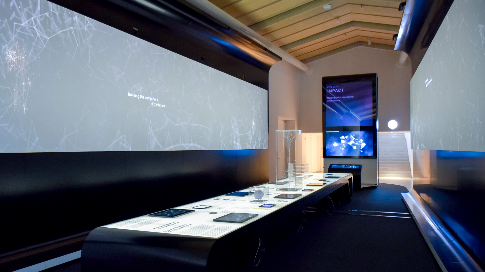
Monolith

The monolith comprises a 4,60m high vertical display space — with ambient animations on top, a large, high resolution screen on eye height, and two multitouch panel for interacting with the installation.
The experience is structured along three main themes — PEOPLE, TOPICS, and IMPACT:
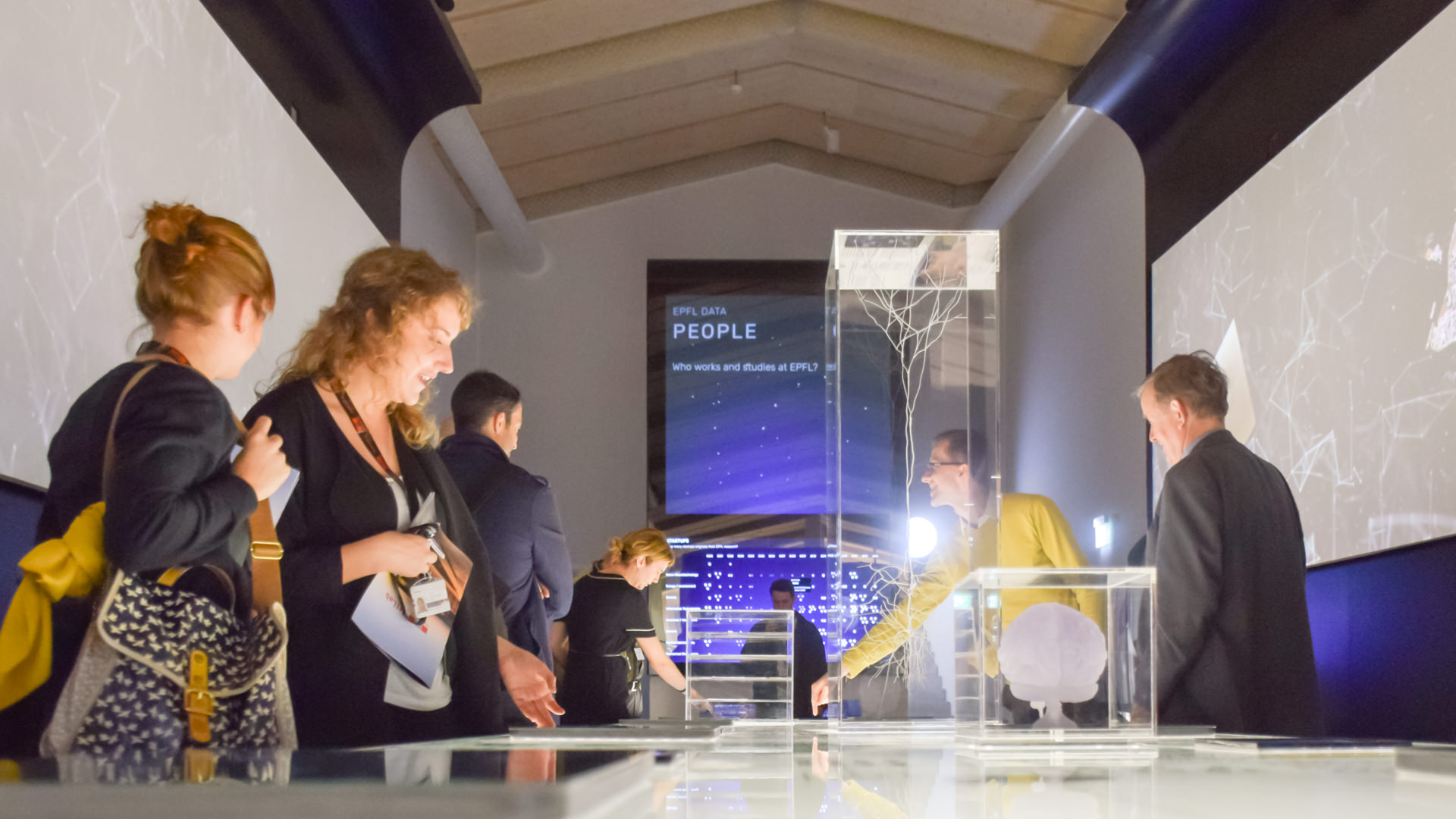
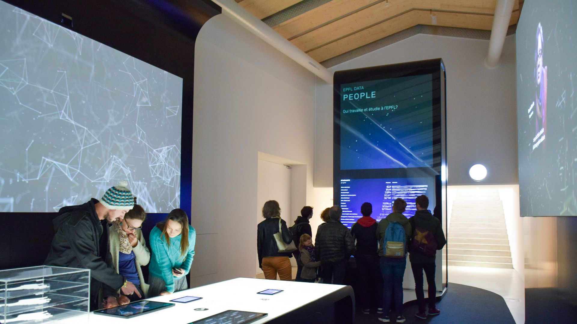
People
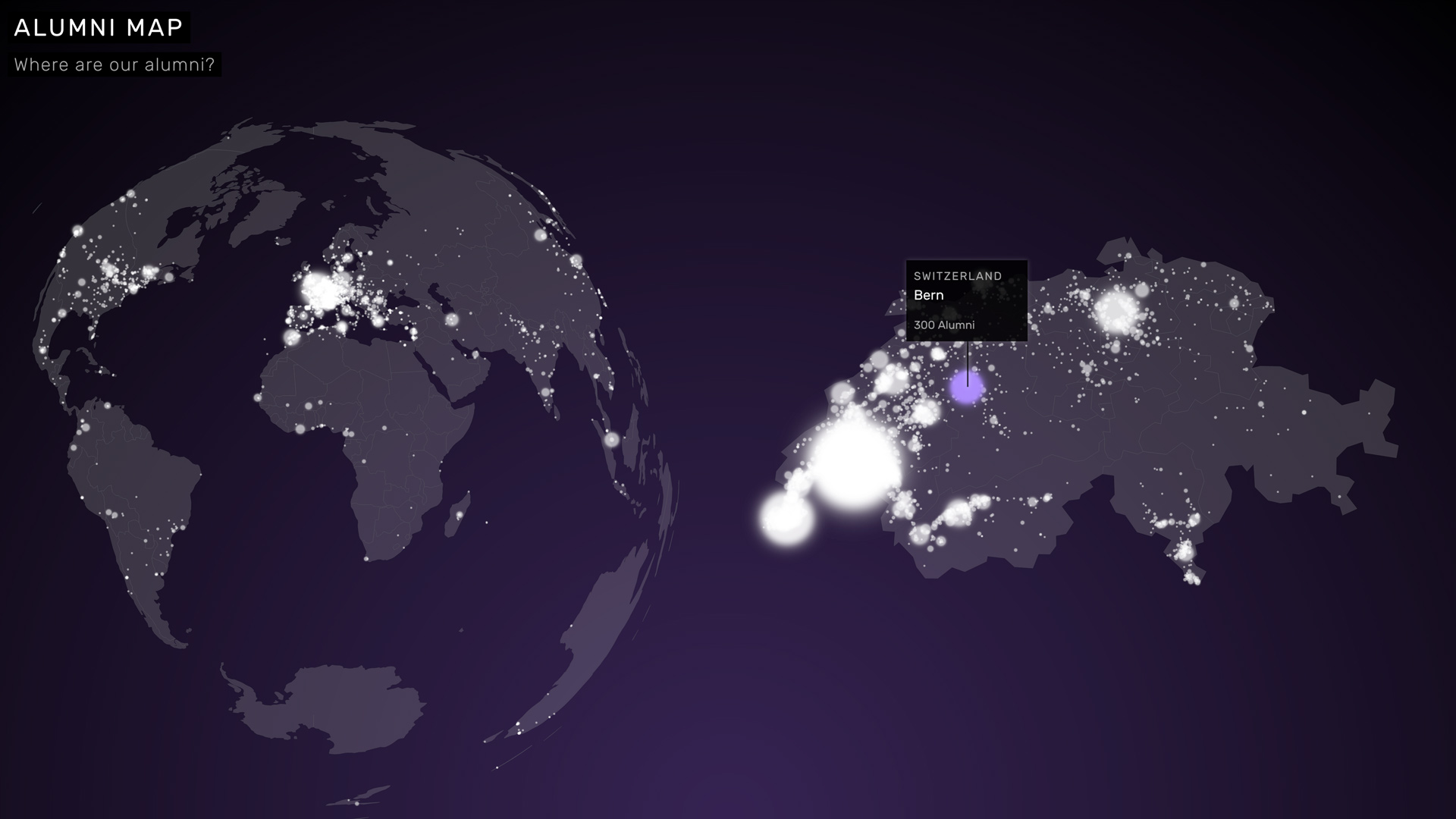
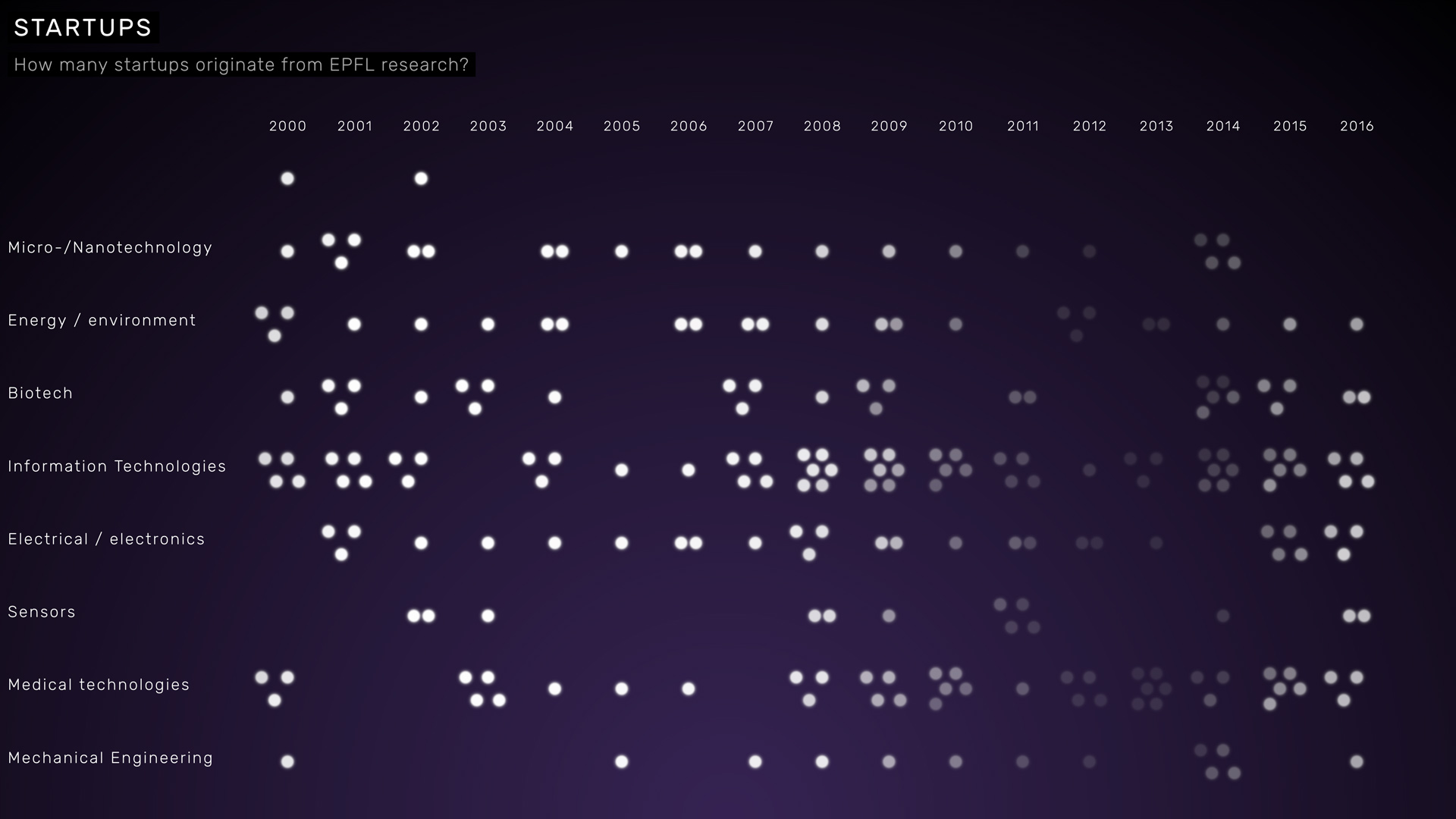
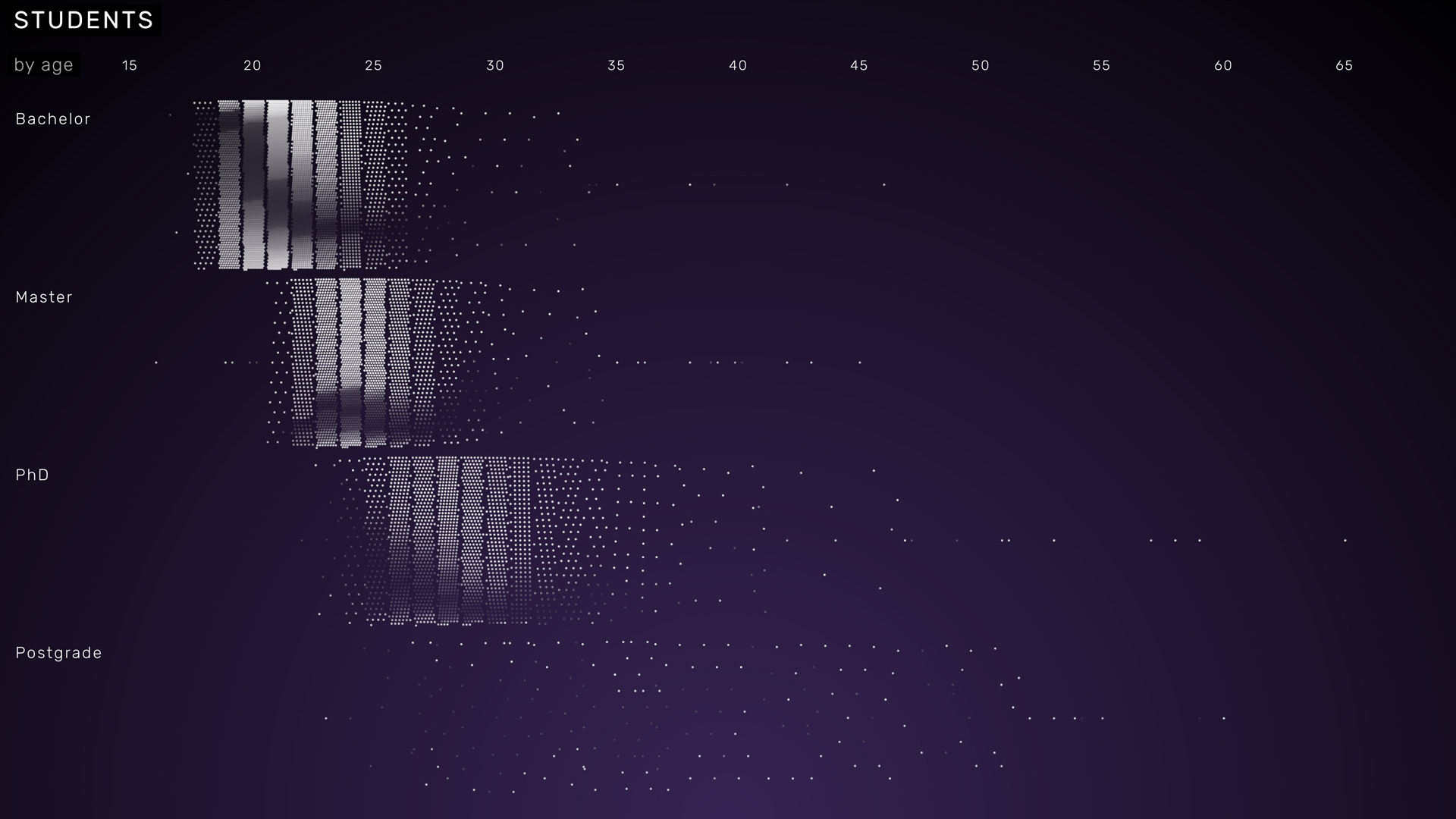
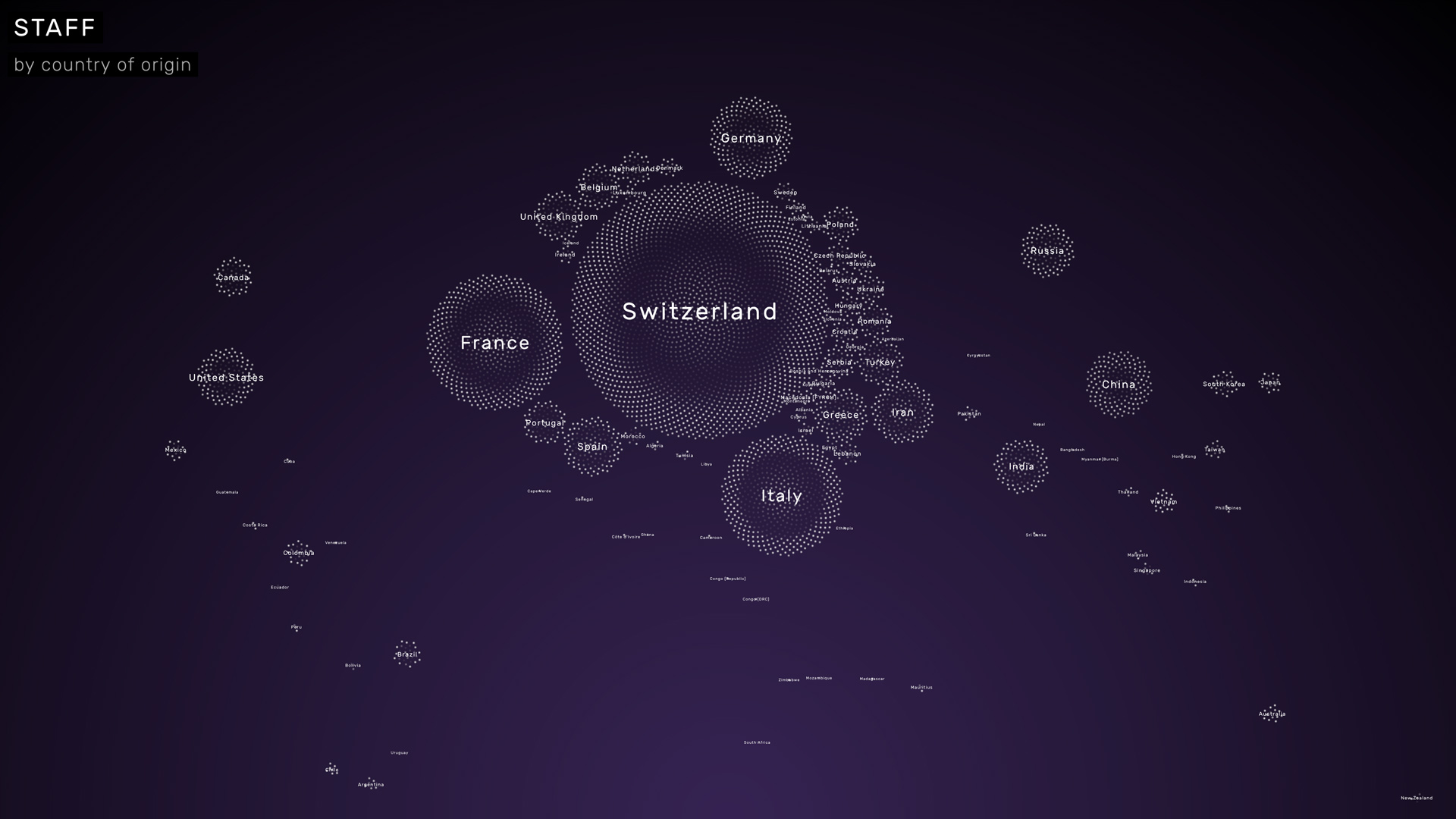
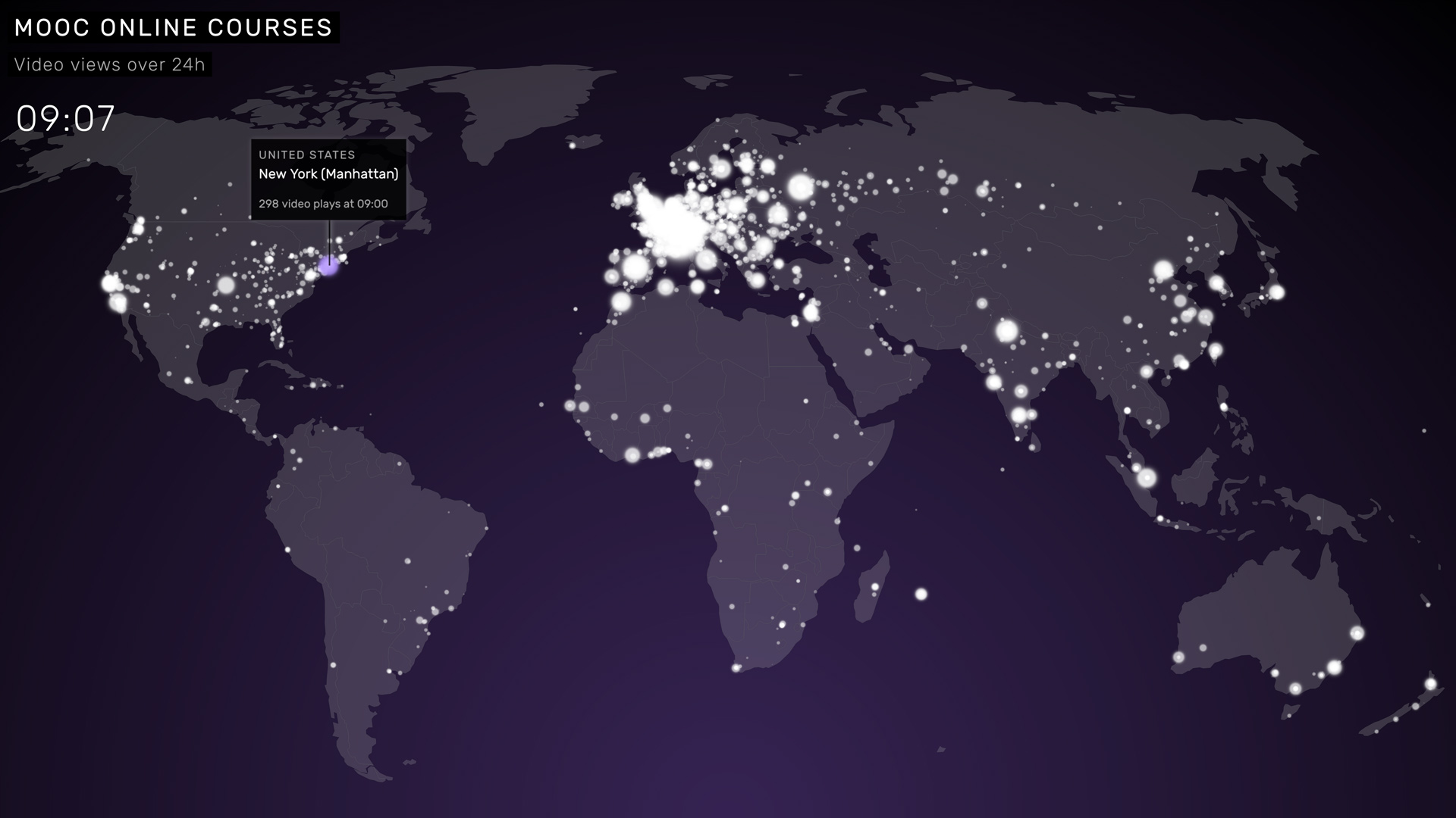
PEOPLE, the first theme, is all about the individuals that constitute EPFL as an organization.
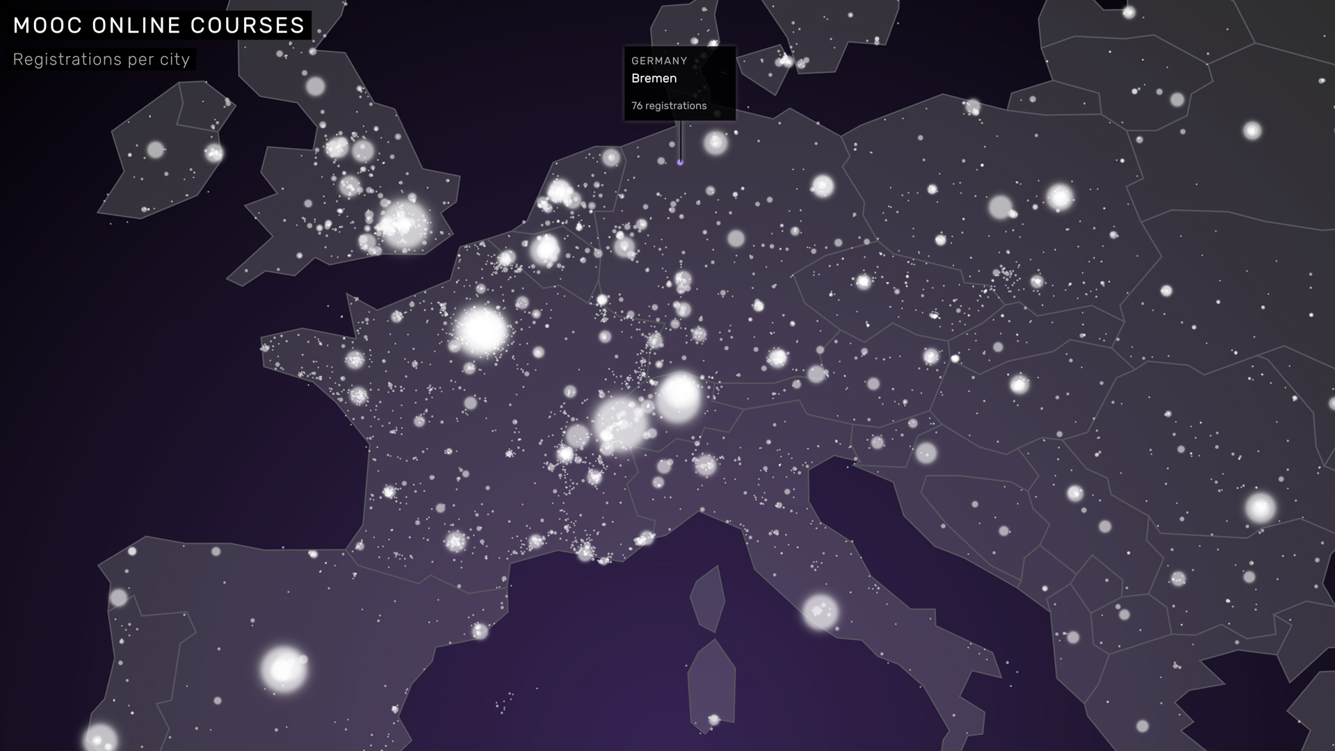
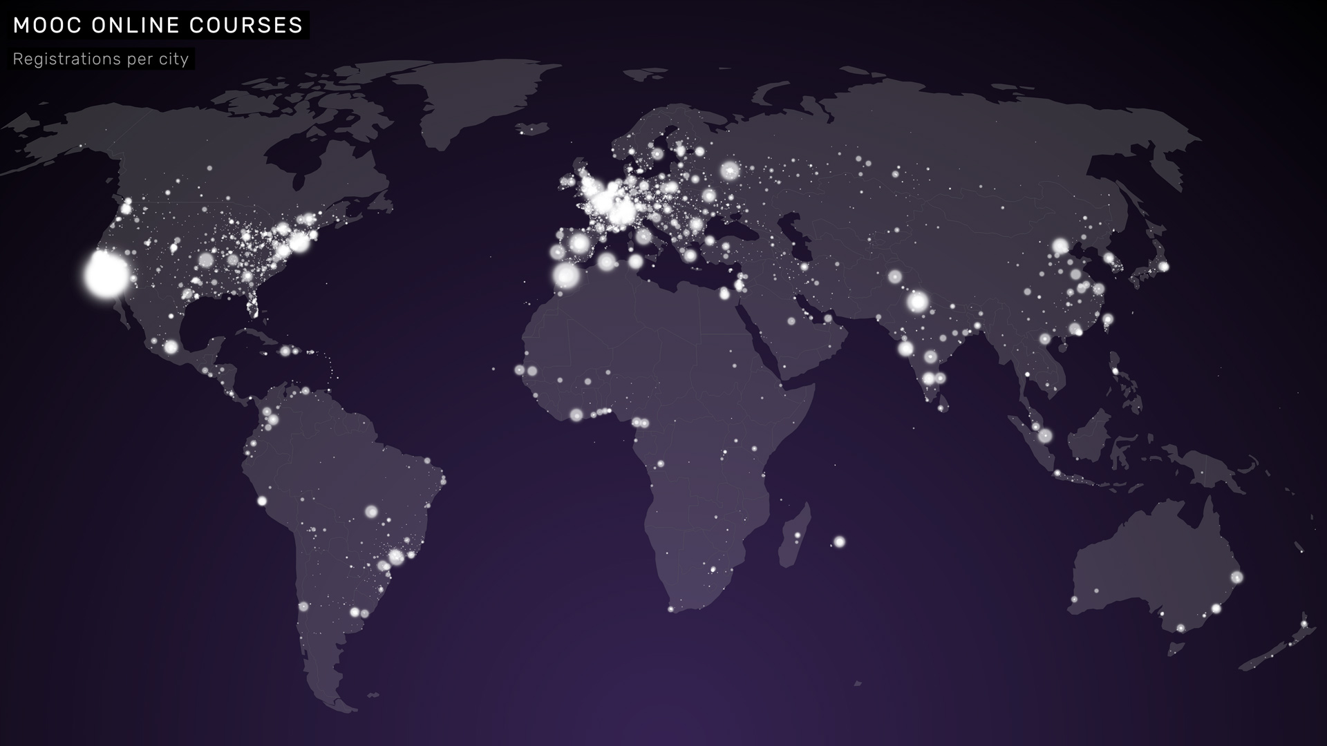
Who are the students, who the researchers and teachers? How many online students are participating in MOOC online courses, all over the world, every day? Where did the alumni go? And how many start-ups are founded based on EPFL research outputs? All of these questions can be explored in a playful series of interactive graphics, where each new view on the data unfolds in swarm-like particle flows.

Topics
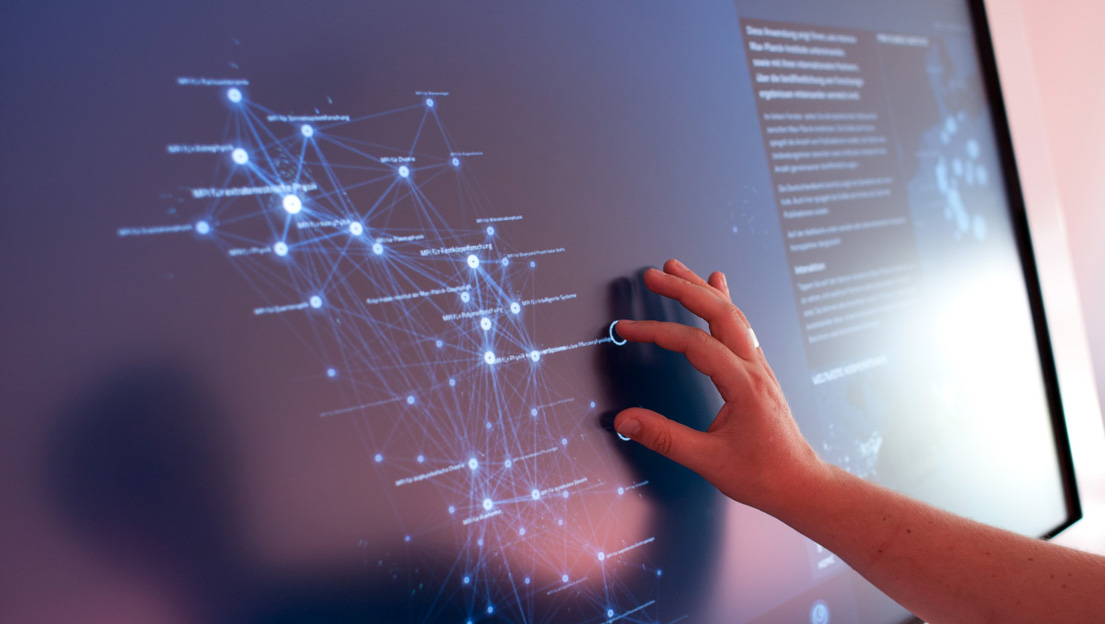
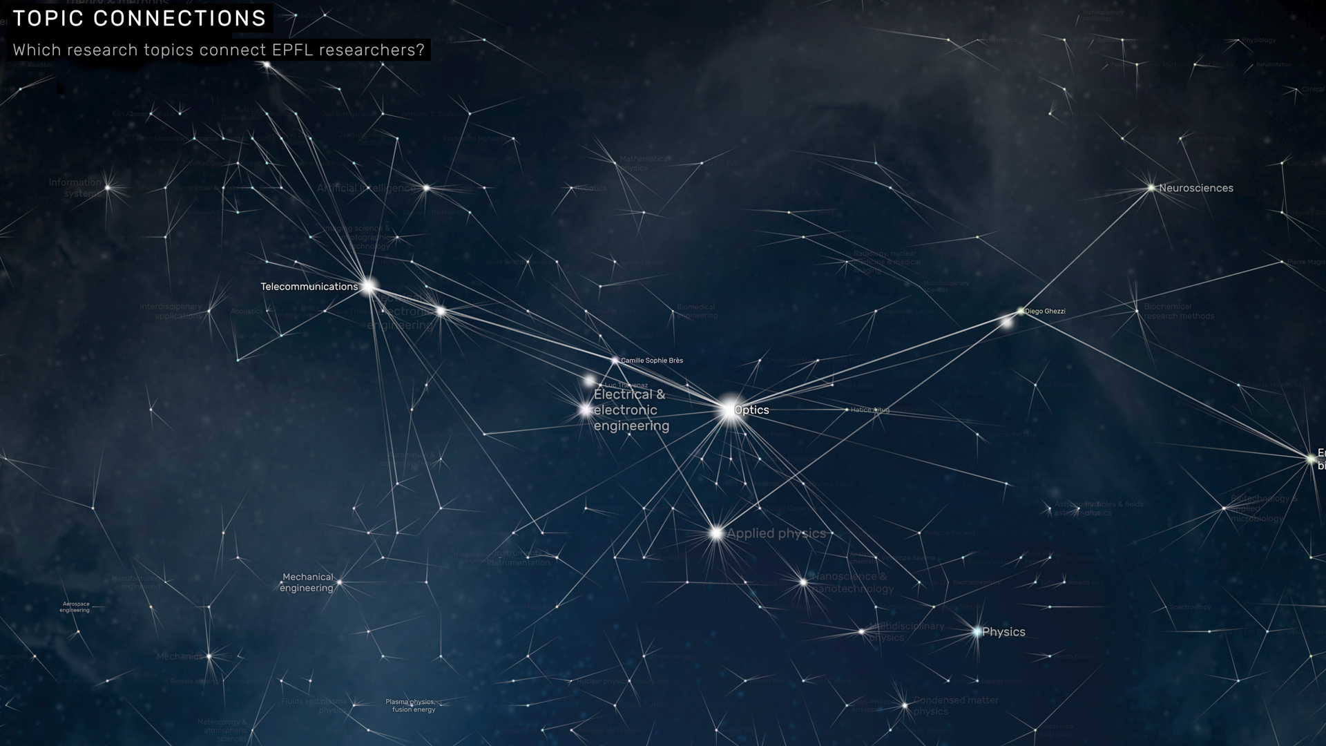
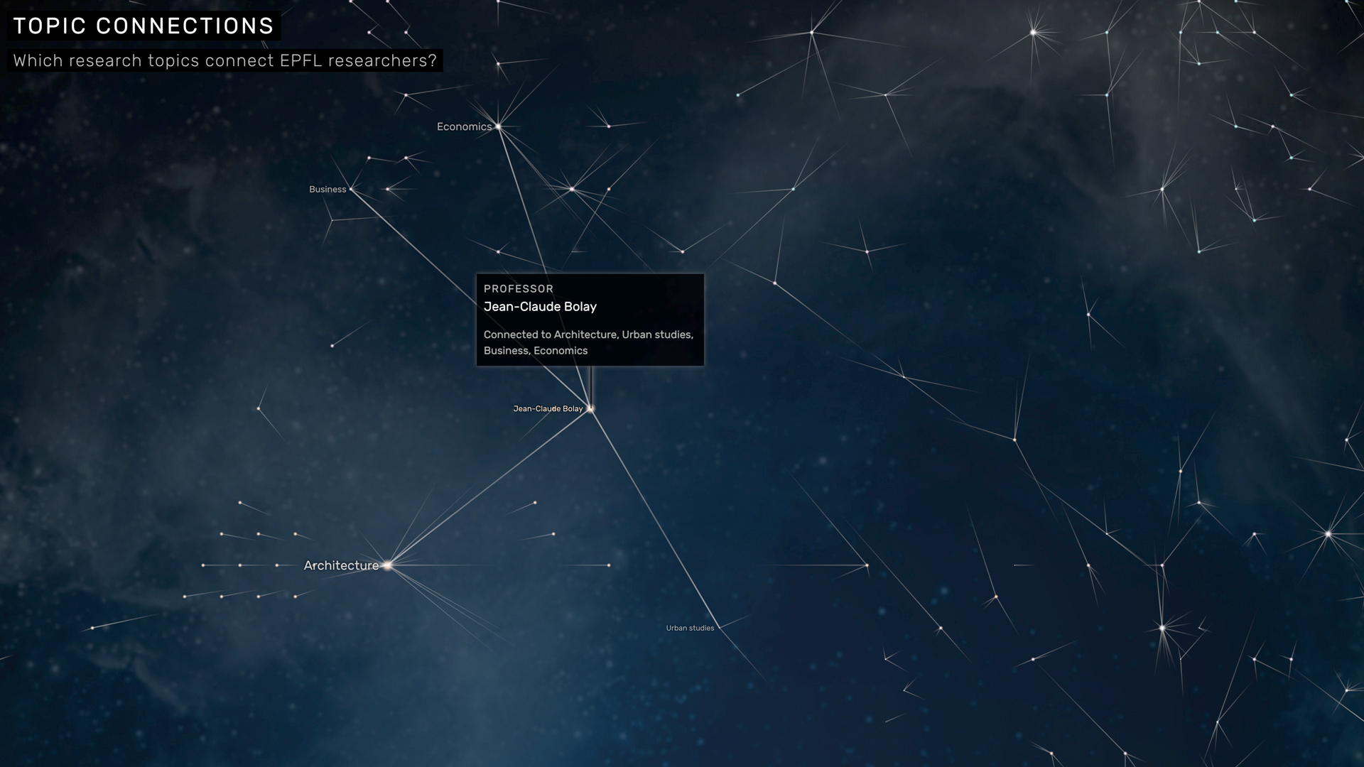
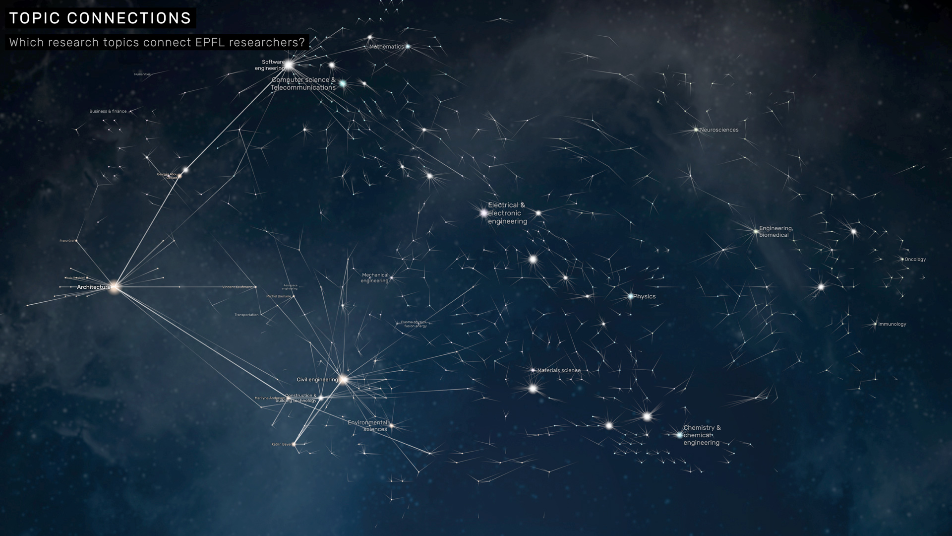
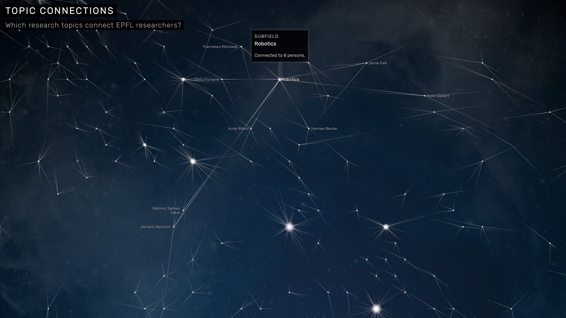
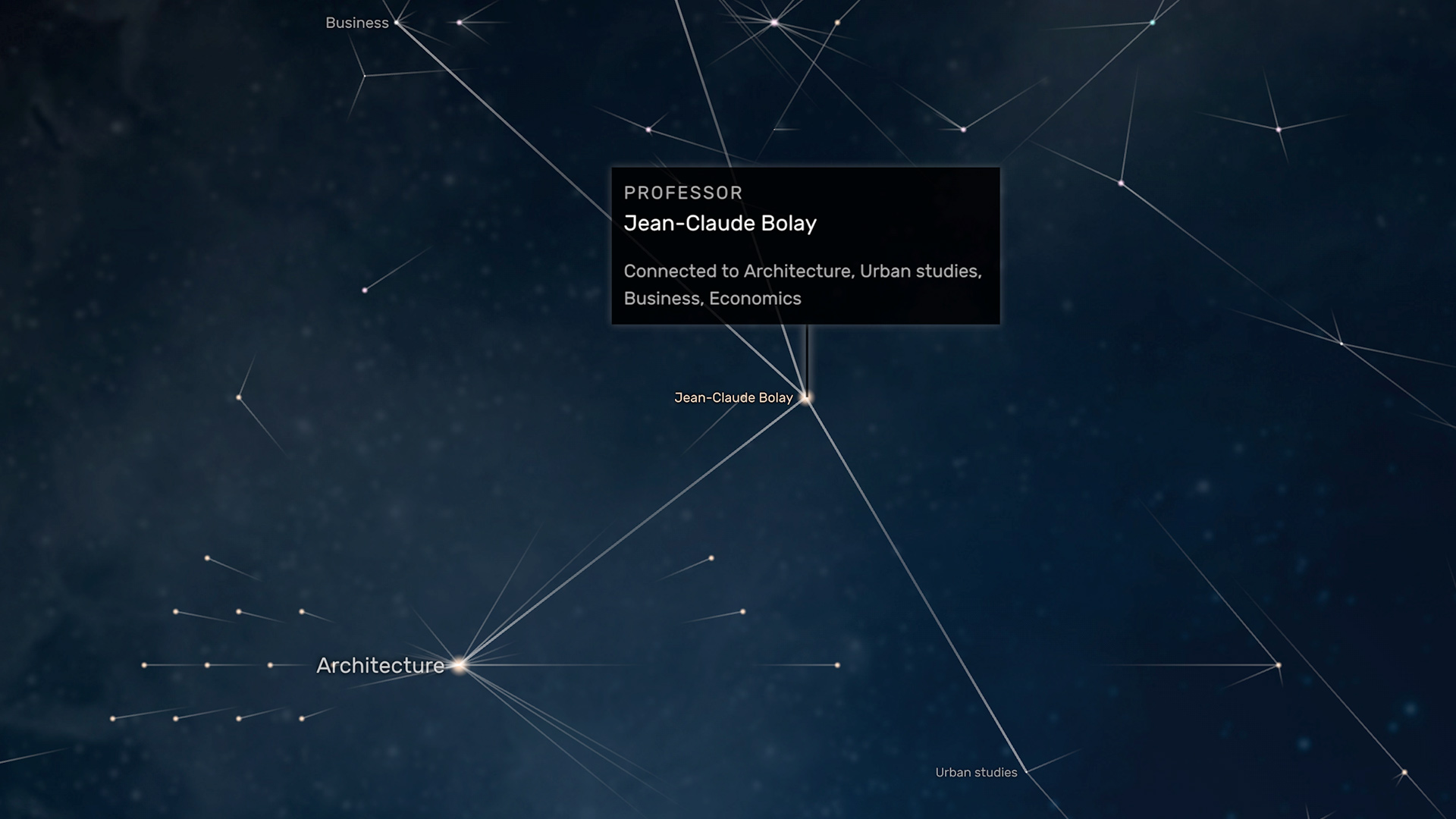
The second theme, TOPICS, relates to the scientific themes EPFL researchers are investigating.
We analyzed the top three keywords of each researcher, based on their scientific writings. This results in a dense network of topics and researchers, revealing how cross-connections in research interests transcend department and faculty borders. The visualization is based on an energy metaphor: analogous to neural activation in the brain, nodes that receive an energy input (e.g. by user interaction), pass it on to their neighbors, thus illuminating their neighborhood in the network. In ambient mode, the network visualization is activated by two random walkers, which traverse the network and rhythmically highlight the shortest path between them — whichever two researchers or topics you pick, there is always a connection.

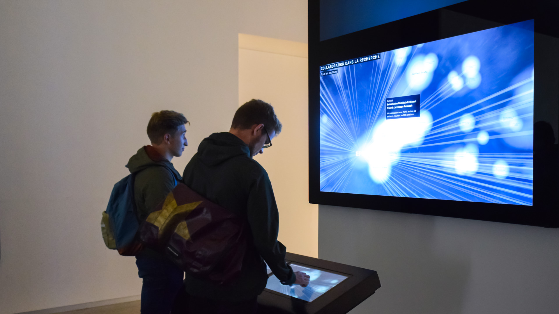
Impact

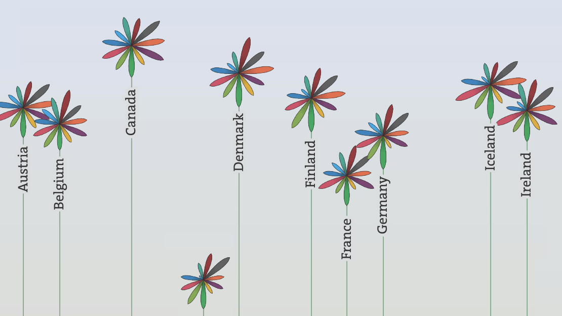
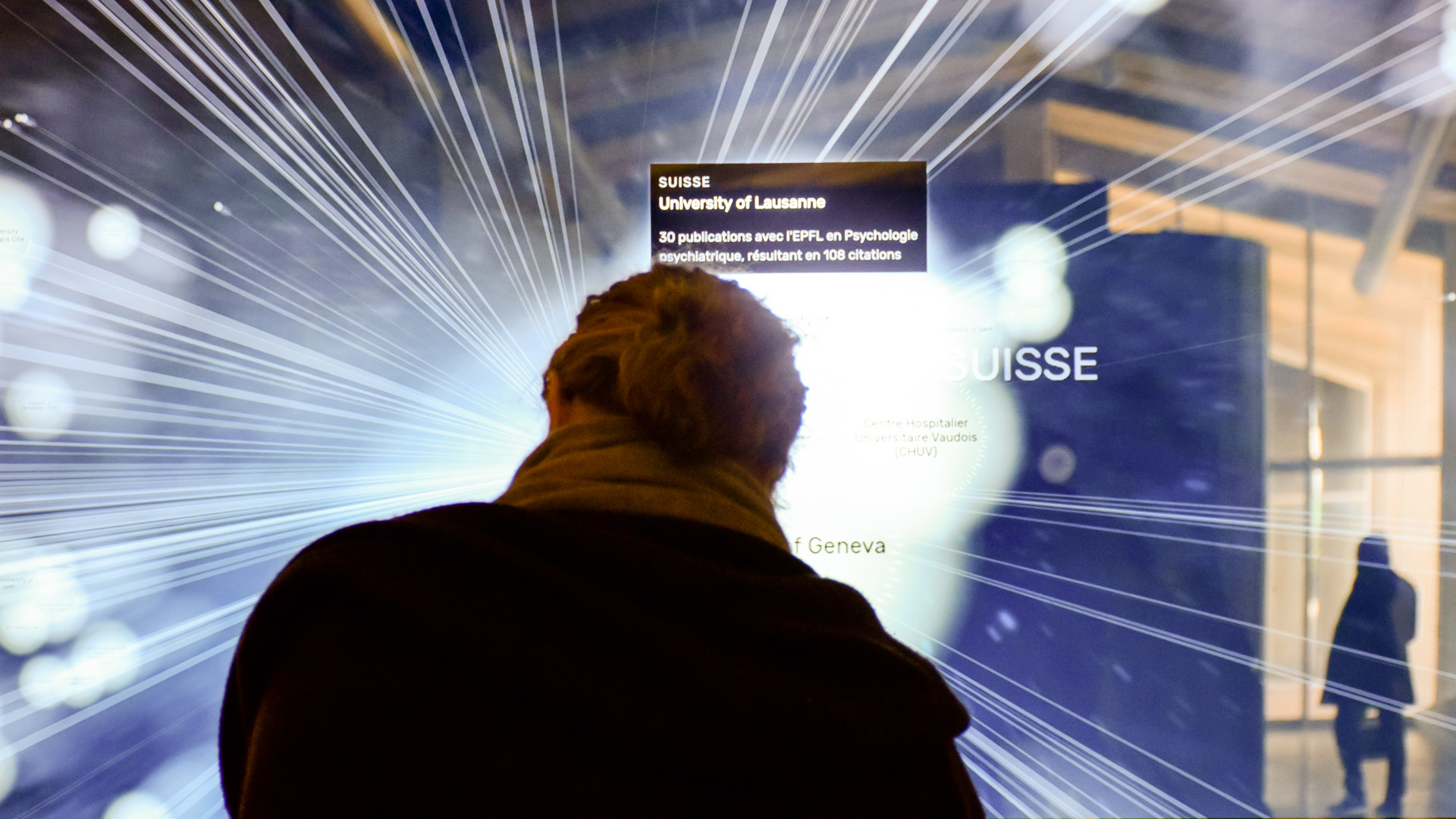
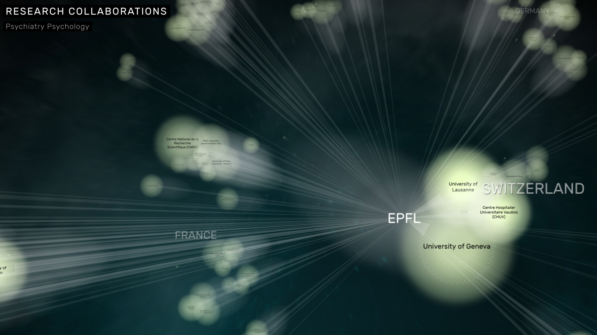
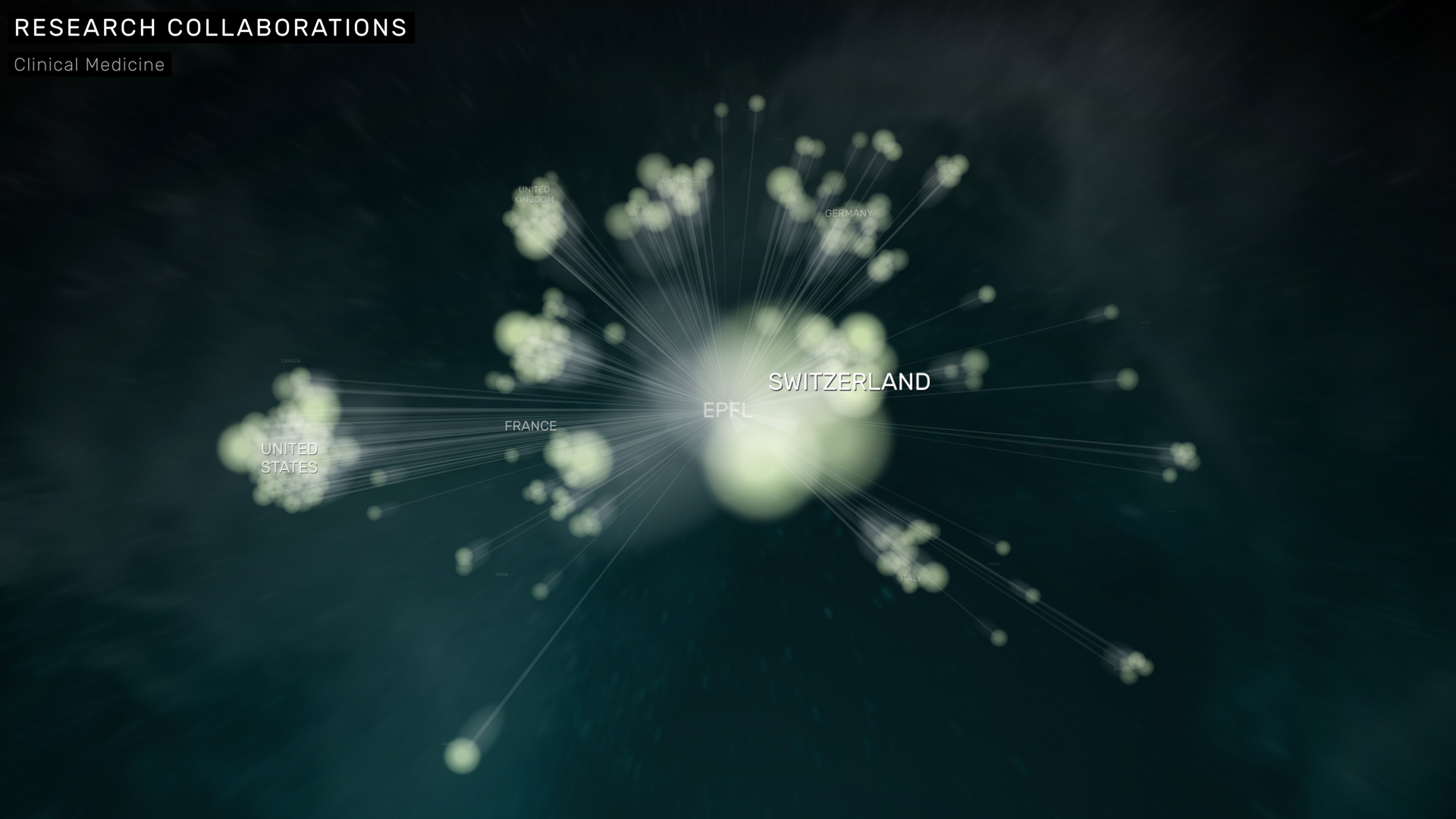
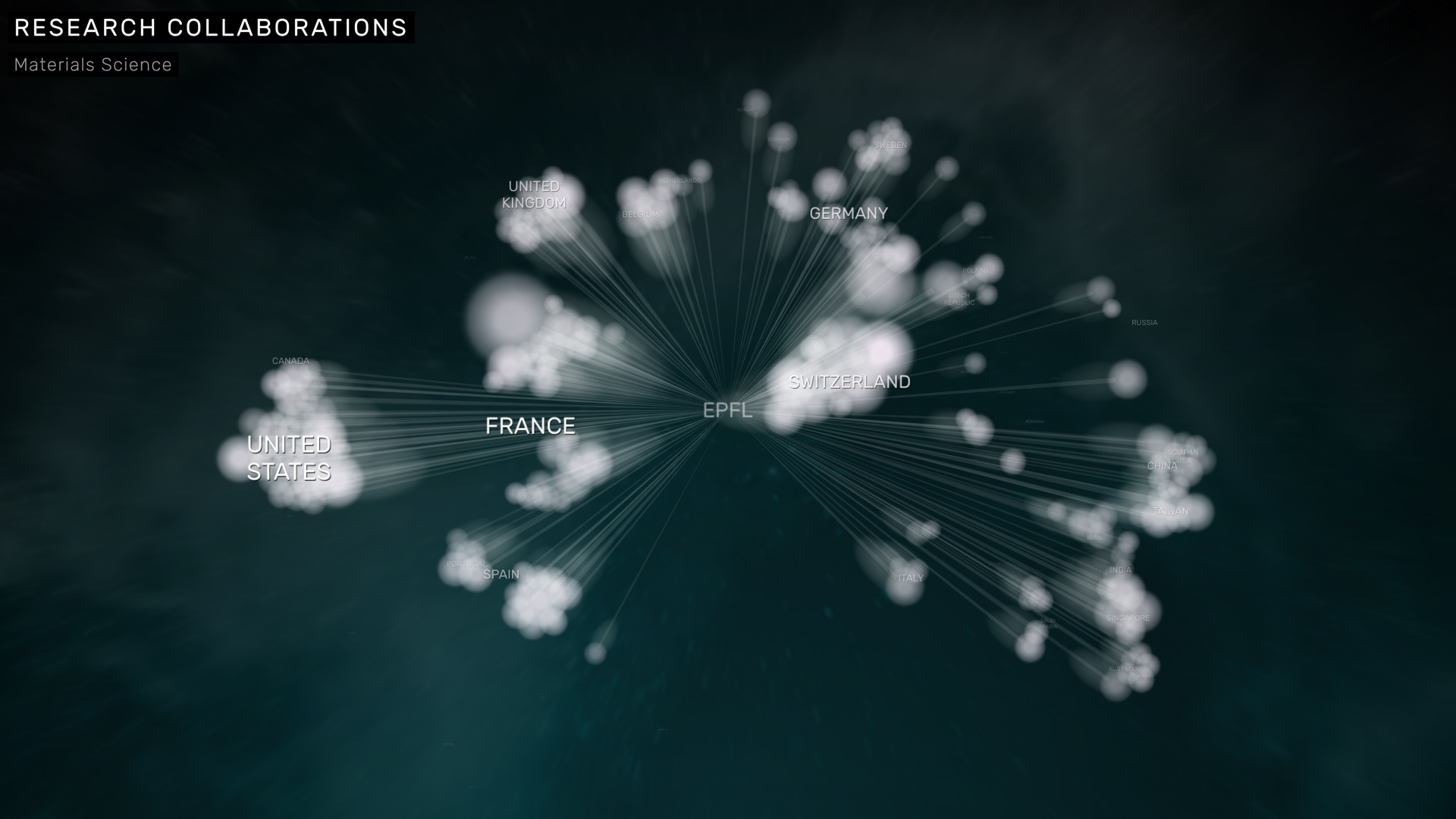
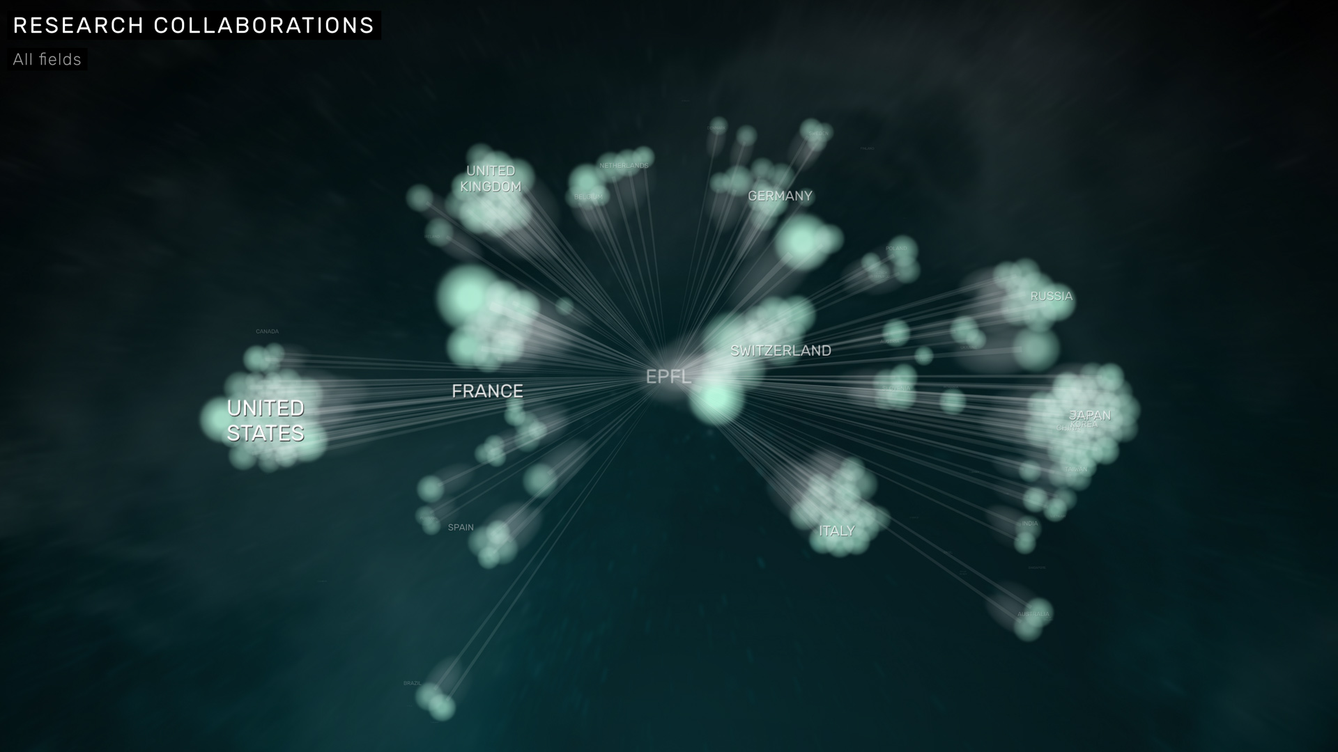
IMPACT, finally, looks outside EPFL itself. What is EPFL’s international research impact? Which international partners is EPFL collaborating with the most, and in which fields?
A cloudy, plasma-like visualization, based on physical simulations and a geographic layout of research institutions reveals how the weights shift, as we cycle through different scientific fields — from Astrophysics over Electrical Engineering to Social Sciences.
Animation and transitions
The transitions between views are smoothly animated and emulated camera zooms and pans on the otherwise 2D graphics:
When nobody is interacting, the monolith starts to "dream" and creates random associations between its contents. This smart idle mode makes sure there is always something exciting to see, even for bystanders. This is a key difference when designing interactive installations, as compared to websites or apps: There is a much wider range of attention and social situations to design for — as reflected both in the hardware as well as the software design for this project.
Connected displays
Internally, the monolith runs on four full screen Chrome instances on two computers. We used d3, react, pixi.js and gsap to implement the smoothly animated, high resolution WebGL graphics. The web apps sync their application state through a node.js server application in real time. This setup can be replicated and extended for a variety of settings, where large display spaces are to be remote controlled by visitors, a moderator or a guide.