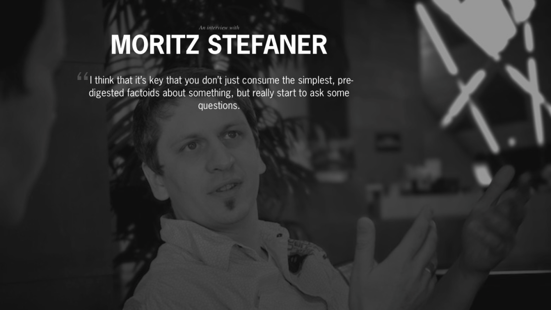
Around the world, around the world…
Featured
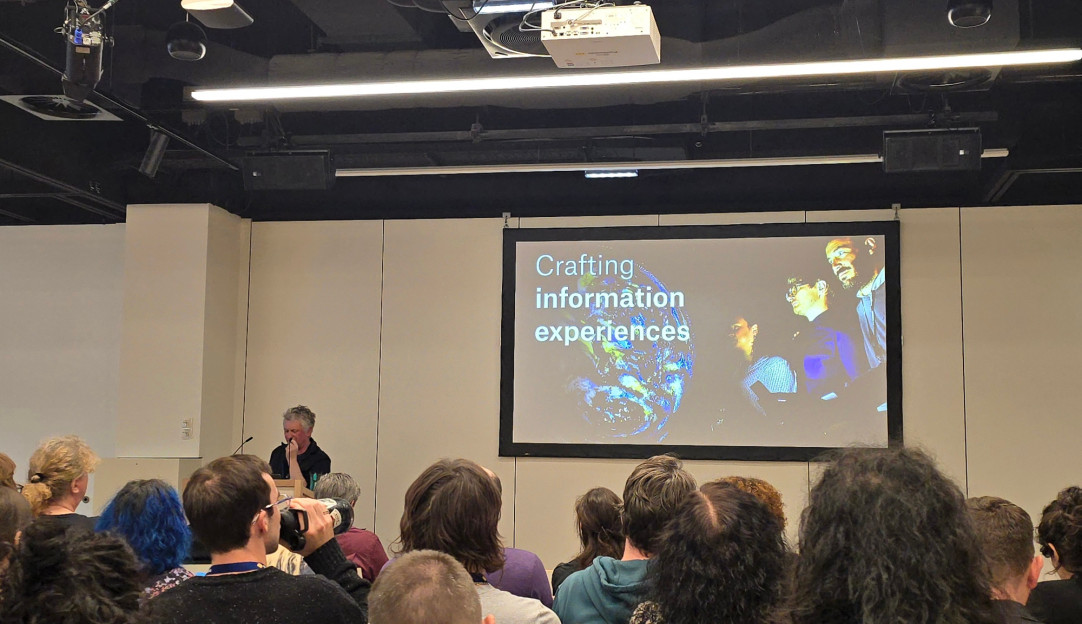
VISCOMM keynote 2025
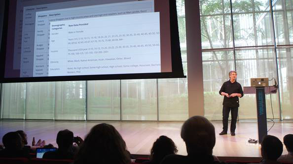
As invited keynote speaker for the VISCOMM workshop at IEEE VIS conference, I talked about current trends in data visualization, my design approach, and how our profession is changing in the recent wave of AI tools.
Truth & Beauty for the German administration
At the 11th Öffentliches Gestalten meetup on "Visualising data", hosted by CityLAB Berlin and DigitalService des Bundes, I shared more recent work for and with the German Federal government — including the Climate—Conflict—Vulnerability Index (CCVI) for the Federal Foreign Office and the official COVID-19 vaccination dashboard for the Federal Ministry of Health.
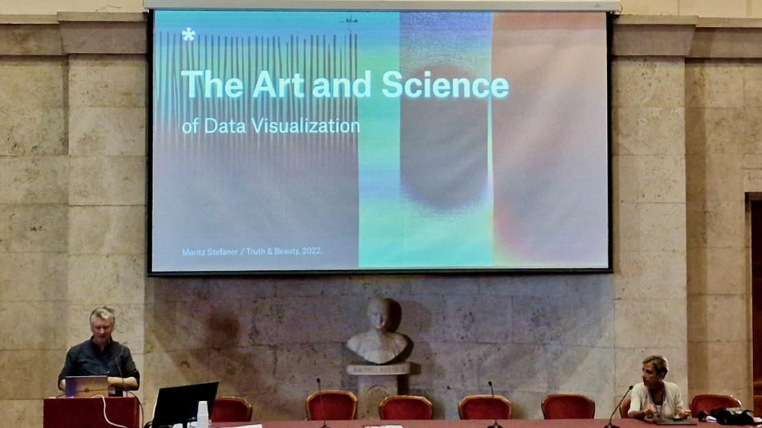
Eurovis keynote 2022
As invited keynote speaker for the EUROVIS conference, I talked about the iconic power of data visualization, the role of emotions, culture, symbols and how we read "between the lines" of data visualizations.
Visual Rhetorics / Data Art for Climate Action
In my keynote at DACA 2022, I presented my perspective on climate visualization — from data sculptures over dashboards for beehives to Ed Hawkins' warming stripes.
Designing the official German COVID-19 vaccination dashboard
A concise, remote presentation on the design rationale and process behind the Impfdashboard — the official German COVID-19 vaccination dashboard.
The dataviz mindset
This (German language) talk from the Solutions conference summarizes my thoughts on what constitutes the unique dataviz mindset. Enjoy!
Silver at Malofiej 2021
The Language of Science won a silver medal at the Malofiej awards, the (self-proclaimed) "Pulitzers of infographics". This project visualizes word usage trends over the 175 year history of the Scientific American magazine.
Winner at National Geographic Innovation Challenge
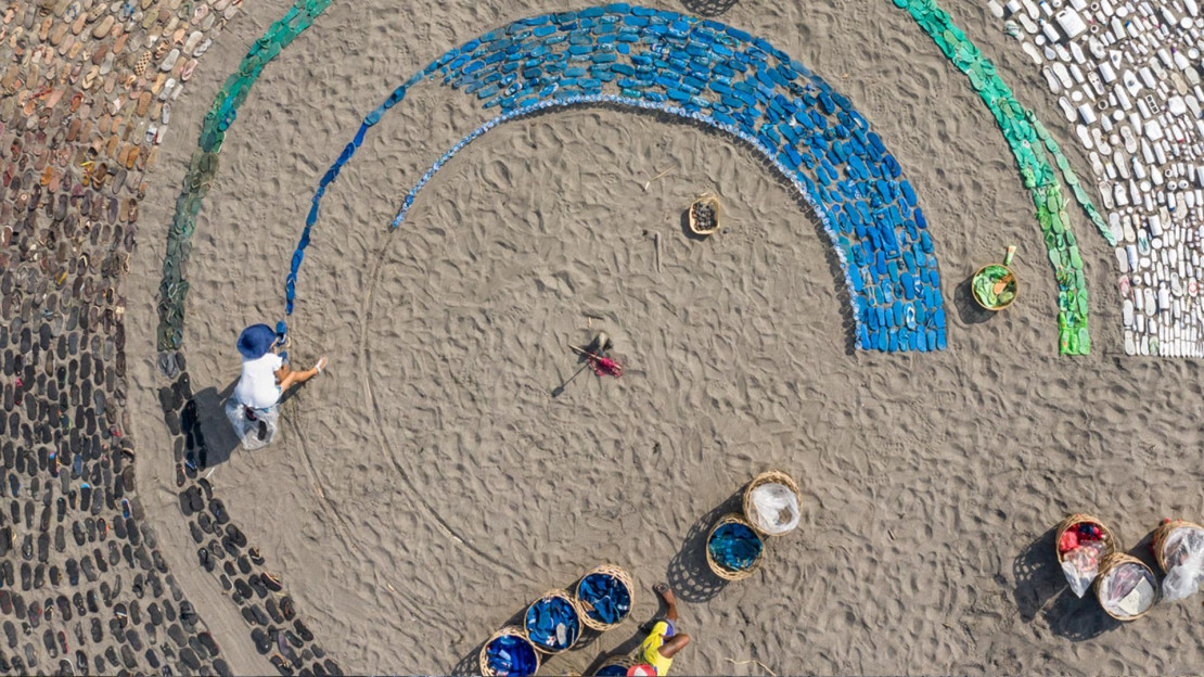
Perpetual Plastic — a 46ft data sculpture made from beach debris, showing the fate of all plastic ever produced — won Gold at the National Geographic Ocean Plastic Innovation Challenge 2019. Thanks to my art activist Liina Klauss and marine scientist and designer Skye Morét for the great collaboration!
dataviz : ecologies
At this year’s eyeo festival, I talked about visual strategies for data visualization in the realm of ecology and climate change. Contents may include data sculptures, bee data dashboards, hyperobjects.
Keynote at VIZBI 2019
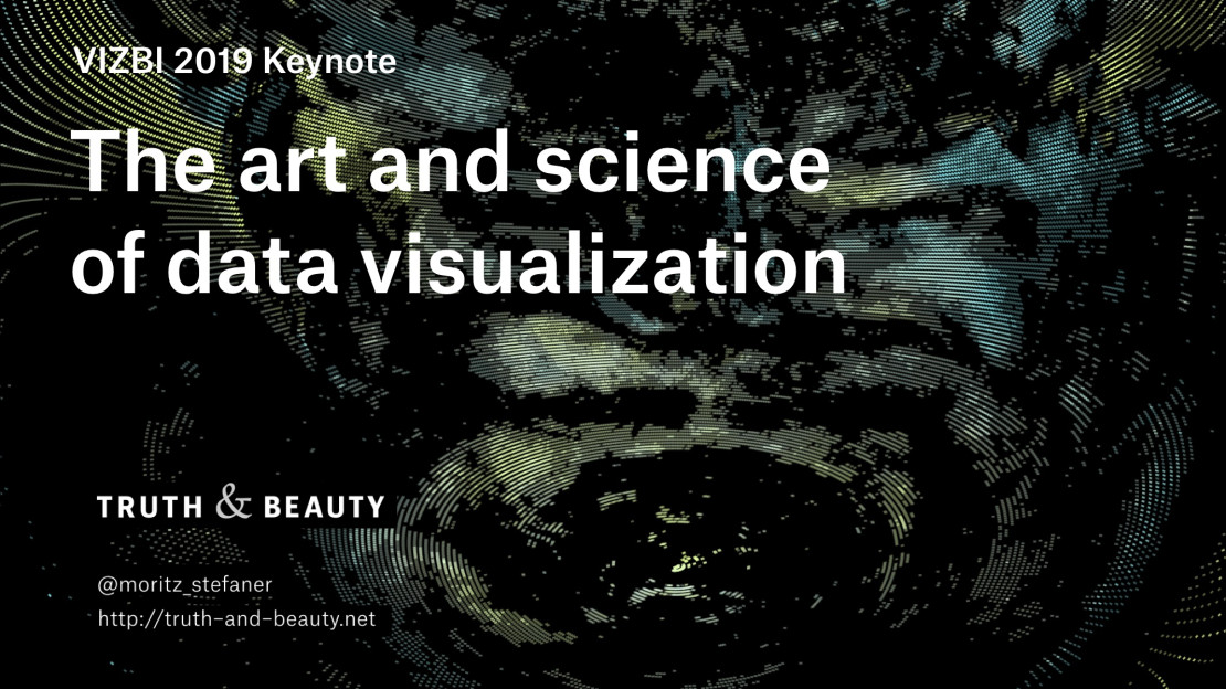
I was invited to give a keynote at VIZBI, the scientific conference for visualizing biological data. I talked about "The art and science of data visualization" — reaching from data legibility to data art, and bigger questions in the relation of the arts and the sciences.
Beyond heatmaps — Data visualization for a warming planet
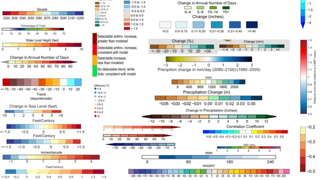
As it seems, we have hit a wall in the visual rhetorics surrounding climate change. How can data visualization help to make global warming more graspable? We investigated this question in the course "Beyond heatmaps" at HfK Bremen.
Information is Beautiful Awards 2018
M U L T I P L I C I T Y won Gold in the "Unusual" category at the Information is Beautiful Awards 2018. For me, this marks award number eleven in a winning streak of seven consecutive years. Wow!
Rhythm of Food at Places & Spaces
I am very happy to announce that the Rhythm of Food project was selected to be part of the Places and Spaces exhibition, curated by the Cyberinfrastructure for Network Science Center at Indiana University. I am very excited to bring our work to many young people around the world — so far the exhibit has been shown at over 375 venues in 28 countries on 6 continents!
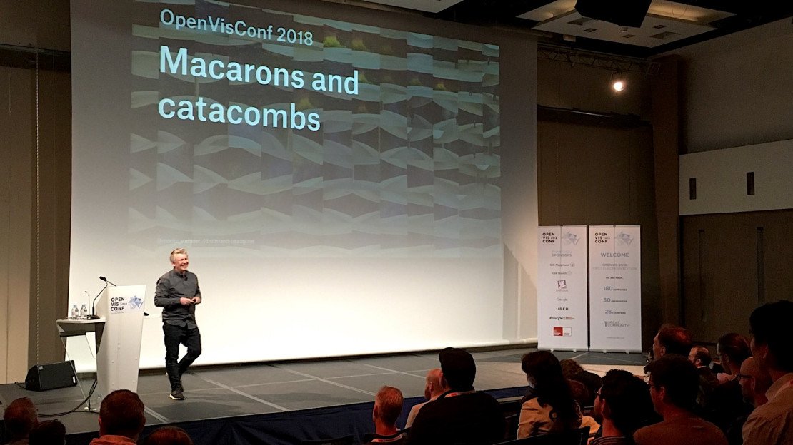
Keynote at OpenVisConf 2018
It was a huge honor for me to keynote the first European edition of one of my favorite conferences: OpenVisConf in Paris, May 14-16, 2018.
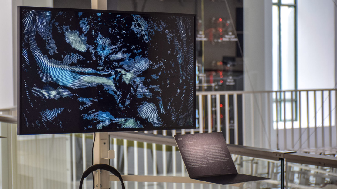
123 data at Fondation EDF, Paris
1 2 3 data at Fondation EDF Paris (open May to September 2018) features five of my projects: from Projekt Ukko, On Broadway, Selfiecity to a first-ever physical exhibit of Data Cuisine and finally, a brand new commission specifically for the exhibition: Multiplicity — a collective photographic portrait of the city of Paris, with the help of machine learning techniques.
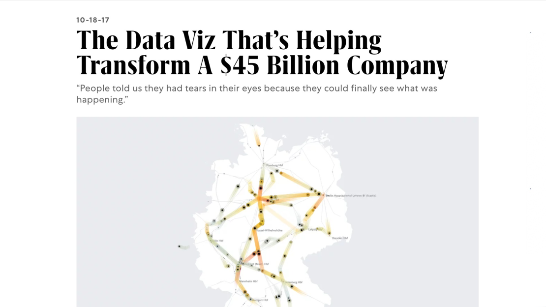
"The Data Viz That’s Helping Transform A $45 Billion Company"
Fast Company features our work for Deutsche Bahn, describing it as "Not only is it pretty to look at, but it’s affecting change in ways that are easy to measure, but also profound."
Data Cuisine talk at eyeo 2016
Can we use food as a medium for information? This talk from eyeo 2016 presents the Data Cuisine project, which turns abstract data into delicious experiences.
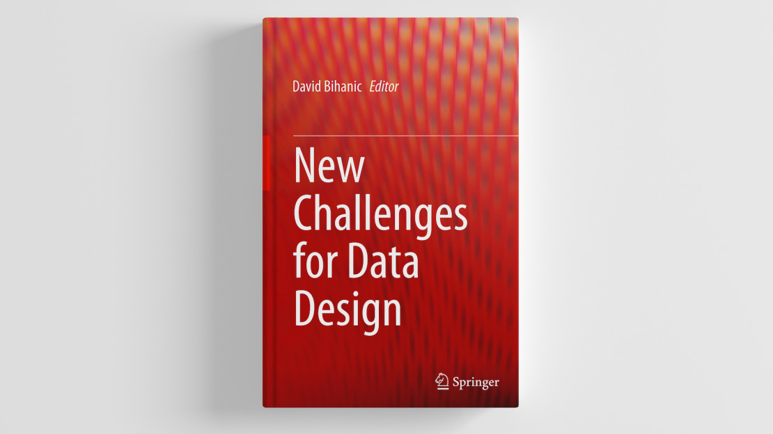
New challenges for Data Design
David Bihanic's "New challenges for Data Design" for Springer features a full-chapter interview with me on my work process and approach. Read the pre-print version here!
Also good
Explore Explain S6E8 with Enrico Bertini
Together with Enrico Bertini, I appeared in a special two-part episode of Andy Kirk's Explore Explain series. We each shared five significant visualization-related works by others that have most influenced our thinking about data visualization, plus a selection from our own work that has been significant to our careers. Watch part 1 and part 2.
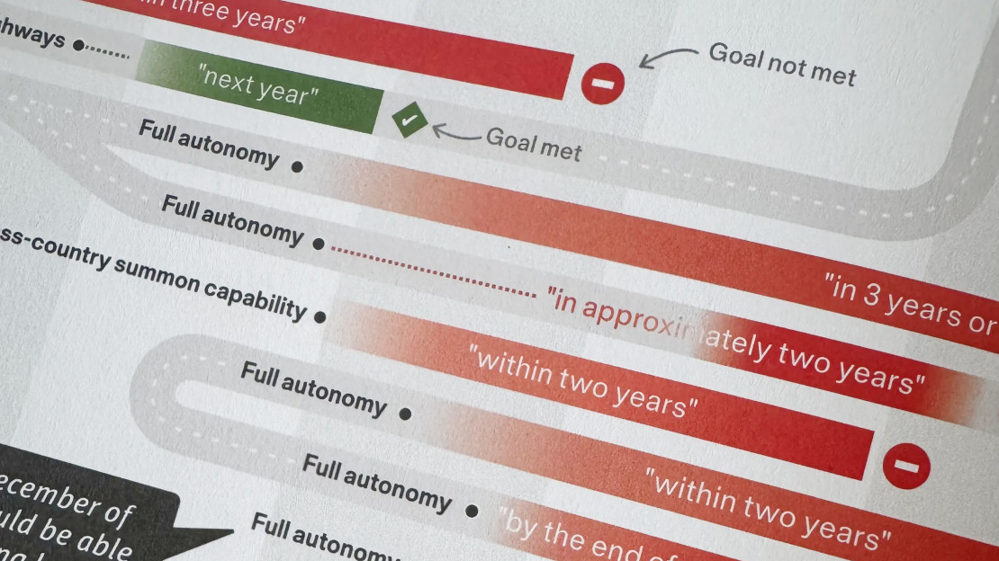
INGRAPHICS contribution
INGRAPHICS is a „magazine for visual thinkers“ — and I was kindly invited to contribute a double spread.
I created a visual overview of the long history of Elon Musk‘s not-quite-materialized predictions on autonomous cars.
The magazine is full of stunning visuals, and completely self financed. Grab a copy — it’s worth it!
PolicyViz Podcast Episode #278
Jon Schwabish and I chat about my work and I reflect on my journey in the field — the Data Stories podcast, my shift from bespoke data visualization projects to scalable design systems, and collaborations with organizations like the World Health Organization.
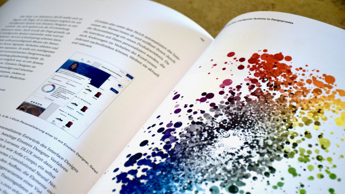
Design und Künstliche Intelligenz
My work on Einstein Designer was featured in a full book chapter for the German language book "Design und Künstliche Intelligenz", covering the relationship of design and artificial intelligence.
The Data Wranglers: Data with a Purpose
I joined Jeffrey Heer and Adam Wilson on The Data Wranglers podcast to discuss how I create a character from a dataset to give it emotional meaning. We talked about my work on the German Covid-19 vaccine dashboard, visualizing train traffic for Deutsche Bahn, and 175 years of text from Scientific American.
HeadsOfData / d:u Podcast
German-language podcast episode on becoming an independent "Truth & Beauty Operator", the importance of data visualization in data value creation, and the relationship between data literacy and data visualization.
Interview on Andy Kirk's Explore Explain
It was an honour to be featured in Andy Kirk's series "Explore Explain". Together with Scientific American's art director Jen Christiansen, we tell the story how our visualization project of word trends in the rich 175 year history of the magazine came about.
Zukunftsfragen Interview
Goethe Institute Italy invited me to contribute to their German / Italian Zukunftsfragen" interview series.
Fast Company’s 2020 Innovation by Design Awards
Einstein Designer — Powered by Deep Learning UX was a finalist in the Data Design category and received an honorable mention in the General Excellence category in Fast Company’s 2020 Innovation by Design Awards. Read more here.
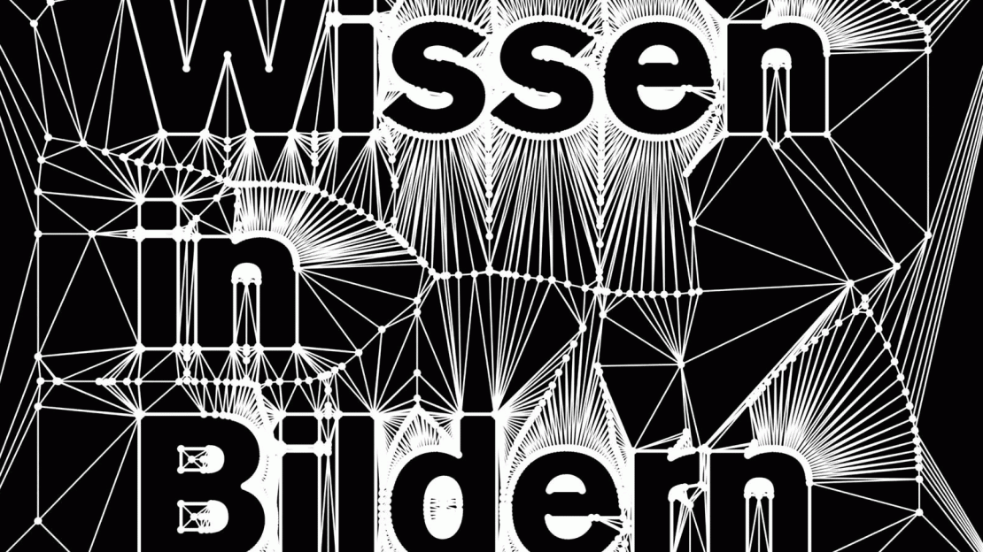
Data Cuisine exhibited in Zürich
Happy to announce that photo and video material from the Data Cuisine workshops will be on display at "Wissen in Bildern – Informationsdesign heute" in Zürich! Opening: Sep 20, 2019.
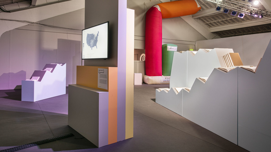
Rhythm of Food in Breda
The Rhythm of Food project was selected to be part of the Graphic Matters: Information Superpower exhibition, Sep 20 to Oct 27, 2019.
Graphic Hunters interview
A longer-form interview with Graphic Hunters about my work and philosophy — covering what makes data visualization easy to learn but hard to master, and why "good data visualizations tell a story, but really great ones tell a thousand stories — but not all at once."
Truth & Beauty for Science!
I taught a training course for data visualization for scientists in Utrecht, Netherlands, August 2018. For more information, check out this interview I did with the organizers from Graphic Hunters.
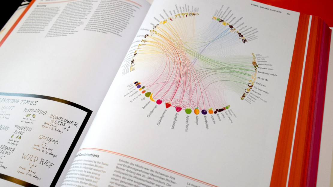
Food & Drink Infographics
"Food & Drink Infographics" (TASCHEN, Simone Klabin, ed. Julius Wiedemann) features my Muesli Ingredient Network.

Information is Beautiful Awards 2017
I won Gold for Rhythm of Food and Bronze for Peak Spotting at the Information is Beautiful Awards 2017.
This marks awards number 9 and 10 from a winning streak of 6 consecutive years(!). It's an incredible honor to receive such amazing ongoing support and recognition. Huge thanks and hi-fives also to my numerous collaborators on these projects!
Google News Lab interview on Wahl 2Q17
Isa Sonnenfeld from Google News Lab interviewed me about our visualization of Google Trends data around the German federal election — how we turned search interest into a rich, explorable portrait of the campaign, and what we learned along the way.
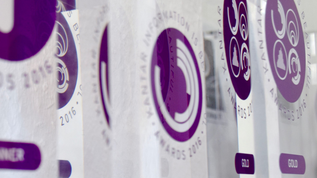
Information is Beautiful Awards 2016
I am thrilled to have been awarded three Information is Beautiful Awards 2016.
- Dataviz Project Gold for Data Cuisine
- Data Visualization Silver for Projekt Ukko
- Special price for Outstanding Individual
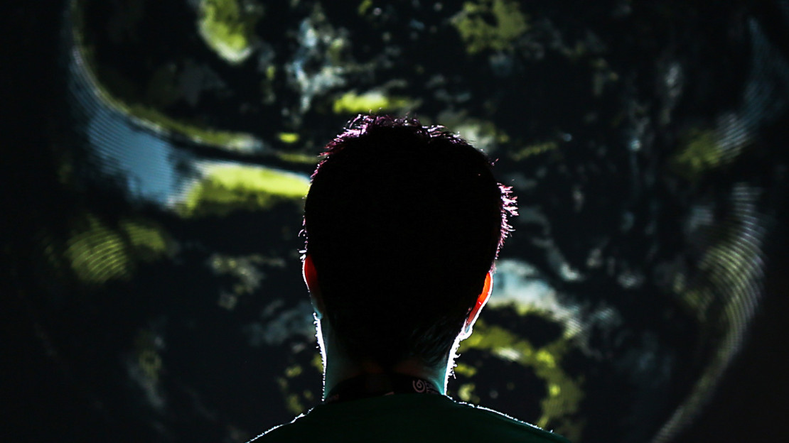
Project Ukko exhibitions
Project Ukko was exhibited at Future Everything, Manchester, 2016 (Multitouch installation and ambient loop) as well as Information+ exhibition, Vancouver, 2016.

Selfiecity London
We created a special London version of the Selfiecity project for the Big Bang Data exhibition at Somerset House, London. The installation is up 03 Dec 2015 — 28 Feb 2016.
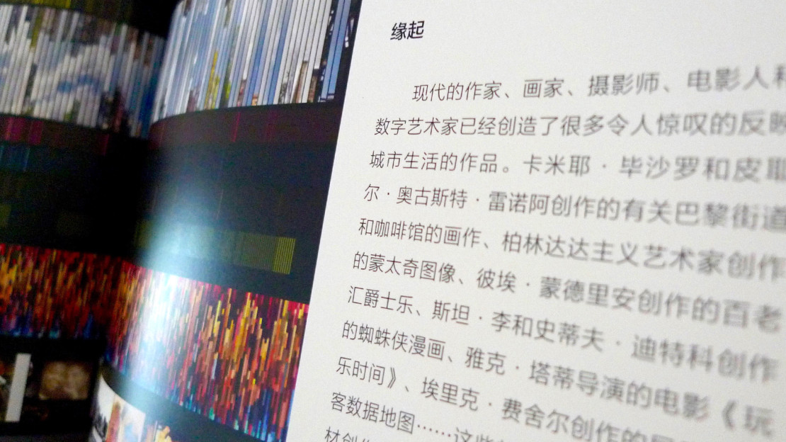
Landscape Architecture Frontiers
On Broadway was featured in the leading Chinese journal Landscape Architecture Frontiers.
FutureEverything Conference
I was speaking at FutureEverything Conference 2015 as part of the session "What now for memory and identity?".

Information is Beautiful Award 2014
Selfiecity and OECD Regional Well-Being won Gold and Silver in the website category of Information is Beautiful Awards 2014.
Data with a cause
I moderated a panel on visualization for policy change at VIS 2014, featuring Tariq Khokhar, Scott David, Matteo Maggiore, and Greg McInerny. We tried to shed some light on what it’s like to work with and publish data in the NGO context, and how we can improve!
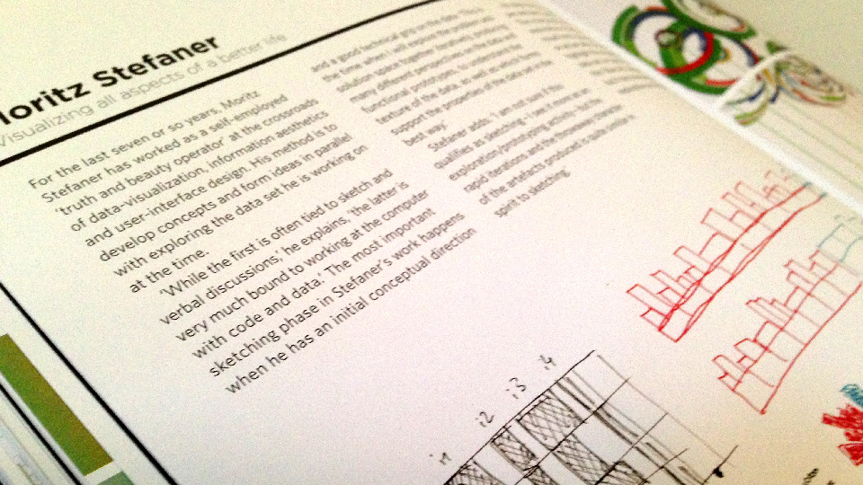
Raw Data — Infographic Designers' Sketchbooks
The design sketches for the OECD Better Life Index are featured in Best Raw Data — Infographic Designers' Sketchbooks, a great collection of design sketches from a variety of information designers.
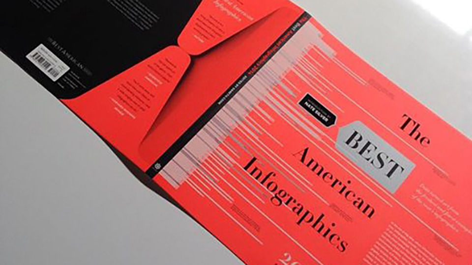
Best American Infographics 2014
Where the Wild Bees are is featured in Best American Infographics 2014. Thanks to Jen Christiansen and Jillian Walters for the great collaboration!

Places and Spaces 2014
The Visual Funding Portfolios project is part of the Places&Spaces exhibition.

Selfie São Paulo
The Selfiecity project was displayed as a media facade installation at São Paulo. SelfieSaoPaulo (2014) is a project by Moritz Stefaner, Jay Chow and Lev Manovich created for SP_Urban Festival (São Paolo). The project develops further the ideas from Selfiecity published in February 2014. SelfieSaoPaulo animates hundreds of São Paulo Instagram selfies images sorted by age, gender, and degree of smile, as analyzed by software. The animations play on a large media facade in the center of São Paulo.
Keynote at Gurus of BI
I presented some of my the off-the-beaten-track work at Gurus of BI 2014, a leading conference in Business Intelligence.
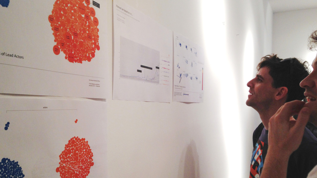
Truth & Beauty at resonate
Together with Dominikus Baur, I taught a 3-day workshop on data visualization at resonate.
"The city is alive" — interview with Sandra Rendgen
Sandra Rendgen interviewed me about my work at the intersection of data visualization and urban data — how I came to the field with a background in cognitive science and interface design, and my efforts to create a comprehensible visual vocabulary for mapping complex data.

Information is Beautiful Award 2013
The emoto project won Bronze in the data visualization category of information is beautiful awards 2013.
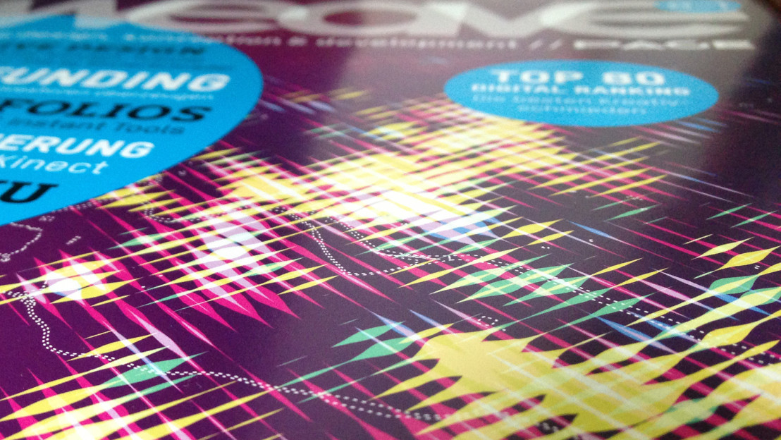
WEAVE magazine cover
WEAVE magazine featured my Stadtbilder project on as cover image of edition 03/2013
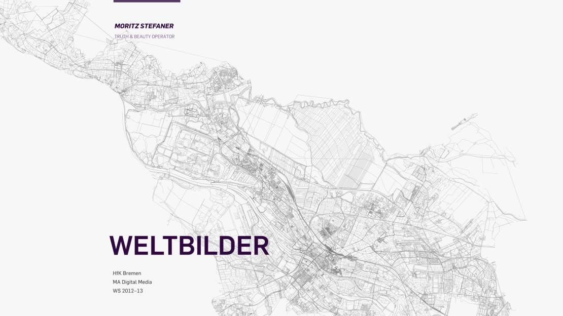
Weltbilder
As part of the master's program at Digital Media program in Bremen, I taught a full-semester course on Information visualization under the title of "Weltbilder" ("World Images").
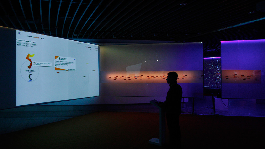
GeoCity SmartCity
The emoto project was shown in the GeoCity SmartCity exhibition in Beijing, as part of Beijing Design Week 2012 curated by CMoDA, the China Millennium Monument Museum of Digital Arts.
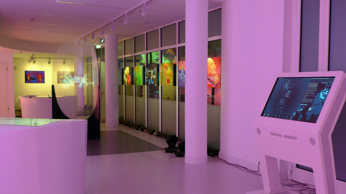
Max Planck Science Gallery
The Max Planck Research Networks project is at display at the Max Planck Sciene Gallery, Berlin.
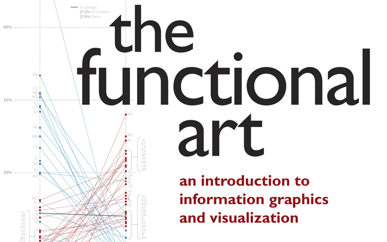
The functional art
Alberto Cairo's book The Functional Art features a long interview with me and introduces some of my works.

Insect Smarts Workshop
I taught a workshop at eyeo festival on how complex patterns can emerge from networked interactions in ensembles of simple agents.
Eyeo 2012
"OMG — it's all connected": I presented my experiences with network visualizations at eyeo festival 2012.

Information is Beautiful Award 2012
The Notabilia project was awarded as best Interactive Visualisation 2012 in the information is beautiful awards.

Places and Spaces exhibition
The MACE classification visualization is part of the Places and Spaces exhibition.

Designpreis 2010: Nominee
I was nominated for the Design Award of the German Federal Republic in 2010.
Workshops for scientists
I have taught one to two day workshops at various universities and research institutions, among others at HU Berlin, University of Osnabrück, and Bernstein Center Berlin.
Workshops for designers
I have taught one to two day workshops at various universities and research institutions, among others at resonate festival, HfK Bremen, Haute Ecole Albert Jacquard, Namur, and Hochschule für Gestaltung Schwäbisch Gmünd.

Powerdome Potsdam
The Well-Formed Eigenfactor project is shown in the powerdome in Potsdam, an immersive visual projection environment.

