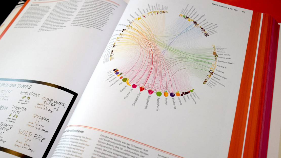


Müsli Ingredient Network
Analysing custom müsli mixtures
The German start-up mymuesli.com offers individual, custom mixed mueslis per mail order. For their fifth anniversary, I was commissioned to analyze and visualize how their clients combined the ingredients they offer.
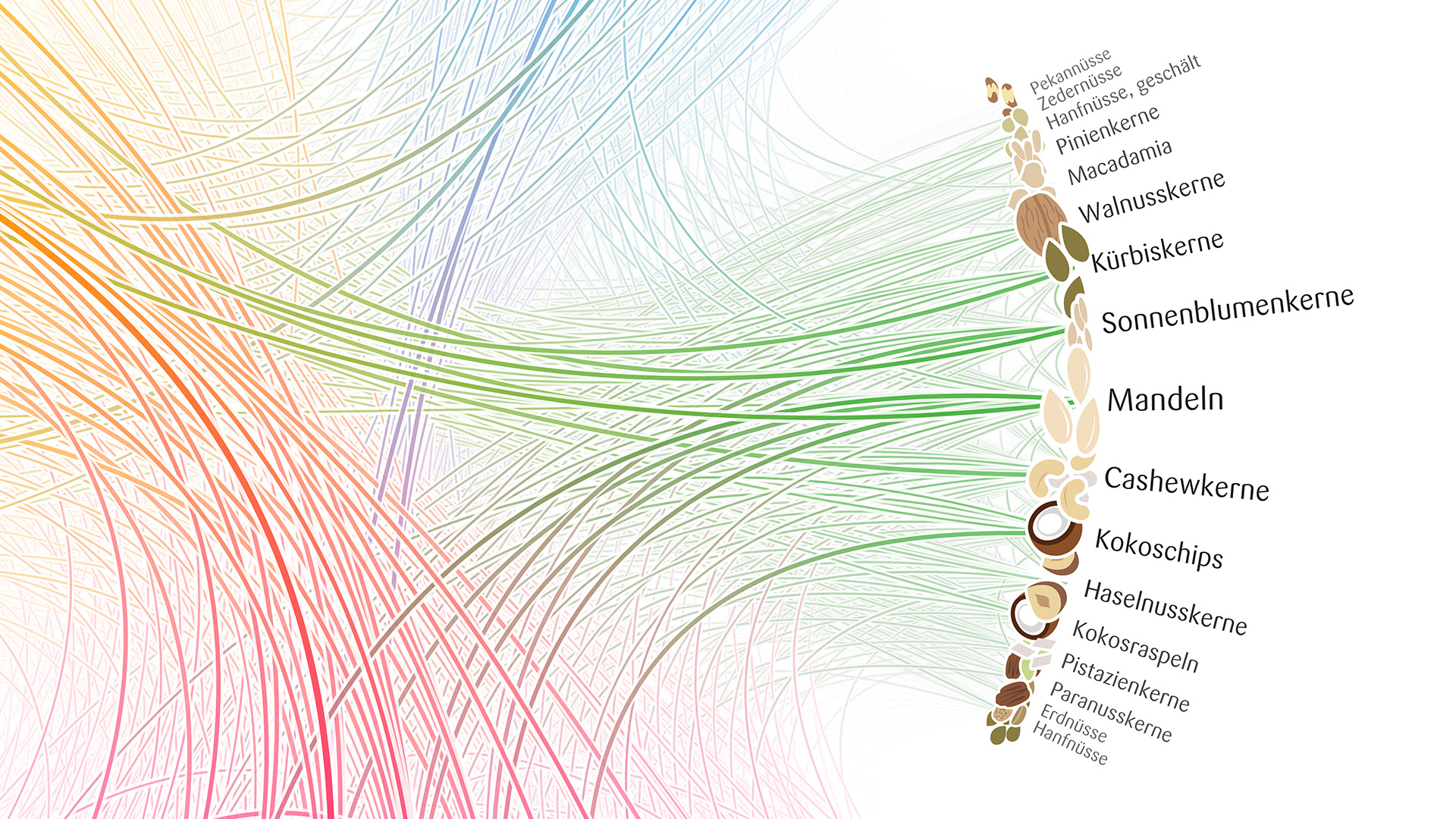
Radial convergence
The end result was a straight-forward radial network visualization, with the ingredients grouped by category (base mueslis, fruit, nuts, sweets, etc.). Some niceties have gone into the line rendering, with gradient strokes (depending on the categories of the connected nodes) and white stroke outlines to facilitate visual perception of the depth stacking. Some interesting insights can be gained from this visualization: Fruit are the most popular ingredient, and are often combined with each other. Sweets and nuts, however, are rarely combined. Mango is often combined with coconut (Kokosnuß) or pineapple (Ananas), although these two don't tend to be used together. Goji berries with plantago seeds. Almonds (Mandeln) with fruit are also really popular.

Enter... The Matrix
But, as so often, a certain visualization form often highlights specific insights, but neglects others. In the above case, the strongest link almost disappears (raspberries (Himbeeren) to strawberries (Erdbeeren)), because they are neighbors on the circle. During development, the view that helped us most with identifying all the little interesting stories in the data, was in fact a matrix visualization:

Whenever we use lines as visual markers of the connections, the line length will inevitably interfere with the reading of how important a line is perceived. In this visualization form, all link strengths can be read equally good, because we use circle markers instead of lines. New stories stand out now: Strawberry (Erdbeeren) with "Crunchy and Oat". Raspberry (Himbeeren) and strawberry (Erdbeeren). Almonds (Mandeln) and sunflower seeds (Sonnenblumenkerne). All very strong links that are underrepresented in the radial visualization.
Matrix Surprise
We took it even one step further - a matrix with "surprise factor", and I would argue this is the most interesting one. Here, again, the circles represent link strengths in their area, but now, the saturation and darkness of a circle indicates the "unexpectedness" of that respective link strength. This means that we are not only looking at how often a certain combination occurs, but also, how well we could have predicted that value, by only looking at the "popularity" of the two ingredients in isolation. Let me illustrate that concept with an example. Let's say, every second muesli contains almonds, and every third contains strawberries. If there is nothing special going between strawberries and almonds, i.e. they don't fit especially well or badly together, we would expect that every sixth (1/2 times 1/3 equals 1/6) muesli contains strawberries AND almonds together. However, if they occur together more often than this "theoretical" value, this could mean they go together pretty well. And this visualization form highlights exactly these cases, which might be the most interesting little stories in the data set.

Some of the additional insights gained from this graphic - picking one sweet ingredient makes a second one very improbable (the blue square at the bottom right). Pineapple (Ananas) and papaya are actually stronger correlated than pineapple (Ananas) and mango (which stood out so strongly in the radial graphic). Apple pieces (Apfelstücke) with coconut (Kokosnuß). etc. etc. In the end - why didn't we pick this one? Well, first of all, it had to work as a print piece, and it is hard to get all labels to show up well readable in this format. Second, from a visual point of view, it does not look very tasty. Lastly, the whole concept of statistical independence and surprise factor etc. might just be a bit over the top for the casual muesli buyer. Nevertheless, I found it interesting how much additional information could be squeezed out of the data in this form.