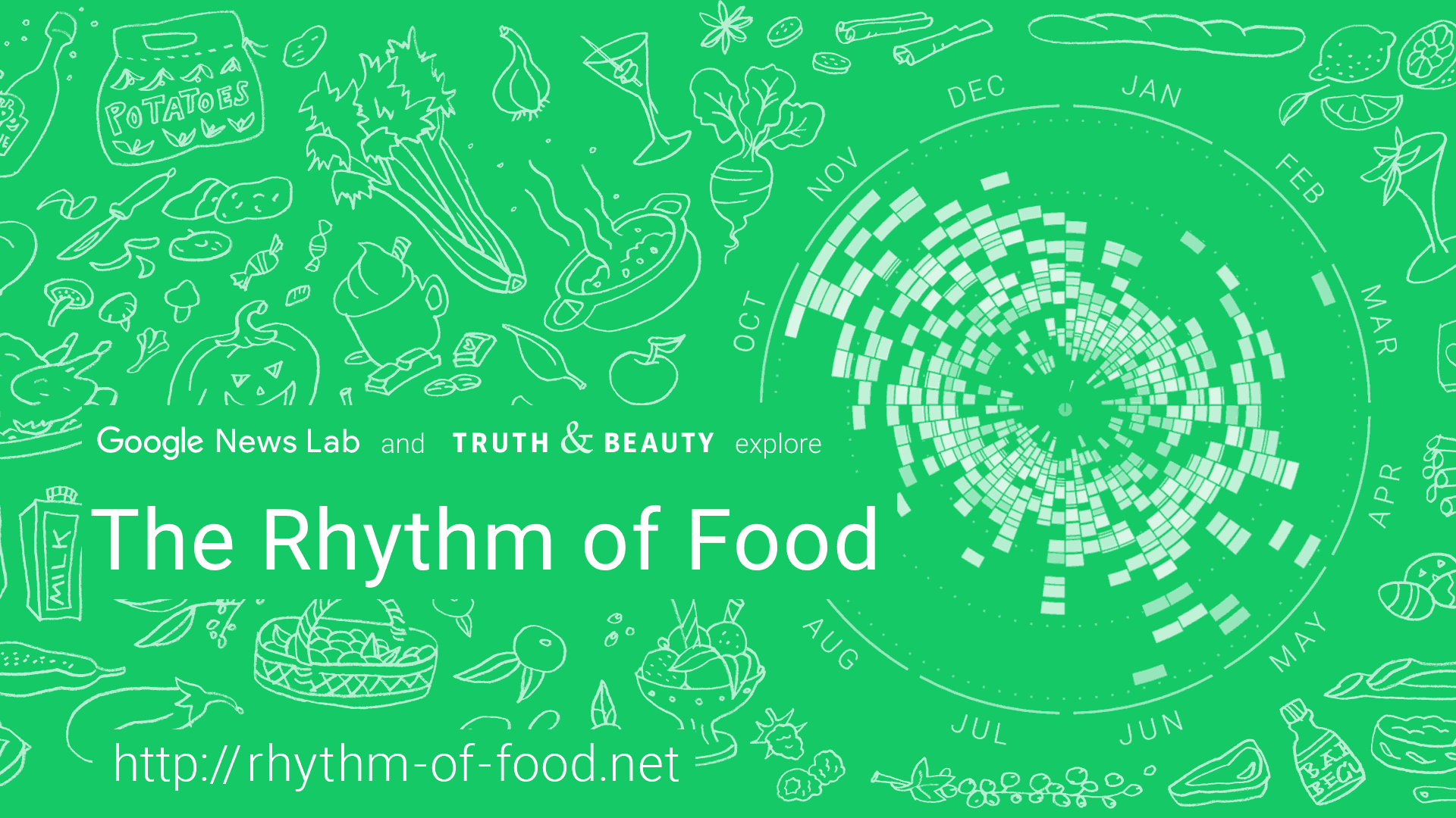


The Rhythm of Food
Analyzing food seasonality
What can we learn about food culture by looking at Google search data? When do people search for smoothies, soup, or fruit salad? The Rhythm of Food, a visualization project in collaboration with Google News Lab, sheds light on the many facets of food seasonality, based on twelve years of Google search data.
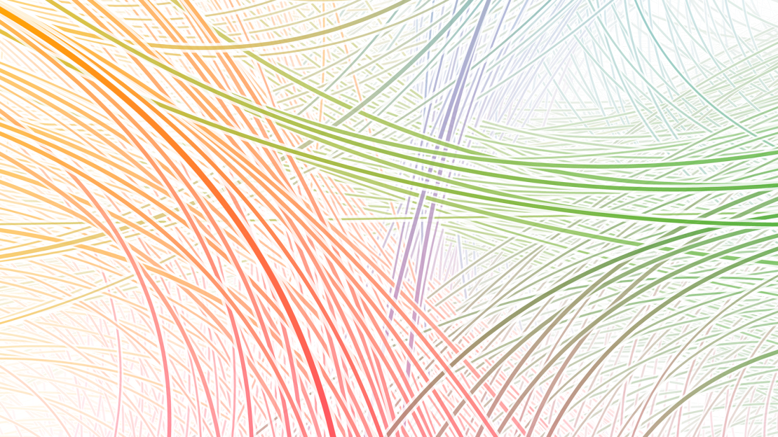
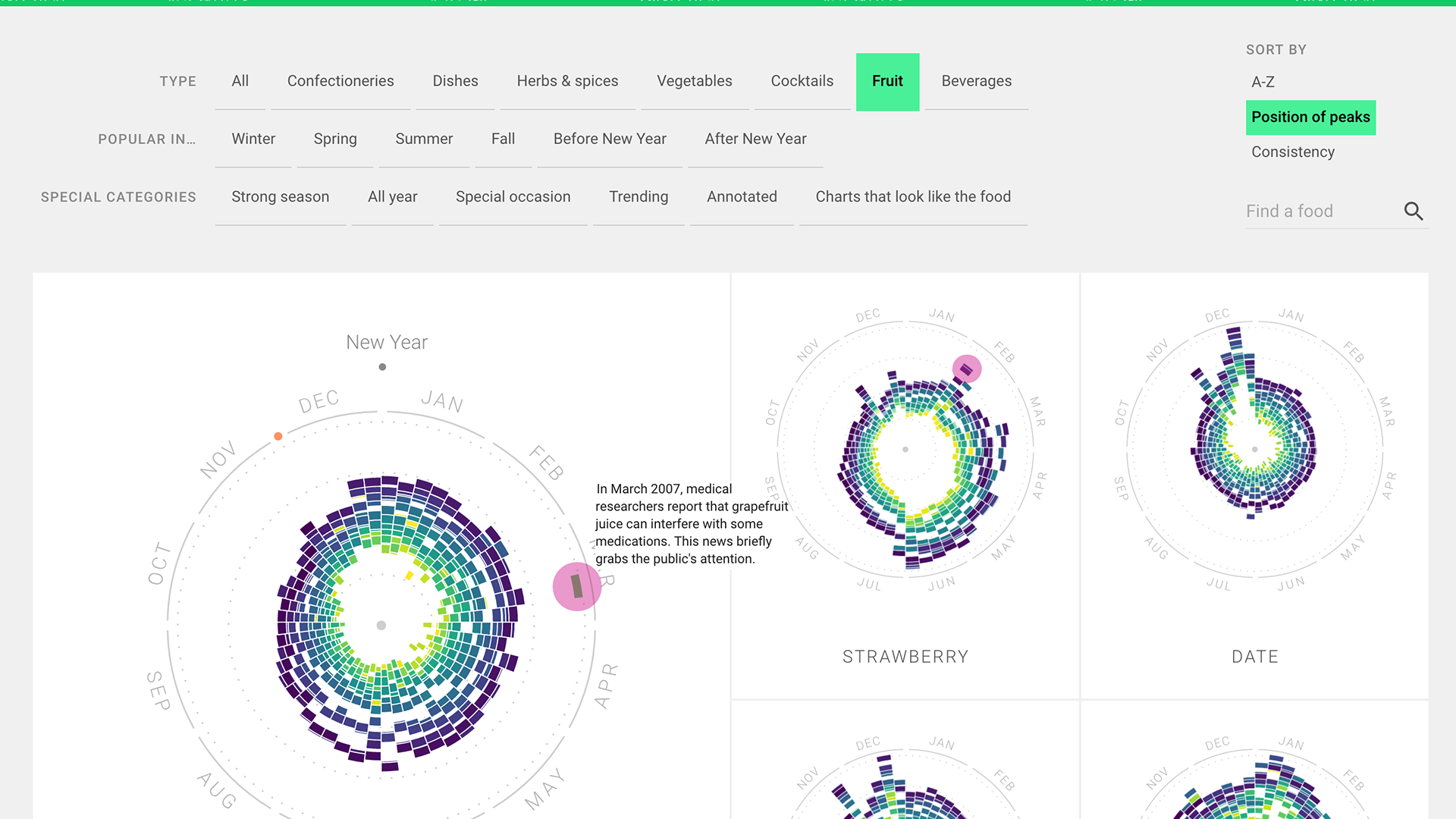
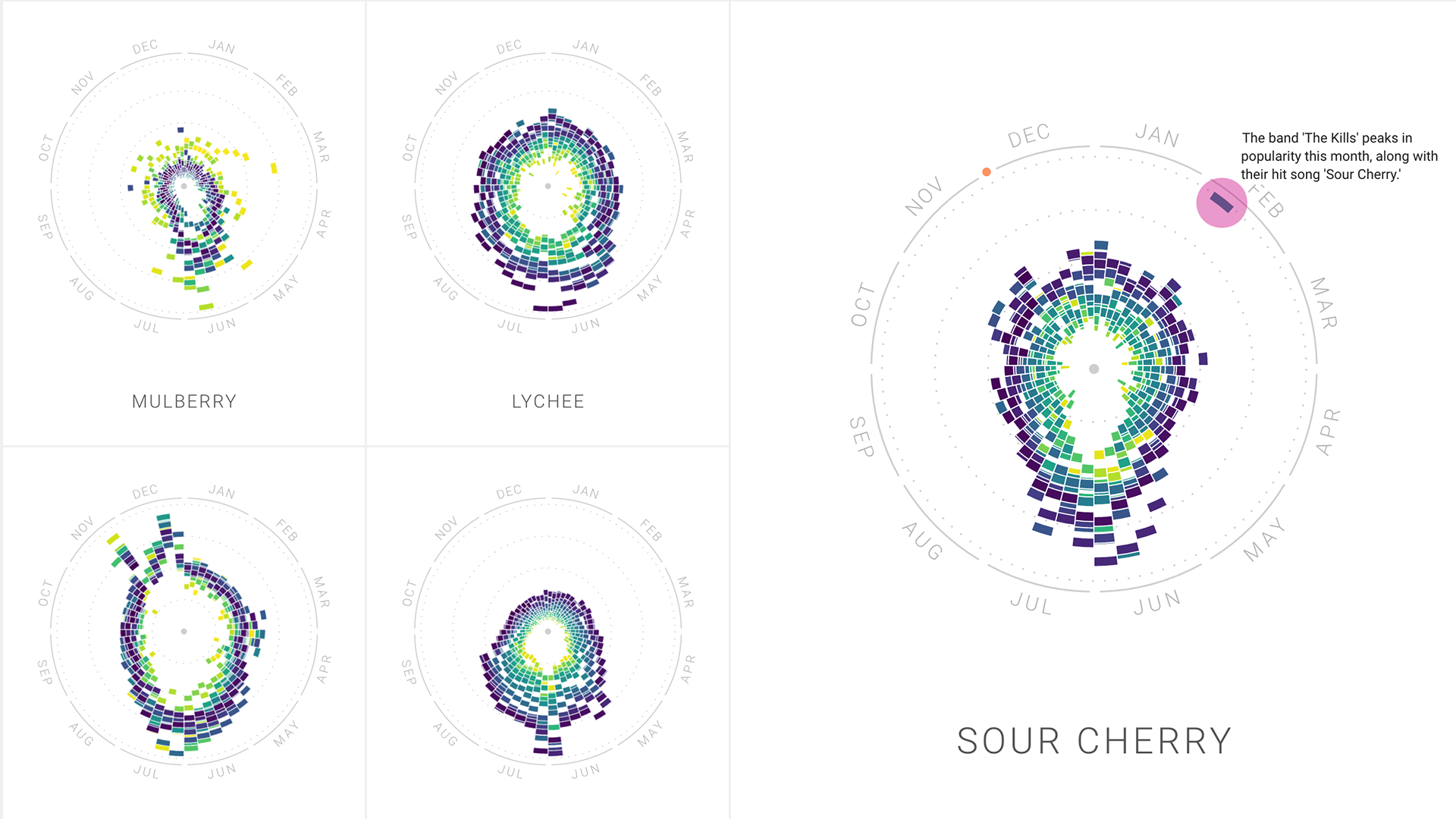
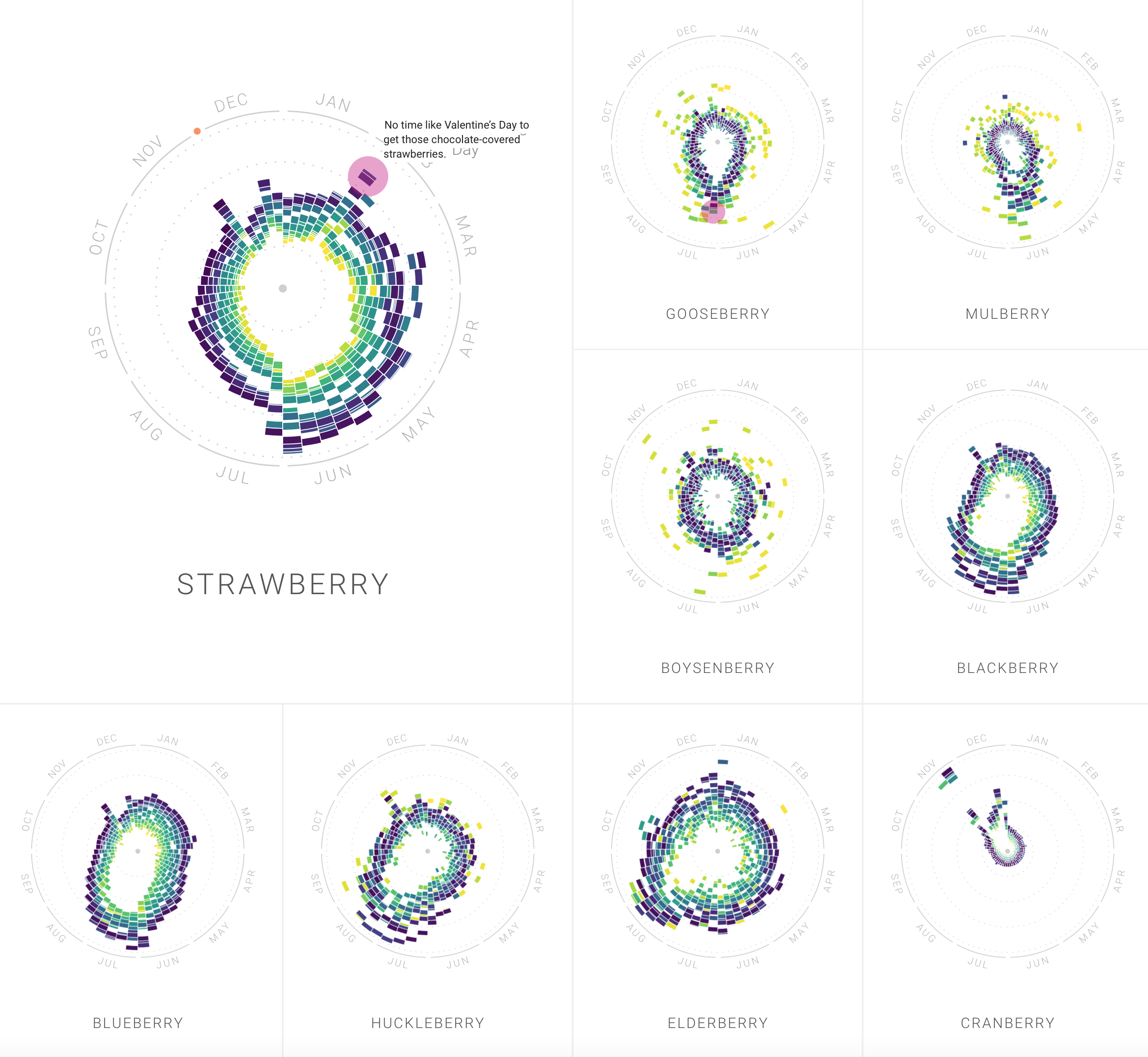
In order to investigate seasonal patterns in food searches, we developed a new type of radial “year clock” chart to reveal seasonal trends for food items. Each segment of the chart indicates the search interest in one of the weeks of the past 12 years, with its distance from the center showing the relative search interest, and the color indicating the year. This allows to spot both rhythms that repeat on a yearly basis (such as natural season, peaks at holidays, …) but also year-over-year trends (such as the rise of avocado or the collapse of interest in energy drinks).
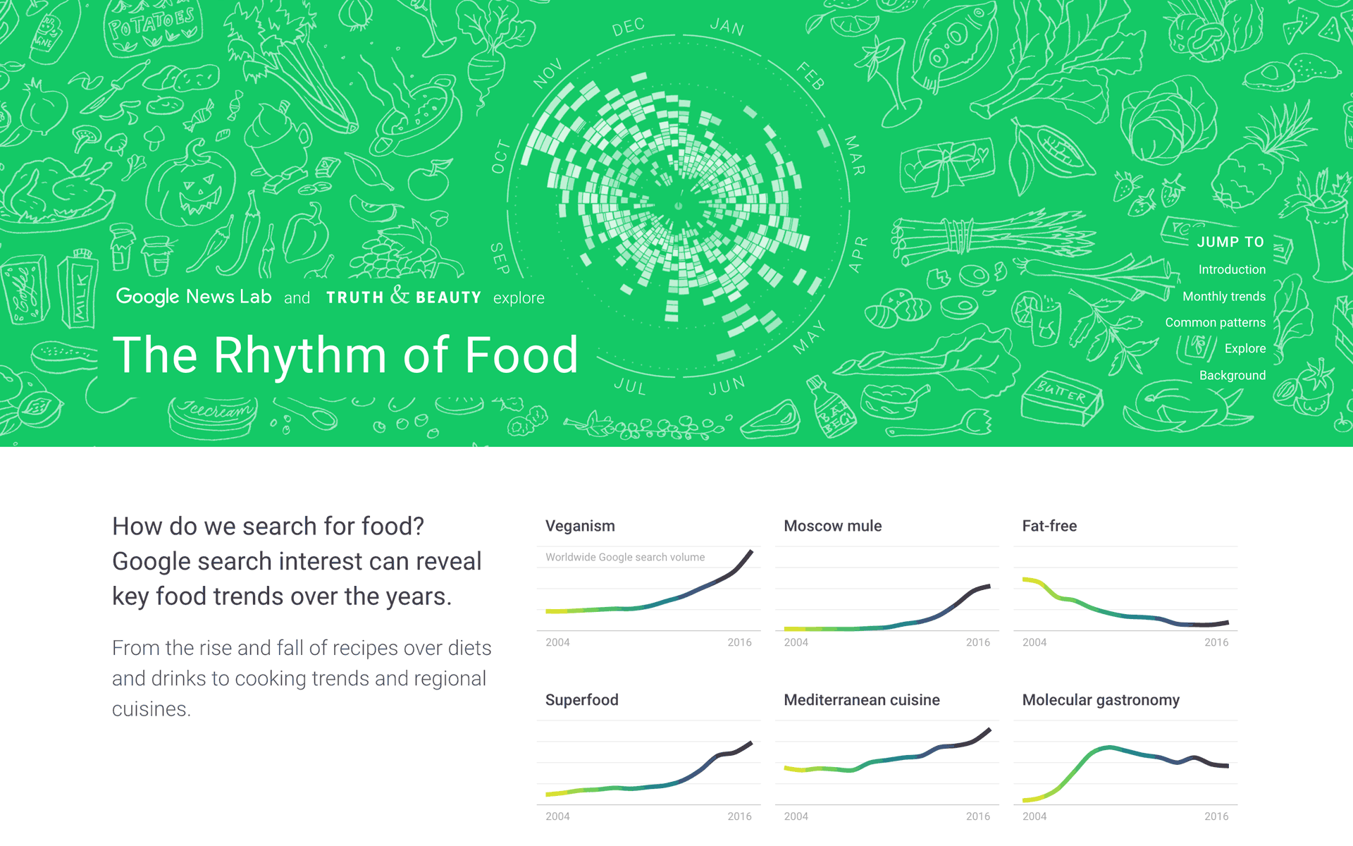
The website Rhythm of Food presents our findings around the seasonality of food queries — from high-level patterns to lots of small anecdotes — and also lets visitors explore the data themselves to great depth. Overall, we present more than 130,000 data points on over 200 topics.

Process
When Google News Lab approached me to work with Google Trends data, it became clear early on that we wanted to investigate a complex cultural phenomenon through the lens of Google search queries. Food was a natural choice — everybody eats, everyday, and looking at food queries turned out to be an amazingly rich resource to explore all kinds of interesting cultural and social phenomena.

In the beginning of this project, we analyzed hundreds of ingredients, recipes, and other food related search terms. More than 12 years of weekly Google Trends data supplied us with a rich dataset to explore food trend over the years and explore all kinds of angles on the data. In the beginning we investigated, for instance, international and regional differences in terms of food queries, or the rise and fall of specific diets and recommendations.

But, the most interesting revelations happened when we looked at the seasonal rhythm of food — first in simple line charts, later in our custom radial charts. We immediately saw how each vegetable, fruit, dish or drink had its own signature seasonality pattern — some are tied to natural seasons, some to special holidays, some are popular all year long.
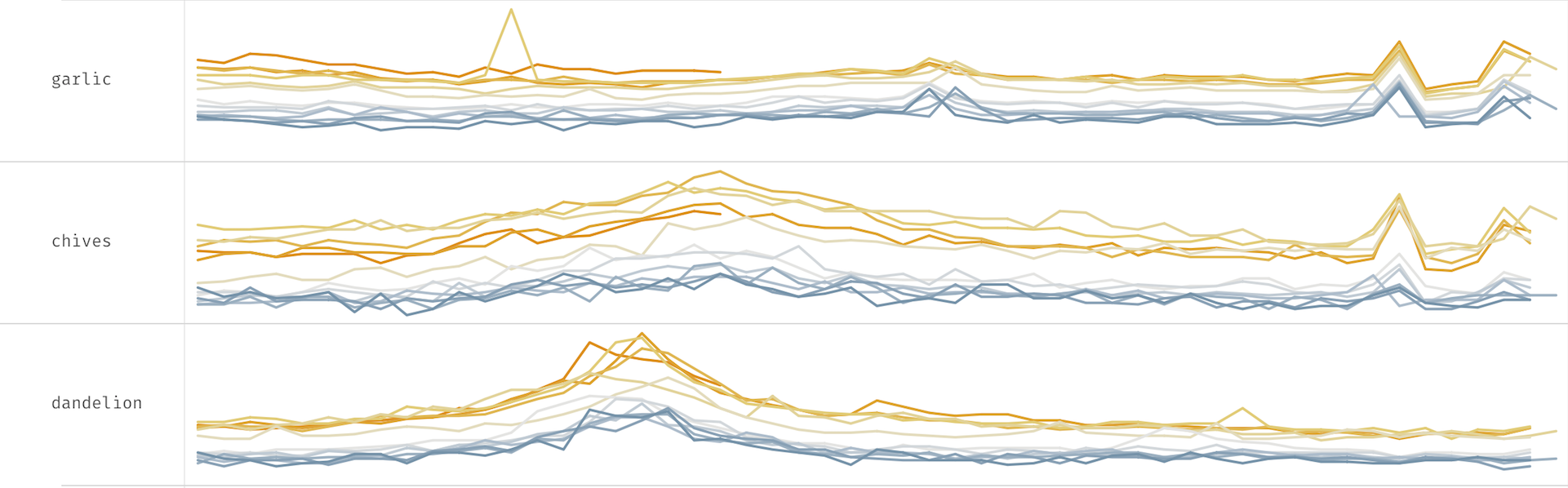
The line charts that gave rise to the project idea
The final chart design we came up with highlights two aspects: first and foremost, seasonality - in which times of the year do people search the most for the food in question. As a secondary information, we also show year-over-year trends through the coloring of the elements. This allows you to see not only how consistent the seasonality is over the years, but also which foods are rising in popularity, and which are falling. Each chart shows a lot of data — in fact, over 600 individual weekly data values — but nevertheless, the relevant patterns jump right at you.
I always try to find unique, intriguing, expressive and elegant visual devices to bring out the most interesting aspects of the data. After the basic data language has been defined, it provides the basis for all following visual design decisions — how do we structure the site, which interactions do we offer, etc. The sensual and diverse theme of food is support through the wonderful illustrations from Federflug, which provide a nice counterpoint to the otherwise very clean and data-driven design.
Narrative structure
Coming up with an innovative new visualization is one thing - but how do you explain it well, and provide quick insights, but also the potential for deep exploration? Do you show a tool first, then explain on demand? Or walk people through clearly structured narrative?
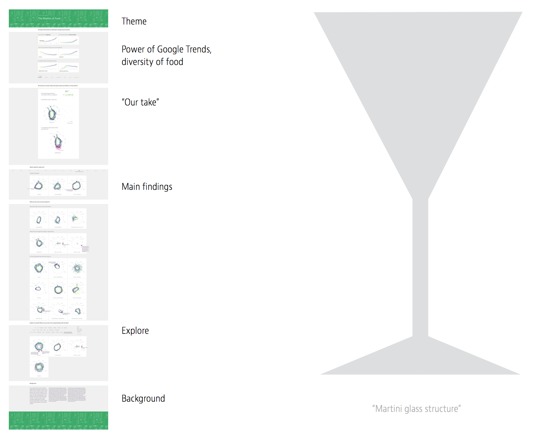
In the end, we settled on a single long web page, following a so-called “Martini glass structure”: Provide a wide overview and introduction to the topic first, then narrow down towards a single, narrative path through the key insights, and then open up to free, self-steered exploration.
The exploration interface offers a mixture of hand-curated and automatically analyzed category. It was a priority to make every search result set interesting, and not put the burden of finding interesting selections on the user. If there are no results from the free keyword search, we direct users to the corresponsing Google Trends search, but also track the searched food item in the backend, so we can improve our selection over time.
Animation
Animation can be a powerful device - but also draw a lot of attention or overwhelm viewers. We decidedly used it in the explanatory part of the website, to show how the charts can be read:
Explanatory animation - how do we get from simple bar charts to our radial chart? (vimeo)
And, there's also animated versions of each chart — hidden in the detail view which opens on click. A pleasant surprise for anyone who digs deeper :)
Animated versions of some of the charts (vimeo)
Annotation and sharing

Annotation and guidance has been a crucial part of the project. Destry Sibley researched the explanations behind many of the peaks and peculiarities in the data and added little “annotation dots” to the charts to add explanatory context.
Another important aspect is sharing and commenting — we made sure all of our charts can be downloaded and shared on social media very easily.

Technology
This project was built using ES2015, webpack, react, Material UI, and d3 v4. The color scale used for the years is viridis. Thanks to Yuri Vishnevsky and Dominikus Baur for the great development and design support.