OECD Regional Well-Being
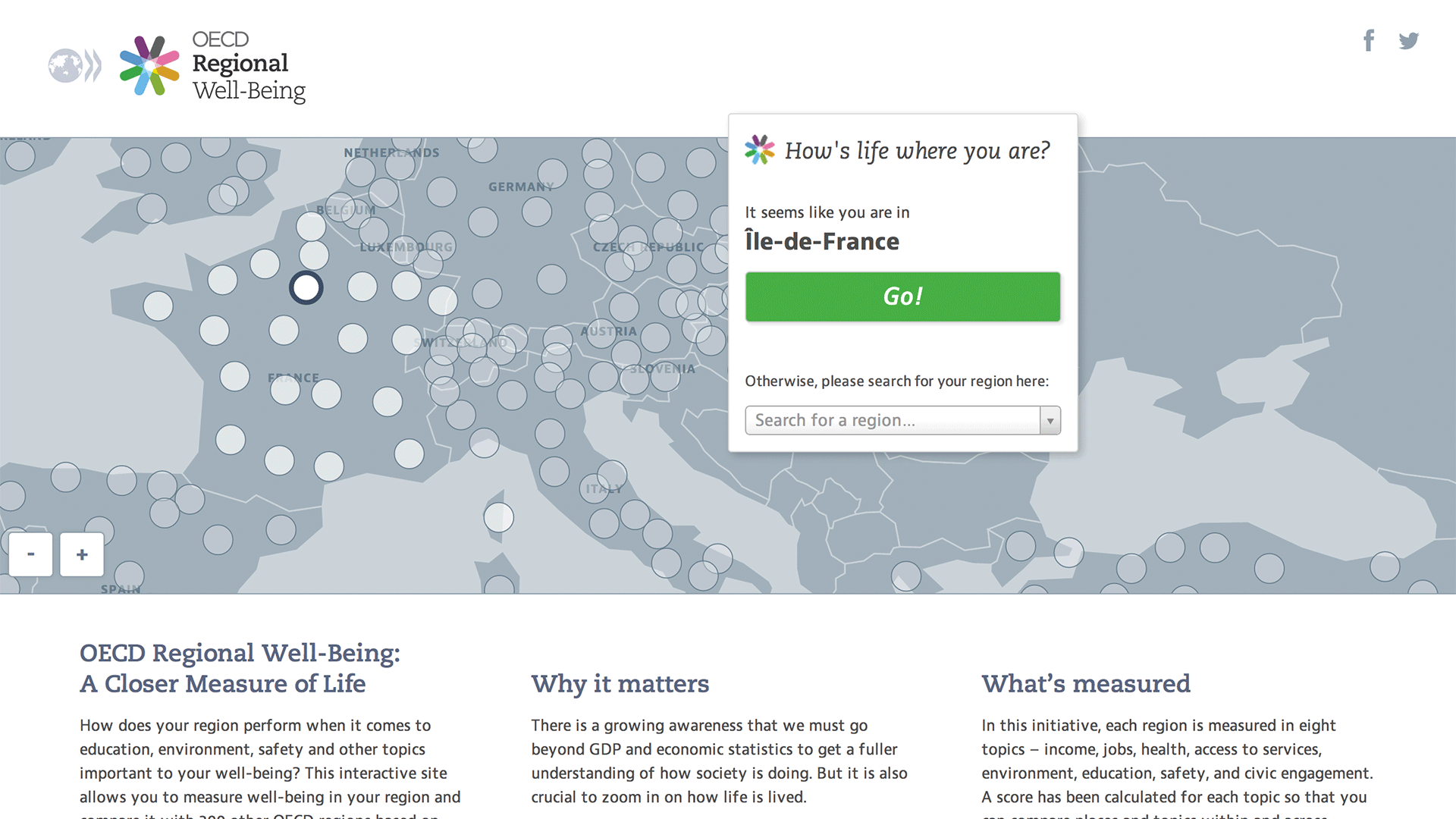
How is life where you are?
The site presents an exciting new perspective on more than 300 regions worldwide. As we all know, conditions inside a country can differ quite drastically, so going beyond the country averages presents an important step in the Better Life Initiative.
How is Life around you?
The user experience of the site is very consciously centered around the comparison of single regions in their context. Instead of presenting complex overviews, we start the experience with what people know best — their own home region. How does it compare to other regions in their country? And across all OECD regions? How have things developed over time?
Design rationale
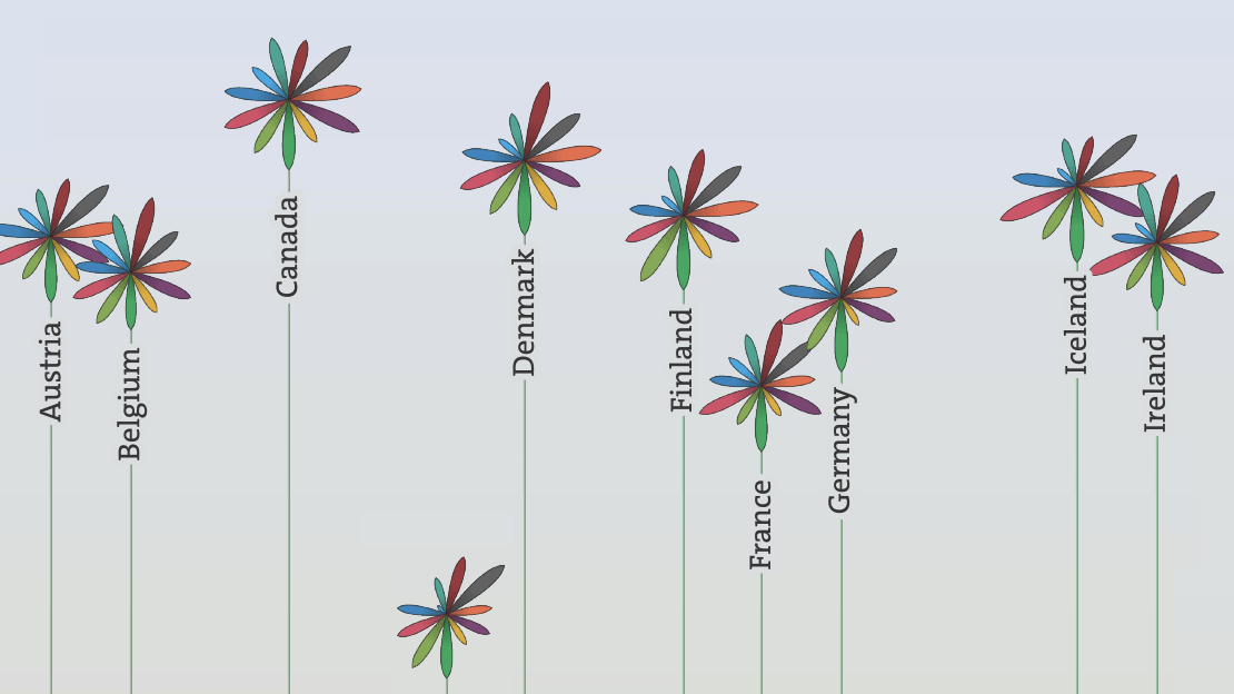
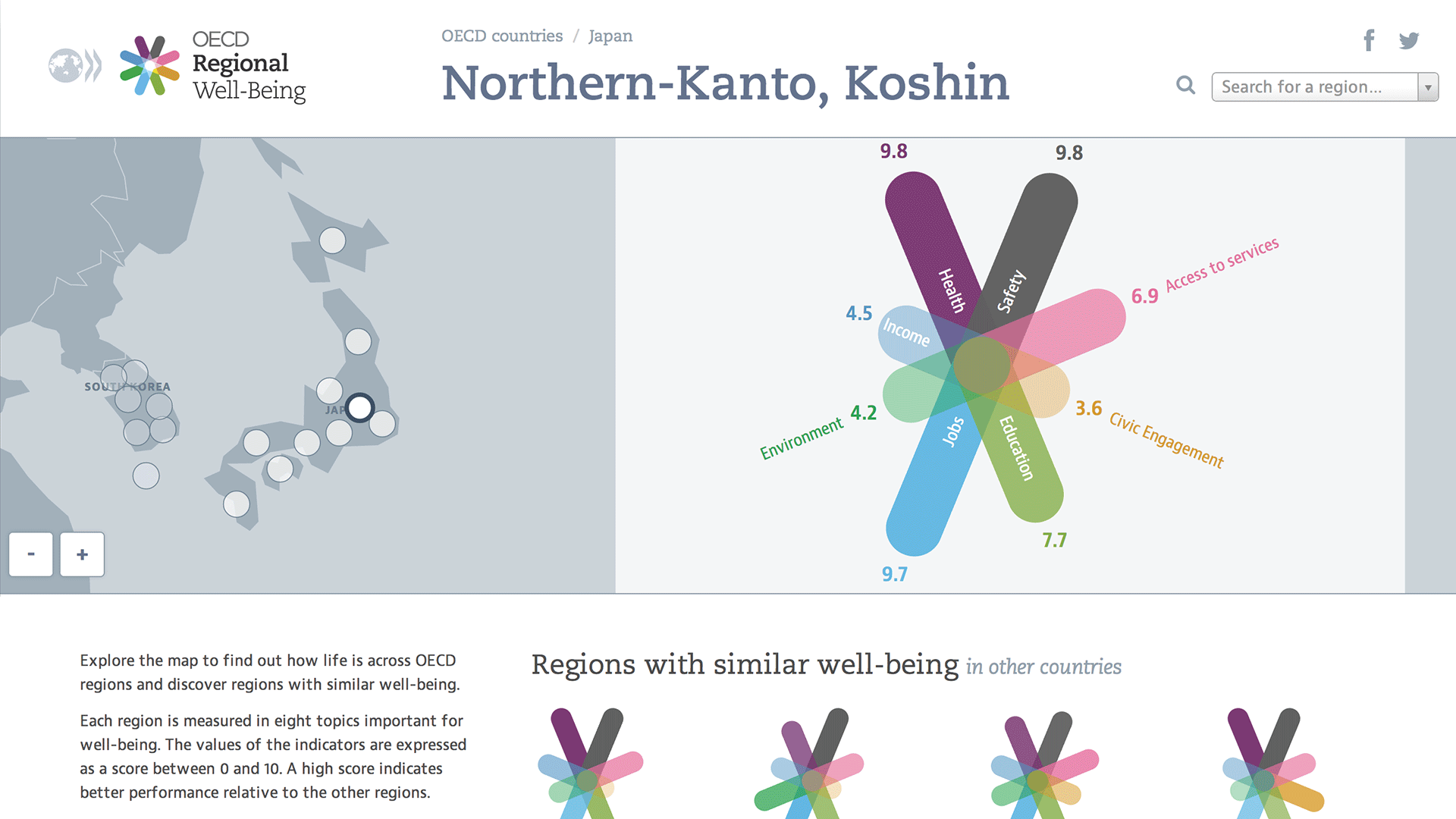
The key visual element — the multi-colored star charts — represent the diversity of aspects we need to consider at when talking about regional differences. Each region receives a unique symbol, representing its particular well-being profile. This design principle was pioneered in the famous flower design of the OECD Better Life Index — which is part of the same initiative — and was now brought to a new logical extension for this new “family member”.
Serendipity by design
Reflecting your own region in context provides a natural starting point for further explorations. One particular option we offer is the “Regions with similar well-being” section, which suggests regions with similar indiator values all over the world. Who knew that Texas and Scotland are actually not that far apart, when it comes to well-being (well, except for the Safety aspect)? Or that Berlin has a similar profile as Alsace?
Taming complexity
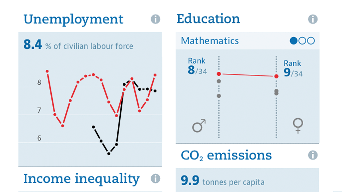
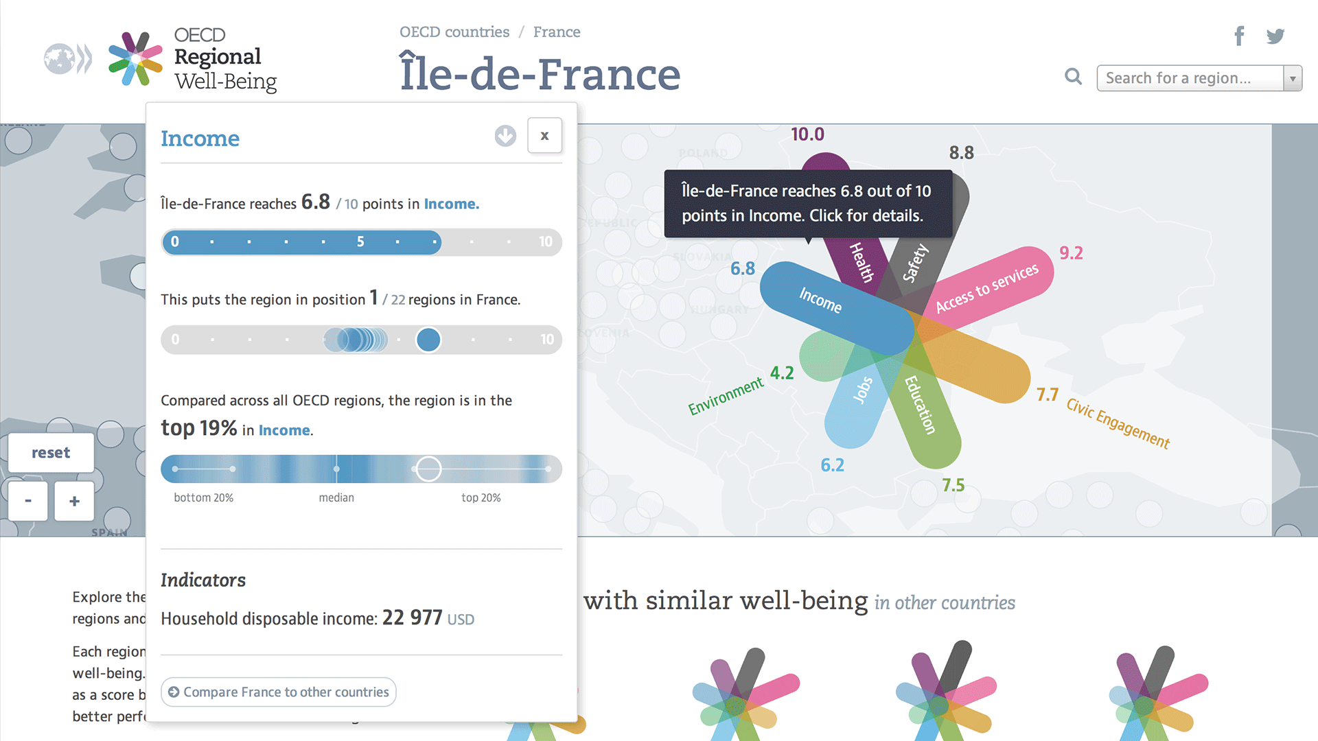
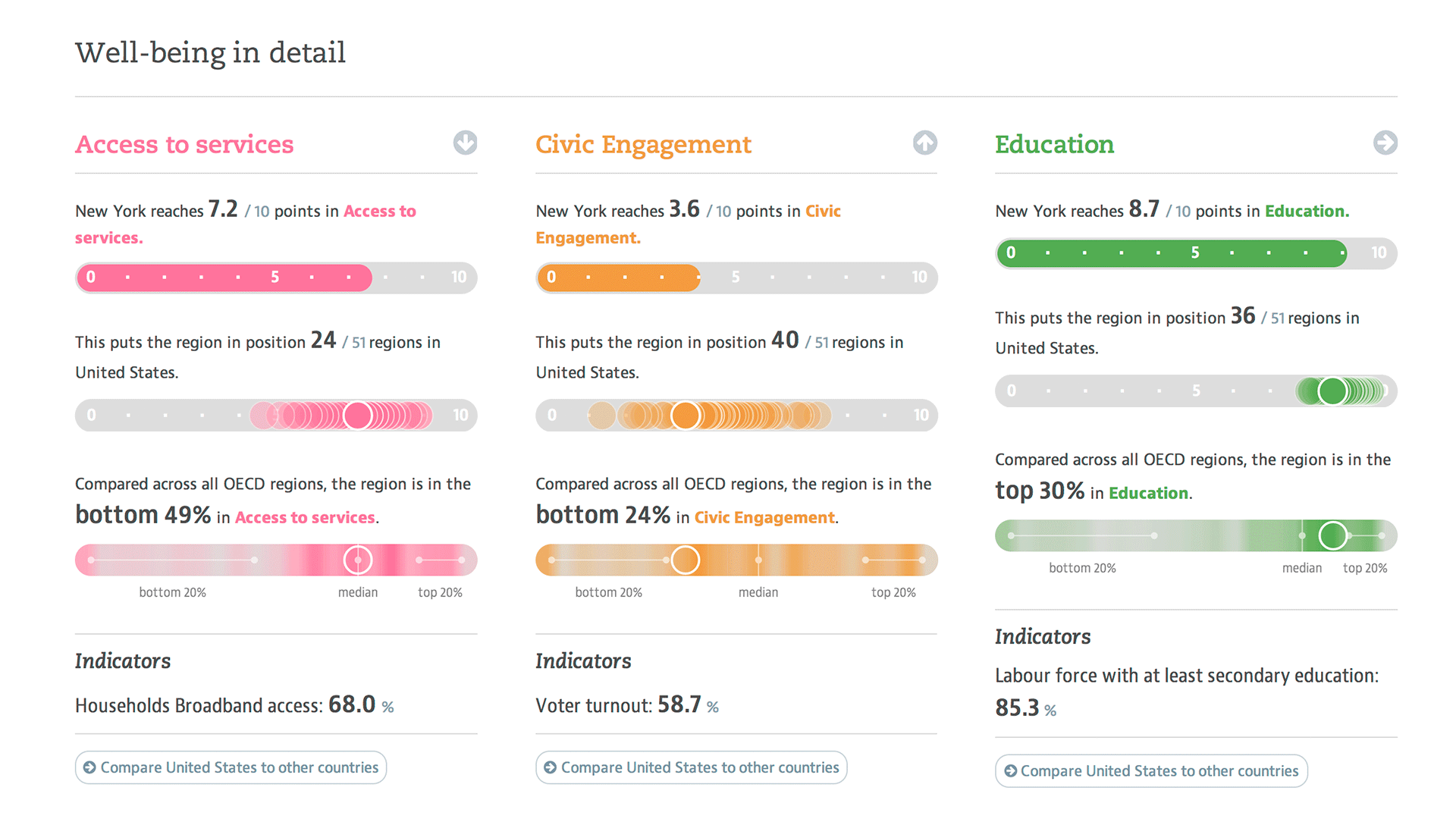
From a design point of view, the main challenge has been to deal with the complexity and scale of the data set. With ten indicators per region, most of which have also trend values, and 362 regions in the dataset, the site provides access to over 7000 data points. In designing the site, we made sure to introduce a hierarchy of information that presents the most important values values at a glance, but at the same always provides the context to a single data points that makes it meaningful, and reveals deeper information step by step.
Sharable factoids
Another detail we really like is that we added twitter and facebook buttons to all the auto-generated short factoid sentences, so you can easily spread facts you find interesting or surprising. Just hover with your mouse and wait for two seconds for the pop-ups to appear.