OECD Data Portal
Open, accessible, free
In an ongoing effort to make their data open, acccessible and free, the OECD commissioned Raureif GmbH to envision and design a new platform to make their vast data sources accessible to the public. In this highly complex ambitious project, I was responsible for the data visualization strategy and design.
Unlike many of my other projects, this project is less about spotting patterns in the data, or communicating insights, but starts one step earlier: How can we actually make large collections of data sets available, and how can we guide users to the datasets they are looking for?

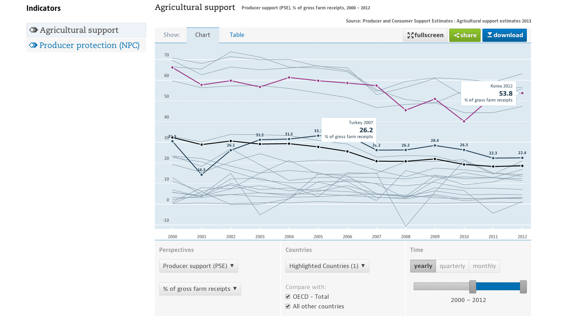
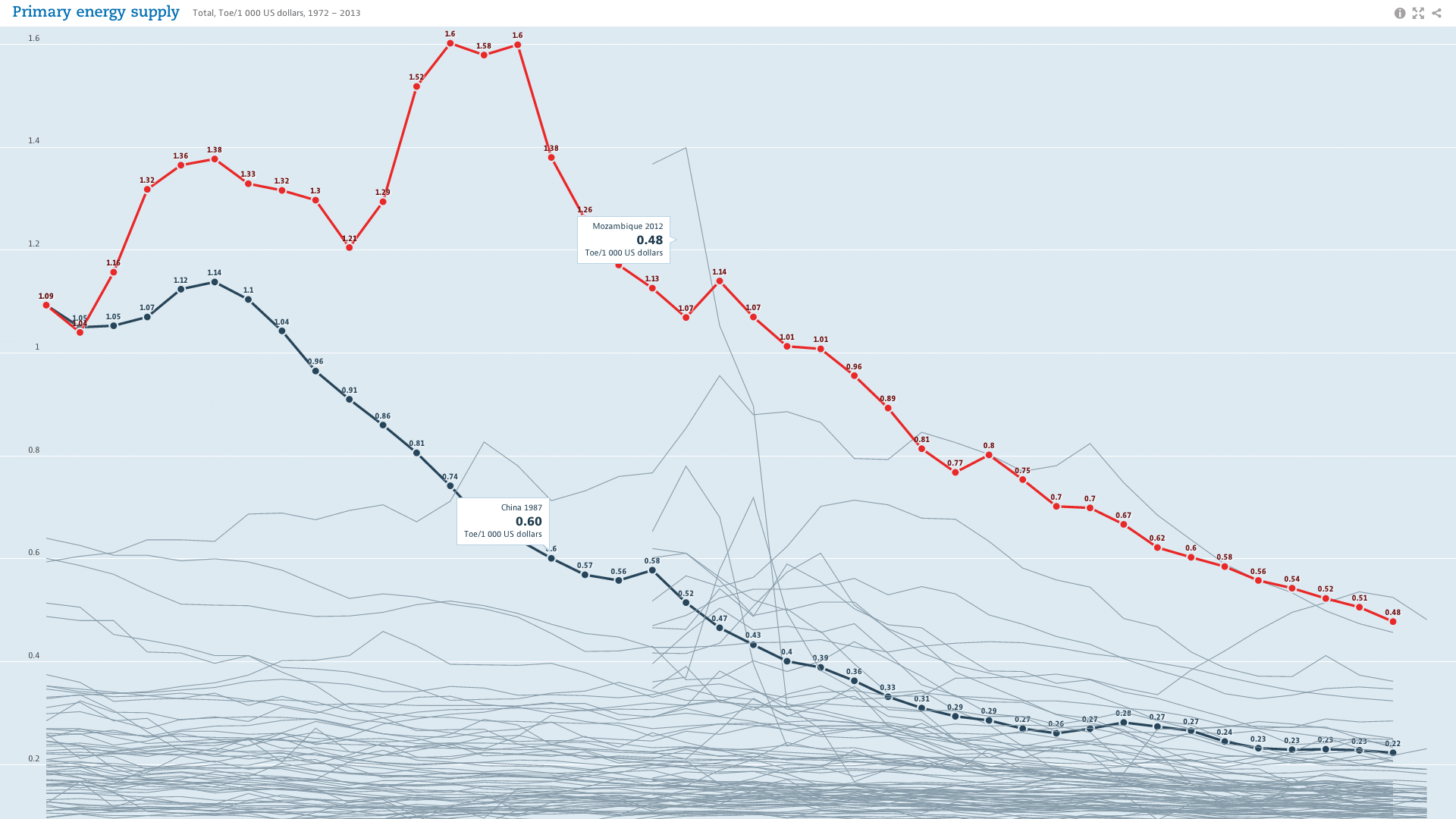
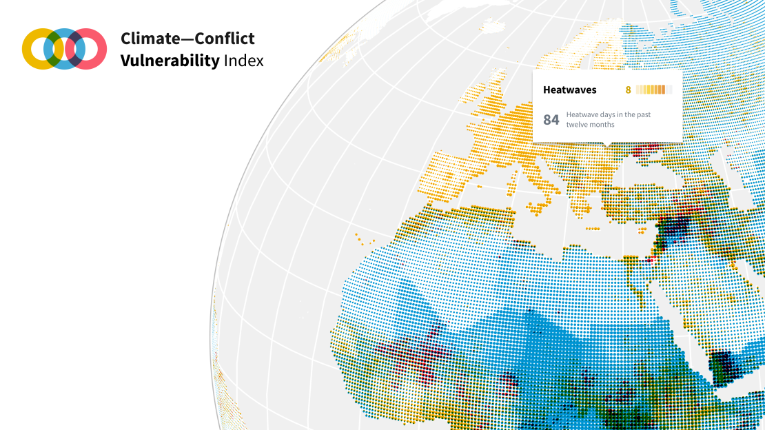
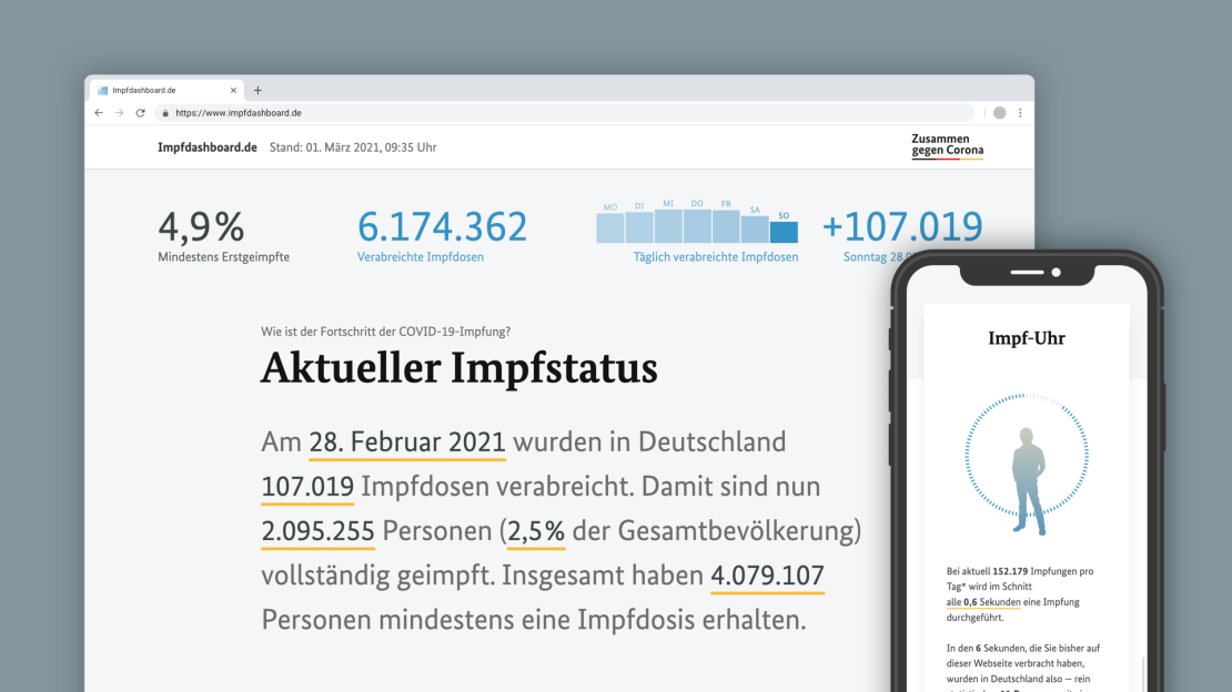
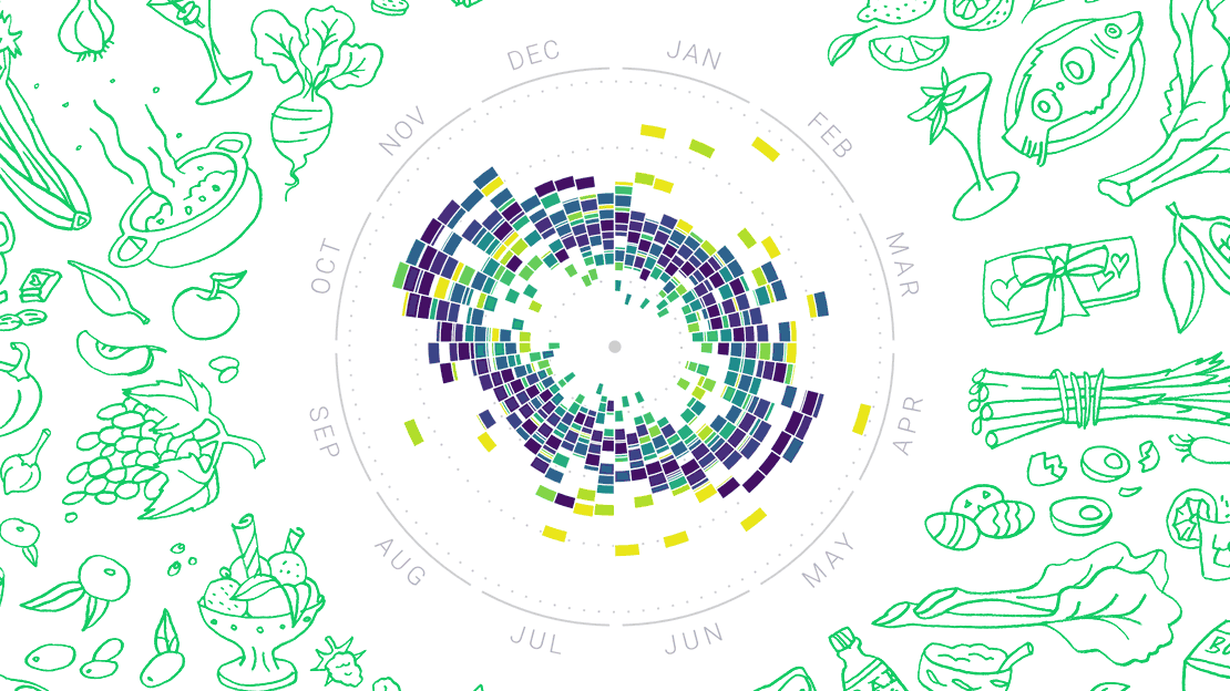
The design of the data visualizations reflects that purpose: Much emphasis has been put on responsiveness, the charts have flexible sizes and functionalities, depending on context – from full screen piece to tiny list element, all of our chart types will always look good and work well. Of course, responsiveness does not mean to draw everything smaller, but to think about reasonable functionalities for all sizes – for instance, moving the subtitles, title, and caption elements into little info buttons for small sizes, and dealing in a smart way with axes, grids, and annotations.
Find a few notes on the design features and rationale at well-formed-data.net

