

I live and breathe data visualization —
as an independent designer and consultant.
I help organizations, researchers and businesses to
find truth and beauty in relevant and meaningful data.
How could we work together? Let me know!


I live and breathe data visualization —
as an independent designer and consultant.
I help organizations, researchers and businesses to
find truth and beauty in relevant and meaningful data.
How could we work together? Let me know!
Explore Explain S6E8 with Enrico Bertini
Together with Enrico Bertini, I appeared in a special two-part episode of Andy Kirk's Explore Explain series. We each shared five significant visualization-related works by others that have most influenced our thinking about data visualization, plus a selection from our own work that has been significant to our careers. Watch part 1 and part 2.
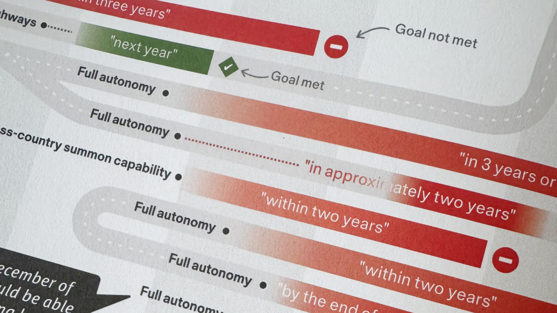
INGRAPHICS contribution
INGRAPHICS is a „magazine for visual thinkers“ — and I was kindly invited to contribute a double spread.
I created a visual overview of the long history of Elon Musk‘s not-quite-materialized predictions on autonomous cars.
The magazine is full of stunning visuals, and completely self financed. Grab a copy — it’s worth it!
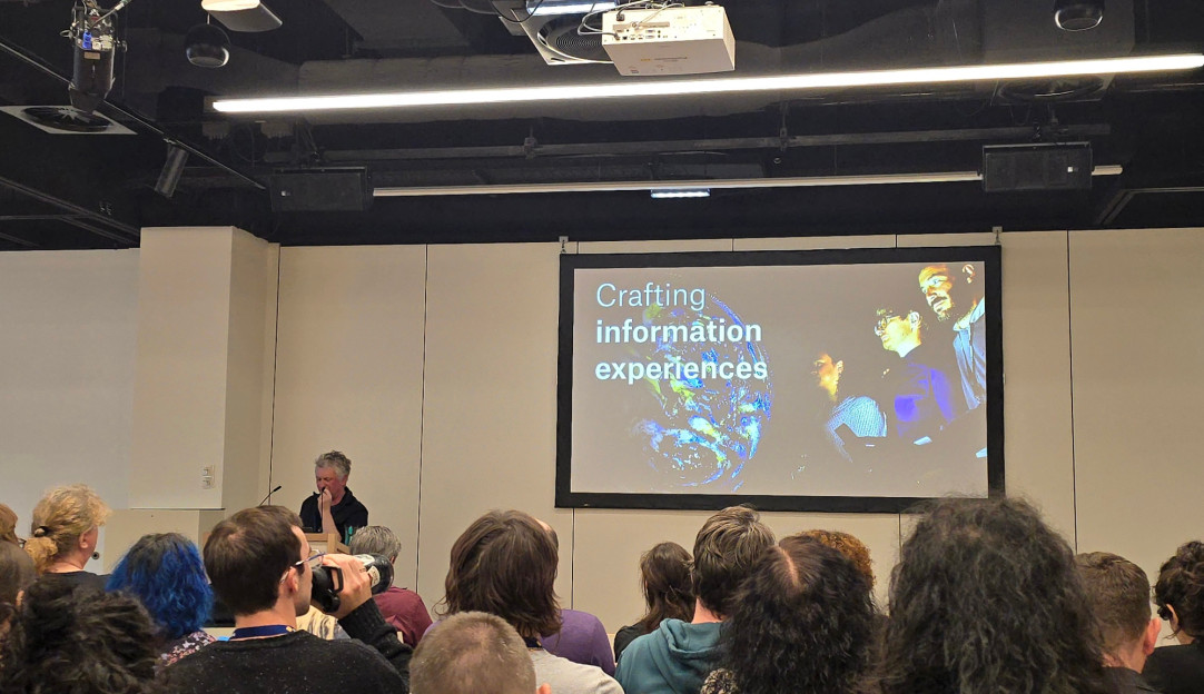
VISCOMM keynote 2025
As invited keynote speaker for the VISCOMM workshop at IEEE VIS conference, I talked about current trends in data visualization, my design approach, and how our profession is changing in the recent wave of AI tools.
Truth & Beauty for the German administration
At the 11th Öffentliches Gestalten meetup on "Visualising data", hosted by CityLAB Berlin and DigitalService des Bundes, I shared more recent work for and with the German Federal government — including the Climate—Conflict—Vulnerability Index (CCVI) for the Federal Foreign Office and the official COVID-19 vaccination dashboard for the Federal Ministry of Health.