Image 1 of 3
Where the wild bees are
Making complex research visually accessible
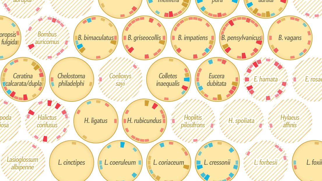
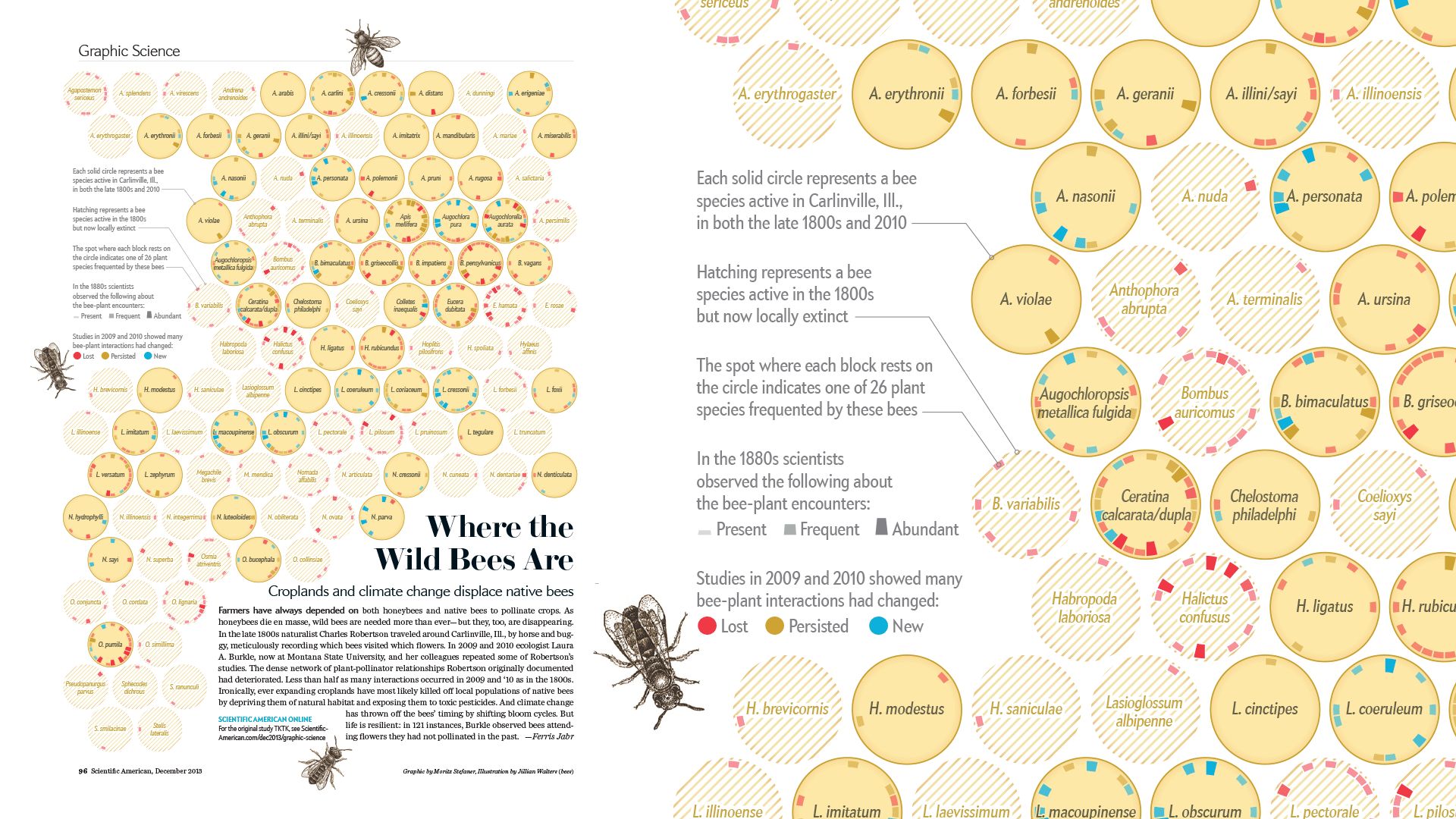
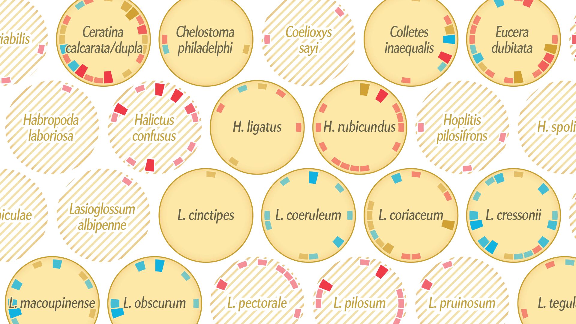
How has the bee population changed over the last 120 years, and how has that affected bee-plant interactions? Scientific American commissioned me to design a custom visualization of a complex dataset.
In collaboration with Jen Christiansen (Scientific American art direction), Jillian Walters (Illustration)
Design process
Find a recap of my design rationale and process at well-formed-data.net
Related

Keynote at VIZBI 2019
I was invited to give a keynote at VIZBI, the scientific conference for visualizing biological data. I talked about "The art and science of data visualization" — reaching from data legibility to data art, and bigger questions in the relation of the arts and the sciences.

Best American Infographics 2014
Where the Wild Bees are is featured in Best American Infographics 2014. Thanks to Jen Christiansen and Jillian Walters for the great collaboration!