Services
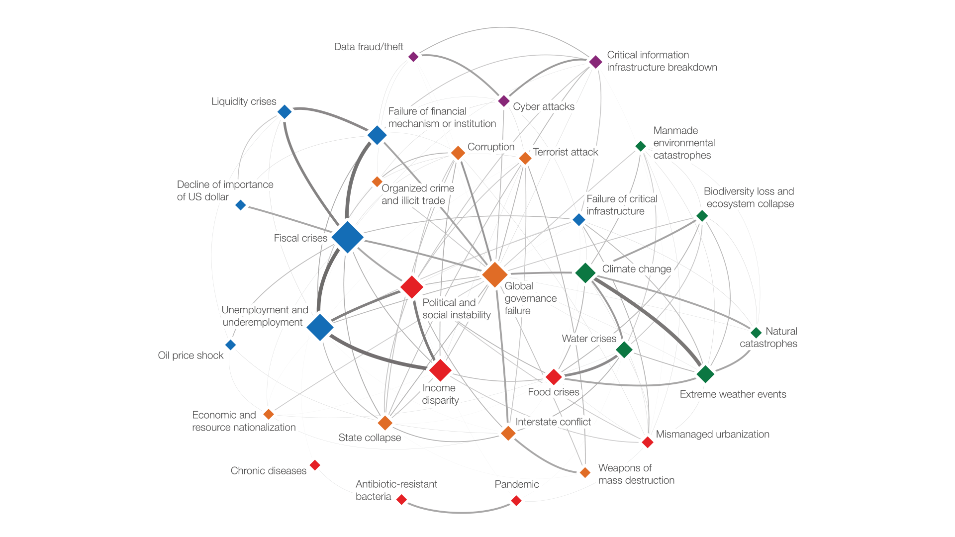
As an independent consultant, I’ve helped organisations like the OECD, World Economic Forum, Google, Deutsche Bahn, the WHO, Salesforce and the Max Planck Society make sense of large, complex data — as custom visualizations, interactive tools, and the design systems that keep data clear at scale.
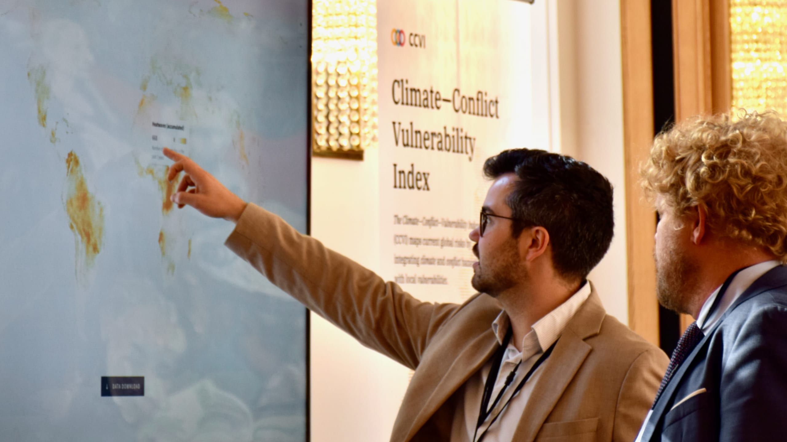
Bespoke data tools & experiences
Custom interactive and static visualizations, built from your actual data — for reports, products, campaigns, exhibitions and the web. From first sketch to shipped experience.
“Peak Spotting took one of our hardest operational questions — where and when trains will be overcrowded across the entire network — and made it something our planners could actually see and act on, up to 100 days ahead. Moritz has a rare ability to turn enormous, messy operational data into a tool people trust and genuinely use.”
Examples
- Peak Spotting — Managing passenger loads in the German rail network
- Climate—Conflict—Vulnerability Index — Climate × conflict risk for the Federal Foreign Office
- OECD Better Life Index — How's life beyond GDP?
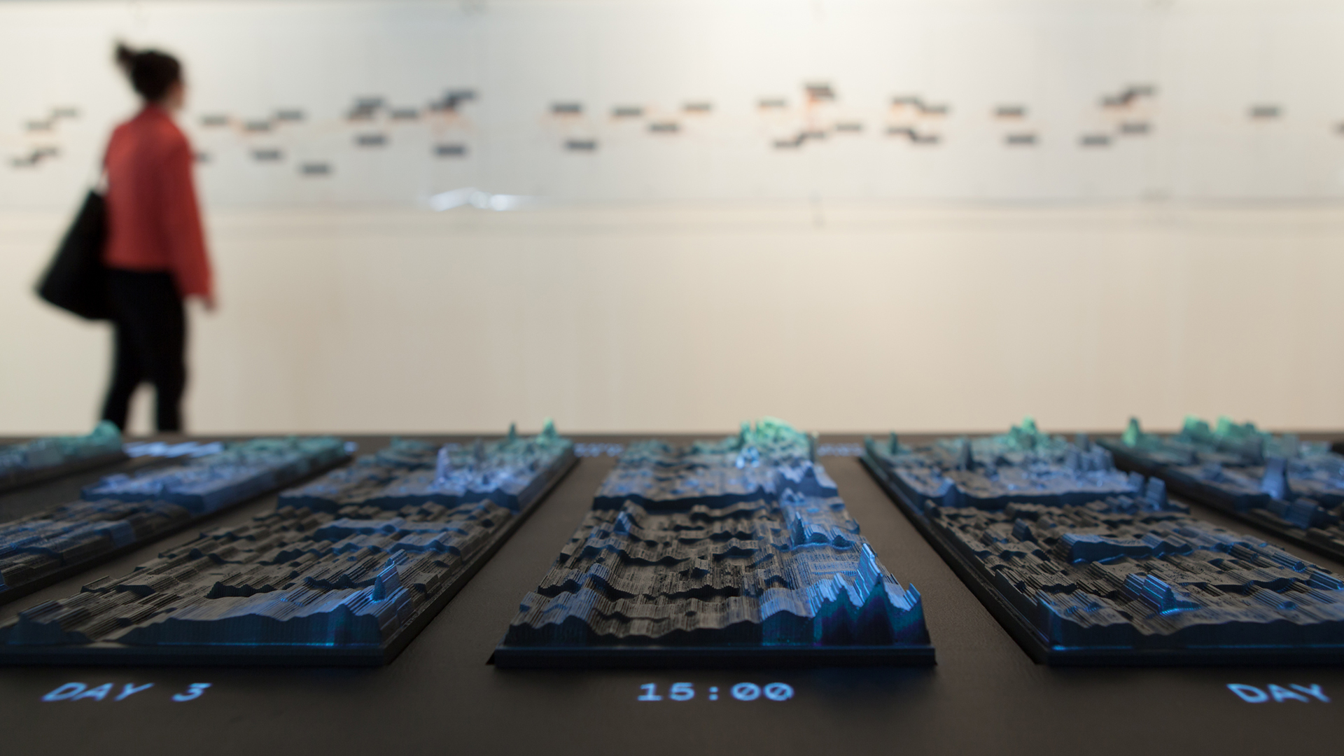
Data art
Data-driven artworks, installations and physical experiences — from edible visualizations to data sculptures — for festivals, galleries, exhibitions and brand spaces. Where the goal is to make people feel a dataset, not just read it.
“Moritz and I have worked together since the early days of Emoto and through Project Ukko and GROW at FutureEverything. He treats a dataset the way an artist treats a material — with curiosity, rigour, and the patience to find the gesture that actually lands. The work has stood up on festival floors, in galleries and at scientific institutions, which says everything.”
Examples
- Emoto — Exploring emotional responses through data
- Data Cuisine — What is the taste of data? Edible data experiences.
- Perpetual Plastic — Exploring the lifecycle of plastic waste
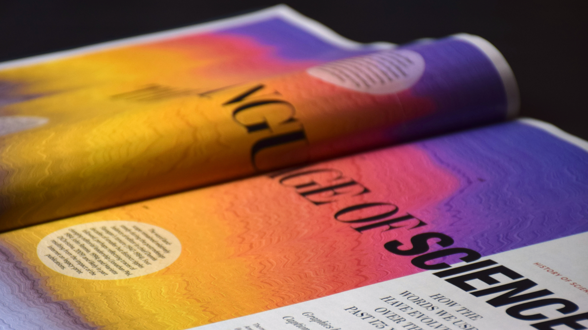
Science communication
Translating research and complex datasets into visuals that non-specialist readers can follow — without flattening the science. For magazines, journals, research institutions and labs who want their work to land beyond the field.
“Moritz consistently demonstrates a critical combination in the field of science communication; respect for the data, the researchers, and the reader—along with the knowledge and craft to honor all three at once. Our Scientific American piece on 175 years of language change was a pleasure to work on. His clear communication style and collaborative spirit energized the whole team. He pushed back where he needed to and deferred to others where it served the story. The result is sharper for it.”
Examples
- Scientific American 175th anniversary — 175 years of language change in science, on the cover and inside the magazine
- State of Neuroscience — Putting 50 years of neuroscience research on the map
- EPFL Data Monolith — A birds-eye view on EPFL's sprawling ecosystem of research
- Where the wild bees are — Making complex research visually accessible
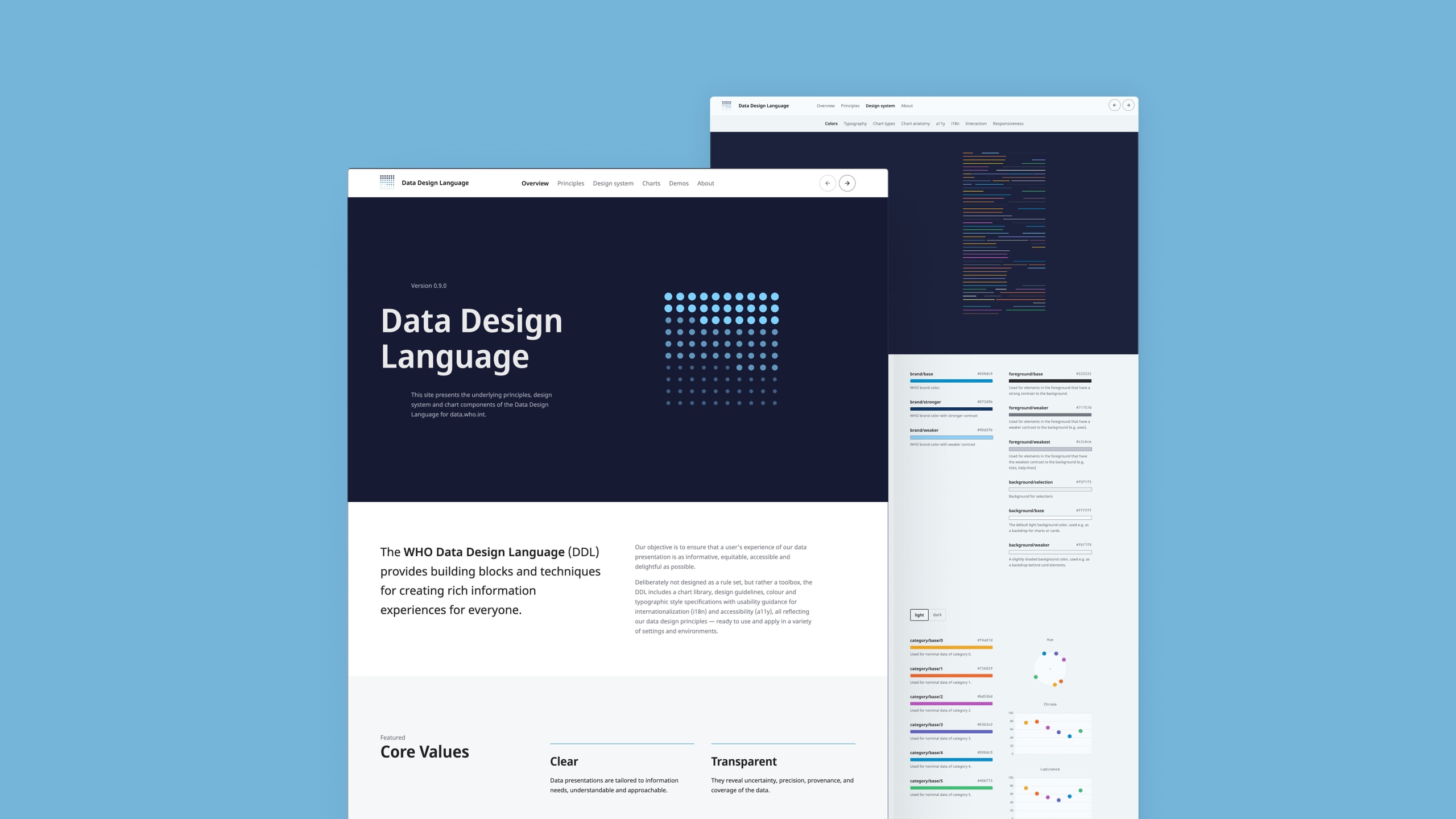
Data design systems
The building blocks that let a whole organisation produce clear, consistent, accessible data graphics — chart libraries, guidelines and templates.
“Working with Moritz on the WHO Data Design Language was a masterclass in turning a complex, diverse brief into a coherent system. His creative direction was sharp without being precious: clear about the why, generous with the how, and a pleasure to build alongside.”
Examples
- WHO Data Design Language — Rich data experiences for public health data
- Climate—Conflict—Vulnerability Index — Climate × conflict risk for the Federal Foreign Office
Consulting & creative direction
Strategy, concept and direction for ambitious data projects — often the long, invisible work of figuring out what to show before how. Or, if your team just needs focused input on dataviz-specific questions: advisory engagements and expert reviews.
“We brought Moritz in at a moment when our ambitions for the product had outgrown our visual language. He helped us figure out what to build before how to build it — not by handing over a deck, but by working through real product decisions alongside the team. Moritz is a world-class designer, but what makes him rare is that his taste is matched by product judgment: calm, hands-on, opinionated where it counts, and refreshingly free of consultant theatrics.”
Examples
- World Economic Forum — Long-term consulting for global issues
- Salesforce — Dataviz and design support for early internal AI research
Selected internal consulting clients
Salesforce · Airbnb · Covestro · Swiss Re · RetailAI
Keynotes & workshops
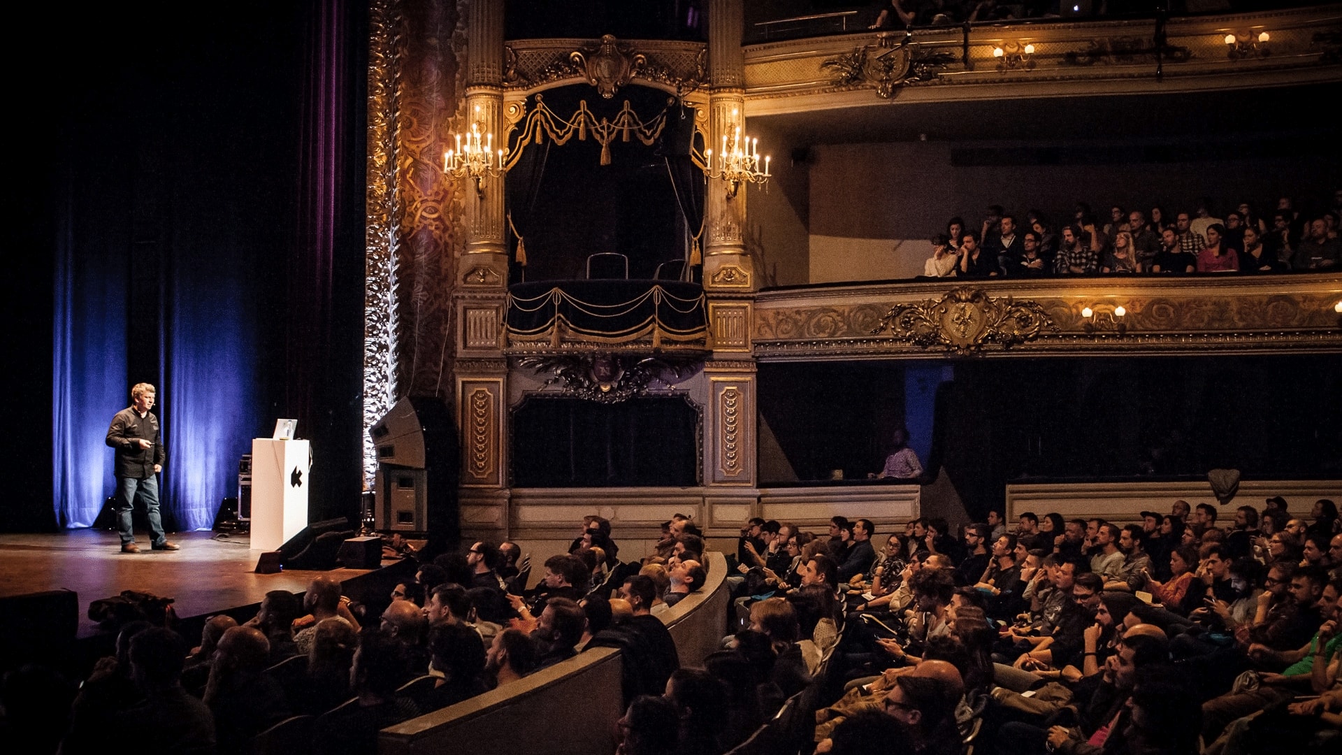
Keynotes and hands-on training that get teams genuinely excited about data — and better at exploring and presenting it.
“Moritz was one of the most talked-about speakers at Solutions Hamburg. He shows genuinely complex data work without ever making the room feel small. People walked out energized, with concrete things to try the next morning. That combination of substance and warmth is exactly what makes a keynote land — and Moritz brings both.”
Examples
- Keynote at EUROVIS 2022 — On the iconic power of data visualization · Rome
- The dataviz mindset — A presentation on the stories and thinking behind impactful data projects
- Speaking topics, formats & booking — My most requested topics, upcoming dates and availability
Selected workshop clients & venues
AirBnB · Graphic Hunters · Deloitte · IEEE VIS · Max Planck Society · Deutsche Bahn · SAP · University of Oxford
How I work
Principles
- Holistic My projects reflect my position not only on how to present data and information, but also how to collect, measure, aggregate, compare, and juxtapose it — in which granularity, for which people in which context, and to what end — aiming at a holistic view on human-data interactions.
- Purpose-driven I always clarify Why, What and For Whom before worrying about the How too much. The application needs to make sense, and needs to help make sense.
- Hands-on I design with actual data, using code and in contact with the audience. “Data goes here” is not a valid design strategy for data-intense projects.
- Iterative Explore, design, evaluate, rinse, repeat. Insights cannot be simulated — they need to be experienced. Visual languages need to be tested, and refined.
- Truth > data All data is incomplete, biased, and imperfect. But some data is closer to the truth than others. At all times, my goal is to show the right perspective on the data. I think and act foremost like a journalist — not like a salesman, entertainer, or engineer.
- Collaborative The best work happens in close exchange. I bring the craft and the perspective; you bring the domain, the data, and the goals. From there, we figure it out together.
Deliverables
I develop designs by exploring the actual data, and I deliver them as working prototypes — not as static mockups or decks. This allows us to iterate on the design based on real data and
user feedback, and to hand off a design that’s already been tested in the real world.
Working end-to-end, the final deliverable is often a production-ready implementation. It can also be a detailed design spec, a style guide, or a set of templates and components, depending on the project.
In advisory
projects, I also made good experiences with screen recordings plus transcripts — an efficient, lightweight output to provide
your team with guidance and consideration they can act upon and consume asynchronously.
Pricing
I work on fixed-fee projects based on a shared, scoped understanding of the work and the project objectives. We optimize for outcomes (impact, clarity, adoption), not for billable time.
I do not take part in competitive pitches. My work depends on iterative collaboration and candid conversations — practices that don’t fit the pitch format. If my previous work resonates with you, let’s just explore whether we’re a mutual match.
Let’s find truth and beauty in your data. Get in touch